Revert to old icons for way points and waypoint management
-
I noticed today the the default waypoint icon has changed from a pin to what looks a little bit like a hand. And when you click the way point, the balloon now shows a bunch of redesigned icons which seem to have been lifted straight out of Windows 95 or some other app of that era!
The old icon set was more modern, cleaner, and more useful. Is there a configuration setting to revert to the old icons. If not, can there be please? This update has reduced usability and the visual identify of the app, not improved it.
@Ben-Craig said in Revert to old icons for way points and waypoint management:
I noticed today the the default waypoint icon has changed from a pin to what looks a little bit like a hand. And when you click the way point, the balloon now shows a bunch of redesigned icons which seem to have been lifted straight out of Windows 95 or some other app of that era!
The old icon set was more modern, cleaner, and more useful. Is there a configuration setting to revert to the old icons. If not, can there be please? This update has reduced usability and the visual identify of the app, not improved it.
@Ben-Craig. You are perfectly entitled to your opinion, but I couldn’t disagree with you more.
I like the new appearance and added functionality of the waypoints. I also like the new look waypoint list on the left that clearly shows the coloured waypoints. I’m sure that you’ll begin to enjoy the new look and features the more that you use it. Happy planning

-
@Ben-Craig said in Revert to old icons for way points and waypoint management:
I noticed today the the default waypoint icon has changed from a pin to what looks a little bit like a hand. And when you click the way point, the balloon now shows a bunch of redesigned icons which seem to have been lifted straight out of Windows 95 or some other app of that era!
The old icon set was more modern, cleaner, and more useful. Is there a configuration setting to revert to the old icons. If not, can there be please? This update has reduced usability and the visual identify of the app, not improved it.
@Ben-Craig. You are perfectly entitled to your opinion, but I couldn’t disagree with you more.
I like the new appearance and added functionality of the waypoints. I also like the new look waypoint list on the left that clearly shows the coloured waypoints. I’m sure that you’ll begin to enjoy the new look and features the more that you use it. Happy planning

@Nick-Carthew said in Revert to old icons for way points and waypoint management:
I’m sure that you’ll begin to enjoy the new look...
Not likely. The icon set in the balloons fails on the best practice front for icon design. They are way too busy visually, so the user now has an increased cognitive load to make sense of them. A user shouldn't have to work hard to understand what an icon means. Good icon design is about clear and simple communication. These new icons are a step in the opposite direction

-
@Nick-Carthew said in Revert to old icons for way points and waypoint management:
I’m sure that you’ll begin to enjoy the new look...
Not likely. The icon set in the balloons fails on the best practice front for icon design. They are way too busy visually, so the user now has an increased cognitive load to make sense of them. A user shouldn't have to work hard to understand what an icon means. Good icon design is about clear and simple communication. These new icons are a step in the opposite direction

@Ben-Craig Give it some time, the new update has only just been implemented.
-
I noticed today the the default waypoint icon has changed from a pin to what looks a little bit like a hand. And when you click the way point, the balloon now shows a bunch of redesigned icons which seem to have been lifted straight out of Windows 95 or some other app of that era!
The old icon set was more modern, cleaner, and more useful. Is there a configuration setting to revert to the old icons. If not, can there be please? This update has reduced usability and the visual identify of the app, not improved it.
@Ben-Craig The new "hand" icon has apparently been introduced to make the distinction between points that only serve to shape the route (that are still using the old waypoint icons) and can (if your GPS system allows) be ignored by the GPS while driving, and "via" points that the GPS must reach (like a point to visit, or the hotel). That means that durign a normal route yuo would have only a few "hnds" and many traditional waypoint icons.
That does not look to bad to me, on the contrary, my attention will be drawn to the hands are these are the ones that matter.
-
Liking the new upgrades. good job.

-
I like the new look and the hand icon certainly stands out. Agree with @Nick-Carthew that we need to give it some time and ‘play’ with the new version. In time however, I would like to have the ability to have different themes of icon sets that an individual could choose. Personally, I think the new icons are better than the old which I initially I found hard to understand. Also liking the ability to have via and shaping points for use with my Garmin XT. Good work MRA.

-
I think the TS doesn't just mean the hand icon. TS refers to the balloon with other icons.
And I agree with TS that these are very poorly chosen images and I have a hard time recognizing the meaning of each icon at a glance.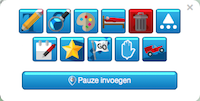
-
I think the TS doesn't just mean the hand icon. TS refers to the balloon with other icons.
And I agree with TS that these are very poorly chosen images and I have a hard time recognizing the meaning of each icon at a glance.
@Jack-van-Tilburg Hoovering over them gives a nice tooltip
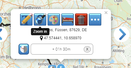
that explains what is below the button. It may be requireing some getting used to but I guess we will manage
-
@Jack-van-Tilburg Hoovering over them gives a nice tooltip

that explains what is below the button. It may be requireing some getting used to but I guess we will manage
@Drabslab
I know that. But if you have to hover it is proof that the icons are not intuitive. -
@Nick-Carthew said in Revert to old icons for way points and waypoint management:
I’m sure that you’ll begin to enjoy the new look...
Not likely. The icon set in the balloons fails on the best practice front for icon design. They are way too busy visually, so the user now has an increased cognitive load to make sense of them. A user shouldn't have to work hard to understand what an icon means. Good icon design is about clear and simple communication. These new icons are a step in the opposite direction

@Ben-Craig I agree.
-
If I'm understanding the update correctly the hand icon is a via and the original balloon is a stop, why then is the icon at the beginning and end of a route a hand that you cannot change, my thoughts are the beginning and end icons should be balloons with hands inbetween other than designated stops i.e balloons.
@speedup100 said in Revert to old icons for way points and waypoint management:
If I'm understanding the update correctly the hand icon is a via and the original balloon is a stop, why then is the icon at the beginning and end of a route a hand that you cannot change, my thoughts are the beginning and end icons should be balloons with hands inbetween other than designated stops i.e balloons.
@speedup100 It’s the other way round. The hand icon is for stop waypoints and balloons are for via ones. The first and last WPs are automatically added as stops. You will notice that each time you add a WP to a route it will show as a hand and change to a balloon when you add the next one.
-
Confusing, for one thing I've no idea what shaping is which seems to be something connected with Garmin whereas I use tomtom. That said if you already have a balloon icon on a route and click on it you are offered the option to turn it into a via which becomes a hand, so that says to me it in now not a stop.
-
I like the new waypoint icons. They are very simple to both understand and use, even just a day after being introduced. Gary.
-
Confusing, for one thing I've no idea what shaping is which seems to be something connected with Garmin whereas I use tomtom. That said if you already have a balloon icon on a route and click on it you are offered the option to turn it into a via which becomes a hand, so that says to me it in now not a stop.
@speedup100 said in Revert to old icons for way points and waypoint management:
Confusing, for one thing I've no idea what shaping is which seems to be something connected with Garmin whereas I use tomtom. That said if you already have a balloon icon on a route and click on it you are offered the option to turn it into a via which becomes a hand, so that says to me it in now not a stop.
@speedup100. I’m a TomTom user too. From what I gather Garmins work slightly differently to TTs. When you add stop
 points the Garmin has to pass that WP but it is more flexible with the via balloon WPs and may take you on a slightly different route to the next stop point depending on conditions. The hand icon is definitely a stop point.
 -
@speedup100 said in Revert to old icons for way points and waypoint management:
Confusing, for one thing I've no idea what shaping is which seems to be something connected with Garmin whereas I use tomtom. That said if you already have a balloon icon on a route and click on it you are offered the option to turn it into a via which becomes a hand, so that says to me it in now not a stop.
@speedup100. I’m a TomTom user too. From what I gather Garmins work slightly differently to TTs. When you add stop
 points the Garmin has to pass that WP but it is more flexible with the via balloon WPs and may take you on a slightly different route to the next stop point depending on conditions. The hand icon is definitely a stop point.
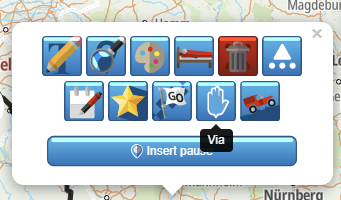
@Nick-Carthew But the prompt says ‘via’ when you hover over the icon menu. I used to have a TT but have swapped to a Garmin Zumo XT; familiar with both systems and so the differing terminologies may cause confusion. Personally, I would like to see the prompt say “stop’ as I would agree with @speedup100 that the ‘via’ terminology does appear confusing. Also, Waypoints and shaping points (alerting and non-alerting) are Garmin terms that could add further confusion to TT users. A ‘via’, to me, does tend to indicate a shaping point and so I would prefer to see the term ‘Stop’ used which could be applied to any waypoint (shaping point).
Another term I have seen is a ‘reporting point’ but I can see this becoming horribly confusing. It certainly was an education when I moved from Garmin to TT, and then back to Garmin with how points are termed and used/behave within the different systems.

-
@speedup100 said in Revert to old icons for way points and waypoint management:
Confusing, for one thing I've no idea what shaping is which seems to be something connected with Garmin whereas I use tomtom. That said if you already have a balloon icon on a route and click on it you are offered the option to turn it into a via which becomes a hand, so that says to me it in now not a stop.
@speedup100. I’m a TomTom user too. From what I gather Garmins work slightly differently to TTs. When you add stop
 points the Garmin has to pass that WP but it is more flexible with the via balloon WPs and may take you on a slightly different route to the next stop point depending on conditions. The hand icon is definitely a stop point.
@Nick-Carthew said in Revert to old icons for way points and waypoint management:
@speedup100 said in Revert to old icons for way points and waypoint management:
Confusing, for one thing I've no idea what shaping is which seems to be something connected with Garmin whereas I use tomtom. That said if you already have a balloon icon on a route and click on it you are offered the option to turn it into a via which becomes a hand, so that says to me it in now not a stop.
@speedup100. I’m a TomTom user too. From what I gather Garmins work slightly differently to TTs. When you add stop
 points the Garmin has to pass that WP but it is more flexible with the via balloon WPs and may take you on a slightly different route to the next stop point depending on conditions. The hand icon is definitely a stop point.
Hi Nick, I think the confusing bit is that hovering over a balloon brings up the word via which when you click on it, it becomes a hand which by its image indicates stop but by the fact you clicked the word via gives the opposite impression, confuses me anyway. I also think MRA have made a mistake in introducing a Garmin word "Shaping" to a generalised route planner. What's wrong with stop, it's almost an international word, it even appears on foreign road signs.
-
I like the new waypoint icons. They are very simple to both understand and use, even just a day after being introduced. Gary.
@Gary-France I agree, I also think we should be prepared to adapt to a new situation otherwise there is absolutely no incentive to introduce new features no matter how usefulo these would be.
-
@Nick-Carthew said in Revert to old icons for way points and waypoint management:
@speedup100 said in Revert to old icons for way points and waypoint management:
Confusing, for one thing I've no idea what shaping is which seems to be something connected with Garmin whereas I use tomtom. That said if you already have a balloon icon on a route and click on it you are offered the option to turn it into a via which becomes a hand, so that says to me it in now not a stop.
@speedup100. I’m a TomTom user too. From what I gather Garmins work slightly differently to TTs. When you add stop
 points the Garmin has to pass that WP but it is more flexible with the via balloon WPs and may take you on a slightly different route to the next stop point depending on conditions. The hand icon is definitely a stop point.
Hi Nick, I think the confusing bit is that hovering over a balloon brings up the word via which when you click on it, it becomes a hand which by its image indicates stop but by the fact you clicked the word via gives the opposite impression, confuses me anyway. I also think MRA have made a mistake in introducing a Garmin word "Shaping" to a generalised route planner. What's wrong with stop, it's almost an international word, it even appears on foreign road signs.
Hi Nick, I think the confusing bit is that hovering over a balloon brings up the word via which when you click on it, it becomes a hand which by its image indicates stop but by the fact you clicked the word via gives the opposite impression, confuses me anyway. I also think MRA have made a mistake in introducing a Garmin word "Shaping" to a generalised route planner. What's wrong with stop, it's almost an international word, it even appears on foreign road signs.
I agree, seems like an easy thign to solve for the developers. STOP would be a better word.
Instead of "shaping" maybe use "way".
Hello! It looks like you're interested in this conversation, but you don't have an account yet.
Getting fed up of having to scroll through the same posts each visit? When you register for an account, you'll always come back to exactly where you were before, and choose to be notified of new replies (either via email, or push notification). You'll also be able to save bookmarks and upvote posts to show your appreciation to other community members.
With your input, this post could be even better 💗
Register Login
