Feature Request: Map Contrast & Road Visibility in Navigation
-

Subject: Feature Request: Map Contrast & Road Visibility in Navigation
Hi MyRoute-app Team,
As a lifetime subscriber who uses the Web Routeplanner regularly, I’d like to share a suggestion to improve map readability while riding.
The Issue:
While the active navigation track is clear, the surrounding secondary roads, street names, and map details are far too thin, faint, and low-contrast.
Why it Matters:
When riding a motorcycle, quick readability is essential. It is crucial to clearly see the surrounding road network at a glance, not just the blue track line.
Proposed Solution:
Add an option for High Contrast / Bold Roads map style.
Increase line thickness and contrast for secondary roads.
Improve font size and visibility for street names.
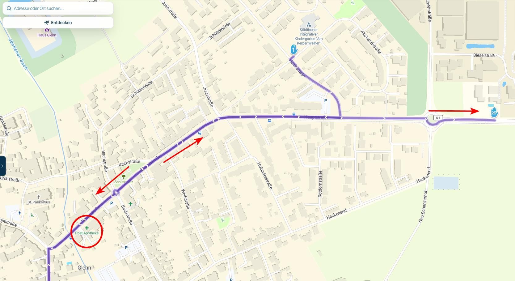
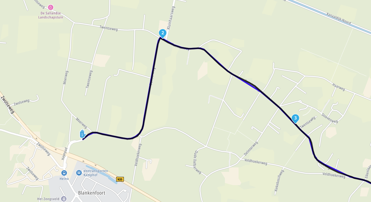
I have attached a side-by-side visual comparison to illustrate the difference.
Thank you for your continuous work on MRA!
Best regards image url)
 -

I am all in for better contrast, but I would like it slightly different then yours, which makes the map way too busy for my taste.
Personally I would appreciate a little more contrast for roads and more than that for street names and such.Positive emotions are worth every penny ;)
-
I am all in for better contrast, but I would like it slightly different then yours, which makes the map way too busy for my taste.
Personally I would appreciate a little more contrast for roads and more than that for street names and such.
@LennyO
Thanks for the feedback Lenny! My image was just an exaggerated visual example to clearly highlight the contrast issue. Having customizable display settings—or a subtle balance like you described—would indeed be the perfect solution so everyone can adjust it to their taste. -

I fully agree! And it is discussed in other threads too.
I drive a lot in all weather conditions the whole year and it's often annoying to have a white (or light grey) screen and white roads on it. So, it's not helpful for such map style, to have a screen with 3000 NITS; white is white.I know it would be not easy to find a color scheme, which fits for all users. Therefore I often suggested: the configuration of the color scheme should be kept in a txt file of the app. If users with passion want to optimise it for own needs, they can override the #hex code for some colours.
That's not difficult for users and there is no risk.
Garmin is doing it for Zŭmo models. -
I agree with all the sentiments that this needs to be addressed.
I think the best way to address this is not via a txt file but by a number of profiles that can be configured by the end user. These profiles would be configured in the online planner and synchronised to the app for navigation. The end user can then select the most appropriate profile for their current situation.
So for example, I might configure a profile for use on my bike where I use a ruggedised phone for navigation. In my car I have a built-in Android Auto/Carplay device which would use a different profile. For my camper I have a different set of requirements and therefore a different profile. The key is that I as the end user can define, easily save and then select the best profile for my scenario.
Settings would include, but certainly not limited to: map colours, road colours, contrast, route colour, line width and opacity, map scaling, zoom level at which POI's appear (by category), etc etc.
This way you can set a "sensible" default that can be used, probably by a majority of users, but also give "power" users the opportunity to customise their navigation experience.
We all use different devices in different environments, some are colour blind or have other visual impairments and others have very strong preferences. The development team will never be able to accommodate all of these scenarios so give the end user the option to choose.
-
I agree, the maps on Car Play are far too washed out. You can see your highlighted road but you have no context to other streets. I have stopped using MRA Nav for this very reason.
-
Yes, I think the topic of map contrasts is also really important, but it is not taken up by the MRA team at the moment ... had already written something about it in the beta area.
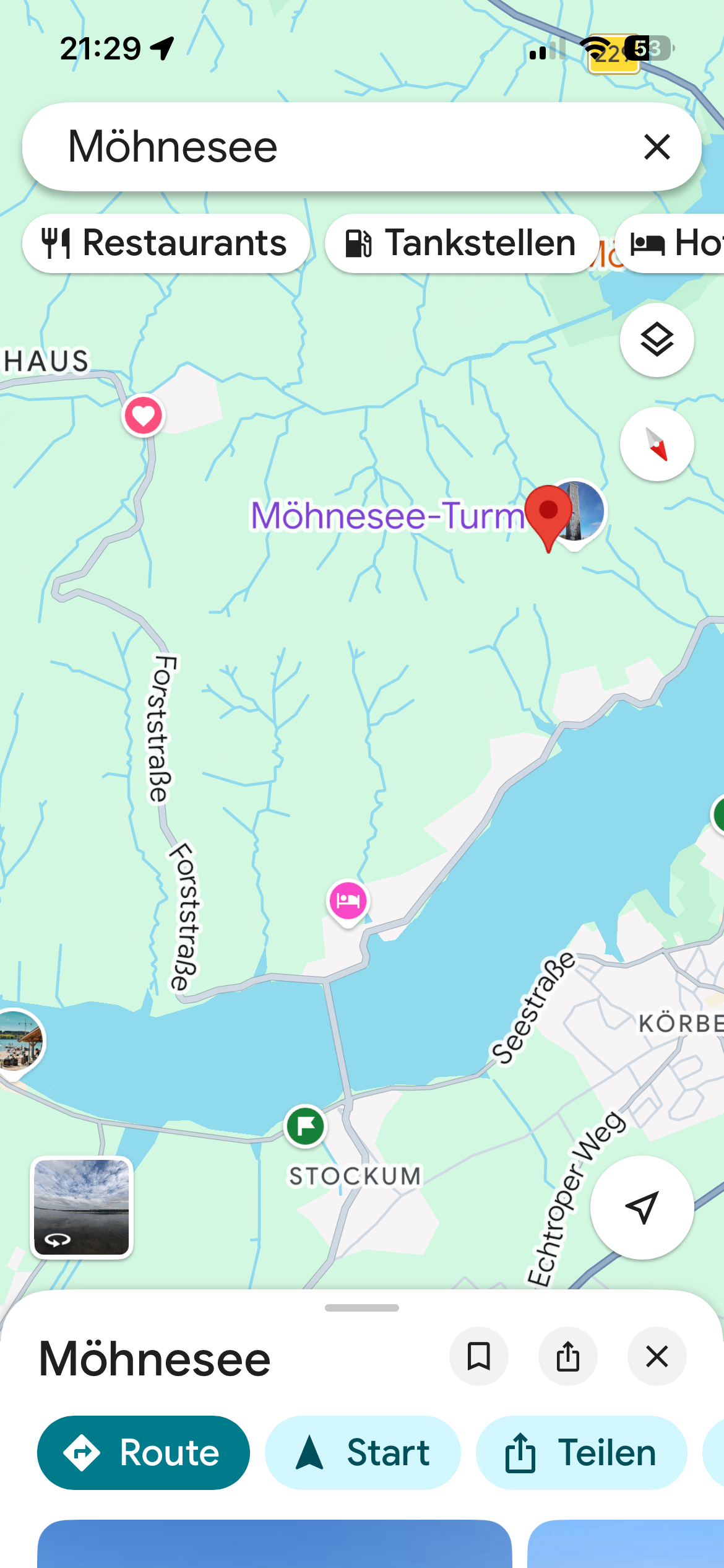
Here is the map example: MRA to G-Maps
- Same view of the forest road
—-###—
Ja ich finde das Thema Karten Kontraste auch wirklich wichtig, es wird allerdings im Moment vom MRA Team nicht aufgegriffen … hatte dazu auch schon was im Beta Bereich geschrieben.Hier das Karten Beispiel: MRA zu G-Maps
- Gleiche Sicht auf die Forststraße
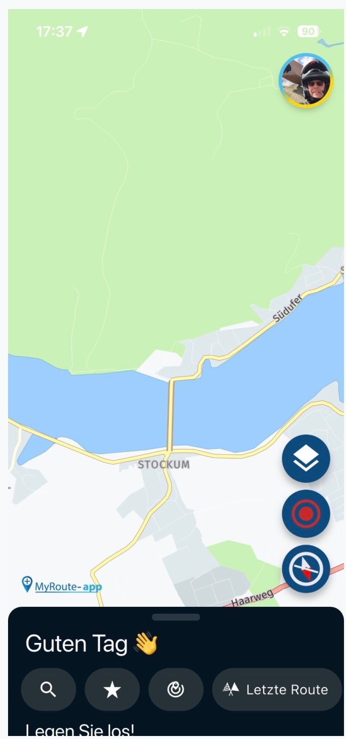
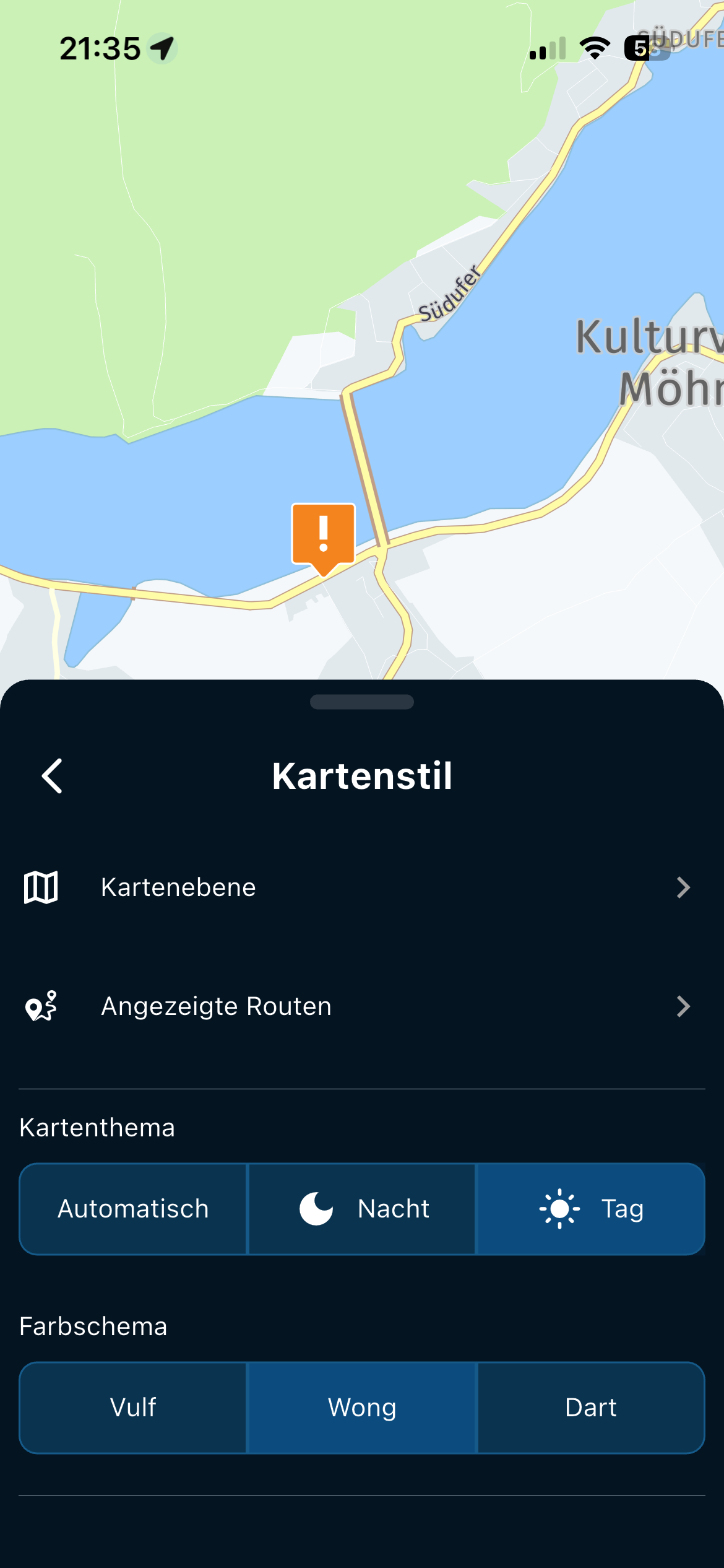
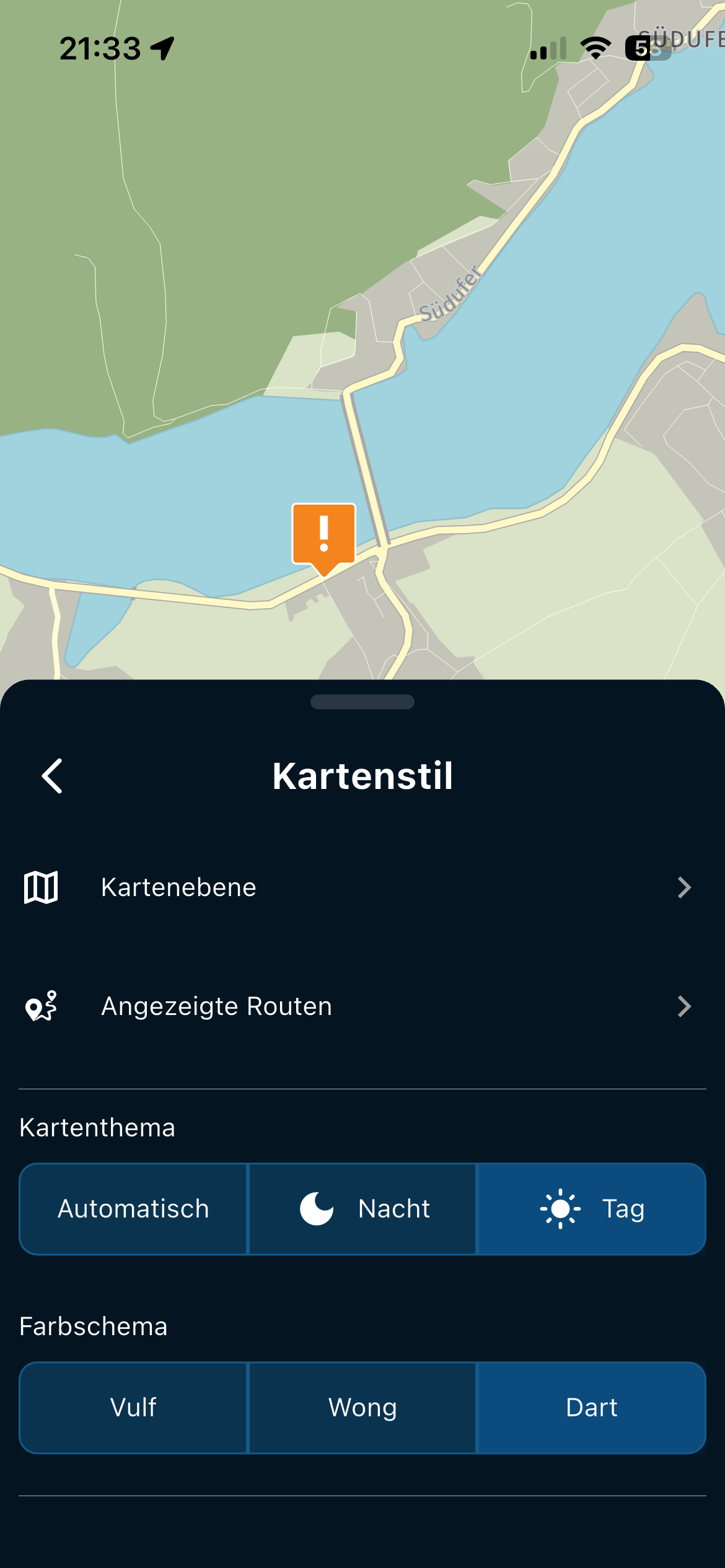
Even when zooming out, the forest road on the left remains much more visible.
—-###—-
Selbst beim raus Zoomen bleibt die Forststraße links viel besser sichtbar.

-
I do not know how the cards work inside MRA, but the HERE cards inside Garmin work with a so called a TYP file. With this you can set the card items to your own liking.
For my outdoor Garmin devices I use cards in my own style made from OSM maps, I still use the old java programs from 15 years ago for that. -
@bertm : Good if you can do it yourself

-
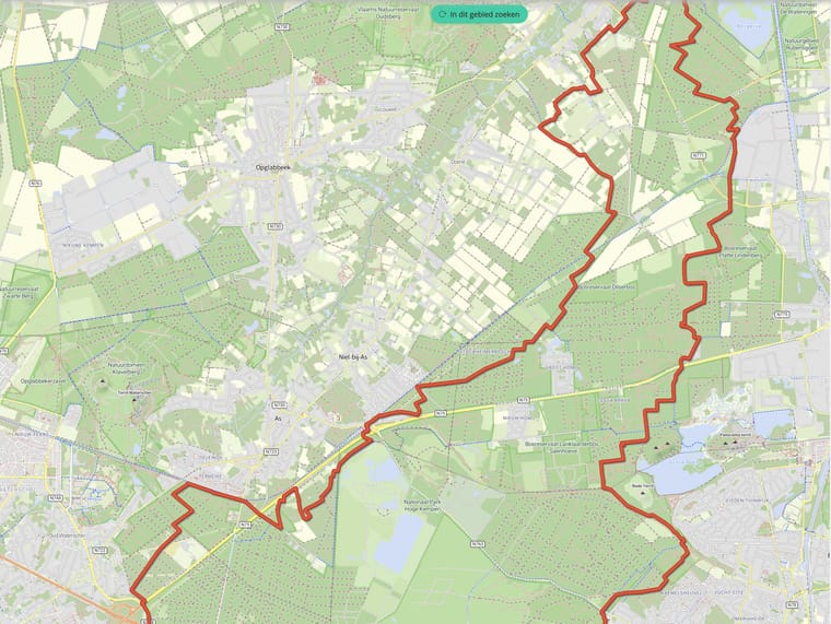
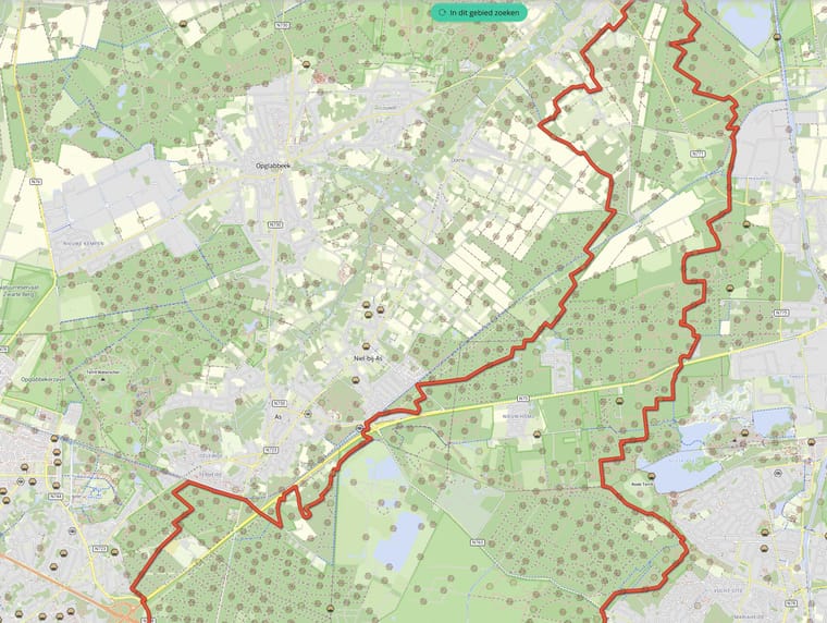
I highly support the idea of higher contrast. I love the way the WonderWheel of BMW is integrated in MRA, but the low contrast and the spinning map push me to use other apps with way poorer integration.
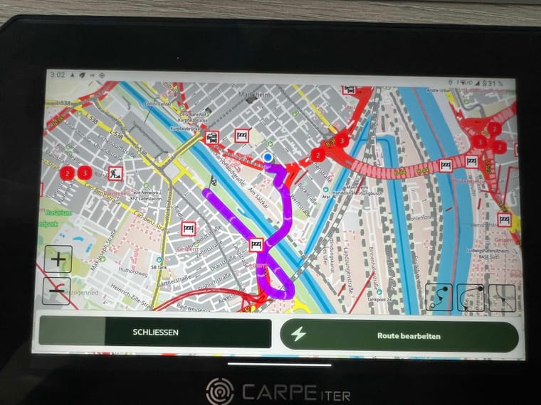
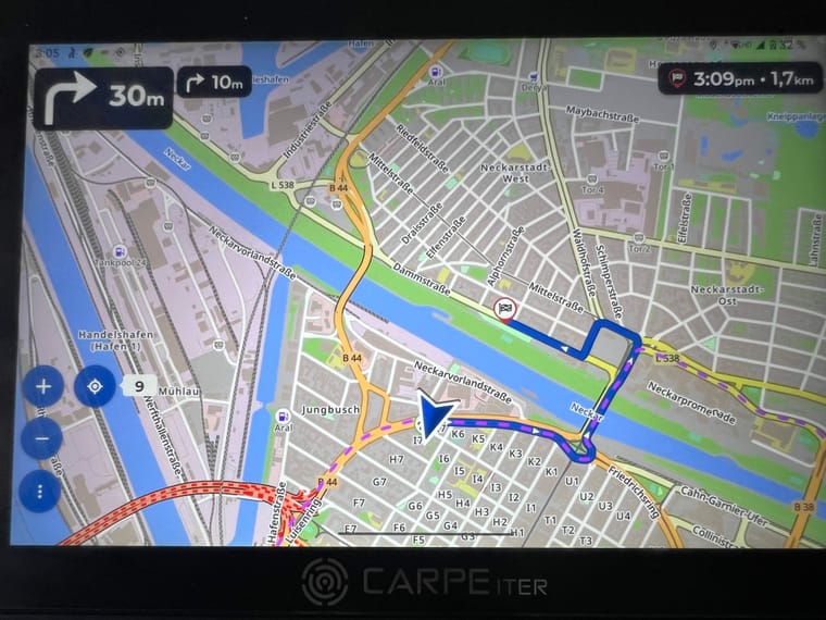
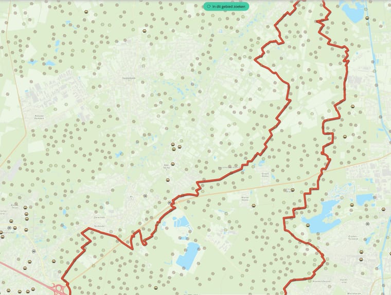
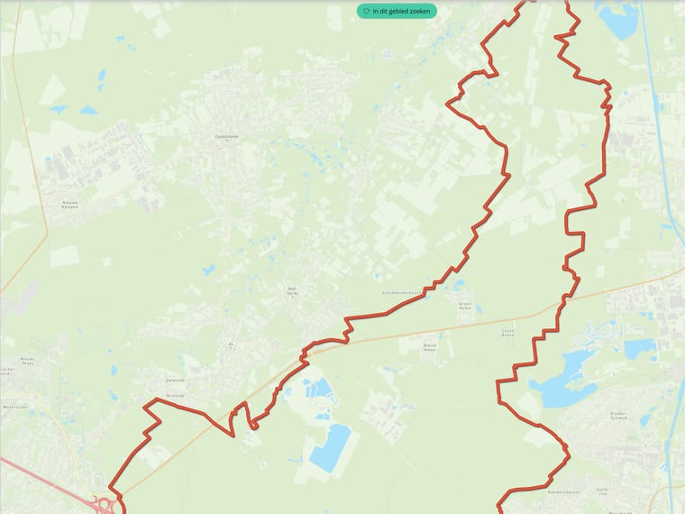
Being able to choose the color of the route would be a nice first step. For comparison, these are the solutions of kurviger and scenic.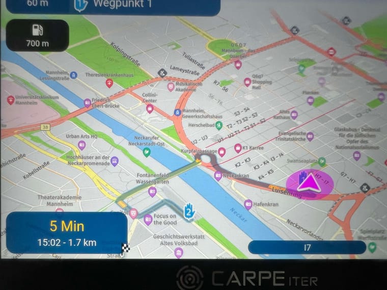
Hello! It looks like you're interested in this conversation, but you don't have an account yet.
Getting fed up of having to scroll through the same posts each visit? When you register for an account, you'll always come back to exactly where you were before, and choose to be notified of new replies (either via email, or push notification). You'll also be able to save bookmarks and upvote posts to show your appreciation to other community members.
With your input, this post could be even better 💗
Register Login-
 1431657
-
 0938
0938
-
 07114
07114
-
 0636
0636
-
05108
-
 5417
5417
-
0411
-
 116315