New MRA Mobile Update 3.2.3
-
You are completely right
 That's not really workable.
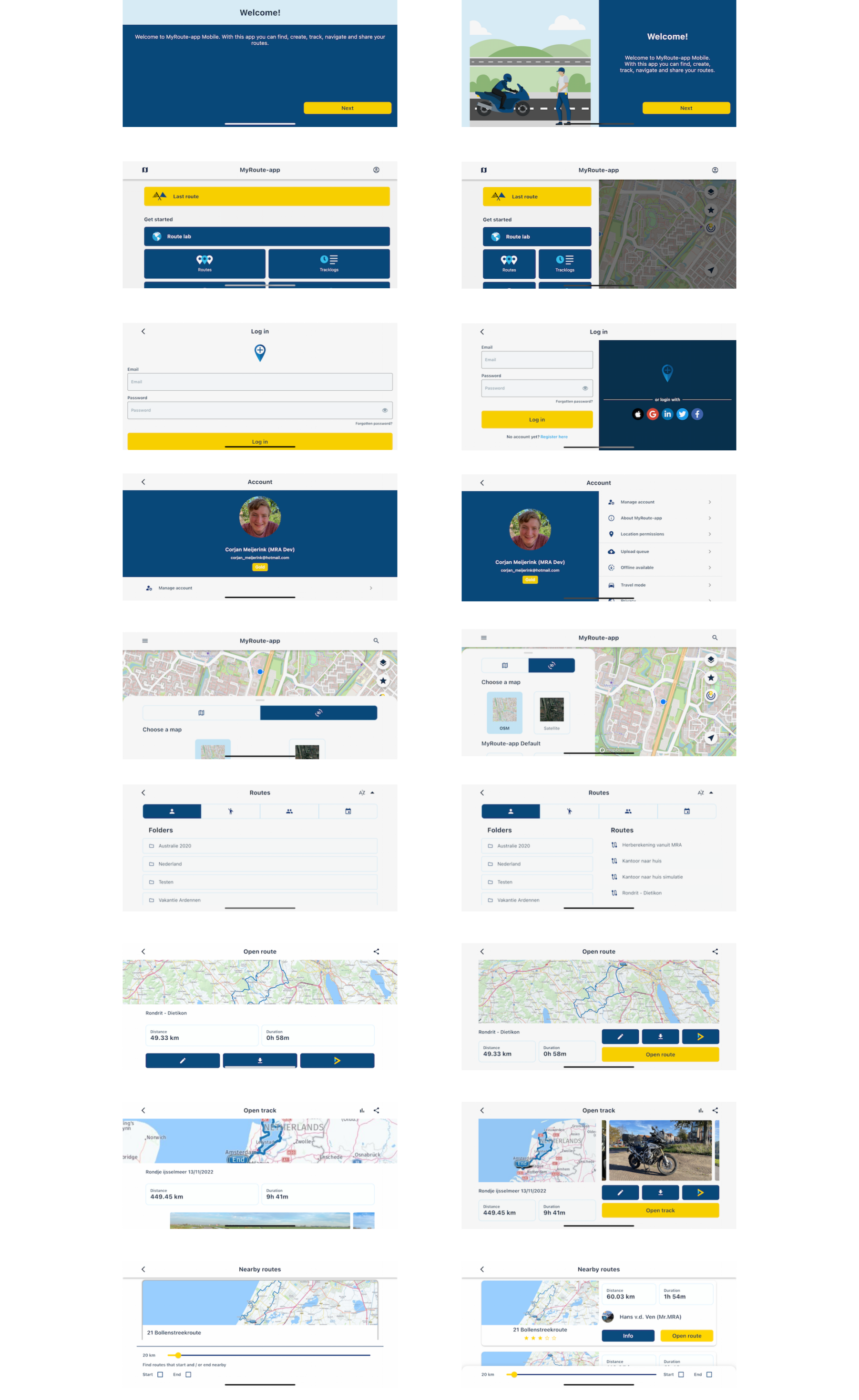
This hasn't changed as creating a new route happens in the website, not in the app. The app just loads the website for you resulting in this suboptimal (to say the least) layout.
The app update improved all landscape / tablet layouts with regards to the native app environment. Not the so called in-app browser, as that's just the website
") (which definitely needs some improving, no question)
(which definitely needs some improving, no question) -
If you are planning a new route, the chances are that you will have your phone in your hand and therefore be able to use it in portrait mode.
I agree that for planning a new route in landscape is (@Corjan-Meijerink word) sub-optimal. Maybe not showing the banner would be enough. -
Portrait mode works satisfactorily.
Given the function buttons on the left side of the map, the landscape mode will not function properly on a smartphone. (imho ) -
Portrait mode works satisfactorily.
Given the function buttons on the left side of the map, the landscape mode will not function properly on a smartphone. (imho )@Jack-van-Tilburg If someone is insistent on using landscape mode for planning. The left menu can be closed with the arrow.
Always willing to help if I can.
Triumph Tiger 1200 XRT called Tina.
MRA Navigation Next and SilverFox BJ8 -
@Jack-van-Tilburg If someone is insistent on using landscape mode for planning. The left menu can be closed with the arrow.
@Nick-Carthew
I know. But even then the function buttons on the left side of the map can not be used. Or am I missing something?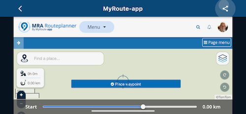
-
@Nick-Carthew
I know. But even then the function buttons on the left side of the map can not be used. Or am I missing something?@Jack-van-Tilburg Like I said, use it in portrait mode until @Corjan-Meijerink can make adjustments.
Always willing to help if I can.
Triumph Tiger 1200 XRT called Tina.
MRA Navigation Next and SilverFox BJ8 -
@Jack-van-Tilburg Like I said, use it in portrait mode until @Corjan-Meijerink can make adjustments.
@Nick-Carthew
Yep like I said before:Portrait mode works satisfactorily.
I was just helping Stanislaw with some screenshots.
-
hopelijk bij sessie van morgen krijgen we laatste update te zien en uitleg. indien niet dan toch hopelijk leerzaam
-
hopelijk bij sessie van morgen krijgen we laatste update te zien en uitleg. indien niet dan toch hopelijk leerzaam
Ik ben mijn best aan het doen om een versie te pakken te krijgen, zodat ik morgen e.e.a kan laten zien
-
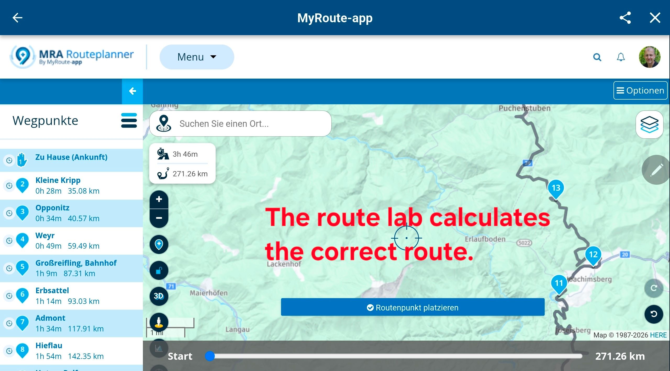
I wonder if there's a User eXperience behind the choice of dividing the screen by it's half size, making the button smaller ? (Line 2)
Most of the old app, has inconsistent size of UI element, like choose a route (good to catch with winter motorcycle glove) then the over-mini start to be pressed
I deeply hope that Next will figure out all those little things that we always moan about.
One of the best test you can make, is wear a pair of winter gloves on a motocycle and try to change an option, by pass a waypoint, and if the law doesn't prohibit that, do it when riding.
-
@Nick-Carthew
Yep like I said before:Portrait mode works satisfactorily.
I was just helping Stanislaw with some screenshots.
@Jack-van-Tilburg Thanks for sharing those, like mentioned those issues concern the website. Yes, that needs improvement. No, that won’t be done tomorrow
Hope you all can still appreciate the actual improvements made within the app itself
-
I wonder if there's a User eXperience behind the choice of dividing the screen by it's half size, making the button smaller ? (Line 2)
Most of the old app, has inconsistent size of UI element, like choose a route (good to catch with winter motorcycle glove) then the over-mini start to be pressed
I deeply hope that Next will figure out all those little things that we always moan about.
One of the best test you can make, is wear a pair of winter gloves on a motocycle and try to change an option, by pass a waypoint, and if the law doesn't prohibit that, do it when riding.
@Bruno-Friedmann Thanks for your response. Navigation Next will be a massive improvement on all aspects. However, there is a thin line between usable big buttons and a really ugly design
We are starting beta testing soon to gather actual user feedback!I’m not sure what image you are referring to but this Mobile update did not decrease any button sizes. We changed how layouts are rendered on different devices / orientation to maximise efficient screen usage.
If you are referring to the screenshot of the browser, I stand by my previous comment that it indeed is not optimal at all.
-
@Bruno-Friedmann Thanks for your response. Navigation Next will be a massive improvement on all aspects. However, there is a thin line between usable big buttons and a really ugly design
We are starting beta testing soon to gather actual user feedback!I’m not sure what image you are referring to but this Mobile update did not decrease any button sizes. We changed how layouts are rendered on different devices / orientation to maximise efficient screen usage.
If you are referring to the screenshot of the browser, I stand by my previous comment that it indeed is not optimal at all.
@Corjan-Meijerink said in New MRA Mobile Update 3.2.3:
@Bruno-Friedmann Thanks for your response. Navigation Next will be a massive improvement on all aspects. However, there is a thin line between usable big buttons and a really ugly design
We are starting beta testing soon to gather actual user feedback!I’m not sure what image you are referring to but this Mobile update did not decrease any button sizes. We changed how layouts are rendered on different devices / orientation to maximise efficient screen usage.
Was referring to the one you presented, instead of having just buttont you now present half screen with button, and half with the map, that's how I deduce you shrink the button size.
-
@Jack-van-Tilburg Thanks for sharing those, like mentioned those issues concern the website. Yes, that needs improvement. No, that won’t be done tomorrow
Hope you all can still appreciate the actual improvements made within the app itself
@Corjan-Meijerink please note that the distinction between "the app itself" and "using the website through the app" will be lost on most users.
-
@Nick-Carthew
I know. But even then the function buttons on the left side of the map can not be used. Or am I missing something?@Jack-van-Tilburg said in New MRA Mobile Update 3.2.3:
@Nick-Carthew
I know. But even then the function buttons on the left side of the map can not be used. Or am I missing something?Thank you for this picture, it is like this on my screen. I tried the landscape mode only to check if last bottom button (my current location) is better visible on my screen, which is with non-default scaling to have bigger icons.
I suppose portrait mode is better in general, so I will us it, not landscape one.
I can see that it is web view only shown by application, so there is less possibilities to tune it, the responsiveness is also worse. By the way - will I go to this screen when I will want to switch from navigation screen in MRA NEXT to whole route view, to check how it is going ahead of my current location?--
Regards
Staszek -
@Jack-van-Tilburg said in New MRA Mobile Update 3.2.3:
@Nick-Carthew
I know. But even then the function buttons on the left side of the map can not be used. Or am I missing something?Thank you for this picture, it is like this on my screen. I tried the landscape mode only to check if last bottom button (my current location) is better visible on my screen, which is with non-default scaling to have bigger icons.
I suppose portrait mode is better in general, so I will us it, not landscape one.
I can see that it is web view only shown by application, so there is less possibilities to tune it, the responsiveness is also worse. By the way - will I go to this screen when I will want to switch from navigation screen in MRA NEXT to whole route view, to check how it is going ahead of my current location?@Stanisław
For creating or editing your routes you best use the landscape mode indeed. -
 undefined Corjan Meijerink unpinned this topic on
Hello! It looks like you're interested in this conversation, but you don't have an account yet.
Getting fed up of having to scroll through the same posts each visit? When you register for an account, you'll always come back to exactly where you were before, and choose to be notified of new replies (either via email, or push notification). You'll also be able to save bookmarks and upvote posts to show your appreciation to other community members.
With your input, this post could be even better 💗
Register Login-
0379
-
07129
-
0251
-
017413
-
010443
-
315491
-
0351.7k