Font for the distance to the next turn to smal
-
@richard-3v, but it does... along with a "next waypoint" tile.
It's in the public update to v5.1, 3 weeks ago
https://forum.myrouteapp.com/post/77330The screenshots of MyRoute-App running on Android Auto—from the link you provided—look very promising. In my opinion, they’ve handled the font size issue exceptionally well there. That could be the ideal solution for me. The only downside is that the Carpuride unfortunately doesn't have a built-in battery. I’m not too keen on that aspect.
@Daniel-7, It's not just promising, it's already available in the last public update
")
I am just an enthusiastic MRA user, and hope you will be one too!
Most motorcycle problems are caused by the nut that connects the handlebar to the saddle.
Check out RideSleepRepeat.eu, a biker community for sharing stays across Europe
-
@Daniel-7, It's not just promising, it's already available in the last public update
@Daniel-7, It's not just promising, it's already available in the last public update
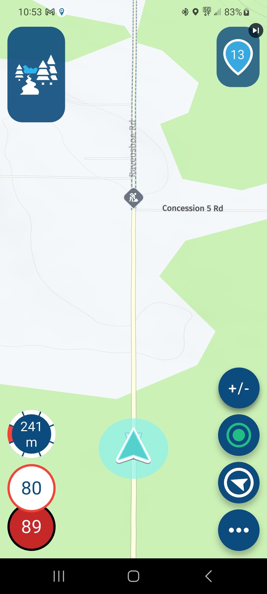
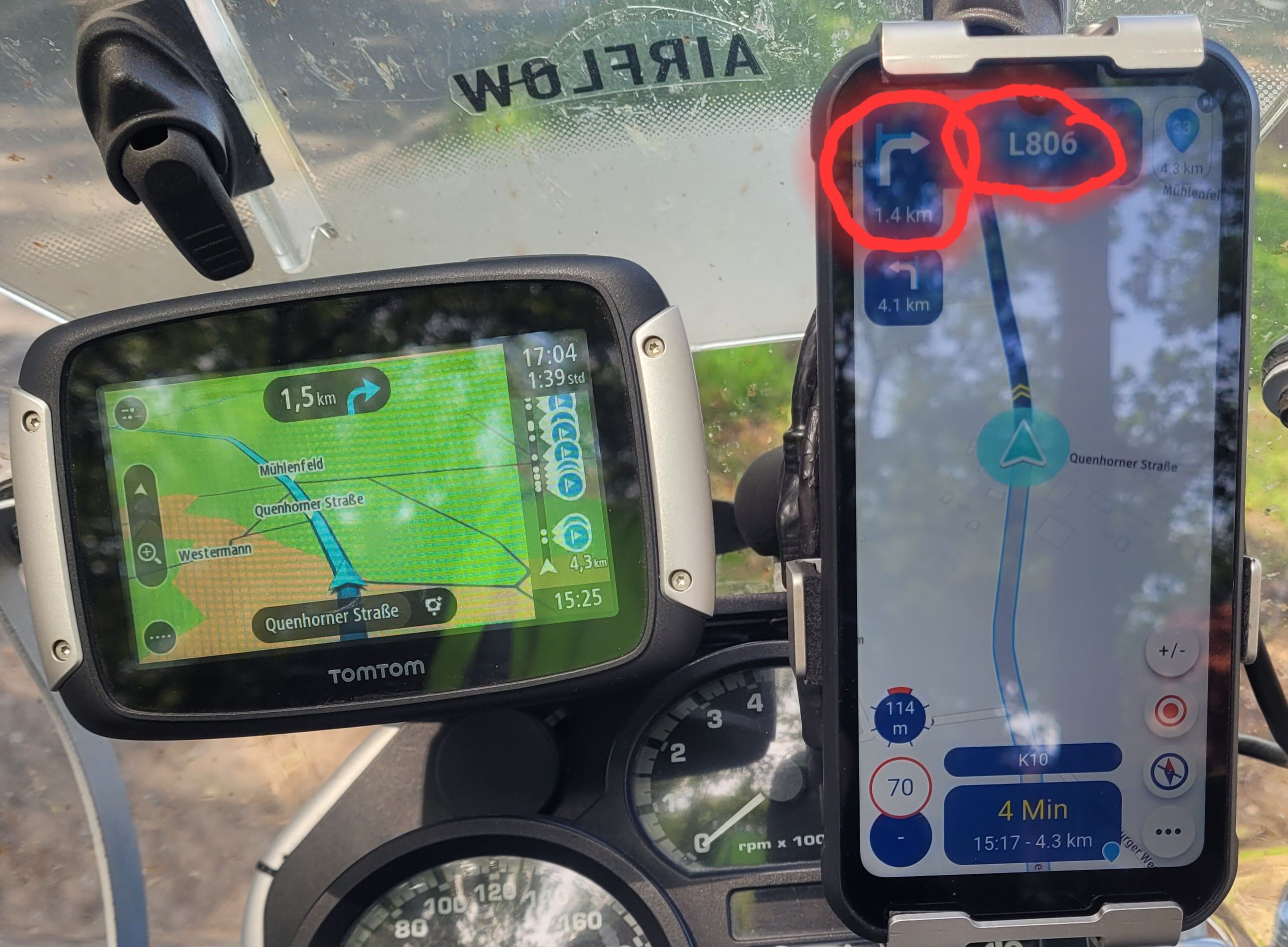
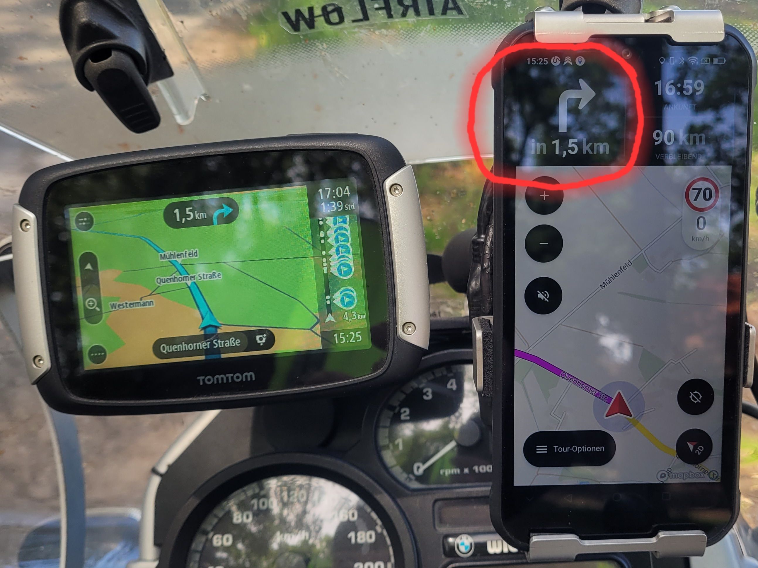
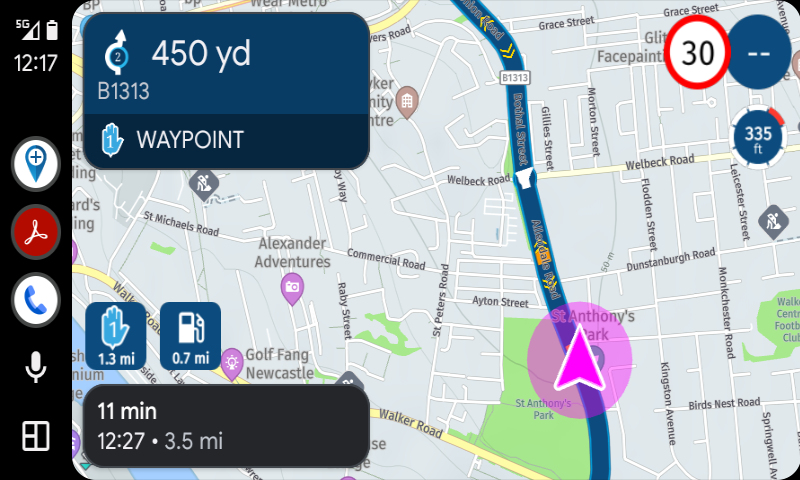
I have been an MRA user for a very long time, and back in the day, I purchased the Lifetime version for both components (the Web Planner and Navigation). Until now, however, I have only used the MRA Web Planner to plan my routes for my TomTom Rider 400. My intention was to use my ruggedized smartphone as an alternative device for MRA Navigation—something I recently put to the test. However, I found that the display showing the distance to the next turn instruction was simply too small on my smartphone screen. I can read this information without any trouble on my TomTom Rider 400, but not when using MRA Navigation on my phone. I have since noticed, though, that this information is displayed in a larger format when using Android Auto. To take advantage of that, however, I would need to acquire yet another new device (a Carpuride unit).
-
@richard-3v, but it does... along with a "next waypoint" tile.
It's in the public update to v5.1, 3 weeks ago
https://forum.myrouteapp.com/post/77330@Con-Hennekens Ooops, indeed it does. My apologies for posting duff information

-
Here's one I mocked up 3 years ago exactly as you suggested:
https://forum.myrouteapp.com/topic/4307/suggestions-for-next-turn-boxStill looking foward to it!
-
I fully support the idea. The size of the text in the ETA box has also been up for discussion.
And yes I know this is a boring thing to do for developers. But it can help to make the app usable on different devices when done right.
more settings isnt a problem as long as they are easy to understand and sensibly grouped. -
Here's one I mocked up 3 years ago exactly as you suggested:
https://forum.myrouteapp.com/topic/4307/suggestions-for-next-turn-boxStill looking foward to it!
Here's one I mocked up 3 years ago exactly as you suggested:
https://forum.myrouteapp.com/topic/4307/suggestions-for-next-turn-boxStill looking foward to it!
It is a shame that nothing has been done about this problem in the three years since your post. Apparently, listening to individual users and their issues is not a high enough priority for the myRoute development team.
-
@Corjan-Meijerink
It would be great if someone from the myRoute team could comment on this. -
@Corjan-Meijerink
It would be great if someone from the myRoute team could comment on this.@Daniel-7 It’s vacation season. There will be for sure no awnser the next 14 days!
-
Here's one I mocked up 3 years ago exactly as you suggested:
https://forum.myrouteapp.com/topic/4307/suggestions-for-next-turn-boxStill looking foward to it!
It is a shame that nothing has been done about this problem in the three years since your post. Apparently, listening to individual users and their issues is not a high enough priority for the myRoute development team.
Oh, Corjan and the team definitely listen! I definitely wasn't complaining at the level of support - it's truly outstanding for the app world.
It's just that particular issue seems to have slipped through the net.
There is, of course, the possiblity that we're both wrong, and the rest of the world can easily read it on a shaking phone at 60/70mph.

-
Here's one I mocked up 3 years ago exactly as you suggested:
https://forum.myrouteapp.com/topic/4307/suggestions-for-next-turn-boxStill looking foward to it!
It is a shame that nothing has been done about this problem in the three years since your post. Apparently, listening to individual users and their issues is not a high enough priority for the myRoute development team.
Oh, Corjan and the team definitely listen! I definitely wasn't complaining at the level of support - it's truly outstanding for the app world.
It's just that particular issue seems to have slipped through the net.
There is, of course, the possiblity that we're both wrong, and the rest of the world can easily read it on a shaking phone at 60/70mph.
And when the sun shines on the screen, it becomes even harder to see anything—even though my phone’s screen is already quite bright.
When using Calimoto, I didn’t have any trouble seeing the distance to the next turn.
I don’t think it would be a big deal to increase the font size for the distance to the next turn; after all, they’ve already released much more extensive updates.Otherwise, I’m really happy with MRA.
-
Here's one I mocked up 3 years ago exactly as you suggested:
https://forum.myrouteapp.com/topic/4307/suggestions-for-next-turn-boxStill looking foward to it!
It is a shame that nothing has been done about this problem in the three years since your post. Apparently, listening to individual users and their issues is not a high enough priority for the myRoute development team.
Oh, Corjan and the team definitely listen! I definitely wasn't complaining at the level of support - it's truly outstanding for the app world.
It's just that particular issue seems to have slipped through the net.
There is, of course, the possiblity that we're both wrong, and the rest of the world can easily read it on a shaking phone at 60/70mph.
There is, of course, the possiblity that we're both wrong, and the rest of the world can easily read it on a shaking phone at 60/70mph.
Now that you mention it, yes... At that speed I can still read my screen just fine. Or does that have more to do with the souplesse of my bike and the vibrationdemper under my phone?
-
@rob-verhoeff I do think it’s related to the mount, because it works perfectly fine on my thumping twin-cylinder bike as well 🫨

The adventure starts where the plans end | READY TO >> RACE 🧡
-
@con-hennekens You are so right. Vibrating phone mounts on your bike are the most horrible accessories you can find. When you have a bad (mostly cheap) mount, is doesn't matter how large the font size is. The text still won't be the easy to read.
-
@rob-verhoeff I do think it’s related to the mount, because it works perfectly fine on my thumping twin-cylinder bike as well 🫨
@rob-verhoeff I do think it’s related to the mount, because it works perfectly fine on my thumping twin-cylinder bike as well 🫨
My mount is very good.
There is very little vibration .
It is clearly due to the font size.🫣 -
I have to agree that the font size of some elements is way too small. I use AA on a Honda NT1100 and with the new version, quickly glancing at the screen makes reading the speed and distance to next manoeuvre easy – no issues there. I also don’t face any difficulties with the distance to the subsequent manoeuvre but it seems others do. However, the distance to the next waypoint is too small. I have to lean forward quite a bit to read it which I think makes this unsafe. I like this new feature, but it’s current implementation is far from ideal. Similarly with the altitude. These are good and worthwhile features to have and we know about the issues with screen “real estate” and competing demands for clarity and more features, but having them when they can’t be read easily or safely strikes me as being an area for development. The exit number on the roundabout symbol is currently just too small to be of any use.
-
I have to agree that the font size of some elements is way too small. I use AA on a Honda NT1100 and with the new version, quickly glancing at the screen makes reading the speed and distance to next manoeuvre easy – no issues there. I also don’t face any difficulties with the distance to the subsequent manoeuvre but it seems others do. However, the distance to the next waypoint is too small. I have to lean forward quite a bit to read it which I think makes this unsafe. I like this new feature, but it’s current implementation is far from ideal. Similarly with the altitude. These are good and worthwhile features to have and we know about the issues with screen “real estate” and competing demands for clarity and more features, but having them when they can’t be read easily or safely strikes me as being an area for development. The exit number on the roundabout symbol is currently just too small to be of any use.
I have to agree that the font size of some elements is way too small. I use AA on a Honda NT1100 and with the new version, quickly glancing at the screen makes reading the speed and distance to next manoeuvre easy – no issues there. I also don’t face any difficulties with the distance to the subsequent manoeuvre but it seems others do. However, the distance to the next waypoint is too small. I have to lean forward quite a bit to read it which I think makes this unsafe. I like this new feature, but it’s current implementation is far from ideal. Similarly with the altitude. These are good and worthwhile features to have and we know about the issues with screen “real estate” and competing demands for clarity and more features, but having them when they can’t be read easily or safely strikes me as being an area for development. The exit number on the roundabout symbol is currently just too small to be of any use.
Yes, I agree with you there. The key information regarding the next turn needs to be easy and clear to read. To achieve this, the font size in that area needs to be increased. On a mobile phone, the distance to the next turn—and the roundabout exit number you mentioned—are far too small. I’m just concerned that the MyRoute team won’t make any changes based on the feedback of only a few users. The majority seems satisfied with the current setup; at least, that’s my impression based on previous comments from some users.
-
Well, I find many of the fonts on the screen too small: distance to next waypoint, distance to next fuel station and names of cities on the map. If the font size would be adjustable, that would be perfect!
-
Well, I find many of the fonts on the screen too small: distance to next waypoint, distance to next fuel station and names of cities on the map. If the font size would be adjustable, that would be perfect!
Well, I find many of the fonts on the screen too small: distance to next waypoint, distance to next fuel station and names of cities on the map. If the font size would be adjustable, that would be perfect!
I agree with you on that.
Hello! It looks like you're interested in this conversation, but you don't have an account yet.
Getting fed up of having to scroll through the same posts each visit? When you register for an account, you'll always come back to exactly where you were before, and choose to be notified of new replies (either via email, or push notification). You'll also be able to save bookmarks and upvote posts to show your appreciation to other community members.
With your input, this post could be even better 💗
Register Login-
0884
-
09210
-
0431.1k
-
010310
-
0357
-
07231
-
0297.8k
-
0240