Suggestions for improvements to MRA Navigation
-
I have been using MRA Route Planner on an iMac for a few years, and MRA Navigation app on an iPhone 7 on my motorcycle. I do not have a separate Satnav device.
I have found MRA Route Planner to be very good and whilst MRA Navigation is adequate it lacks refinement compared to other phone navigation apps such as Google Maps (the de facto Satnav for phone) and Sygic navigation.
An important consideration when using a phone Satnav app for motorcycling is that as much information as possible can be accessed from the main screen, using a single touch button. It is difficult and potentially dangerous to have to swipe the screen to access sub-menus or other screens.
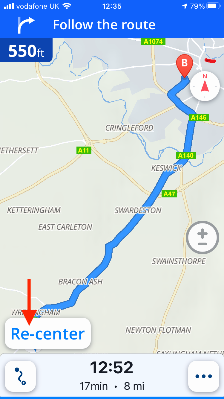
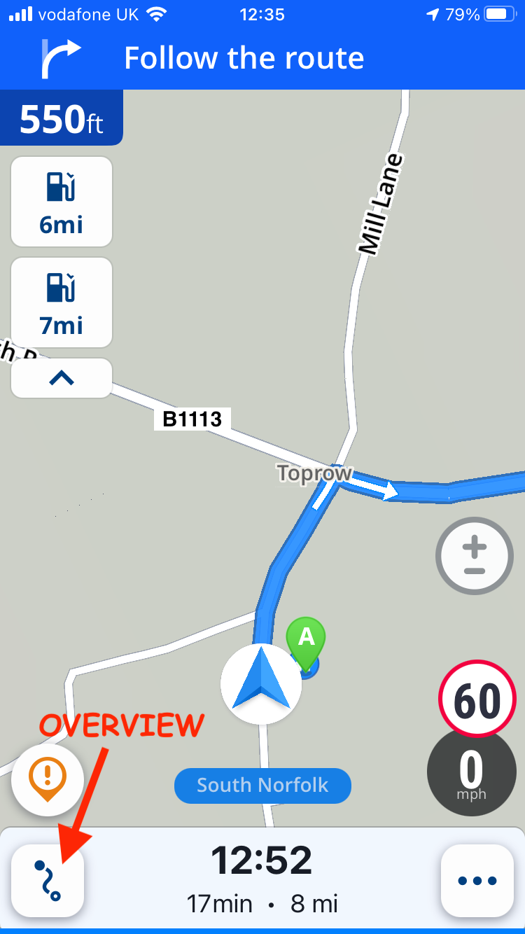
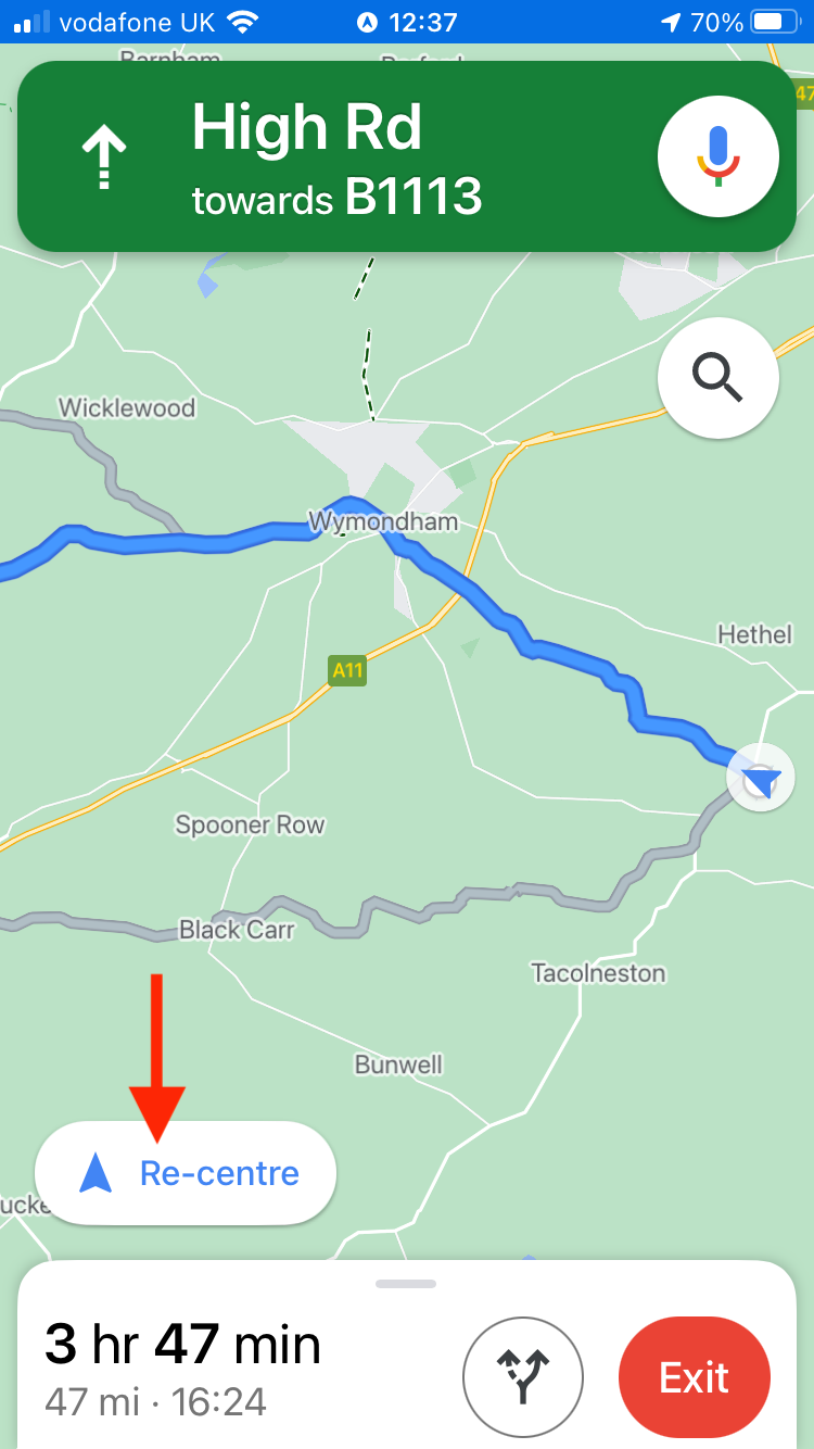
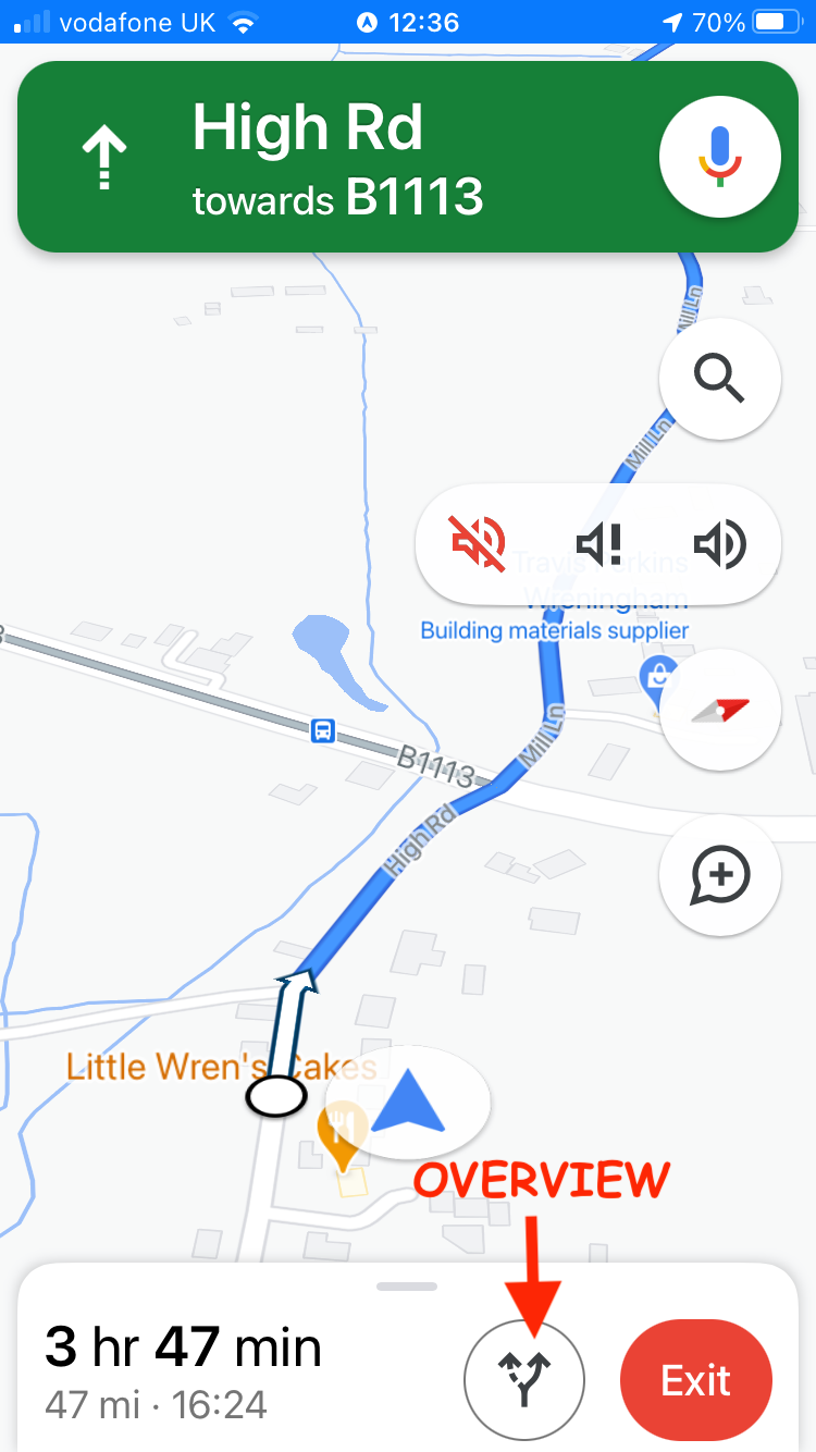
I have attached screenshots form Google Maps & Sygic taken from my iPhone 7, and I have the following suggestions that I believe would improve MRA Navigation and enable it to keep up with competitive phone apps -
-
From the main screen it should be possible to access an overview of the route without having to zoom the screen. The attached Google 1 & Sygic 1 screenshots show how this is achieved by these apps using a single button. Screenshots Google 2 and Sygic 2 show how these apps return to the main screen with a ‘re-centre’ button. This ‘one click’ operation is very simple, wheras obtaining an overview in MRA Navigation is difficult and fiddly.
-
It is often desirable to temporarily mute voice guidance, for example when talking to other riders via intercom. This is possible in Google Maps using a pop-up menu from the main screen - see Google 1 attachment. As well as being able to mute/un-mute voice guidance it is also possible to change the frequency of guidance using this control. MRA Navigation guidance is often quite intrusive and therefore it would be useful to be able to moderate the frequency of guidance. Note that all these changes can be accomplished from the Google Maps main screen via a simple button selection.
-
The ‘Exit’ (route) button should be located on the main screen.
-
Also the ‘Skip’ (waypoint) button should be on the main screen.
-
Regarding voice guidance, it would be good to have a choice of voices to choose from e.g. male or female, also the ability to set default guidance volume would be beneficial. It is not necessary to access these options from the main screen but the parameters could be selected in Settings.
I hope these suggestions are of assistance and I hope will MRA to be even more successful in the future.
Kind regards
David Bonner
-
-
I have been using MRA Route Planner on an iMac for a few years, and MRA Navigation app on an iPhone 7 on my motorcycle. I do not have a separate Satnav device.
I have found MRA Route Planner to be very good and whilst MRA Navigation is adequate it lacks refinement compared to other phone navigation apps such as Google Maps (the de facto Satnav for phone) and Sygic navigation.
An important consideration when using a phone Satnav app for motorcycling is that as much information as possible can be accessed from the main screen, using a single touch button. It is difficult and potentially dangerous to have to swipe the screen to access sub-menus or other screens.
I have attached screenshots form Google Maps & Sygic taken from my iPhone 7, and I have the following suggestions that I believe would improve MRA Navigation and enable it to keep up with competitive phone apps -
-
From the main screen it should be possible to access an overview of the route without having to zoom the screen. The attached Google 1 & Sygic 1 screenshots show how this is achieved by these apps using a single button. Screenshots Google 2 and Sygic 2 show how these apps return to the main screen with a ‘re-centre’ button. This ‘one click’ operation is very simple, wheras obtaining an overview in MRA Navigation is difficult and fiddly.
-
It is often desirable to temporarily mute voice guidance, for example when talking to other riders via intercom. This is possible in Google Maps using a pop-up menu from the main screen - see Google 1 attachment. As well as being able to mute/un-mute voice guidance it is also possible to change the frequency of guidance using this control. MRA Navigation guidance is often quite intrusive and therefore it would be useful to be able to moderate the frequency of guidance. Note that all these changes can be accomplished from the Google Maps main screen via a simple button selection.
-
The ‘Exit’ (route) button should be located on the main screen.
-
Also the ‘Skip’ (waypoint) button should be on the main screen.
-
Regarding voice guidance, it would be good to have a choice of voices to choose from e.g. male or female, also the ability to set default guidance volume would be beneficial. It is not necessary to access these options from the main screen but the parameters could be selected in Settings.
I hope these suggestions are of assistance and I hope will MRA to be even more successful in the future.
Kind regards
David Bonner


@David-Bonner MRA are always happy to receive thoughts and ideas and I’m sure yours will be passed on to the development team.
-
-
I have been using MRA Route Planner on an iMac for a few years, and MRA Navigation app on an iPhone 7 on my motorcycle. I do not have a separate Satnav device.
I have found MRA Route Planner to be very good and whilst MRA Navigation is adequate it lacks refinement compared to other phone navigation apps such as Google Maps (the de facto Satnav for phone) and Sygic navigation.
An important consideration when using a phone Satnav app for motorcycling is that as much information as possible can be accessed from the main screen, using a single touch button. It is difficult and potentially dangerous to have to swipe the screen to access sub-menus or other screens.
I have attached screenshots form Google Maps & Sygic taken from my iPhone 7, and I have the following suggestions that I believe would improve MRA Navigation and enable it to keep up with competitive phone apps -
-
From the main screen it should be possible to access an overview of the route without having to zoom the screen. The attached Google 1 & Sygic 1 screenshots show how this is achieved by these apps using a single button. Screenshots Google 2 and Sygic 2 show how these apps return to the main screen with a ‘re-centre’ button. This ‘one click’ operation is very simple, wheras obtaining an overview in MRA Navigation is difficult and fiddly.
-
It is often desirable to temporarily mute voice guidance, for example when talking to other riders via intercom. This is possible in Google Maps using a pop-up menu from the main screen - see Google 1 attachment. As well as being able to mute/un-mute voice guidance it is also possible to change the frequency of guidance using this control. MRA Navigation guidance is often quite intrusive and therefore it would be useful to be able to moderate the frequency of guidance. Note that all these changes can be accomplished from the Google Maps main screen via a simple button selection.
-
The ‘Exit’ (route) button should be located on the main screen.
-
Also the ‘Skip’ (waypoint) button should be on the main screen.
-
Regarding voice guidance, it would be good to have a choice of voices to choose from e.g. male or female, also the ability to set default guidance volume would be beneficial. It is not necessary to access these options from the main screen but the parameters could be selected in Settings.
I hope these suggestions are of assistance and I hope will MRA to be even more successful in the future.
Kind regards
David Bonner


@David-Bonner Excellent idea's. I hope that MRA will organise a user consutation before re-vamping the navigation app. I guess there are many such good idea's floating amongst users
-
-
@David-Bonner Excellent idea's. I hope that MRA will organise a user consutation before re-vamping the navigation app. I guess there are many such good idea's floating amongst users
@Drabslab Ya definetel. I.e.: I just missed the roadmap poll but have been using MRA Nav a lot since then. New users most of the time have the most objective view since they're not accustomed to the quirks of the apps yet.
-
@Drabslab Ya definetel. I.e.: I just missed the roadmap poll but have been using MRA Nav a lot since then. New users most of the time have the most objective view since they're not accustomed to the quirks of the apps yet.
@StefanHummelink True, users also have the ability to come up with working methods and requiremetns that no developer can invent

-
As a camper user, I would like to have the option to put in the measures of our camper, so that in planning a route, we are not send on very small roads, low bridges etc. etc. Some big navigation companies have that (Sygic, TomTom), but there app's are very limited en closed, not like MRA.
