Suggestion: Expand Waypoint Color Palette and Pause Symbol Options
-
I like being able to change the waypoint colors (for the hand and shaping point) and also like the pause symbols you can add. I see that Mobile shows the pause symbols, so it appears that this box has already been checked when it comes to this feature showing up in Next (something that's missing in MRA Navigation).
It would be nice if the color palette for the waypoints were expanded as well as choices for pause symbols. Looking at Scenic, they approach it with a decent sized color palette and use emojis for symbols...
Color Palette:
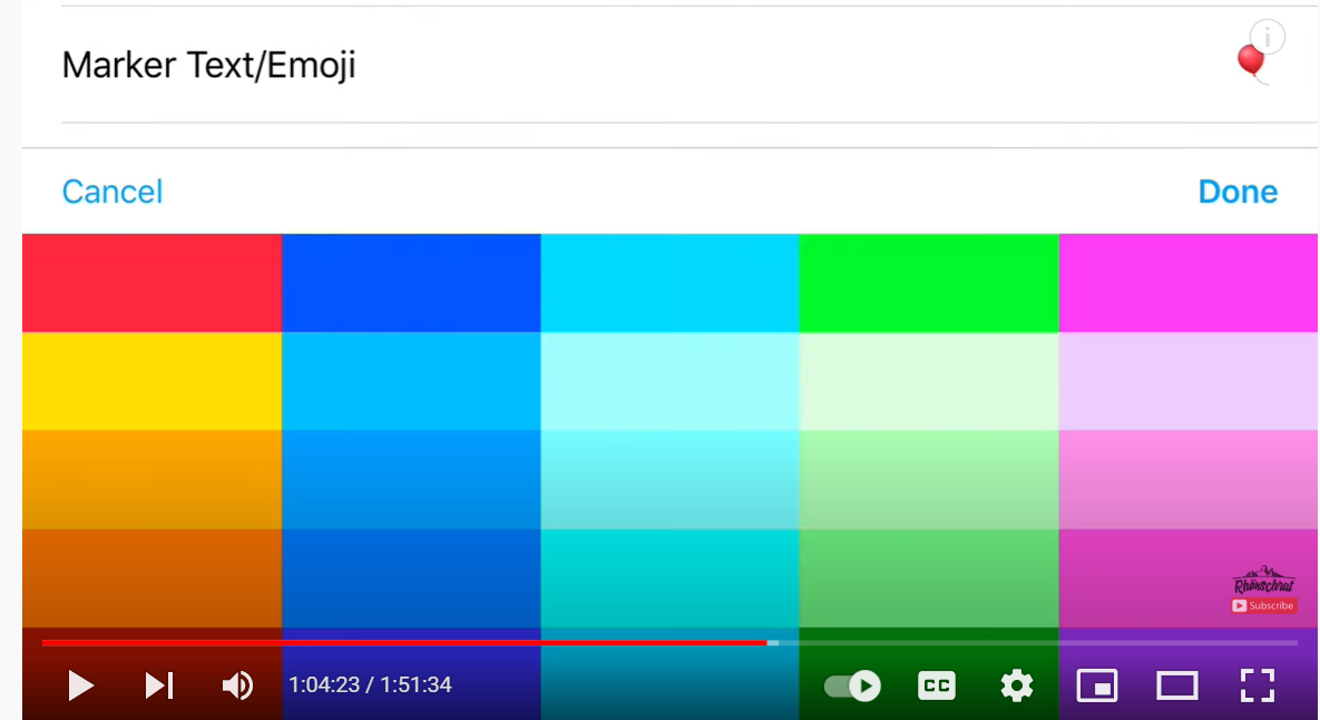
Marker configured with color and emoji...

I actually prefer how MRA does it in regards to having a separate pause symbol at the side of the waypoint (either shaping point or the hand in desired color)...
...But it might be nice to have more symbols to choose from. IDK... Maybe something like POI symbols (an expanded list of them).
-
I like being able to change the waypoint colors (for the hand and shaping point) and also like the pause symbols you can add. I see that Mobile shows the pause symbols, so it appears that this box has already been checked when it comes to this feature showing up in Next (something that's missing in MRA Navigation).
It would be nice if the color palette for the waypoints were expanded as well as choices for pause symbols. Looking at Scenic, they approach it with a decent sized color palette and use emojis for symbols...
Color Palette:
Marker configured with color and emoji...
I actually prefer how MRA does it in regards to having a separate pause symbol at the side of the waypoint (either shaping point or the hand in desired color)...
...But it might be nice to have more symbols to choose from. IDK... Maybe something like POI symbols (an expanded list of them).
HJi Tim, see the roadmap. Click!
-
I like being able to change the waypoint colors (for the hand and shaping point) and also like the pause symbols you can add. I see that Mobile shows the pause symbols, so it appears that this box has already been checked when it comes to this feature showing up in Next (something that's missing in MRA Navigation).
It would be nice if the color palette for the waypoints were expanded as well as choices for pause symbols. Looking at Scenic, they approach it with a decent sized color palette and use emojis for symbols...
Color Palette:
Marker configured with color and emoji...
I actually prefer how MRA does it in regards to having a separate pause symbol at the side of the waypoint (either shaping point or the hand in desired color)...
...But it might be nice to have more symbols to choose from. IDK... Maybe something like POI symbols (an expanded list of them).
Regarding the colour palette I think too many colours would just diminish the experience and confuse users.
In my opinion the current MRA palette gives a clear distinction of the categories that each colour represents. -
@Tim-Thompson, I see a lot of "looking at Scenic" comments from you. I Think Scenic is a great Navigation tool, and MRA can indeed learn a lot from it. But If you think Scenic is such a great app, there is nothing holding you back from using that one. I don't feel the need for MRA to resemble Scenic that much. Like these colors, it is important not to have as many indistinguishable colors, but as less as needed contrastful colors.
I am just an enthusiastic MRA user, and hope you will be one too!
Most motorcycle problems are caused by the nut that connects the handlebar to the saddle.
Check out RideSleepRepeat.eu, a biker community for sharing stays across Europe
-
@Tim-Thompson, I see a lot of "looking at Scenic" comments from you. I Think Scenic is a great Navigation tool, and MRA can indeed learn a lot from it. But If you think Scenic is such a great app, there is nothing holding you back from using that one. I don't feel the need for MRA to resemble Scenic that much. Like these colors, it is important not to have as many indistinguishable colors, but as less as needed contrastful colors.
@Con-Hennekens
MRA will never become Scenic or Kurviger or any other tool.
MRA will only get better than all the others and remain unique, check out what maps it has and the RouteXpert library. What other scheduling tool does this have? -
@Tim-Thompson, I see a lot of "looking at Scenic" comments from you. I Think Scenic is a great Navigation tool, and MRA can indeed learn a lot from it. But If you think Scenic is such a great app, there is nothing holding you back from using that one. I don't feel the need for MRA to resemble Scenic that much. Like these colors, it is important not to have as many indistinguishable colors, but as less as needed contrastful colors.
@Con-Hennekens said in Suggestion: Expand Waypoint Color Palette and Pause Symbol Options:
@Tim-Thompson, I see a lot of "looking at Scenic" comments from you. I Think Scenic is a great Navigation tool, and MRA can indeed learn a lot from it. But If you think Scenic is such a great app, there is nothing holding you back from using that one. I don't feel the need for MRA to resemble Scenic that much. Like these colors, it is important not to have as many indistinguishable colors, but as less as needed contrastful colors.
Sorry that this bothers you.
As to the comment "But If you think Scenic is such a great app, there is nothing holding you back from using that one"... Well there is actually - a huge factor... Scenic is currently iOS only. I swim in the Android ecosystem. Plus there are other factors. First, I've paid for a lifetime subscription to MRA Navigation - so you can say that I may be invested in it's outcome. There are other nits that make MRA more attractive... MRA has a web based planner, Scenic doesn't. This is not a deal killer for me personally because I'm a Furkot user/fan. However, I do use MRA Routeplanner to correct imports and to make quick simple routes when needed (particularly in the field). Also, Scenic doesn't have any live traffic capabilities (not sure if this is a big deal either). MRA Navigation speed limit information is quite good (excellent coverage). If you watch Scenic's video, Scenic's speed limit coverage might be a bit spotty. This might be a deal killer for me. To be fair, I haven't tested Scenic locally to know for sure. I have tested CoPilot locally, and it's spottiness is one of the reasons I chose MRA over it.
I probably could create a fair list of things I think MRA does better. But I've never seen a piece of software yet that couldn't use some improvement. I believe looking at the competition is a healthy thing to do - that is if you want to make the best product or at least be competitive. To do otherwise is tantamount to sticking one's head in the sand.
One might note that MRA makes the following claim (in the latest paraphernalia promoting Next no less)... "MRA Navigation is still the only navigation app that can distinguish between via (hard) and formation points (soft way points)!" Now I don't believe that's really an accurate statement. I know of at least two other navigation apps that do this (Scenic and CoPilot) and there might be others. This seems to beg the question... Do the folks at MRA actually look at the competition? It seems a shame if they don't.
Anyway... You indicate that you disagree with this suggestion about the color palette. Fine. That's fair. In fact I'm a member of the more "color challenged" community at large and I might find it hard to differentiate between a few closely related options. Nevertheless, I do find myself wishing there were a few more colors to choose from. What would it hurt? One is always free to use less. Why not give folks the option to use more if they like?
One last comment... If/when Scenic releases an Android version (they claim end of this year - early next), I will indeed probably give it a spin. I'm not necessarily wedded to any product. However, Scenic would have to make a compelling case to make me switch. It's possible, but I doubt that will happen. In the interim, here's to future improvements to MRA making it much less likely.
-
@Tim-Thompson, I am not bothered at all. It's just that it was striking me how much you want Navigation to be like Scenic. I think you can mention a lot of improvements without mentioning Scenic. There are a lot of users doing the same with Zumo, TomTom and other apps. Everyone seems to be wanting Navigation to be the same as what they are already used to. There is really no need for them to all look alike. In fact, they would loose uniqueness if they were all the same. I would like for MRA to invent their own unique features.
Scenic is currently iOS only.
Yes, but I heard they are working on an Android app as well.
I do find myself wishing there were a few more colors to choose from. What would it hurt? One is always free to use less.
Actually I disagree. Remember that MRA is invented to share routes between different navigation platforms. So most of the time people use routes made by others, and therefore use the colors others thought up in the route. Therefore the RouteExperts (I am not one of them) use a specific colorscheme to avoid confusion.
If/when Scenic releases an Android version (they claim end of this year - early next)
Oh, that makes my previous comment about that obsolete
")
Please don't take my disagreement as critique, I am not bothered, I am just giving opinion about it, just like you do. The beauty of MRA is that we have so much choice with what navigation tool we prefer.
-
At risk of inciting further discussions here, I thought it would be good to let you all know my current stance on design. That said, design choices are always at least a day out of fashion. In addition, I strongly hold the view that good design isn't necessarily a democratic process per se.
The simple assumption here is that it is better to understand the Strengths and Weaknesses of your customer base and build a solid design around this group rather than give as many options as possible. With design, more is usually less.
Understanding this doesn't mean I make those very same mistakes though. I occasionally glance back at design decisions with wariness, knowing I could've done better.
Anyway, to circle back to the original subject of the topic: I do not intend to prioritize adding more coloured waypoints to the existing set. I am critical-neutral towards adding more icons. I want to ensure that people who would normally never add a colour to a waypoint are encouraged to do so by keeping the functionality extremely simple. Giving too much choice will only result in the feature being used by a limited group of people.
I will admit that this limited group of people, the true route-planning hobbyists, are a cornerstone of our community. I know that they will not be 'frightened' by a vast colour-picking wheel and page-upon-page of icons to choose from. I'd probably be a part of that group myself.
For those people I'd love to have an 'advanced' feature that opens more colour- and icon options.
Just my two cents.
@Timo-Martosatiman-MRA said in Suggestion: Expand Waypoint Color Palette and Pause Symbol Options:
At risk of inciting further discussions here, I thought it would be good to let you all know my current stance on design. That said, design choices are always at least a day out of fashion. In addition, I strongly hold the view that good design isn't necessarily a democratic process per se.
The simple assumption here is that it is better to understand the Strengths and Weaknesses of your customer base and build a solid design around this group rather than give as many options as possible. With design, more is usually less.
Can't help but think that this might be self-limiting. Maybe a counterpoint might be that it might be more advantageous to seek to expand the customer base. In so doing it might be beneficial to try to understand what design changes might be necessary to do that, while at the same time not alienating your current customers.
Understanding this doesn't mean I make those very same mistakes though. I occasionally glance back at design decisions with wariness, knowing I could've done better.
Anyway, to circle back to the original subject of the topic: I do not intend to prioritize adding more coloured waypoints to the existing set. I am critical-neutral towards adding more icons. I want to ensure that people who would normally never add a colour to a waypoint are encouraged to do so by keeping the functionality extremely simple. Giving too much choice will only result in the feature being used by a limited group of people.
I will admit that this limited group of people, the true route-planning hobbyists, are a cornerstone of our community. I know that they will not be 'frightened' by a vast colour-picking wheel and page-upon-page of icons to choose from. I'd probably be a part of that group myself.
For those people I'd love to have an 'advanced' feature that opens more colour- and icon options.
Just my two cents.
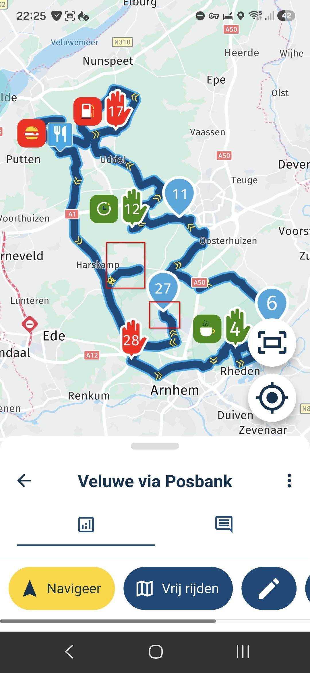
I appreciate the current implementation for it's simplicity and there's good arguments for keeping it that way. However, I still find myself wanting a little more occasionally. Take the color choices for example... I tend to use green for the route start and red for the route end. That leaves me 3 colors to choose from for all else. Blue I consider to be the default, so now I'm down to two - yellow and pink(?). It might be nice to have just a few more choices.
On the pause symbols... I can get by with the current choices fine. I generally only use Fuel, Food, and Viewpoint. I might occasionally use Drinks, although I generally don't drink much while riding. I use Viewpoint as a catchall - signifying anything that might be something you stop to see or do. It might be nice to have a few more options here. But not a big deal. I can live with what there is.
-
@Timo-Martosatiman-MRA said in Suggestion: Expand Waypoint Color Palette and Pause Symbol Options:
At risk of inciting further discussions here, I thought it would be good to let you all know my current stance on design. That said, design choices are always at least a day out of fashion. In addition, I strongly hold the view that good design isn't necessarily a democratic process per se.
The simple assumption here is that it is better to understand the Strengths and Weaknesses of your customer base and build a solid design around this group rather than give as many options as possible. With design, more is usually less.
Can't help but think that this might be self-limiting. Maybe a counterpoint might be that it might be more advantageous to seek to expand the customer base. In so doing it might be beneficial to try to understand what design changes might be necessary to do that, while at the same time not alienating your current customers.
Understanding this doesn't mean I make those very same mistakes though. I occasionally glance back at design decisions with wariness, knowing I could've done better.
Anyway, to circle back to the original subject of the topic: I do not intend to prioritize adding more coloured waypoints to the existing set. I am critical-neutral towards adding more icons. I want to ensure that people who would normally never add a colour to a waypoint are encouraged to do so by keeping the functionality extremely simple. Giving too much choice will only result in the feature being used by a limited group of people.
I will admit that this limited group of people, the true route-planning hobbyists, are a cornerstone of our community. I know that they will not be 'frightened' by a vast colour-picking wheel and page-upon-page of icons to choose from. I'd probably be a part of that group myself.
For those people I'd love to have an 'advanced' feature that opens more colour- and icon options.
Just my two cents.
I appreciate the current implementation for it's simplicity and there's good arguments for keeping it that way. However, I still find myself wanting a little more occasionally. Take the color choices for example... I tend to use green for the route start and red for the route end. That leaves me 3 colors to choose from for all else. Blue I consider to be the default, so now I'm down to two - yellow and pink(?). It might be nice to have just a few more choices.
On the pause symbols... I can get by with the current choices fine. I generally only use Fuel, Food, and Viewpoint. I might occasionally use Drinks, although I generally don't drink much while riding. I use Viewpoint as a catchall - signifying anything that might be something you stop to see or do. It might be nice to have a few more options here. But not a big deal. I can live with what there is.
@Tim-Thompson said in Suggestion: Expand Waypoint Color Palette and Pause Symbol Options:
I appreciate the current implementation for it's simplicity and there's good arguments for keeping it that way. However, I still find myself wanting a little more occasionally. Take the color choices for example... I tend to use green for the route start and red for the route end. That leaves me 3 colors to choose from for all else. Blue I consider to be the default, so now I'm down to two - yellow and pink(?). It might be nice to have just a few more choices.
On the pause symbols... I can get by with the current choices fine. I generally only use Fuel, Food, and Viewpoint. I might occasionally use Drinks, although I generally don't drink much while riding. I use Viewpoint as a catchall - signifying anything that might be something you stop to see or do. It might be nice to have a few more options here. But not a big deal. I can live with what there is.
Hi @Tim-Thompson The problem with using the green for the start and the red for the finish is; you only get to use those two colours once, so I can see why you would want a larger palette.
The RouteXpert colour key seems to work ok why not give it a go:
Blue: Just used for shaping the route.
Yellow: We use this as an indicator that from that exact spot, something can be seen. This could be a castle on a hill, a waterfall or a prominent mountain on the skyline.
Green: This is used to show great places to stop for photos (used in conjunction with a camera icon and generally a 10 minute pause break).
Red: This has several uses but it always indicates a stop. This could be a fuel stop, coffee/lunch stop or a stop to visit an attraction like a museum. Suitable icons and pause breaks are added.
Pink: This also has several uses, but they will all be for information. This could just be general information about the area, or an option to take an alternative route. We also use pink along with the warning triangle icon to warn of any hazards like unprotected mountain roads or a series of tight hairpin bends.
In addition to this we generally use via points for green and red route points..Always willing to help if I can.
Triumph Tiger 1200 XRT called Tina.
MRA Navigation Next and SilverFox BJ8 -
@Tim-Thompson said in Suggestion: Expand Waypoint Color Palette and Pause Symbol Options:
I appreciate the current implementation for it's simplicity and there's good arguments for keeping it that way. However, I still find myself wanting a little more occasionally. Take the color choices for example... I tend to use green for the route start and red for the route end. That leaves me 3 colors to choose from for all else. Blue I consider to be the default, so now I'm down to two - yellow and pink(?). It might be nice to have just a few more choices.
On the pause symbols... I can get by with the current choices fine. I generally only use Fuel, Food, and Viewpoint. I might occasionally use Drinks, although I generally don't drink much while riding. I use Viewpoint as a catchall - signifying anything that might be something you stop to see or do. It might be nice to have a few more options here. But not a big deal. I can live with what there is.
Hi @Tim-Thompson The problem with using the green for the start and the red for the finish is; you only get to use those two colours once, so I can see why you would want a larger palette.
The RouteXpert colour key seems to work ok why not give it a go:
Blue: Just used for shaping the route.
Yellow: We use this as an indicator that from that exact spot, something can be seen. This could be a castle on a hill, a waterfall or a prominent mountain on the skyline.
Green: This is used to show great places to stop for photos (used in conjunction with a camera icon and generally a 10 minute pause break).
Red: This has several uses but it always indicates a stop. This could be a fuel stop, coffee/lunch stop or a stop to visit an attraction like a museum. Suitable icons and pause breaks are added.
Pink: This also has several uses, but they will all be for information. This could just be general information about the area, or an option to take an alternative route. We also use pink along with the warning triangle icon to warn of any hazards like unprotected mountain roads or a series of tight hairpin bends.
In addition to this we generally use via points for green and red route points..@Nick-Carthew said in Suggestion: Expand Waypoint Color Palette and Pause Symbol Options:
@Tim-Thompson said in Suggestion: Expand Waypoint Color Palette and Pause Symbol Options:
I appreciate the current implementation for it's simplicity and there's good arguments for keeping it that way. However, I still find myself wanting a little more occasionally. Take the color choices for example... I tend to use green for the route start and red for the route end. That leaves me 3 colors to choose from for all else. Blue I consider to be the default, so now I'm down to two - yellow and pink(?). It might be nice to have just a few more choices.
On the pause symbols... I can get by with the current choices fine. I generally only use Fuel, Food, and Viewpoint. I might occasionally use Drinks, although I generally don't drink much while riding. I use Viewpoint as a catchall - signifying anything that might be something you stop to see or do. It might be nice to have a few more options here. But not a big deal. I can live with what there is.
Hi @Tim-Thompson The problem with using the green for the start and the red for the finish is; you only get to use those two colours once, so I can see why you would want a larger palette.
The RouteXpert colour key seems to work ok why not give it a go:
Blue: Just used for shaping the route.
Yellow: We use this as an indicator that from that exact spot, something can be seen. This could be a castle on a hill, a waterfall or a prominent mountain on the skyline.
Green: This is used to show great places to stop for photos (used in conjunction with a camera icon and generally a 10 minute pause break).
Red: This has several uses but it always indicates a stop. This could be a fuel stop, coffee/lunch stop or a stop to visit an attraction like a museum. Suitable icons and pause breaks are added.
Pink: This also has several uses, but they will all be for information. This could just be general information about the area, or an option to take an alternative route. We also use pink along with the warning triangle icon to warn of any hazards like unprotected mountain roads or a series of tight hairpin bends.
In addition to this we generally use via points for green and red route points..That's certainly one way of doing it. But it shouldn't be the only.
I think this is dependent on how things work best and seem most logical for the individual user. Again, you don't want to force/constrain the user into a use case that isn't logical or intuitive to them because of the limitation of the tool.
Personally... I use Yellow for fuel stops. Yellow stands out and it's something that I don't want to miss. I like Green and Red for the beginning and end because they catch my eye and I can quickly recognize them for what they are immediately upon opening/viewing the route on a map. I use pink for stops - whatever kind of stops they may be - because it's sort of reddish (reddish for intermediate vias/stops) and because it's the only option left.
Is my way of thinking about color use right? For me maybe, but maybe not for others. Flexibility and (enough) options seems good here.
-
 undefined MyRoute-app community moved this topic from [Beta] The MyRoute-app on
Hello! It looks like you're interested in this conversation, but you don't have an account yet.
Getting fed up of having to scroll through the same posts each visit? When you register for an account, you'll always come back to exactly where you were before, and choose to be notified of new replies (either via email, or push notification). You'll also be able to save bookmarks and upvote posts to show your appreciation to other community members.
With your input, this post could be even better 💗
Register Login-
1663.0k
-
011106
-
21281
-
111291
-
06128
-
028715
-
0230
-
09562