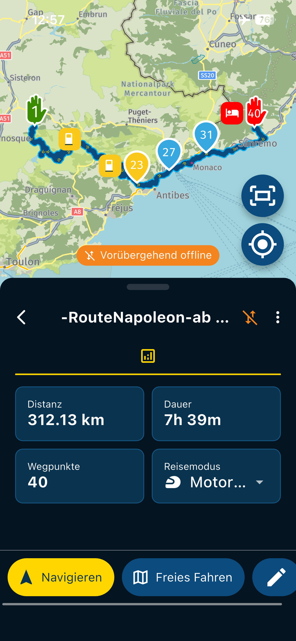
Overview of extended testing (goods and bads) done in United Kingdom
-
@Afterforever666 Thanks for the very elaborate feedback!

We do really tend to listen to our users.The visualisation of the route on the display is by far the best on the myrouteapp. The zooming, and tilting using the default values is spot on. All other navigation apps are doing a worse job in my opinion (I know this is subjective, but wanted to share my opinion).
Happy to read that! I totally agree because I configured it

It is indeed very subjective.- Speed restrictions will be improved for motorhomes in the next update!
- Units can now be set in the app directly (for the app). Website is indeed a separate configuration (by design). You might want to plan in units you are familiar with but drive using the local units as these match the signs.
- Traffic information is something we want to improve! It's there, but not fully optimised. Root cause is that mainly our users drive their routes exactly as planned regardless of any delays.
- Roadworks, same as above.
- I'll change this

Cheers!
I performalso extended testing and report last time increasing problems with the announcement of shaping and waypoints.
May my test is hard on a 9 km trip but I found similar problems sometimes few weeks ago on my holidays in France.
The anouncements get in conflict when they are close to navigation instructions or close together
.
Youtuber everyday Roadster tested several Apps which works with Carplay (not MRA up to now, but I request him to do so) He was satisfied with scenic and so I bought a years description offer to compare it with MRA.
Big big advantages on the same route. A counter presenst all WPs
For shaping points no information either sound nor text but you see on the map the number 2 in a circle for the first one because Start is WP 1
A Viapoint will be announced with his text you create has his own number 1over3 in a droparrow on the map and is shown on the left upper main textbox on carplay with the remaining distance interuppted by routing instructions when necessary. You got repeating annoncement like Garmin do.
A quite clear and easy desing on CP.
Why is this not possible for MRA.
By the way there is an announcement for scenix 4 starts on 1. October.
Scenic leave HERE, because of the concerns regard colors ( like on MRA) and promise new options, like streetview integration
Let see what is better.
Up to now the planer on the Web is better with the several map overlays. MRA next is for me actually not reliable at several situations. -
I performalso extended testing and report last time increasing problems with the announcement of shaping and waypoints.
May my test is hard on a 9 km trip but I found similar problems sometimes few weeks ago on my holidays in France.
The anouncements get in conflict when they are close to navigation instructions or close together
.
Youtuber everyday Roadster tested several Apps which works with Carplay (not MRA up to now, but I request him to do so) He was satisfied with scenic and so I bought a years description offer to compare it with MRA.
Big big advantages on the same route. A counter presenst all WPs
For shaping points no information either sound nor text but you see on the map the number 2 in a circle for the first one because Start is WP 1
A Viapoint will be announced with his text you create has his own number 1over3 in a droparrow on the map and is shown on the left upper main textbox on carplay with the remaining distance interuppted by routing instructions when necessary. You got repeating annoncement like Garmin do.
A quite clear and easy desing on CP.
Why is this not possible for MRA.
By the way there is an announcement for scenix 4 starts on 1. October.
Scenic leave HERE, because of the concerns regard colors ( like on MRA) and promise new options, like streetview integration
Let see what is better.
Up to now the planer on the Web is better with the several map overlays. MRA next is for me actually not reliable at several situations.Your statement about Scenic leaving HERE because of colours is incorrect. Scenic has had the ability to completely customise all colours with HERE maps for over a year.
They’ve moved to OSM due to HERE having performance issues, many routing issues and the fact that HERE don’t seem to care or be responsive to smaller developers.
I’m on the beta for Scenic 4 and have constant contact with the developer.
This is their explanation from their blog:-
We want the best for our users and that means empowering them with accurate, detailed maps, reliable routing options, and avoiding unwanted surprises. Around three years ago, Scenic switched to HERE maps, which served our adventurous community well. However, after two years of excellent service, HERE released a new mapping framework with changes to map styles and other elements that negatively impacted the community.
Since the switch, you’ve consistently reported a lack of map detail, counterintuitive route suggestions, and unexpected route alterations.
We’ve heard your concerns and appealed to HERE for feature request changes to address these challenges, specifically for motorcyclists and our other adventurers. But HERE’s focus has shifted to logistics and big automotive clients, and the needs of our close community were either not prioritized or were denied altogether.
We have now found a map partner that can answer each of these concerns as well as offer new features that will uniquely improve your Scenic experience, giving you more freedom to adventure your way. -
Your statement about Scenic leaving HERE because of colours is incorrect. Scenic has had the ability to completely customise all colours with HERE maps for over a year.
They’ve moved to OSM due to HERE having performance issues, many routing issues and the fact that HERE don’t seem to care or be responsive to smaller developers.
I’m on the beta for Scenic 4 and have constant contact with the developer.
This is their explanation from their blog:-
We want the best for our users and that means empowering them with accurate, detailed maps, reliable routing options, and avoiding unwanted surprises. Around three years ago, Scenic switched to HERE maps, which served our adventurous community well. However, after two years of excellent service, HERE released a new mapping framework with changes to map styles and other elements that negatively impacted the community.
Since the switch, you’ve consistently reported a lack of map detail, counterintuitive route suggestions, and unexpected route alterations.
We’ve heard your concerns and appealed to HERE for feature request changes to address these challenges, specifically for motorcyclists and our other adventurers. But HERE’s focus has shifted to logistics and big automotive clients, and the needs of our close community were either not prioritized or were denied altogether.
We have now found a map partner that can answer each of these concerns as well as offer new features that will uniquely improve your Scenic experience, giving you more freedom to adventure your way.I am just new in Scenic and I find the color adjustments and do some test with planning.
The handling with Waypoints ist just quite clearer.
Shapingpoints at Scenic these are Via points, which is in my point of view correct, are only bullets on the route with a number (assumed internally use only the Geocoordinates for route calculation in conjunction with the numbers in sequence) Viapoints in scenic called Stop poibt could named as you like and are announced as interim target (Milestone) 3 Times with remaining distance like Garmin do this. Text is on the screen. What MRA is doing with SPs and VPs is an overkill, which when they close together or near route advices which happen in cities also very quick get in trouble.
There are a lot of advantages with MRA especially currently with the Webplaner and I like it, but on MRA next the different handling of SPs and VPs in announcements by distances 700 m for SPs, which van be disabled and 2 Kilometers only one time for an interim Target Viapoint is for me in a car or with the limited View of infos on CarPlay not satisfying.
By the way, Scenic presents the text of Viapoints, called there Stop points in the main Text box of Carplay too.Let see what Scenic additionally may do better next week with version 4.
May for my requests it should be better tool in the routing mode.You know:The better ones is the enemy of the good ones.
-
Your statement about Scenic leaving HERE because of colours is incorrect. Scenic has had the ability to completely customise all colours with HERE maps for over a year.
They’ve moved to OSM due to HERE having performance issues, many routing issues and the fact that HERE don’t seem to care or be responsive to smaller developers.
I’m on the beta for Scenic 4 and have constant contact with the developer.
This is their explanation from their blog:-
We want the best for our users and that means empowering them with accurate, detailed maps, reliable routing options, and avoiding unwanted surprises. Around three years ago, Scenic switched to HERE maps, which served our adventurous community well. However, after two years of excellent service, HERE released a new mapping framework with changes to map styles and other elements that negatively impacted the community.
Since the switch, you’ve consistently reported a lack of map detail, counterintuitive route suggestions, and unexpected route alterations.
We’ve heard your concerns and appealed to HERE for feature request changes to address these challenges, specifically for motorcyclists and our other adventurers. But HERE’s focus has shifted to logistics and big automotive clients, and the needs of our close community were either not prioritized or were denied altogether.
We have now found a map partner that can answer each of these concerns as well as offer new features that will uniquely improve your Scenic experience, giving you more freedom to adventure your way.@Dae-0 said in Overview of extended testing (goods and bads) done in United Kingdom:
They’ve moved to OSM due to HERE having performance issues, many routing issues and the fact that HERE don’t seem to care or be responsive to smaller developers.
Performance issues, yes sometimes. Battery usage is a big issue but they are now actively working on improvements and I've seen some promising results!
Routing issues? Never to be honest. We as MRA haven't always implemented stuff in the best way possible. Lack of correct information? Definitely sometimes but that would be worse with OSM.
Caring about smaller developers? Not always as much as I would like but cannot really blame them for that. Switching to open sourced alternative means nobody cares as you need to care for yourself / hope some random community members do that.
Generally I am a massive fan of OSM and Graphhopper routing. They do not however provide any development platform for both iOS / Android and definitely not a singular cross-platform enabler.
So there is a lot of nuance to their post that can be added. -
@Dae-0 said in Overview of extended testing (goods and bads) done in United Kingdom:
They’ve moved to OSM due to HERE having performance issues, many routing issues and the fact that HERE don’t seem to care or be responsive to smaller developers.
Performance issues, yes sometimes. Battery usage is a big issue but they are now actively working on improvements and I've seen some promising results!
Routing issues? Never to be honest. We as MRA haven't always implemented stuff in the best way possible. Lack of correct information? Definitely sometimes but that would be worse with OSM.
Caring about smaller developers? Not always as much as I would like but cannot really blame them for that. Switching to open sourced alternative means nobody cares as you need to care for yourself / hope some random community members do that.
Generally I am a massive fan of OSM and Graphhopper routing. They do not however provide any development platform for both iOS / Android and definitely not a singular cross-platform enabler.
So there is a lot of nuance to their post that can be added.Absolutely. I was just pointing out the real reason that they’ve left HERE and correcting Peter’s assertion that it’s due to colours.
I’m not loyal to a particular product or developer - I simply use the one that’s best for my needs and will honestly tell people if asked.
I frequently mention Scenic on here as I prefer it over MRA for navigation. It meets my needs more than MRA. However, I often mention MRA on the Scenic forum, often with the claim that it’s light years ahead of Scenic for planning. It’s about balance and suitability. I see the MRA/Scenic combo as like having 2 dedicated tools in my toolbox, rather than a Swiss Army knife.
-
Absolutely. I was just pointing out the real reason that they’ve left HERE and correcting Peter’s assertion that it’s due to colours.
I’m not loyal to a particular product or developer - I simply use the one that’s best for my needs and will honestly tell people if asked.
I frequently mention Scenic on here as I prefer it over MRA for navigation. It meets my needs more than MRA. However, I often mention MRA on the Scenic forum, often with the claim that it’s light years ahead of Scenic for planning. It’s about balance and suitability. I see the MRA/Scenic combo as like having 2 dedicated tools in my toolbox, rather than a Swiss Army knife.
@Dae-0 Appreciated!

-
Absolutely. I was just pointing out the real reason that they’ve left HERE and correcting Peter’s assertion that it’s due to colours.
I’m not loyal to a particular product or developer - I simply use the one that’s best for my needs and will honestly tell people if asked.
I frequently mention Scenic on here as I prefer it over MRA for navigation. It meets my needs more than MRA. However, I often mention MRA on the Scenic forum, often with the claim that it’s light years ahead of Scenic for planning. It’s about balance and suitability. I see the MRA/Scenic combo as like having 2 dedicated tools in my toolbox, rather than a Swiss Army knife.
@Dae-0
As you could read, I correct myself regard color scheme, it was first a miss translation by me regard user concerns at scenic with Here maps.
And to Corjan, creating own road colors as known from paper maps like Shell or Michelin is a great option.
And as Dea confirmed too, the routing works better. You can select number of announcement for stop points, viapoints and routing instructions, not only for the routing.
MRA has this option only for routing.
Shaping points will not be announced, because normally there is no need. MRA says you can, when you rename the position with no digits or add info.
Reduce this function to POI, stop points only, simliar to Scenic or Garmin.
Currently I test scenic routing engine a bit more, but it seems this is with CarPlay, the own colors and better announcement stability reduced to POIs the reference and perhaps I will use both.Regard Here or OSM I believe HERE who is working for automotive since decades has and works with more profession. OSM is perhaps too much splitted in interest groups.
-
Absolutely. I was just pointing out the real reason that they’ve left HERE and correcting Peter’s assertion that it’s due to colours.
I’m not loyal to a particular product or developer - I simply use the one that’s best for my needs and will honestly tell people if asked.
I frequently mention Scenic on here as I prefer it over MRA for navigation. It meets my needs more than MRA. However, I often mention MRA on the Scenic forum, often with the claim that it’s light years ahead of Scenic for planning. It’s about balance and suitability. I see the MRA/Scenic combo as like having 2 dedicated tools in my toolbox, rather than a Swiss Army knife.
@Dae-0, Am I guessing correctly that long-announced Android project is thrown off by this change of map-provider decision?
-
@Dae-0, Am I guessing correctly that long-announced Android project is thrown off by this change of map-provider decision?
I believe the developer actually said the change helps. I’m not on top of the Android stuff as I stopped using it 4 years ago.
-
@Dae-0 said in Overview of extended testing (goods and bads) done in United Kingdom:
They’ve moved to OSM due to HERE having performance issues, many routing issues and the fact that HERE don’t seem to care or be responsive to smaller developers.
Performance issues, yes sometimes. Battery usage is a big issue but they are now actively working on improvements and I've seen some promising results!
Routing issues? Never to be honest. We as MRA haven't always implemented stuff in the best way possible. Lack of correct information? Definitely sometimes but that would be worse with OSM.
Caring about smaller developers? Not always as much as I would like but cannot really blame them for that. Switching to open sourced alternative means nobody cares as you need to care for yourself / hope some random community members do that.
Generally I am a massive fan of OSM and Graphhopper routing. They do not however provide any development platform for both iOS / Android and definitely not a singular cross-platform enabler.
So there is a lot of nuance to their post that can be added.@Corjan-Meijerink said in Overview of extended testing (goods and bads) done in United Kingdom:
Performance issues, yes sometimes. Battery usage is a big issue but they are now actively working on improvements and I've seen some promising results!
@Corjan-Meijerink, I am very happy to hear about the promising results! My Pixel 6 gets pretty hot even if I just have MRA open on my computer desk. If I run MRA on the motorcycle while it is plugged into a charging port, it gets really, really hot and sometimes shuts down, even in moderate temperatures. This is the single most important obstacle to me having complete confidence in the program. Thanks for all of your work in prodding HERE to address the issue!
Vinnie
-
@Corjan-Meijerink said in Overview of extended testing (goods and bads) done in United Kingdom:
Performance issues, yes sometimes. Battery usage is a big issue but they are now actively working on improvements and I've seen some promising results!
@Corjan-Meijerink, I am very happy to hear about the promising results! My Pixel 6 gets pretty hot even if I just have MRA open on my computer desk. If I run MRA on the motorcycle while it is plugged into a charging port, it gets really, really hot and sometimes shuts down, even in moderate temperatures. This is the single most important obstacle to me having complete confidence in the program. Thanks for all of your work in prodding HERE to address the issue!
Vinnie
@Vincent-Curren see my reply here: https://forum.myrouteapp.com/post/55080

-
@Vincent-Curren see my reply here: https://forum.myrouteapp.com/post/55080

@Corjan-Meijerink
Regard usability on CarPlay the winner is ScenicSorry Corjan, I perform now some test with the until unknown Scenic App.
May you know I like MRA with the palnning on the Web but i struggle with next and the differences in announcments of SP und VP. May you consider this
I copied now my two test route to Scenic in the GPX 1.2 format but renamed the Viapoints at Scenic Stoppoints to a clear readable Text.
Scenic open this file with no difference.
Wall waypoint get numbers in Sequence, a Stoppoint a own number over the total numbers.
even when a SP is close to a VP there is no conflict in announcement of the distance up to 3 times of an upcomming „Zwischenziel“.
The text of this stop point will not be announced, but is readable as selected by you in the upper main screen of CarPlay as thenext point interchanged by routing instructions.
In the lower left CarPlay screen you see the time and distance to the next Stoppoint but you can select in the settings that you see there in in about every 10 second change also the time and distance to the final target.
Here some pictures.
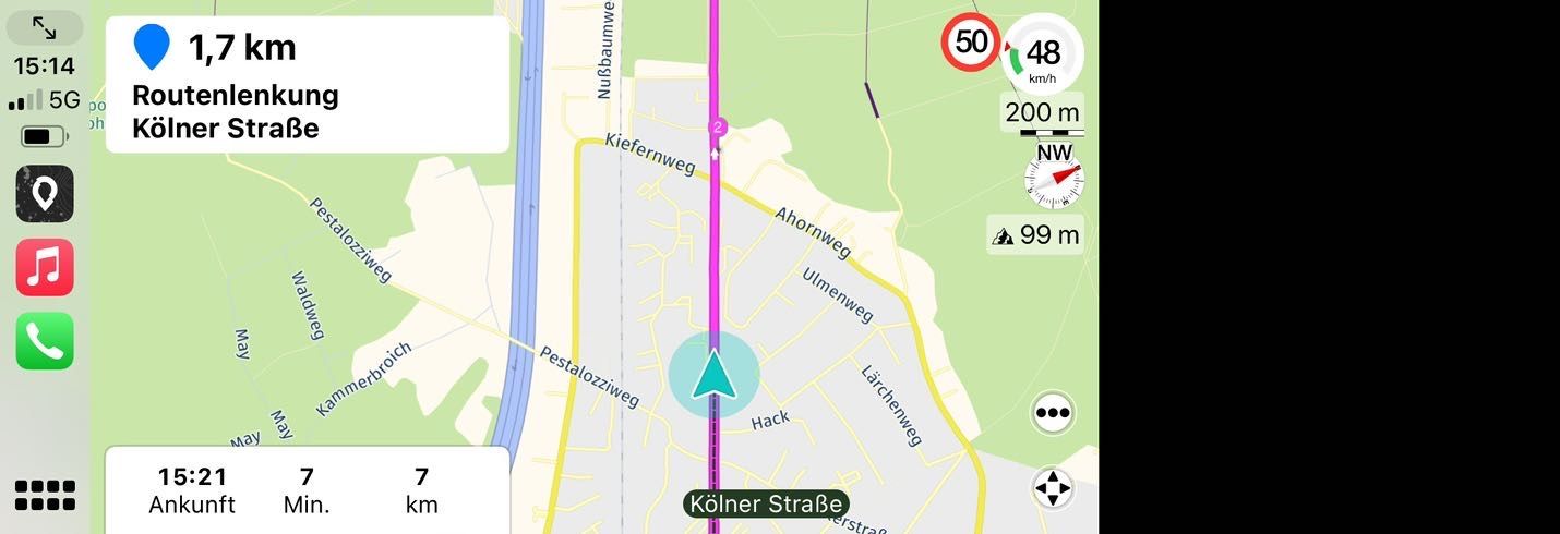
CarPlay screen (with own selected Colors in the setting of Scenic)
Next Stoppoint (Via at MRA) in the upper left textbox
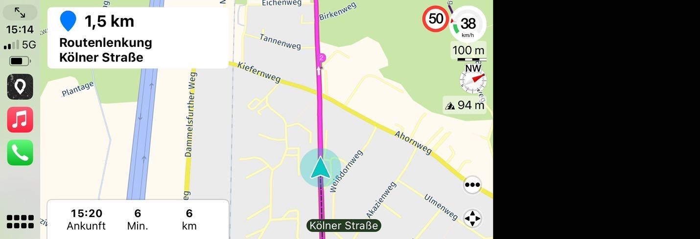
Nr. 2 is a visible shapingpoint, no verbal info.
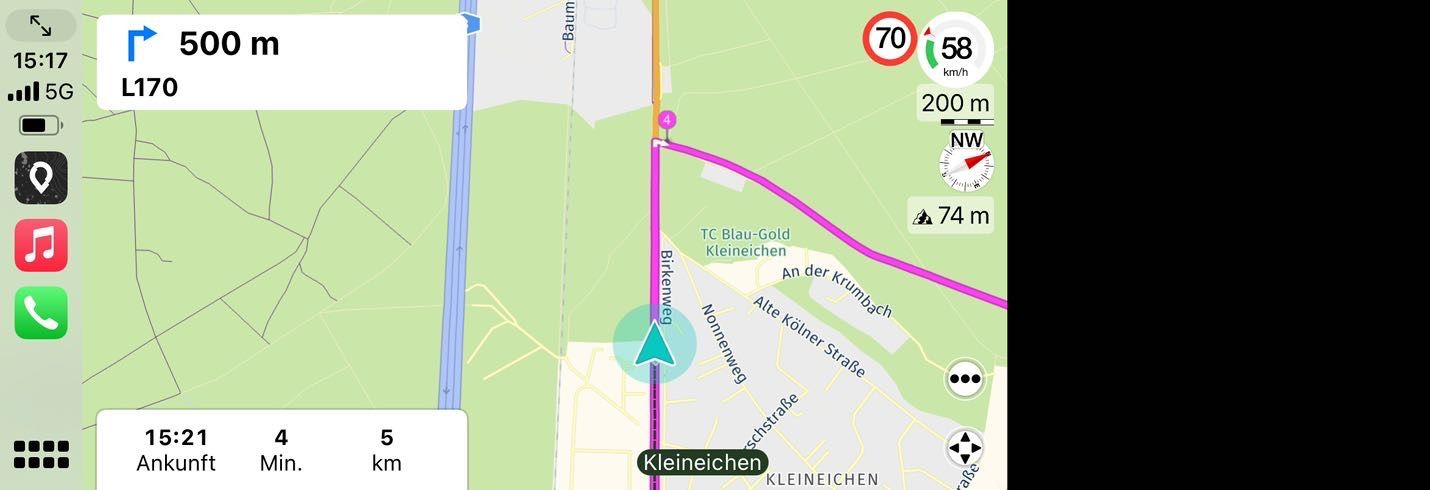
routing instruction just comming (in 300 m rechts abbiegen) with no problems and a shaping point nr.4 just behind the corner.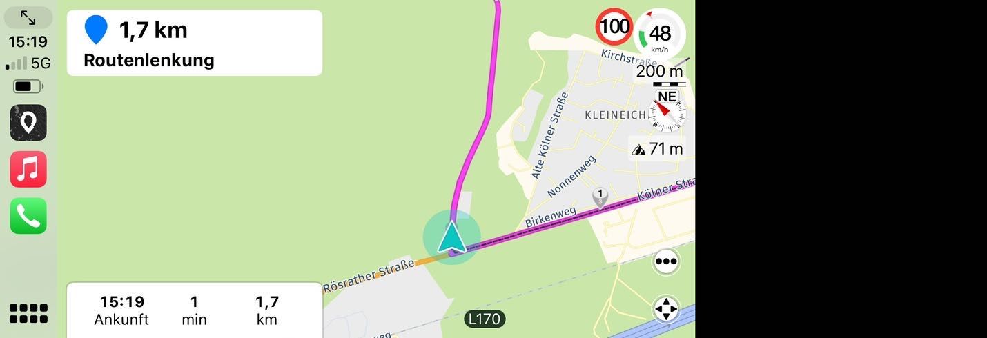
just after turning right and passing Sp 4 you get on the textbox the info for the next stoppoint.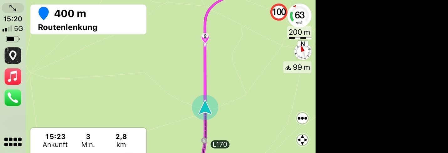
Here I am close to this stopppoint from the pictuer before just after passing a sp nr 5 (grey now) and the stoppoint number over the total numer of Waypoint on the road.
in the lower box ist just the tiem and distance to the final destination visible.Advantage her in the textbox for a stoppoint you can write what you need, Restaurant name, filling station, a forced shapingpoint between the other shapingpoints. Whatever it is always visible as the next important instruction about two kilometers before with the remaining distance, perhaps interuppted by a routing direction, but with no conflicts when they are close together down to 50 meters.
The hand and Bullet is nice in MRA but with no big clear readable Infotext or not seen on CarPlay and AA not useful.
Also the possibilty the have an interchangable via of the ETA of the ViaPoint and Final Dest is not bad.
The compicated use of SPs with announcements or not, additional text is too much. limit this to VPs and reduce the conflict with the distances to other instructions which are increase since 4.3 -
@Corjan-Meijerink
Regard usability on CarPlay the winner is ScenicSorry Corjan, I perform now some test with the until unknown Scenic App.
May you know I like MRA with the palnning on the Web but i struggle with next and the differences in announcments of SP und VP. May you consider this
I copied now my two test route to Scenic in the GPX 1.2 format but renamed the Viapoints at Scenic Stoppoints to a clear readable Text.
Scenic open this file with no difference.
Wall waypoint get numbers in Sequence, a Stoppoint a own number over the total numbers.
even when a SP is close to a VP there is no conflict in announcement of the distance up to 3 times of an upcomming „Zwischenziel“.
The text of this stop point will not be announced, but is readable as selected by you in the upper main screen of CarPlay as thenext point interchanged by routing instructions.
In the lower left CarPlay screen you see the time and distance to the next Stoppoint but you can select in the settings that you see there in in about every 10 second change also the time and distance to the final target.
Here some pictures.

CarPlay screen (with own selected Colors in the setting of Scenic)
Next Stoppoint (Via at MRA) in the upper left textbox

Nr. 2 is a visible shapingpoint, no verbal info.

routing instruction just comming (in 300 m rechts abbiegen) with no problems and a shaping point nr.4 just behind the corner.
just after turning right and passing Sp 4 you get on the textbox the info for the next stoppoint.
Here I am close to this stopppoint from the pictuer before just after passing a sp nr 5 (grey now) and the stoppoint number over the total numer of Waypoint on the road.
in the lower box ist just the tiem and distance to the final destination visible.Advantage her in the textbox for a stoppoint you can write what you need, Restaurant name, filling station, a forced shapingpoint between the other shapingpoints. Whatever it is always visible as the next important instruction about two kilometers before with the remaining distance, perhaps interuppted by a routing direction, but with no conflicts when they are close together down to 50 meters.
The hand and Bullet is nice in MRA but with no big clear readable Infotext or not seen on CarPlay and AA not useful.
Also the possibilty the have an interchangable via of the ETA of the ViaPoint and Final Dest is not bad.
The compicated use of SPs with announcements or not, additional text is too much. limit this to VPs and reduce the conflict with the distances to other instructions which are increase since 4.3@Peter-Schiefer Unfortunately, as far as I have been able to see, Scenic is not yet available for Android. Only for Apple yet - I have an Android phone, unfortunately!
-
@Corjan-Meijerink
Regard usability on CarPlay the winner is ScenicSorry Corjan, I perform now some test with the until unknown Scenic App.
May you know I like MRA with the palnning on the Web but i struggle with next and the differences in announcments of SP und VP. May you consider this
I copied now my two test route to Scenic in the GPX 1.2 format but renamed the Viapoints at Scenic Stoppoints to a clear readable Text.
Scenic open this file with no difference.
Wall waypoint get numbers in Sequence, a Stoppoint a own number over the total numbers.
even when a SP is close to a VP there is no conflict in announcement of the distance up to 3 times of an upcomming „Zwischenziel“.
The text of this stop point will not be announced, but is readable as selected by you in the upper main screen of CarPlay as thenext point interchanged by routing instructions.
In the lower left CarPlay screen you see the time and distance to the next Stoppoint but you can select in the settings that you see there in in about every 10 second change also the time and distance to the final target.
Here some pictures.

CarPlay screen (with own selected Colors in the setting of Scenic)
Next Stoppoint (Via at MRA) in the upper left textbox

Nr. 2 is a visible shapingpoint, no verbal info.

routing instruction just comming (in 300 m rechts abbiegen) with no problems and a shaping point nr.4 just behind the corner.
just after turning right and passing Sp 4 you get on the textbox the info for the next stoppoint.
Here I am close to this stopppoint from the pictuer before just after passing a sp nr 5 (grey now) and the stoppoint number over the total numer of Waypoint on the road.
in the lower box ist just the tiem and distance to the final destination visible.Advantage her in the textbox for a stoppoint you can write what you need, Restaurant name, filling station, a forced shapingpoint between the other shapingpoints. Whatever it is always visible as the next important instruction about two kilometers before with the remaining distance, perhaps interuppted by a routing direction, but with no conflicts when they are close together down to 50 meters.
The hand and Bullet is nice in MRA but with no big clear readable Infotext or not seen on CarPlay and AA not useful.
Also the possibilty the have an interchangable via of the ETA of the ViaPoint and Final Dest is not bad.
The compicated use of SPs with announcements or not, additional text is too much. limit this to VPs and reduce the conflict with the distances to other instructions which are increase since 4.3@Peter-Schiefer, I think making advertisement of a competing product is not very appropriate. If you like scenic that much, place subscribe to it, and be happy with it and let MRA move in it's own direction.
-
@Peter-Schiefer, I think making advertisement of a competing product is not very appropriate. If you like scenic that much, place subscribe to it, and be happy with it and let MRA move in it's own direction.
MRA claimed herself in his advertisment „to be the best Navigation System“. In consequence the must look at the competitors and see what works better and is perhaps a room for improvement.
Currently the web planer is in opinion in his concept the best what I have tested.
But the concept of handling shaping points and via points on the routing App and the announcement rules is an overkill.
Actually to much conflicts when points are close together or close to upcomming routing instructions or behind.Just today a second test with scenic. Even a Viapoint 30 meter before a turn left command works together with the command, bit late for the turn command but both points were so close together. At MRA you have problems within few hundred meters to get commands or hints as expected.
Next POI fix Waypoint is as shown in Scenic on CarPlay in the main text book visible with your own words, not only the hand and the distance.An to say, here is a gap at MRA as volunteer is more than authorised.
Scenic announce a new version for Apple and now also Android for October with several improvements. Additional map layouts for the planner tool, CarPlay included by end of the month for navigation and other things
As you say I am not married with MRA,
But as I mentioned before the better one is the enemy of the good one.
And also other MRA user be satisfied now may see on a test,
Oh’ other mothers daughers could be even nice. -
MRA claimed herself in his advertisment „to be the best Navigation System“. In consequence the must look at the competitors and see what works better and is perhaps a room for improvement.
Currently the web planer is in opinion in his concept the best what I have tested.
But the concept of handling shaping points and via points on the routing App and the announcement rules is an overkill.
Actually to much conflicts when points are close together or close to upcomming routing instructions or behind.Just today a second test with scenic. Even a Viapoint 30 meter before a turn left command works together with the command, bit late for the turn command but both points were so close together. At MRA you have problems within few hundred meters to get commands or hints as expected.
Next POI fix Waypoint is as shown in Scenic on CarPlay in the main text book visible with your own words, not only the hand and the distance.An to say, here is a gap at MRA as volunteer is more than authorised.
Scenic announce a new version for Apple and now also Android for October with several improvements. Additional map layouts for the planner tool, CarPlay included by end of the month for navigation and other things
As you say I am not married with MRA,
But as I mentioned before the better one is the enemy of the good one.
And also other MRA user be satisfied now may see on a test,
Oh’ other mothers daughers could be even nice.@Peter-Schiefer, they ARE looking into competitors, but that does not mean they will be making a clone of them. I will not go any further in this senseless discussion with you. I suggest you move on to Scenic.
Hello! It looks like you're interested in this conversation, but you don't have an account yet.
Getting fed up of having to scroll through the same posts each visit? When you register for an account, you'll always come back to exactly where you were before, and choose to be notified of new replies (either via email, or push notification). You'll also be able to save bookmarks and upvote posts to show your appreciation to other community members.
With your input, this post could be even better 💗
Register Login
