Designing the MyRoute-app logo
-
Making a design, in our case both functional and graphical design, isn’t an objective job. In this blog we’ll be looking at the design of the MyRoute-app logo, the stages it went through and where it’s headed in the future.
For example, the MyRoute-app logo went through several iterations before being finalized. The logo I now instantly recognize as being objectively the best possible logo for MyRoute-app, is merely the product of my collective memories associating this logo with this company for the past 7 years or so. Perhaps you think the logo is especially bad, maybe you would’ve liked a different logo better. Maybe putting more focus towards the “moments” feature in MyRoute-app, maybe creating a more realistic pin, maybe even going the abstract route and trying to emphasize “connectiveness”. All in all, even something as “simple” as deciding on a logo is very subjective.
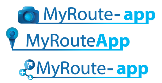
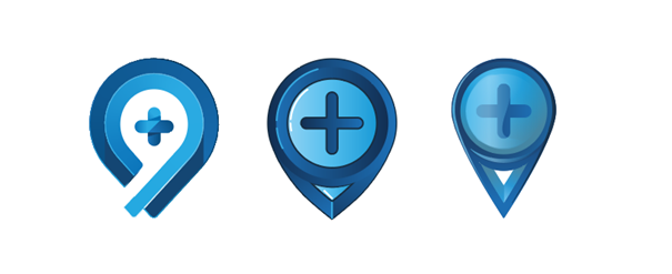
Of all the above logos the middle one was picked as being the most “recognizable”. That said, that’s mostly because all map-based software at that time used pin-like icons to display waypoints. While there’s plenty of arguments that could be made for how that’s a great choice of logo, there’s also good arguments against. After all, it could also be considered a bit lame. Like an online storage service using the iconic floppy-disc icon as a logo. The most important argument against this logo came from Michel however. He liked the logo very much, however, it looked too much like ice-cream.

Using this feedback as input for a new iteration, we designed a new logo that’s both instantly recognizable as a pin whilst not being very “ice-creamy”. This became the current MyRoute-app logo. For good measure we added a plus in the pin, symbolizing how MyRoute-app was an improvement over other legacy-gen route editors.
This logo has been the design for MyRoute-app logo since the inception in 2013, combining the characterstic waypoint logo with stylized “MyRoute-app” lettering through a route line. This peculiar little logo, distinctive from more corporate and abstract logos whilst at the same time exuding a sense of modernity and progress became the brand symbol for MyRoute-app.

Happiness lasted only for a little while though, as during the application of the logo the realisation set in that this logo went with very few colors other than white. In fact, the logo pretty much only worked with white. In general, this wasn’t a problem as there are many ways in which graphical elements can be combined in such a fashion that they create a white background for the logo. Regardless, it made the design progress more time consuming as every design decision could inevitably lead to the question “but how do we make the logo more visible on this design?”. This is why much of the early marketing materials, UI elements and brand visuals contained images of pearly white clouds and snowy mountaintops: ideal backgrounds for the logo.
This problem was quickly resolved by adopting to a then-popular new design trend: flat design. With the first iteration of what artists called flat design, almost all color was removed from logo’s. Returning to an essence of directly recognizable visuals in vibrant colors. What this design trend lacked in visual complexity, it made up for in praciticality. Suddenly, companies all over the world adopted variants of their logo’s containing vibrant photography matched with simple two-tone logo’s. At MyRoute-app, we stylized the visually complex standard logo into a variant that could be used on non-white backgrounds.
Today we’re looking forward to re-inventing our brand, as soon we’re expecting to rebrand some of MyRoute-app’s services for the purposes of clarity. At the same time, we want to bring the design of all logos back to a clearly recognizable identity. Whatever design trend will happen, whether it’ll be about sharp edges or smooth corners, whether it’ll have vibrant hues or a single-color, MyRoute-app will always be instantly recognizable.
-
And I just thought that it all happened by magic
 By the way, I like the ice-cream logo
-
Making a design, in our case both functional and graphical design, isn’t an objective job. In this blog we’ll be looking at the design of the MyRoute-app logo, the stages it went through and where it’s headed in the future.
For example, the MyRoute-app logo went through several iterations before being finalized. The logo I now instantly recognize as being objectively the best possible logo for MyRoute-app, is merely the product of my collective memories associating this logo with this company for the past 7 years or so. Perhaps you think the logo is especially bad, maybe you would’ve liked a different logo better. Maybe putting more focus towards the “moments” feature in MyRoute-app, maybe creating a more realistic pin, maybe even going the abstract route and trying to emphasize “connectiveness”. All in all, even something as “simple” as deciding on a logo is very subjective.
Of all the above logos the middle one was picked as being the most “recognizable”. That said, that’s mostly because all map-based software at that time used pin-like icons to display waypoints. While there’s plenty of arguments that could be made for how that’s a great choice of logo, there’s also good arguments against. After all, it could also be considered a bit lame. Like an online storage service using the iconic floppy-disc icon as a logo. The most important argument against this logo came from Michel however. He liked the logo very much, however, it looked too much like ice-cream.
Using this feedback as input for a new iteration, we designed a new logo that’s both instantly recognizable as a pin whilst not being very “ice-creamy”. This became the current MyRoute-app logo. For good measure we added a plus in the pin, symbolizing how MyRoute-app was an improvement over other legacy-gen route editors.
This logo has been the design for MyRoute-app logo since the inception in 2013, combining the characterstic waypoint logo with stylized “MyRoute-app” lettering through a route line. This peculiar little logo, distinctive from more corporate and abstract logos whilst at the same time exuding a sense of modernity and progress became the brand symbol for MyRoute-app.
Happiness lasted only for a little while though, as during the application of the logo the realisation set in that this logo went with very few colors other than white. In fact, the logo pretty much only worked with white. In general, this wasn’t a problem as there are many ways in which graphical elements can be combined in such a fashion that they create a white background for the logo. Regardless, it made the design progress more time consuming as every design decision could inevitably lead to the question “but how do we make the logo more visible on this design?”. This is why much of the early marketing materials, UI elements and brand visuals contained images of pearly white clouds and snowy mountaintops: ideal backgrounds for the logo.
This problem was quickly resolved by adopting to a then-popular new design trend: flat design. With the first iteration of what artists called flat design, almost all color was removed from logo’s. Returning to an essence of directly recognizable visuals in vibrant colors. What this design trend lacked in visual complexity, it made up for in praciticality. Suddenly, companies all over the world adopted variants of their logo’s containing vibrant photography matched with simple two-tone logo’s. At MyRoute-app, we stylized the visually complex standard logo into a variant that could be used on non-white backgrounds.
Today we’re looking forward to re-inventing our brand, as soon we’re expecting to rebrand some of MyRoute-app’s services for the purposes of clarity. At the same time, we want to bring the design of all logos back to a clearly recognizable identity. Whatever design trend will happen, whether it’ll be about sharp edges or smooth corners, whether it’ll have vibrant hues or a single-color, MyRoute-app will always be instantly recognizable.
@Timo-Martosatiman-MRA Cool
")
What I always get confused about is whether somebody is talking about the navigation app on a mobile or about the web based navigator; I try to be clear taking about MRA Web , or MRA Navigator and avoid using app as both are apps and this does not introduce any distinction.
But I am glad to notice that you are still full of idea's
It is not difficult, it is easy, it's a hobby
-
@Timo-Martosatiman-MRA Cool
What I always get confused about is whether somebody is talking about the navigation app on a mobile or about the web based navigator; I try to be clear taking about MRA Web , or MRA Navigator and avoid using app as both are apps and this does not introduce any distinction.
But I am glad to notice that you are still full of idea's
@Drabslab said in Designing the MyRoute-app logo:
@Timo-Martosatiman-MRA Cool
What I always get confused about is whether somebody is talking about the navigation app on a mobile or about the web based navigator; I try to be clear taking about MRA Web , or MRA Navigator and avoid using app as both are apps and this does not introduce any distinction.
But I am glad to notice that you are still full of idea's
I agree, many people are confused with the word app. MRA Web and MRA Navigator are far less confusing.
-
Making a design, in our case both functional and graphical design, isn’t an objective job. In this blog we’ll be looking at the design of the MyRoute-app logo, the stages it went through and where it’s headed in the future.
For example, the MyRoute-app logo went through several iterations before being finalized. The logo I now instantly recognize as being objectively the best possible logo for MyRoute-app, is merely the product of my collective memories associating this logo with this company for the past 7 years or so. Perhaps you think the logo is especially bad, maybe you would’ve liked a different logo better. Maybe putting more focus towards the “moments” feature in MyRoute-app, maybe creating a more realistic pin, maybe even going the abstract route and trying to emphasize “connectiveness”. All in all, even something as “simple” as deciding on a logo is very subjective.
Of all the above logos the middle one was picked as being the most “recognizable”. That said, that’s mostly because all map-based software at that time used pin-like icons to display waypoints. While there’s plenty of arguments that could be made for how that’s a great choice of logo, there’s also good arguments against. After all, it could also be considered a bit lame. Like an online storage service using the iconic floppy-disc icon as a logo. The most important argument against this logo came from Michel however. He liked the logo very much, however, it looked too much like ice-cream.
Using this feedback as input for a new iteration, we designed a new logo that’s both instantly recognizable as a pin whilst not being very “ice-creamy”. This became the current MyRoute-app logo. For good measure we added a plus in the pin, symbolizing how MyRoute-app was an improvement over other legacy-gen route editors.
This logo has been the design for MyRoute-app logo since the inception in 2013, combining the characterstic waypoint logo with stylized “MyRoute-app” lettering through a route line. This peculiar little logo, distinctive from more corporate and abstract logos whilst at the same time exuding a sense of modernity and progress became the brand symbol for MyRoute-app.
Happiness lasted only for a little while though, as during the application of the logo the realisation set in that this logo went with very few colors other than white. In fact, the logo pretty much only worked with white. In general, this wasn’t a problem as there are many ways in which graphical elements can be combined in such a fashion that they create a white background for the logo. Regardless, it made the design progress more time consuming as every design decision could inevitably lead to the question “but how do we make the logo more visible on this design?”. This is why much of the early marketing materials, UI elements and brand visuals contained images of pearly white clouds and snowy mountaintops: ideal backgrounds for the logo.
This problem was quickly resolved by adopting to a then-popular new design trend: flat design. With the first iteration of what artists called flat design, almost all color was removed from logo’s. Returning to an essence of directly recognizable visuals in vibrant colors. What this design trend lacked in visual complexity, it made up for in praciticality. Suddenly, companies all over the world adopted variants of their logo’s containing vibrant photography matched with simple two-tone logo’s. At MyRoute-app, we stylized the visually complex standard logo into a variant that could be used on non-white backgrounds.
Today we’re looking forward to re-inventing our brand, as soon we’re expecting to rebrand some of MyRoute-app’s services for the purposes of clarity. At the same time, we want to bring the design of all logos back to a clearly recognizable identity. Whatever design trend will happen, whether it’ll be about sharp edges or smooth corners, whether it’ll have vibrant hues or a single-color, MyRoute-app will always be instantly recognizable.
@Timo-Martosatiman-MRA Hi Tino,
I am a new user, I have an event for 30 people this weekend and I need some support to get my navigation to work - have tried the self service and have failed so far - we have a community of over 200 people who would be using the app - please can someone contact me so I can fix this isn the next couple of days ( I have also jsut send a contact communication through the contact form with my telephone number on it)
bestAndy
-
@Timo-Martosatiman-MRA Hi Tino,
I am a new user, I have an event for 30 people this weekend and I need some support to get my navigation to work - have tried the self service and have failed so far - we have a community of over 200 people who would be using the app - please can someone contact me so I can fix this isn the next couple of days ( I have also jsut send a contact communication through the contact form with my telephone number on it)
bestAndy
@Andy-Manning-Smith What help would you like, if it’s technical then I’m sure that I can assist.
-
@Timo-Martosatiman-MRA Hi Tino,
I am a new user, I have an event for 30 people this weekend and I need some support to get my navigation to work - have tried the self service and have failed so far - we have a community of over 200 people who would be using the app - please can someone contact me so I can fix this isn the next couple of days ( I have also jsut send a contact communication through the contact form with my telephone number on it)
bestAndy
Hi Andy,
As Nick shows below, there's quite some people here on the forum who are more than ready to see if they can help you organize.
Perhaps instead of using 200x the Navigation app and going through all that hassle, it'd be more practical to put your route visibly online so that your members can download it for their device. By comparing routes between TomTom and HERE you can make as sure as possible that the ride will be the same for everyone.
Additionally, you can always create a support ticket if you're a GOLD or GOLD Trial member.
Kind regards,
Timo
-
@Timo-Martosatiman-MRA Hi Tino,
I am a new user, I have an event for 30 people this weekend and I need some support to get my navigation to work - have tried the self service and have failed so far - we have a community of over 200 people who would be using the app - please can someone contact me so I can fix this isn the next couple of days ( I have also jsut send a contact communication through the contact form with my telephone number on it)
bestAndy
@Andy-Manning-Smith It would help if you would explain what your problem actually is.
-
I do not want to make the route public - this is the reason I was interested in using the app to create private routes for my club. My problem is that I cannot get it to provide guidance - I can only see the route from the overview rather than see it turn by turn as navigation - I want o be able to send it to my fiends and them click then follow the navigation on google maps
@Andy-Manning-Smith said in Designing the MyRoute-app logo:
I do not want to make the route public - this is the reason I was interested in using the app to create private routes for my club. My problem is that I cannot get it to provide guidance - I can only see the route from the overview rather than see it turn by turn as navigation - I want o be able to send it to my fiends and them click then follow the navigation on google maps
Hi Andy,
If you want routes to be visible only to your club members, proceed as follows:
- Tell all members of your club to create an account on MyRoute-App
- Create a group in your own account.
- Invite the members of your club to join the newly created group.
- Create a closed event per ride that you want to drive with your club
- Create a route in your own account and leave it on Private
- Add your newly created route to the event via the route button in the event
- Invite the group to participate in the event, all members of your group will receive an invitation
- Members who click on "V" will be able to transfer the route to their navigation device
Hello! It looks like you're interested in this conversation, but you don't have an account yet.
Getting fed up of having to scroll through the same posts each visit? When you register for an account, you'll always come back to exactly where you were before, and choose to be notified of new replies (either via email, or push notification). You'll also be able to save bookmarks and upvote posts to show your appreciation to other community members.
With your input, this post could be even better 💗
Register Login-
022281
-
61487
-
021437
-
1422
-
0333
-
0479
-
08130
-
0256