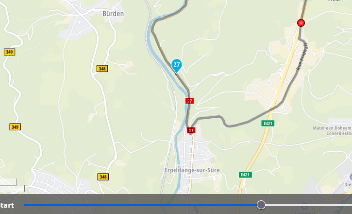
Distance bar at bottom of planning screen
-
not sure if any suggestions have been raised on this feature, or what it is properly called. Anyway.
It is almost useful for me. But I would find it better if:it could switch between distance and time.
The slider ball(?) showed the distance/time
The map did not zoom in so far when using it, in fact I would prefer for the zoom to remain in my control
-
not sure if any suggestions have been raised on this feature, or what it is properly called. Anyway.
It is almost useful for me. But I would find it better if:it could switch between distance and time.
The slider ball(?) showed the distance/time
The map did not zoom in so far when using it, in fact I would prefer for the zoom to remain in my control This post is deleted!
 -
I agree with Tony.
The route preview slider at the bottom of the screen would be nice to have a countdown of distance and traveled. I have used a feature like this in other route planning software, it is very nice when you have a limited size fuel tank when planning longer trips you can slide the Preview slider to the distance you know you can travel on a tank of gas and look for the nearest gas station on your route.
As mentioned by OP the Zoom would be nice to be controlled.
-
That's just the way opinions are, I wish this bar could be switched off. I need more map view on small screens.
