Skip to content
  • Categories
  • Recent
  • Popular
  • Support
  • MyRoute-app
Collapse
Brand Logo

MRA Community Forum

  1. Home
  2. The MyRoute-app
  3. [App] Suggestions and Discussion
  4. Feature/Remark -> FONT size text for next action (turn)

Feature/Remark -> FONT size text for next action (turn)

Scheduled Pinned Locked Moved [App] Suggestions and Discussion
16 Posts 12 Posters 5.3k Views 4 Watching
  • Oldest to Newest
  • Newest to Oldest
  • Most Votes
Reply
  • Reply as topic
Log in to reply
This topic has been deleted. Only users with topic management privileges can see it.
  • ValléeDesFées Offline
    ValléeDesFées Offline
    ValléeDesFées
    wrote on last edited by
    #1

    On a regular iPhone 13, the layout will be fine in both portrait and landscape mode. The only remark / suggestion I have is to increase the font size from the distance indicator (e.g. 200m , 300m) to the next action (turn, left, runabout etc.).

    When this FONT is bigger, it would be perfect in my opinion, probably it is possible to manually adjust the font size, or increase it 'fixed'

    KTM 890 Adventure | DMD T665 | MRA/DMD2

    1 Reply Last reply
    2
    • CD130 Offline
      CD130 Offline
      CD130
      Valued contributor
      wrote on last edited by
      #2

      Goed punt. Ook de reden dat ik momenteel twijfel tussen een “normaal” en groter model iPhone. Zelf instellen zou top zijn.

      The adventure starts where the plans end | READY TO >> RACE 🧡

      1 Reply Last reply
      0
      • richtea999 Offline
        richtea999 Offline
        richtea999
        Valued contributor
        wrote on last edited by richtea999
        #3

        Yes yes yes!

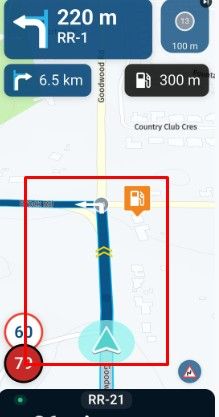
        Here's one I made earlier as an example:

        alt text

        Make the distance number the same size as the road number and the time.

        The thing that matters is the number. The units (m / yd) can stay small since they can be inferred - thus saving a little space.

        And the associated thread:
        https://forum.myrouteapp.com/topic/4676/bigger-fontsize/16

        1 Reply Last reply
        3
        • Roger Stirnimann Offline
          Roger Stirnimann Offline
          Roger Stirnimann
          wrote on last edited by
          #4

          I was testing the Navigation app last month in the alps (with here and there rougher asphalt roads).
          I the had difficulties in reading the EXIT NUMBER in the traffic circle symbol).
          I find the font size much too small.

          1 Reply Last reply
          0
          • richtea999 Offline
            richtea999 Offline
            richtea999
            Valued contributor
            wrote on last edited by richtea999
            #5

            I suspect typical MRA users are slightly more - er - 'mature' than the average bikers, and thus don't have such sharp eyes.

            I look forward to a feature like the Zoom++ where I can pump up the font sizes all round. 😁

            Con Hennekens 1 Reply Last reply
            2
            • richtea999 richtea999

              I suspect typical MRA users are slightly more - er - 'mature' than the average bikers, and thus don't have such sharp eyes.

              I look forward to a feature like the Zoom++ where I can pump up the font sizes all round. 😁

              Con Hennekens Offline
              Con Hennekens Offline
              Con Hennekens
              Alpha tester
              wrote on last edited by Con Hennekens
              #6

              @richtea999, don't hold your breath... Self setting of fontsize causes all kinds of layout problems. From text not fitting in designated space to overlapping buttons and tiles. There are already uncountable screensize, resolution and aspect combinations as it is. In the end we all want a decent view on the map too 😉

              I am just an enthusiastic MRA user, and hope you will be one too!

              Most motorcycle problems are caused by the nut that connects the handlebar to the saddle.

              Check out RideSleepRepeat.eu, a biker community for sharing stays across Europe

              1 Reply Last reply
              0
              • Brian Martindale Offline
                Brian Martindale Offline
                Brian Martindale
                wrote on last edited by
                #7

                I agree totally with the point about the font size in the next turn box. It is way too small, especially for those spectacle wearers among us. It should take no more than 1/3 second to see exactly how far I have to go to my next turn but the font is way too small.

                Glance down, peer, squint - look at the road for heaven's sake!!! Try again...but of course the distance has changed so even though I got an idea of the numbers the last time, now I am starting again. And I should be watching where I am riding. And then suddenly I'm on it and going too fast.

                The road description and number at the top is almost irrelevant to me, the most important thing is which way do I turn and in what distance. That, for me (and everyone I ride with) is the single most important piece of information on the screen and it should be the largest piece of information and the most easily seen and understood.

                1 Reply Last reply
                2
                • Sabine 1 Offline
                  Sabine 1 Offline
                  Sabine 1
                  wrote on last edited by
                  #8

                  We are 2 years later now. This is still not changed! And nobody talks about? Can't believe everybody does have so good eyes...
                  For me this will be a reason to stop with the mra navigation, it's useless like this.

                  1 Reply Last reply
                  1
                  • richtea999 Offline
                    richtea999 Offline
                    richtea999
                    Valued contributor
                    wrote on last edited by
                    #9

                    Agreed, it's a shame.

                    As a rider, the most important thing is the view ahead, but a quick glance at the navigation is needed every 30 seconds or so. That quick glance is inevitably to the top left corner for the next instruction, and the distance to it.

                    The icon is large enough, but the distance isn't.
                    And the 'yd / 'm' - not really useful at all but that's fine, we'll let that pass.

                    The next road number (currently in big font) is useful, but not nearly as useful as the distance to it - currently a small font!

                    Grrr...

                    Con Hennekens 1 Reply Last reply
                    1
                    • GT JWR Offline
                      GT JWR Offline
                      GT JWR
                      Valued contributor
                      wrote on last edited by
                      #10

                      100% agree with FONT size increase - 2yr is a long wait...shameful as @richtea999 says.

                      1 Reply Last reply
                      0
                      • richtea999 Offline
                        richtea999 Offline
                        richtea999
                        Valued contributor
                        wrote on last edited by
                        #11

                        'A shame' and 'shameful' - not quite the same! 'Disappointed' is maybe a better description that I should have used.

                        I realise the dev team are very busy but I think it's a small fix that would go a long way to enhancing usability.

                        1 Reply Last reply
                        0
                        • richtea999 richtea999

                          Agreed, it's a shame.

                          As a rider, the most important thing is the view ahead, but a quick glance at the navigation is needed every 30 seconds or so. That quick glance is inevitably to the top left corner for the next instruction, and the distance to it.

                          The icon is large enough, but the distance isn't.
                          And the 'yd / 'm' - not really useful at all but that's fine, we'll let that pass.

                          The next road number (currently in big font) is useful, but not nearly as useful as the distance to it - currently a small font!

                          Grrr...

                          Con Hennekens Offline
                          Con Hennekens Offline
                          Con Hennekens
                          Alpha tester
                          wrote on last edited by
                          #12

                          @richtea999 said in Feature/Remark -> FONT size text for next action (turn):

                          As a rider, the most important thing is the view ahead, but a quick glance at the navigation is needed every 30 seconds or so. That quick glance is inevitably to the top left corner for the next instruction, and the distance to it.

                          My glance is not at any info box at all. My glance is purely focussed on the route line itself. This resembles the view ahead, and is the best indication of where to go. Having said that, I would have no problem with an increased font for the second next instruction.

                          I am just an enthusiastic MRA user, and hope you will be one too!

                          Most motorcycle problems are caused by the nut that connects the handlebar to the saddle.

                          Check out RideSleepRepeat.eu, a biker community for sharing stays across Europe

                          Brian McG 1 Reply Last reply
                          0
                          • Con Hennekens Con Hennekens

                            @richtea999 said in Feature/Remark -> FONT size text for next action (turn):

                            As a rider, the most important thing is the view ahead, but a quick glance at the navigation is needed every 30 seconds or so. That quick glance is inevitably to the top left corner for the next instruction, and the distance to it.

                            My glance is not at any info box at all. My glance is purely focussed on the route line itself. This resembles the view ahead, and is the best indication of where to go. Having said that, I would have no problem with an increased font for the second next instruction.

                            Brian McG Offline
                            Brian McG Offline
                            Brian McG
                            wrote on last edited by
                            #13

                            Het is een schande dat gewaardeerde bijdragers zich niet in 2 jaar hebben gerealiseerd dat ze dit probleem zelf kunnen oplossen, ongeacht hoe slecht de ogen zijn
                            Zet gewoon audio-aankondigingen aan en je krijgt te horen hoe ver je moet afslaan


                            it is a shame that valued contributors have not realised in 2 years they could resolve this problem for themselves, regardless of how poor the eyes
                            just turn on audio announcements & you will be told how far to the turn
                            BlackView BV7100, Android 12
                            Navigate "Routes as Tracks" in Offline mode with Offline Maps
                            No Wifi, no internet, no interruptions, works well

                            Guzzist 1 Reply Last reply
                            0
                            • Brian McG Brian McG

                              Het is een schande dat gewaardeerde bijdragers zich niet in 2 jaar hebben gerealiseerd dat ze dit probleem zelf kunnen oplossen, ongeacht hoe slecht de ogen zijn
                              Zet gewoon audio-aankondigingen aan en je krijgt te horen hoe ver je moet afslaan


                              it is a shame that valued contributors have not realised in 2 years they could resolve this problem for themselves, regardless of how poor the eyes
                              just turn on audio announcements & you will be told how far to the turn

                              Guzzist Offline
                              Guzzist Offline
                              Guzzist
                              Valued contributor
                              wrote on last edited by
                              #14

                              @Brian-McG what, if someone doesn't have headsets, to be able to use audio (on bike)?

                              Nothing is impossible ;-)
                              In past: GARMIN Zumo 210->GARMIN Zumo 395->GARMIN XT=> now: DMD T865-X + MyRoute-App, LocusMaps, OsmAnd.
                              In past: GARMIN MapSource ->GARMIN BaseCamp->Tyre->Kurviger->Calimoto=> now: MRA-Routplanner.

                              1 Reply Last reply
                              0
                              • JP d Offline
                                JP d Offline
                                JP d
                                wrote on last edited by
                                #15

                                I just worry about the font size being increased to other bugs or problems resulting from it. Luckily I have good eye sight but a small increase in distance size shouldn't cause any layout issues.

                                1 Reply Last reply
                                0
                                • Benjamin Ralston Offline
                                  Benjamin Ralston Offline
                                  Benjamin Ralston
                                  wrote on last edited by
                                  #16

                                  This was the first thing I noticed when using the app. Everything else is nearly perfect, but that tiny font size for the distance to the next turn is a HUGE (pardon the pun) problem. There are two things I look at every time I glance at my navigation - the route line so I can see what the road is doing up ahead, and the distance to the next turn so I know if I can just cruise for a while or if I need to keep checking the navigation during an upcoming turn. Being able to quickly glance at this information is critical on a motorcycle when you have to pay attention to a lot of other things and you're looking through a helmet visor that might already have dirt and bugs on it.

                                  Brian's response regarding turning on audio announcements is not an acceptable solution, especially for those who do not have audio on their bike or helmet.

                                  Every other navigation app uses an acceptable font size for the upcoming turn because they understand this is the single most important piece of information on the screen. Come on MRA team, let's get this fixed.

                                  1 Reply Last reply
                                  4

                                  Hello! It looks like you're interested in this conversation, but you don't have an account yet.

                                  Getting fed up of having to scroll through the same posts each visit? When you register for an account, you'll always come back to exactly where you were before, and choose to be notified of new replies (either via email, or push notification). You'll also be able to save bookmarks and upvote posts to show your appreciation to other community members.

                                  With your input, this post could be even better 💗

                                  Register Login
                                  Reply
                                  • Reply as topic
                                  Log in to reply
                                  • Oldest to Newest
                                  • Newest to Oldest
                                  • Most Votes


                                  ACTIVE USERS
                                  Con Hennekens
                                  Con Hennekens
                                  Guzzist
                                  Guzzist
                                  Brian McG
                                  Brian McG
                                  CD130
                                  CD130
                                  richtea999
                                  richtea999
                                  GT JWR
                                  GT JWR
                                  Benjamin Ralston
                                  Benjamin Ralston
                                  JP d
                                  JP d
                                  Sabine 1
                                  Sabine 1
                                  ValléeDesFées
                                  ValléeDesFées
                                  Roger Stirnimann
                                  Roger Stirnimann
                                  Brian Martindale
                                  Brian Martindale
                                  POPULAR TOPICS
                                  • The compas direction on the elevation circle is wrong
                                    white.mouse
                                    white.mouse
                                    0
                                    55
                                    1.8k

                                  • Er gaat hier iets mis melding
                                    white.mouse
                                    white.mouse
                                    0
                                    4
                                    41

                                  • GPX Versions 1.1 vs 1.2 for Garmin Visually Explained
                                    John S Parry
                                    John S Parry
                                    7
                                    186
                                    16.4k

                                  • MRA V5.2.1 (488) Kompass fest einstellbar auf „Dynamische Kamera“
                                    white.mouse
                                    white.mouse
                                    1
                                    3
                                    34

                                  • New update 5.2 - Avoid roadblocks, persistent map items, POI management and share
                                    Nick Carthew
                                    Nick Carthew
                                    28
                                    50
                                    6.5k

                                  • New update 5.2.1
                                    white.mouse
                                    white.mouse
                                    16
                                    24
                                    1.1k

                                  • route niet zichtbaar op audi scherm
                                    Marinus van Deudekom
                                    Marinus van Deudekom
                                    0
                                    7
                                    270

                                  • Complimenten
                                    Corjan Meijerink
                                    Corjan Meijerink
                                    5
                                    2
                                    91

                                  MY GROUPS
                                  • Login

                                  • Login or register to search.
                                  • First post
                                    Last post
                                  0
                                  • Categories
                                  • Recent
                                  • Popular
                                  • Support
                                  • MyRoute-app