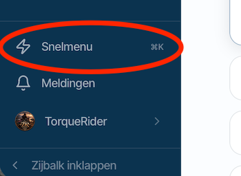
map layout in Android v6 app
-

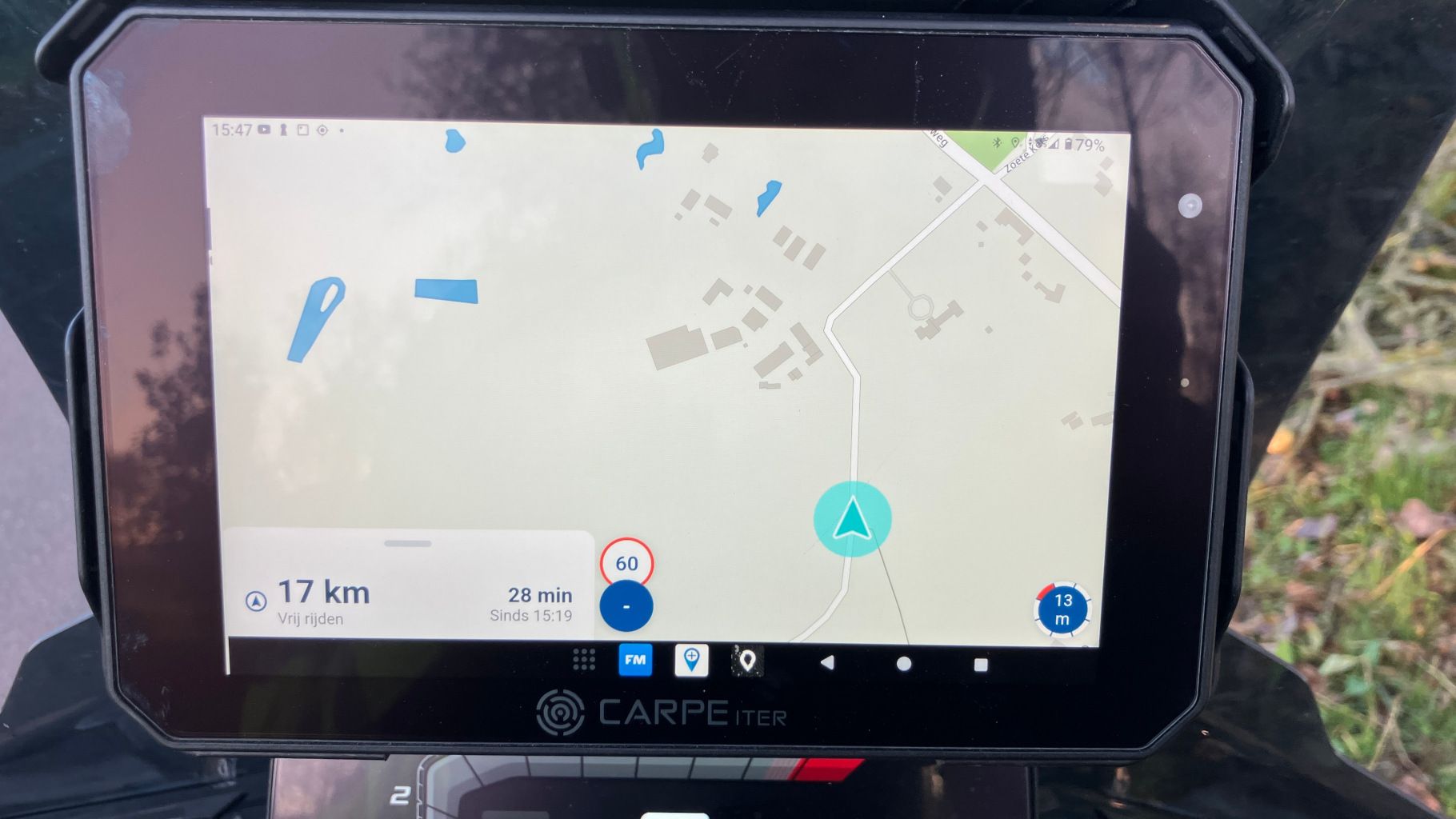
This was tested with the MyRoute-App v6.0.0 on a Carpe Iter Caretta 7" Android tablet.
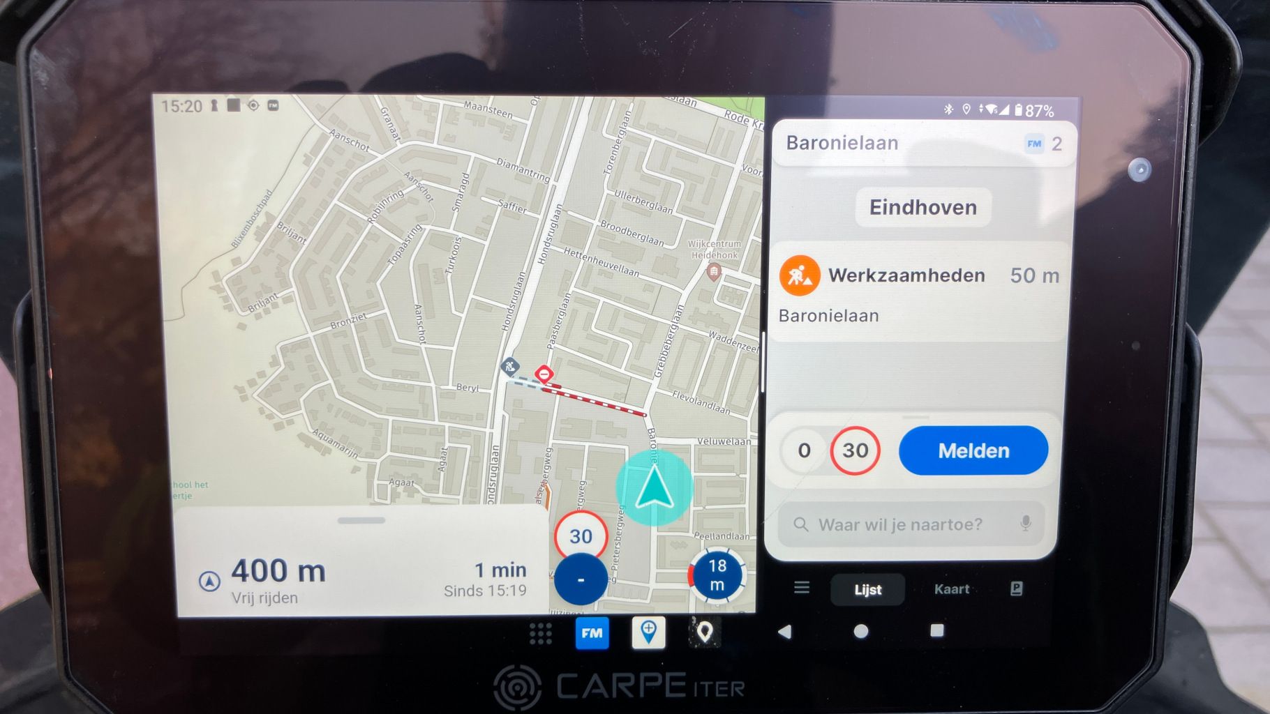
The vehicle arrow if far to the right of the screen, I would expect it more in the center of the screen. As a result a lot of the route and/or road ahead is not optimally displayed.Tested with the "free ride" screen and when following a previously created route.
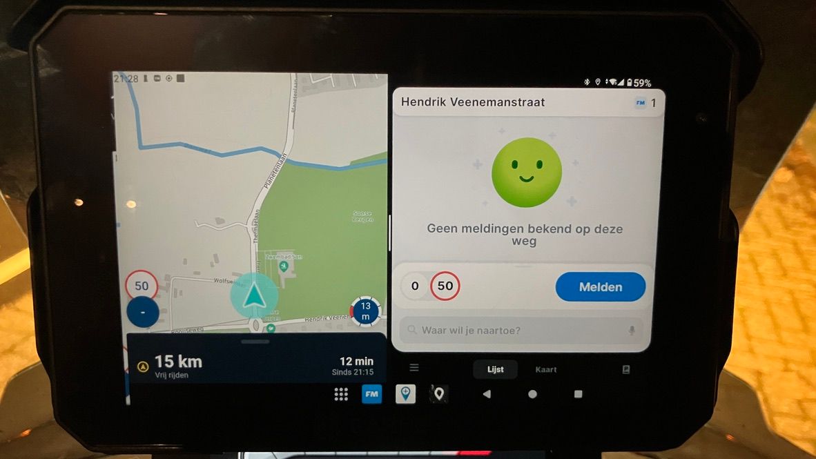
Both when using MyRoute-App in split screen mode (together with Flitsmeister) and with MyRoute-App in full screen mode.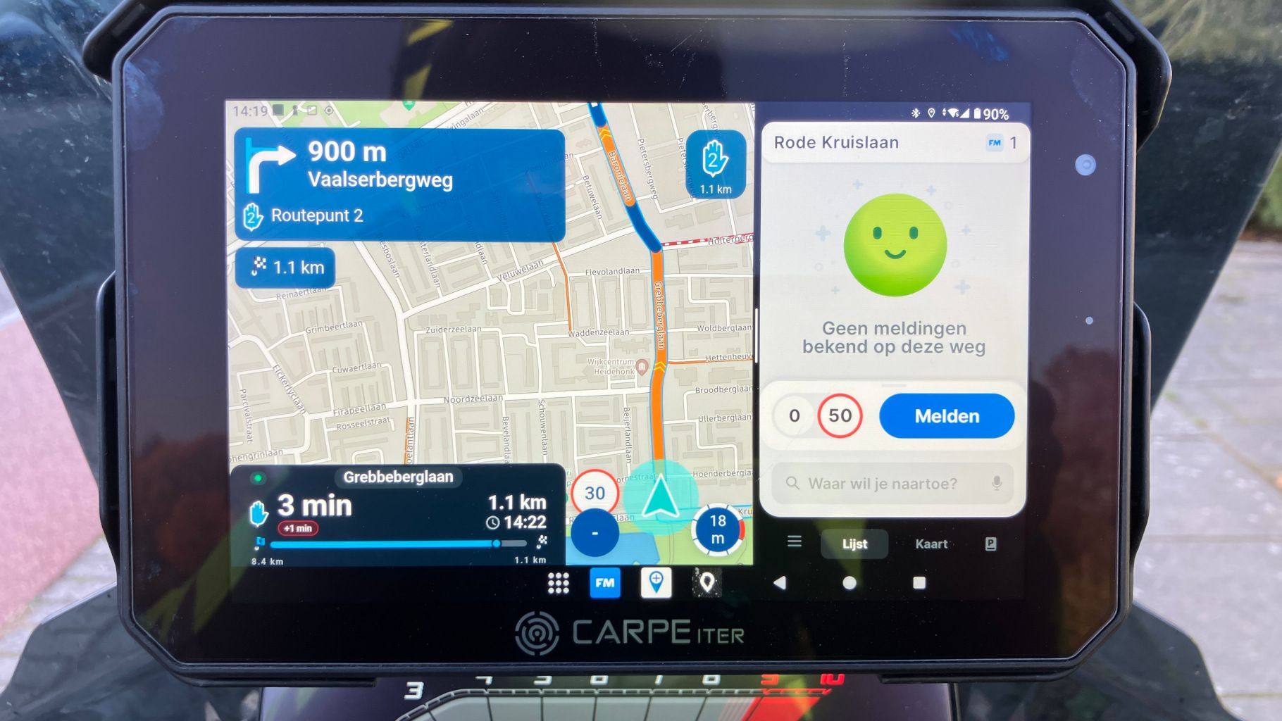
-

Can I be absolutely honest?
This looks bloody beautiful
The app handles it perfectly.
We haven't optimised it for split screen or anything.In the next update there will be an option to allow a slightly smaller menu allowing more map space

-
Thank you Corjan.
From my memory Developers always said that this was by design :).
Good to hear about the option to allow a slightly smaller menu, I'm happy to test this when it's available. -
If I use the default split screen 50/50 ration the vehicle arrow is positioned better (but I prefer MyRoute-app to be using 2/3 of the screen)
-
 Nick Carthew moved this topic from [Web-Beta] Problems, Bugs and other Issues
Hello! It looks like you're interested in this conversation, but you don't have an account yet.
Getting fed up of having to scroll through the same posts each visit? When you register for an account, you'll always come back to exactly where you were before, and choose to be notified of new replies (either via email, or push notification). You'll also be able to save bookmarks and upvote posts to show your appreciation to other community members.
With your input, this post could be even better 💗
Register Login-
 01344
-
0981
-
114182
-
 0954
-
09106
-
 010205
-
 3749
-
0823