[Suggestion] Mark 'skipped' routepoints in sidebar
-

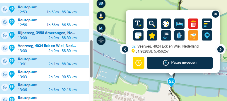
TomTom and Here route planning do support 'skipping' routepoints and their calculated routes towards them, to allow you to fix wrongfully calculated routes by the algorithm. It can be used via the skip option on the sub-menu of a routepoint.
It would be nice to have it show in the left-hand side menu with your routepoints. You are able manually add an icon and different color to represent this, but an automatic assignment of an icon or a seperate indicator on selecting skip, would be a nice to have.
Currently you also need this functionality to create proper off-road routes in OSM (or other algorithms that don't allow for off-road), skip and off-road are different things and it would be better to have seperate buttons and markings for each.
📷: YannickvanVugt | 🏍️: DutchTransalp
-
TomTom and Here route planning do support 'skipping' routepoints and their calculated routes towards them, to allow you to fix wrongfully calculated routes by the algorithm. It can be used via the skip option on the sub-menu of a routepoint.
It would be nice to have it show in the left-hand side menu with your routepoints. You are able manually add an icon and different color to represent this, but an automatic assignment of an icon or a seperate indicator on selecting skip, would be a nice to have.
Currently you also need this functionality to create proper off-road routes in OSM (or other algorithms that don't allow for off-road), skip and off-road are different things and it would be better to have seperate buttons and markings for each.
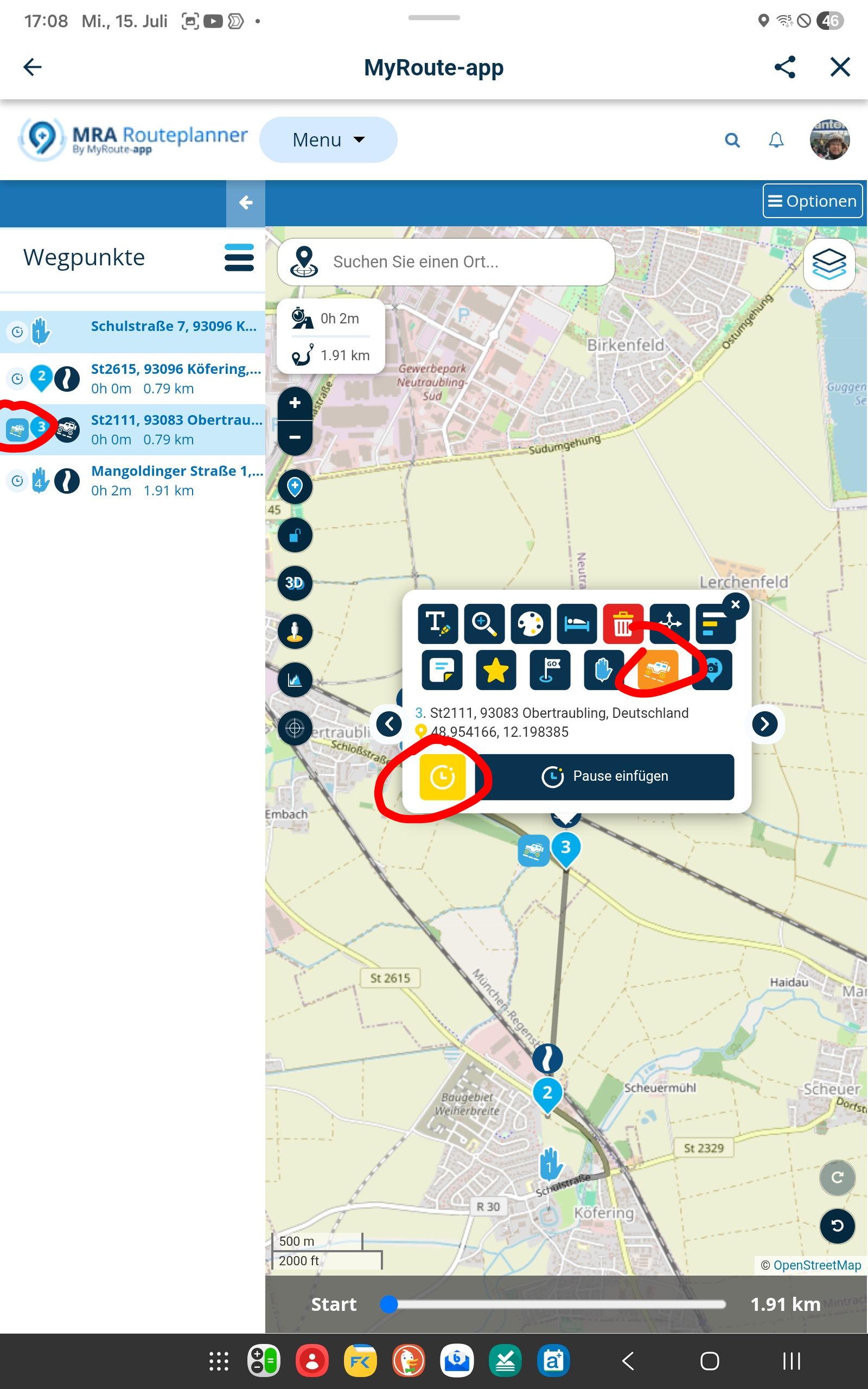
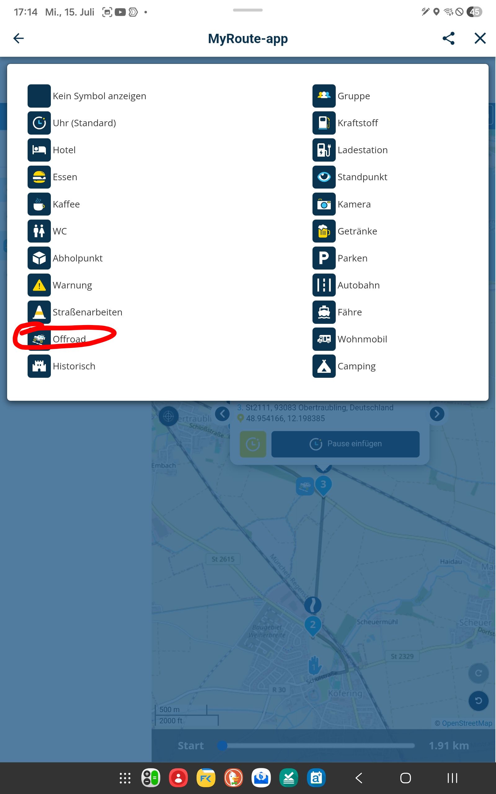
@Yannick_van_Vugt ...what you would like is there: click on a waypoint (no matter if you have skipped/offroad it), click on the "clock" symbol in the setup options, and select the "offroad" icon.
good luck
Nothing is impossible ;-)
In past: GARMIN Zumo 210->GARMIN Zumo 395->GARMIN XT=> now: DMD T865-X + MyRoute-App, LocusMaps, OsmAnd.
In past: GARMIN MapSource ->GARMIN BaseCamp->Tyre->Kurviger->Calimoto=> now: MRA-Routplanner. -
@Yannick_van_Vugt ...what you would like is there: click on a waypoint (no matter if you have skipped/offroad it), click on the "clock" symbol in the setup options, and select the "offroad" icon.
good luck
@Guzzist I know, I mentioned it in my post, but some things are just easier and better when they go
 automagically . That's why it's a suggestion.
📷: YannickvanVugt | 🏍️: DutchTransalp
-
@Guzzist I know, I mentioned it in my post, but some things are just easier and better when they go
automagically . That's why it's a suggestion.
@Yannick_van_Vugt ...now got your point about "automation". But the icon list, I mentioned was created for the [pause button] right next. To be able to not a reason for the pause/break. I fear because this, there will no automation be possible...
Nothing is impossible ;-)
In past: GARMIN Zumo 210->GARMIN Zumo 395->GARMIN XT=> now: DMD T865-X + MyRoute-App, LocusMaps, OsmAnd.
In past: GARMIN MapSource ->GARMIN BaseCamp->Tyre->Kurviger->Calimoto=> now: MRA-Routplanner. -
@Yannick_van_Vugt ...now got your point about "automation". But the icon list, I mentioned was created for the [pause button] right next. To be able to not a reason for the pause/break. I fear because this, there will no automation be possible...
@Guzzist That's also why I mentioned a seperate indicator, when you add scheduled time, it also shows you with some extra information. Just like the OSM view has 3 icons next to the written information, this could be yet another item.
The off-road icons or "skip" are used interchangeably, they should be globally the same and represent different things. Even though they currently do the same, they should show different color in navigating for example. I thought about creating yet another post, but only if this bug (where you also commented) is fixed.
Hello! It looks like you're interested in this conversation, but you don't have an account yet.
Getting fed up of having to scroll through the same posts each visit? When you register for an account, you'll always come back to exactly where you were before, and choose to be notified of new replies (either via email, or push notification). You'll also be able to save bookmarks and upvote posts to show your appreciation to other community members.
With your input, this post could be even better 💗
Register Login-
 08184
08184
-
 0518
0518
-
 010278
-
 0745
0745
-
0310
-
 0336
0336
-
 016812
-
0211