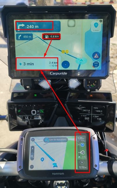
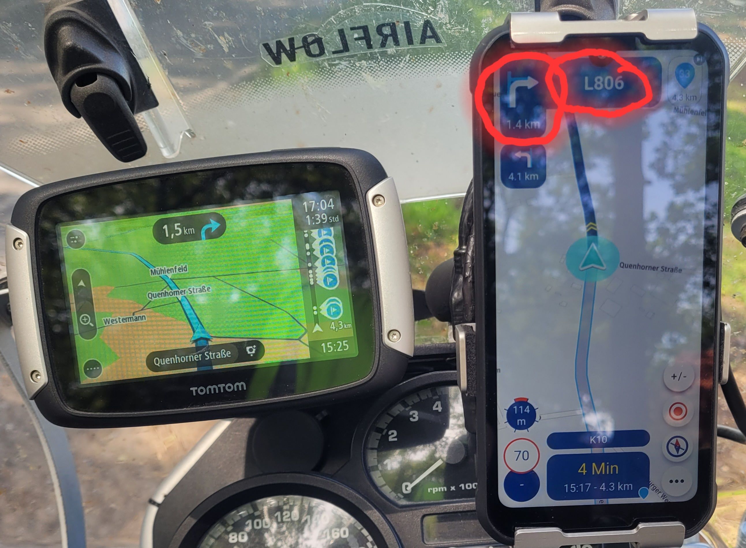
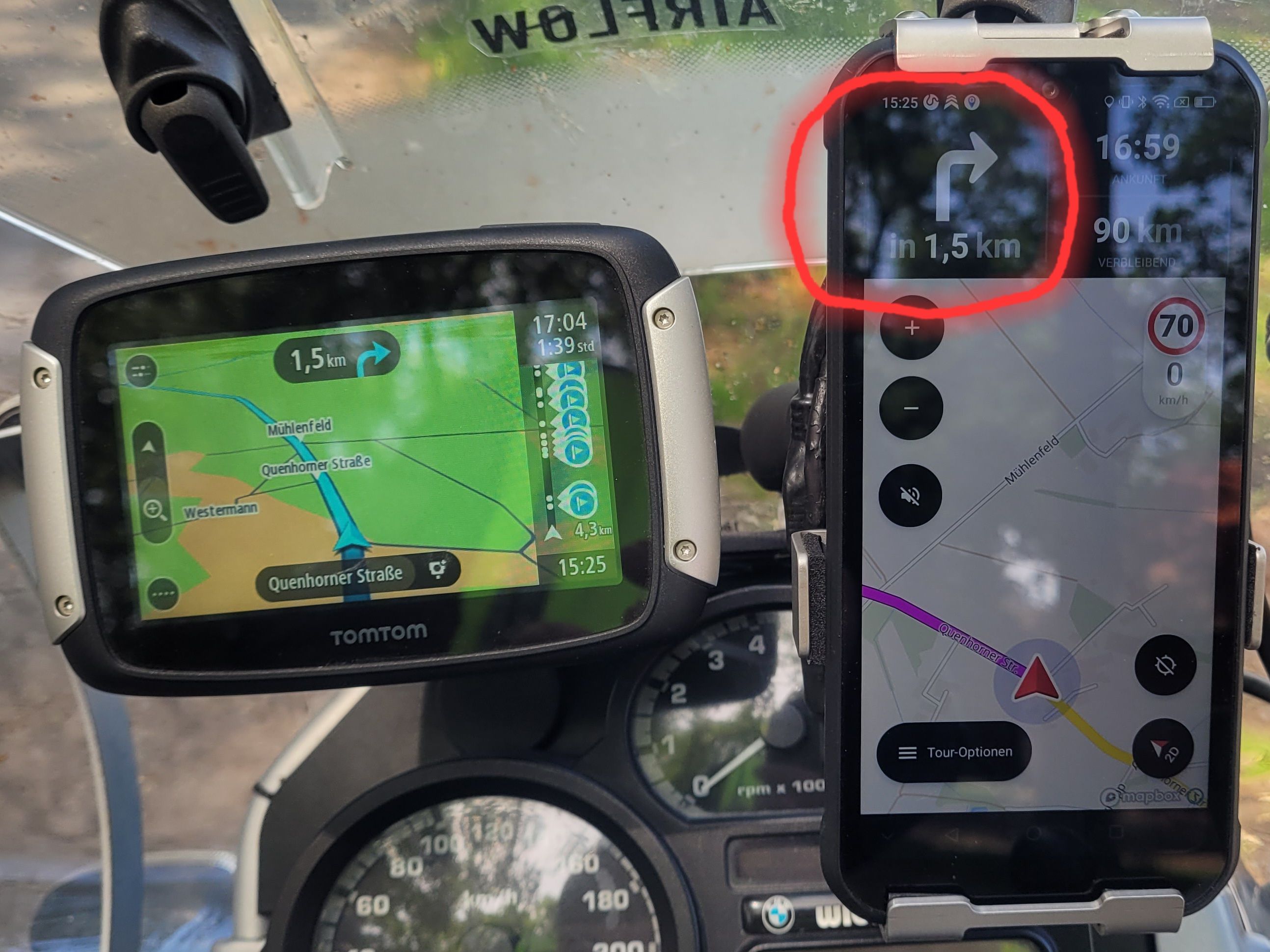
Font for the distance to the next turn to smal
-

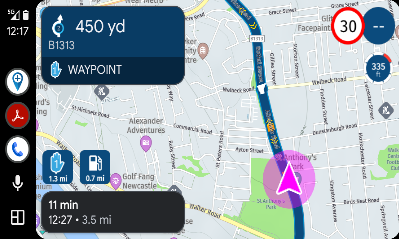
I have to agree that the font size of some elements is way too small. I use AA on a Honda NT1100 and with the new version, quickly glancing at the screen makes reading the speed and distance to next manoeuvre easy – no issues there. I also don’t face any difficulties with the distance to the subsequent manoeuvre but it seems others do. However, the distance to the next waypoint is too small. I have to lean forward quite a bit to read it which I think makes this unsafe. I like this new feature, but it’s current implementation is far from ideal. Similarly with the altitude. These are good and worthwhile features to have and we know about the issues with screen “real estate” and competing demands for clarity and more features, but having them when they can’t be read easily or safely strikes me as being an area for development. The exit number on the roundabout symbol is currently just too small to be of any use.
-
I have to agree that the font size of some elements is way too small. I use AA on a Honda NT1100 and with the new version, quickly glancing at the screen makes reading the speed and distance to next manoeuvre easy – no issues there. I also don’t face any difficulties with the distance to the subsequent manoeuvre but it seems others do. However, the distance to the next waypoint is too small. I have to lean forward quite a bit to read it which I think makes this unsafe. I like this new feature, but it’s current implementation is far from ideal. Similarly with the altitude. These are good and worthwhile features to have and we know about the issues with screen “real estate” and competing demands for clarity and more features, but having them when they can’t be read easily or safely strikes me as being an area for development. The exit number on the roundabout symbol is currently just too small to be of any use.
I have to agree that the font size of some elements is way too small. I use AA on a Honda NT1100 and with the new version, quickly glancing at the screen makes reading the speed and distance to next manoeuvre easy – no issues there. I also don’t face any difficulties with the distance to the subsequent manoeuvre but it seems others do. However, the distance to the next waypoint is too small. I have to lean forward quite a bit to read it which I think makes this unsafe. I like this new feature, but it’s current implementation is far from ideal. Similarly with the altitude. These are good and worthwhile features to have and we know about the issues with screen “real estate” and competing demands for clarity and more features, but having them when they can’t be read easily or safely strikes me as being an area for development. The exit number on the roundabout symbol is currently just too small to be of any use.
Yes, I agree with you there. The key information regarding the next turn needs to be easy and clear to read. To achieve this, the font size in that area needs to be increased. On a mobile phone, the distance to the next turn—and the roundabout exit number you mentioned—are far too small. I’m just concerned that the MyRoute team won’t make any changes based on the feedback of only a few users. The majority seems satisfied with the current setup; at least, that’s my impression based on previous comments from some users.
-

Well, I find many of the fonts on the screen too small: distance to next waypoint, distance to next fuel station and names of cities on the map. If the font size would be adjustable, that would be perfect!
-
Well, I find many of the fonts on the screen too small: distance to next waypoint, distance to next fuel station and names of cities on the map. If the font size would be adjustable, that would be perfect!
Well, I find many of the fonts on the screen too small: distance to next waypoint, distance to next fuel station and names of cities on the map. If the font size would be adjustable, that would be perfect!
I agree with you on that.
-
 richtea999 referenced this topic on
-
Daniel 7 referenced this topic
-
Wat ook scheeld is de kleur van de letters en de achtergrond kleur wat leesbaarheid, bijv, wtt achtergrond met grijze letters in plaats van zwart blauw achtergrond met gele letters is ook slecht leesbaar dan wel een rood achtergrond net blauwe letters allemaal slecht leesbaar.
De vomvinatie van achtergrond en de kleur van leesbare letters werkt niet altijd samen.
De blauwe route lijn die je volgt staan kleine gele dubbele pijltjes die geven je de rijrichting aan, is ook niet goed er goed leesbaar wegens de kleur en de vom van de dubbel pijl een witte ander vorn pijl die de rij richting aan geeft zal beter zichtbaar zijn.Ik draag ook een bril voor afstand en heb een leesbril combinatie van die 2 brillen in 1 bril de fariofocus bril gewone bril en leesbril, is niet geschikt voor mij dan wordt ik echt ziek, aangezien ik ben geboren met een evenwichtsstoornis dan is een fariofocus bril uit den boze.
rij altijd met de bril op afstand de leesbril gebruik ik thuis. op de motor met een leesbril zelf gevaarlijk en zie ik alles dubbel.
Hello! It looks like you're interested in this conversation, but you don't have an account yet.
Getting fed up of having to scroll through the same posts each visit? When you register for an account, you'll always come back to exactly where you were before, and choose to be notified of new replies (either via email, or push notification). You'll also be able to save bookmarks and upvote posts to show your appreciation to other community members.
With your input, this post could be even better 💗
Register Login



-
 11167
-
 0968
-
 01596
-
 28164
-
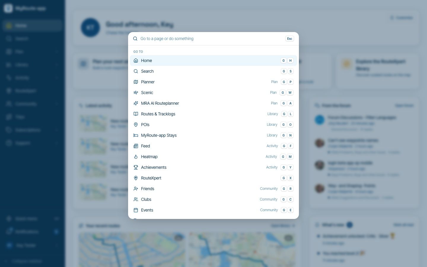
Website update - Keyboard shortcuts, route status, every Discover category and more of your feedback
 611154
-
 0726
-
0648
-
 1448