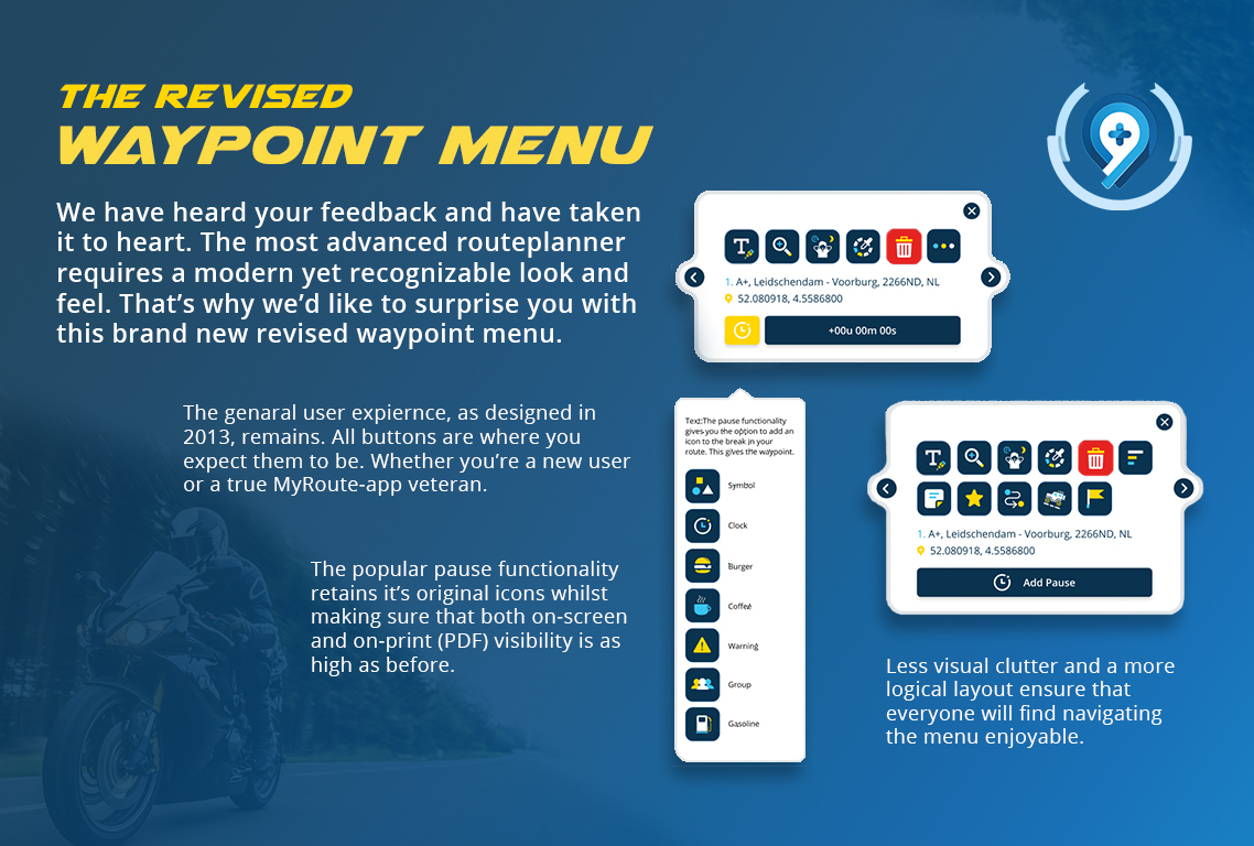
Waypoint menu revision announcement
-
 !
!
Attention Community,On behalf of the MyRoute-app team I'd like to announce a pretty important change to the way the routeplanner looks. We're going to change the waypoint menu's based on gathered feedback regarding it's visual styling and recognizability.
As some of you know, a general styling overhaul has started with the launch of the RoadMap. Our very first update was the 1.1. update, introducing the current waypoint menu. In general, this was received with mixed results. Some people found it a step forwards, whilst others found it a major leap backwards. As always, a large portion of the community has remained silent about it, but that was to be expected. Our assumption however was that to ensure continued satisfaction, we should head in a different direction with our designs.
I've outlined 3 core requirements for our design revisions, which lead to the design revision of the waypoint menu. These are:
- Recognizability. The average age of the MyRoute-app member is 55, this generation (typically) dislikes it if you "move stuff around" in the UI. I can sympathize, I dislike that too. So in general: everything should stay where it is.
- Futurism. MyRoute-app is a forward facing platform that embraces new developments. We want our designs to instill this visually for our members, using MyRoute-app should give you the feeling that you're using a modern, next-generation platform.
- Visibility. Since 2013 our cheapest trick has to use a visible UI. High contrast, big buttons and visual clarity are what originally gave us an advantage over legacy systems like Basecamp and Tyre.
Based on these requirements, I'm very proud to introduce the upcoming Waypoint menu revision.
Please do share your thoughts and comments below.
Kind regards,
Timo Martosatiman
-
!
Attention Community,On behalf of the MyRoute-app team I'd like to announce a pretty important change to the way the routeplanner looks. We're going to change the waypoint menu's based on gathered feedback regarding it's visual styling and recognizability.
As some of you know, a general styling overhaul has started with the launch of the RoadMap. Our very first update was the 1.1. update, introducing the current waypoint menu. In general, this was received with mixed results. Some people found it a step forwards, whilst others found it a major leap backwards. As always, a large portion of the community has remained silent about it, but that was to be expected. Our assumption however was that to ensure continued satisfaction, we should head in a different direction with our designs.
I've outlined 3 core requirements for our design revisions, which lead to the design revision of the waypoint menu. These are:
- Recognizability. The average age of the MyRoute-app member is 55, this generation (typically) dislikes it if you "move stuff around" in the UI. I can sympathize, I dislike that too. So in general: everything should stay where it is.
- Futurism. MyRoute-app is a forward facing platform that embraces new developments. We want our designs to instill this visually for our members, using MyRoute-app should give you the feeling that you're using a modern, next-generation platform.
- Visibility. Since 2013 our cheapest trick has to use a visible UI. High contrast, big buttons and visual clarity are what originally gave us an advantage over legacy systems like Basecamp and Tyre.
Based on these requirements, I'm very proud to introduce the upcoming Waypoint menu revision.
Please do share your thoughts and comments below.
Kind regards,
Timo Martosatiman
@Timo-Martosatiman-MRA Great to see MRA reacting to the feedback from the community! Although me personally, I did not have any trouble with the current icon layout. That being said, since you've asked for it, here is my unsalted feedback
 :
:Routemenu:
- Add waypoint text icon: very clear!
- Zoom waypoint icon: very clear
- Hotel/booking.com icon: HORRIBLE!? I had to look at the current icons to remember the functionality and to analyse what the icon meant: a sleeping dude/girl. Imho this icon shall be updated.
- Waypoint color icon: not horrible, but not great either. I can understand what the icon is trying to symbolize, but a color pallette can be reflected a little differently and more obvious.
- Trashcan: cannot be made any more clear. Great!
- More options icon: marvelous.
- Add additional text icon: hmmmm, not very intuitive to me.
- Add favourite icon: makes total sense.
- Change start point: does not do the trick! Without the old icons, I cannot understand what this one should say? Update required.
- Offroad: makes total sense... but hey, this icon is the old icon, which already was perfect.
- Change shaping point to via point icon? I have to guess, since this icon does not make sense to me.
Pause menu:
All great icons except the Symbol icon. I feel this should just contain the X as in the current menu.I apologize for my critique and perhaps the negative response, but I'm just being honest now. No hard feelings right
For me the old icons were perfect, but they seemed to lack some contrast and general coloring according to the general opinion. I don't feel like the icon symbol itself needed this huge revamp... yet only required some coloring updates like you show in this update. I suggest to leave the icon symbol identical, but apply the new colour scheme

Manks bu'j te bange.
-
@Timo-Martosatiman-MRA Great to see MRA reacting to the feedback from the community! Although me personally, I did not have any trouble with the current icon layout. That being said, since you've asked for it, here is my unsalted feedback
:Routemenu:
- Add waypoint text icon: very clear!
- Zoom waypoint icon: very clear
- Hotel/booking.com icon: HORRIBLE!? I had to look at the current icons to remember the functionality and to analyse what the icon meant: a sleeping dude/girl. Imho this icon shall be updated.
- Waypoint color icon: not horrible, but not great either. I can understand what the icon is trying to symbolize, but a color pallette can be reflected a little differently and more obvious.
- Trashcan: cannot be made any more clear. Great!
- More options icon: marvelous.
- Add additional text icon: hmmmm, not very intuitive to me.
- Add favourite icon: makes total sense.
- Change start point: does not do the trick! Without the old icons, I cannot understand what this one should say? Update required.
- Offroad: makes total sense... but hey, this icon is the old icon, which already was perfect.
- Change shaping point to via point icon? I have to guess, since this icon does not make sense to me.
Pause menu:
All great icons except the Symbol icon. I feel this should just contain the X as in the current menu.I apologize for my critique and perhaps the negative response, but I'm just being honest now. No hard feelings right
For me the old icons were perfect, but they seemed to lack some contrast and general coloring according to the general opinion. I don't feel like the icon symbol itself needed this huge revamp... yet only required some coloring updates like you show in this update. I suggest to leave the icon symbol identical, but apply the new colour scheme
@StefanHummelink said in Waypoint menu revision announcement:
Routemenu:
- Add waypoint text icon: very clear!
- Zoom waypoint icon: very clear
- Hotel/booking.com icon: HORRIBLE!? I had to look at the current waypoints to remember the functionality and to analyse what the icon meant: a sleeping dude/girl. Imho this icon shall be updated.
- Waypoint color icon: not horrible, but not great either. I can understand what the icon is trying to symbolize, but a color pallete can be reflected a little differently and more obvious.
- Trashcan: cannot be made any more clear. Great!
- More options icon: marvelous.
- Add additional text icon: hmmmm, not very intuitive to me.
- Add favourite icon: makes total sense.
- Change start point: does not do the trick! Without the old icons, I cannot understand what this one should say? Update required.
- Offroad: makes total sense... but hey, this icon is the old icon, which already was perfect.
- Change shaping point to via point icon? I have to guess, since this icon does make sense to me.
I agree with that.
-
!
Attention Community,On behalf of the MyRoute-app team I'd like to announce a pretty important change to the way the routeplanner looks. We're going to change the waypoint menu's based on gathered feedback regarding it's visual styling and recognizability.
As some of you know, a general styling overhaul has started with the launch of the RoadMap. Our very first update was the 1.1. update, introducing the current waypoint menu. In general, this was received with mixed results. Some people found it a step forwards, whilst others found it a major leap backwards. As always, a large portion of the community has remained silent about it, but that was to be expected. Our assumption however was that to ensure continued satisfaction, we should head in a different direction with our designs.
I've outlined 3 core requirements for our design revisions, which lead to the design revision of the waypoint menu. These are:
- Recognizability. The average age of the MyRoute-app member is 55, this generation (typically) dislikes it if you "move stuff around" in the UI. I can sympathize, I dislike that too. So in general: everything should stay where it is.
- Futurism. MyRoute-app is a forward facing platform that embraces new developments. We want our designs to instill this visually for our members, using MyRoute-app should give you the feeling that you're using a modern, next-generation platform.
- Visibility. Since 2013 our cheapest trick has to use a visible UI. High contrast, big buttons and visual clarity are what originally gave us an advantage over legacy systems like Basecamp and Tyre.
Based on these requirements, I'm very proud to introduce the upcoming Waypoint menu revision.
Please do share your thoughts and comments below.
Kind regards,
Timo Martosatiman
@Timo-Martosatiman-MRA said in Waypoint menu revision announcement:
- Recognizability. The average age of the MyRoute-app member is 55, this generation (typically) dislikes it if you "move stuff around" in the UI. I can sympathize, I dislike that too. So in general: everything should stay where it is.
This is very generalizing.
I am clearly 55+. But definitely not against changes. And in general, the 55+ generation is not against change. This generation has gone through a lot of changes and also a lot of failures. That comes with the passing of the years......")
But we do take a critical look at the usefulness and necessity of a change.
And if a change improves usability and intuitiveness, that's more than welcome.
So in general: everything should change when things get better.
-
@Timo-Martosatiman-MRA said in Waypoint menu revision announcement:
- Recognizability. The average age of the MyRoute-app member is 55, this generation (typically) dislikes it if you "move stuff around" in the UI. I can sympathize, I dislike that too. So in general: everything should stay where it is.
This is very generalizing.
I am clearly 55+. But definitely not against changes. And in general, the 55+ generation is not against change. This generation has gone through a lot of changes and also a lot of failures. That comes with the passing of the years......
But we do take a critical look at the usefulness and necessity of a change.
And if a change improves usability and intuitiveness, that's more than welcome.
So in general: everything should change when things get better. @Jack-van-Tilburg Ah, I'm sorry if it's taken as offensive. It's not meant to be offending or to, as we say in Dutch, "Shear all sheep over the same comb" (doesn't translate well
 )
)But we do take a critical look at the usefulness and necessity of a change.
And if a change improves usability and intuitiveness, that's more than welcome.
So in general: everything should change when things get better. That's very true and I merely tried to point out the "scientifically extrapolatable behavior patterns and generalizable preferences" that come with having a certain age average in your membership audience.
ie: "don't move a button that has always been on the left side of the screen suddenly to the right side of the screen if it's not neccecary or proven to be an improvement".
Millennials and gen-Z generally (and there we go generalizing again) are much more accepting over "frivolous" changes.
We notice that many IT projects cater solely to this audience with general disregard to recognizability. If anything, my comment was meant as a token of respecting our audience, not to alienate it.
-
Hi,
I totally agree with Stefan and Jack - and I'm really eager to see the waypoint menu being improved.
In addition to the feedback for the icons, I would like to see some other things improved - all around shaping points/via points:- Why is "Search for Hotel" considered more important than "Change Shaping Point to Via Point"? I need a hotel only once a day, but there are lots more route points that can be set as via points for a day route. There more often used function needs more clicks than the less used one
- When clicking through the waypoints, the waypoint menu currently changes from the "long menu" back to the short menu. Cumbersome, if I want to change to shaping points (one more click per each route point). The waypoint menu should stay short or long until I change this option (could also be the solution to my first point)
- Some functions of the waypoint menu let you stay in the menu (which is good) - some funtions close the waypoint menu. So I can rename, zoom in, or change the color and then navigate to the next route point with the side arrows, which is very useful; however if I change the shaping point to a via point, the waypoint menu is closed. Somehow unclear and inconsistent.
Just my 2 cents - others might have different preferences...
Cheers, Sven
-
Change shaping point to via point icon.
Maybe something like this an idea for the icon.
-
!
Attention Community,On behalf of the MyRoute-app team I'd like to announce a pretty important change to the way the routeplanner looks. We're going to change the waypoint menu's based on gathered feedback regarding it's visual styling and recognizability.
As some of you know, a general styling overhaul has started with the launch of the RoadMap. Our very first update was the 1.1. update, introducing the current waypoint menu. In general, this was received with mixed results. Some people found it a step forwards, whilst others found it a major leap backwards. As always, a large portion of the community has remained silent about it, but that was to be expected. Our assumption however was that to ensure continued satisfaction, we should head in a different direction with our designs.
I've outlined 3 core requirements for our design revisions, which lead to the design revision of the waypoint menu. These are:
- Recognizability. The average age of the MyRoute-app member is 55, this generation (typically) dislikes it if you "move stuff around" in the UI. I can sympathize, I dislike that too. So in general: everything should stay where it is.
- Futurism. MyRoute-app is a forward facing platform that embraces new developments. We want our designs to instill this visually for our members, using MyRoute-app should give you the feeling that you're using a modern, next-generation platform.
- Visibility. Since 2013 our cheapest trick has to use a visible UI. High contrast, big buttons and visual clarity are what originally gave us an advantage over legacy systems like Basecamp and Tyre.
Based on these requirements, I'm very proud to introduce the upcoming Waypoint menu revision.
Please do share your thoughts and comments below.
Kind regards,
Timo Martosatiman
@Timo-Martosatiman-MRA
I gladly add some pepper to the salted comments made by others.
I am also one of these old .... who don't want any change.
But I am of that opinion already a long time because using a piece of software (or a car for that matter) often comes down to pushing buttons at familiar places and juggling the interface needlessly around requires a learning process without much benefit.Still, I am quite enthusiastic about your core requirements as long as these contribute to BETTER user experience and not only to a different user experience.
I agree with some comments made by others: The hotel icon is indeed horrible, and the waypoint thingy is not much better
The More options button is nice but I doubt the necessity to have it. Why not showing all options immediately instead of hiding a second row of options under a more options buttons? This effectively hides options for the novice user, and is extra clicking for everybody.
I also agree with the remarks of Exilfranke
Finally, please systematically have a tooltip appearing when hoovering over whatever button
-
Hi everyone,
Thank you for the great feedback so far. I've communicated the points that I agree with to the designer for revising, and have some final notes on things that I disagree with.
In general:
placement of the buttons will remain where you're used that the buttons are. In the designs we presented some buttons are moved around by the designer for trial purposes, but that doesn't represent final placement.I also agree with most of the functional requests put forth by @Exilfranke, with the exception of number one (Search for Hotel). I'll write down the arguments below for such decisions though where they differ from you guys. However, in general, I agree that when the waypoint menu is in it's expanded state, it should remain so when going through waypoints. In addition, I agree that the waypoint menu shouldn't arbitrarily close.
Almost all the icons you guys didn't agree with have been edited, where I agreed with the changes. With the following exceptions:
- palette remains as it is, I've heard good things about it and hope it will come to grow on you.
- add note icon, I actually think it's quite clear that this means adding a note. It's also pretty similar to how it used to be, so I kept it like that.
These are the new icons for hotels, and setting as starting waypoint


Argument: why keep a collapsed state?
When you look at the waypoint menu in it's expanded state as an advanced MRA user you're likely to go "Ah, these are the features I need." And indeed, the features in the expanded state are very, very powerful for the advanced user.These advanced features are even a key to MRA's success. If you use our platform daily, then you undoubtedly have collected a plethora of "favorites", you've skipped many a pesky ferry using the offroad feature, your routes contain colourful waypoints filled with informative notes, and finally you skip all the nasty rerouting issues of some satnav's with the Shaping and Via point controls. For you, these features are key to your daily experience.
However, an even larger number of people will almost never use these features. And we're glad of it. That's because if you just want to "click together" a nice route quickly, you don't need all of these features. If you had to convince someone who has never made a route before to use MRA Routeplanner, I hope you wouldn't start out with "did you know there's an off-road mode?". That's the kind of tip you leave for when someone is already as excited as a puppy.
A lot of comments aimed at our latest developments are that we shouldn't forget what we started with: the idea of a very simple routeplanner for adventurers. That cornerstone led to the collapsed waypoint menu. You have all the most important features at your fingertips, without being overwhelmed with functionality.
All in all, the collapsed waypoint menu allows us to present a set of essential, clean and user-friendly tools for editing waypoints, whilst also providing functionality for our advanced user base. As an afterthought, I'd like to add that with some tweaks to how the expanded menu operates (keeping it open when you haven't collapsed it) will probably ensure happiness among both advanced users and relative novices.
Options/unused:


-
Hi everyone,
Thank you for the great feedback so far. I've communicated the points that I agree with to the designer for revising, and have some final notes on things that I disagree with.
In general:
placement of the buttons will remain where you're used that the buttons are. In the designs we presented some buttons are moved around by the designer for trial purposes, but that doesn't represent final placement.I also agree with most of the functional requests put forth by @Exilfranke, with the exception of number one (Search for Hotel). I'll write down the arguments below for such decisions though where they differ from you guys. However, in general, I agree that when the waypoint menu is in it's expanded state, it should remain so when going through waypoints. In addition, I agree that the waypoint menu shouldn't arbitrarily close.
Almost all the icons you guys didn't agree with have been edited, where I agreed with the changes. With the following exceptions:
- palette remains as it is, I've heard good things about it and hope it will come to grow on you.
- add note icon, I actually think it's quite clear that this means adding a note. It's also pretty similar to how it used to be, so I kept it like that.
These are the new icons for hotels, and setting as starting waypoint
Argument: why keep a collapsed state?
When you look at the waypoint menu in it's expanded state as an advanced MRA user you're likely to go "Ah, these are the features I need." And indeed, the features in the expanded state are very, very powerful for the advanced user.These advanced features are even a key to MRA's success. If you use our platform daily, then you undoubtedly have collected a plethora of "favorites", you've skipped many a pesky ferry using the offroad feature, your routes contain colourful waypoints filled with informative notes, and finally you skip all the nasty rerouting issues of some satnav's with the Shaping and Via point controls. For you, these features are key to your daily experience.
However, an even larger number of people will almost never use these features. And we're glad of it. That's because if you just want to "click together" a nice route quickly, you don't need all of these features. If you had to convince someone who has never made a route before to use MRA Routeplanner, I hope you wouldn't start out with "did you know there's an off-road mode?". That's the kind of tip you leave for when someone is already as excited as a puppy.
A lot of comments aimed at our latest developments are that we shouldn't forget what we started with: the idea of a very simple routeplanner for adventurers. That cornerstone led to the collapsed waypoint menu. You have all the most important features at your fingertips, without being overwhelmed with functionality.
All in all, the collapsed waypoint menu allows us to present a set of essential, clean and user-friendly tools for editing waypoints, whilst also providing functionality for our advanced user base. As an afterthought, I'd like to add that with some tweaks to how the expanded menu operates (keeping it open when you haven't collapsed it) will probably ensure happiness among both advanced users and relative novices.
Options/unused:
@Timo-Martosatiman-MRA about the collapsed state: fair enough
With the suggestions you accepted, and certainly those of exilfranke, this will be a nic improvement, even for an old grunt like me
Hence, thanks a lot for asking our opinion, which is rare in the development world, and for taking our opinion into account, which is even more seldom
-
!
Attention Community,On behalf of the MyRoute-app team I'd like to announce a pretty important change to the way the routeplanner looks. We're going to change the waypoint menu's based on gathered feedback regarding it's visual styling and recognizability.
As some of you know, a general styling overhaul has started with the launch of the RoadMap. Our very first update was the 1.1. update, introducing the current waypoint menu. In general, this was received with mixed results. Some people found it a step forwards, whilst others found it a major leap backwards. As always, a large portion of the community has remained silent about it, but that was to be expected. Our assumption however was that to ensure continued satisfaction, we should head in a different direction with our designs.
I've outlined 3 core requirements for our design revisions, which lead to the design revision of the waypoint menu. These are:
- Recognizability. The average age of the MyRoute-app member is 55, this generation (typically) dislikes it if you "move stuff around" in the UI. I can sympathize, I dislike that too. So in general: everything should stay where it is.
- Futurism. MyRoute-app is a forward facing platform that embraces new developments. We want our designs to instill this visually for our members, using MyRoute-app should give you the feeling that you're using a modern, next-generation platform.
- Visibility. Since 2013 our cheapest trick has to use a visible UI. High contrast, big buttons and visual clarity are what originally gave us an advantage over legacy systems like Basecamp and Tyre.
Based on these requirements, I'm very proud to introduce the upcoming Waypoint menu revision.
Please do share your thoughts and comments below.
Kind regards,
Timo Martosatiman
@Timo-Martosatiman-MRA said in Waypoint menu revision announcement:
Since 2013 our cheapest trick has
2013; my god!!! is it that long already???
-
Loving the look of the new waypoint icons.
I always thought the Jerrycan was a strange one, glad to see that will change.
And @Exilfranke “keeping it open if it hasn’t been collapsed” is a brilliant idea.
-
I have to say that this seems like yet more tinkering around the edges when there are far more fundamental matters that badly need tackling - particularly with regard to the Navigation app, which I have currently had to stop using due to its endless, ever changing, and in at least one instance downright dangerous, issues.
However, I think the new icons look fine. But then I had no problem at all with the old ones. To me, far more important than their purpose being obvious simply by the graphic (this will inevitably be open to interpretation, as surely as ink blots in a Rorschach test or ambiguous images such as the well known 'wife/mother in-law and 'frog or horses head' drawings) is that the purpose is displayed as text on hovering on an icon.
To that end, I would suggest that on hovering on the 'change waypoint type' icon, the text states 'change to via' if it's currently a shaping point, and 'change to shaping' if it's currently a via.
Hi Pad, thanks for commenting. Glad you like this new look better.
I understand this may seem like "tinkering around the edges", but it honestly isn't, at least not for our app developers. They are still 100% focussed on getting the Navigation app to a better state.
This project was a small intermediate project for the design and web-development team. Even if they didn't do this project there's no way their resources would have been better spent on Navigation, primarily due to the physical impossibility: the app is in a completely different programming language.
Hope this clears some things up,
Kind regards,
Timo
-
Hi Pad, thanks for commenting. Glad you like this new look better.
I understand this may seem like "tinkering around the edges", but it honestly isn't, at least not for our app developers. They are still 100% focussed on getting the Navigation app to a better state.
This project was a small intermediate project for the design and web-development team. Even if they didn't do this project there's no way their resources would have been better spent on Navigation, primarily due to the physical impossibility: the app is in a completely different programming language.
Hope this clears some things up,
Kind regards,
Timo
@Timo-Martosatiman-MRA It seems a little ‘opportunistic’ of you to interpret my comments on the ‘new look’ as favouring it over the current UI! All I’ve seen of the former are the images above - hardly a fair comparison. And doubly opportunistic given my ink blot analogy: Well chosen text labels on hovering on an icon are equally valid and important in either case. You could make the icon for changing the waypoint type pretty much anything, a stylised burger for instance (such that no-one would have a clue from the graphic); as long as the accompanying text is explicit, all users are certain of function. Thus my referring to ‘tinkering around the edges’… I see the new look as being of very little consequence either way.
I take your point regarding the two MRA components being distinct from the development perspective. I wish you would consider my viewpoint of them being absolutely essential to one another nonetheless. Combined, they are a potential release from poor route planning environments and the expense and built in obsolescence of dedicated devices, but only when both work reliably… We both know that really isn’t so in relation to one element… And that, for me, is a deal breaker.
Hello! It looks like you're interested in this conversation, but you don't have an account yet.
Getting fed up of having to scroll through the same posts each visit? When you register for an account, you'll always come back to exactly where you were before, and choose to be notified of new replies (either via email, or push notification). You'll also be able to save bookmarks and upvote posts to show your appreciation to other community members.
With your input, this post could be even better 💗
Register Login-
4987
-
615114
-
06134
-
023490
-
0360
-
1957.5k
-
03129
-
018713