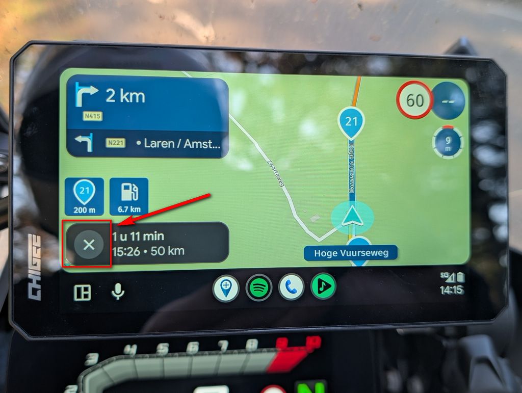
Not enough map view visible
-

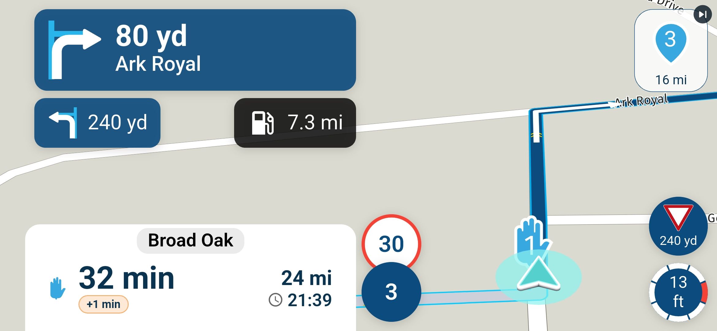
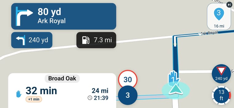
I have just got the android update and looking at the navigation next I feel like there is now less space available for map view and way too much going on in the screen blocking the view when in landscape mode.
The old view was much cleaner in my opinion.
-
 Nick Carthew moved this topic from [Web-Beta] Problems, Bugs and other Issues
-

Hi Stuart, thanks for the screenshot, that really helps. We've already made the navigation layout tighter for phones held sideways: the instructions and the panel under them get narrower, so there is more room for the map. That isn't in the version you have yet. On your screen size it's a modest gain, so we're looking at whether we can go further.
-
@corjan-meijerink thanks for that.
I have just used the app today in my car on the way to work to actually see how this looks on the move rather than just sat at home!
I have to be honest the old version was better when in landscape mode.
I also tried the app in portrait and to be honest it works better but unfortunately this is not an option on my bike due to space constraints and I know a lot of other people who have the same issue so we are stuck with landscape mode.
I also do prefer it to be in landscape rather than portrait but it appears that the app is more built and focused on portrait!
Would it not be wise to make landscape just as good as portrait mode for all the users that prefer that orientation.
I think the stacked speeds could be improved and the location of the fuel stations on route could be moved to the left under the next turn and both the menu and next turn could be a lot smaller.
Thanks
Stu -
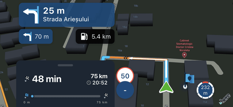
The progress bar would be nice to see permanently !
 (In this case I kept the bar pulled up while taking the screenshot)
-
And there we go again. People complain the menu is too high so on smaller devices we hide the progress bar. Now people on those same devices want it shown again

I'm not ever going to satisfy everyone and no, not everything will be a setting.
-
Well I wouldn't say a pixel 7 Pro is a small device! its a decent sized mobile phone and with it being My Route "APP" it is designed for mobile phones so it would only be fair to have it working well

I never knew that progress bar existed and to be honest its not for me! maybe it could be be made as an option of a tick box for those that want it?
For me less is more
Skip waypoints is in the perfect place
top turn direction is OK but too big
The bottom one is too big
The stacked speed takes up too much room
I dont use the compass or the traffic signs
I done "need" the next turn providing you can see more of the map all is goodYou should maybe put it all to a vote

-
Hi Stuart, thanks for the screenshot, that really helps. We've already made the navigation layout tighter for phones held sideways: the instructions and the panel under them get narrower, so there is more room for the map. That isn't in the version you have yet. On your screen size it's a modest gain, so we're looking at whether we can go further.

Hi Stuart, thanks for the screenshot, that really helps. We've already made the navigation layout tighter for phones held sideways: the instructions and the panel under them get narrower, so there is more room for the map. That isn't in the version you have yet. On your screen size it's a modest gain, so we're looking at whether we can go further.
Glad to hear that efforts are being made to optimize the available space in order to gain a bit more room for the map.
Thanks.
Hello! It looks like you're interested in this conversation, but you don't have an account yet.
Getting fed up of having to scroll through the same posts each visit? When you register for an account, you'll always come back to exactly where you were before, and choose to be notified of new replies (either via email, or push notification). You'll also be able to save bookmarks and upvote posts to show your appreciation to other community members.
With your input, this post could be even better 💗
Register Login-
 023360
-
2241.6k
-
01158
-
011191
-
 0816
-
0843
-
 0782
-
112151