Landscape Layout - Suggestion
-
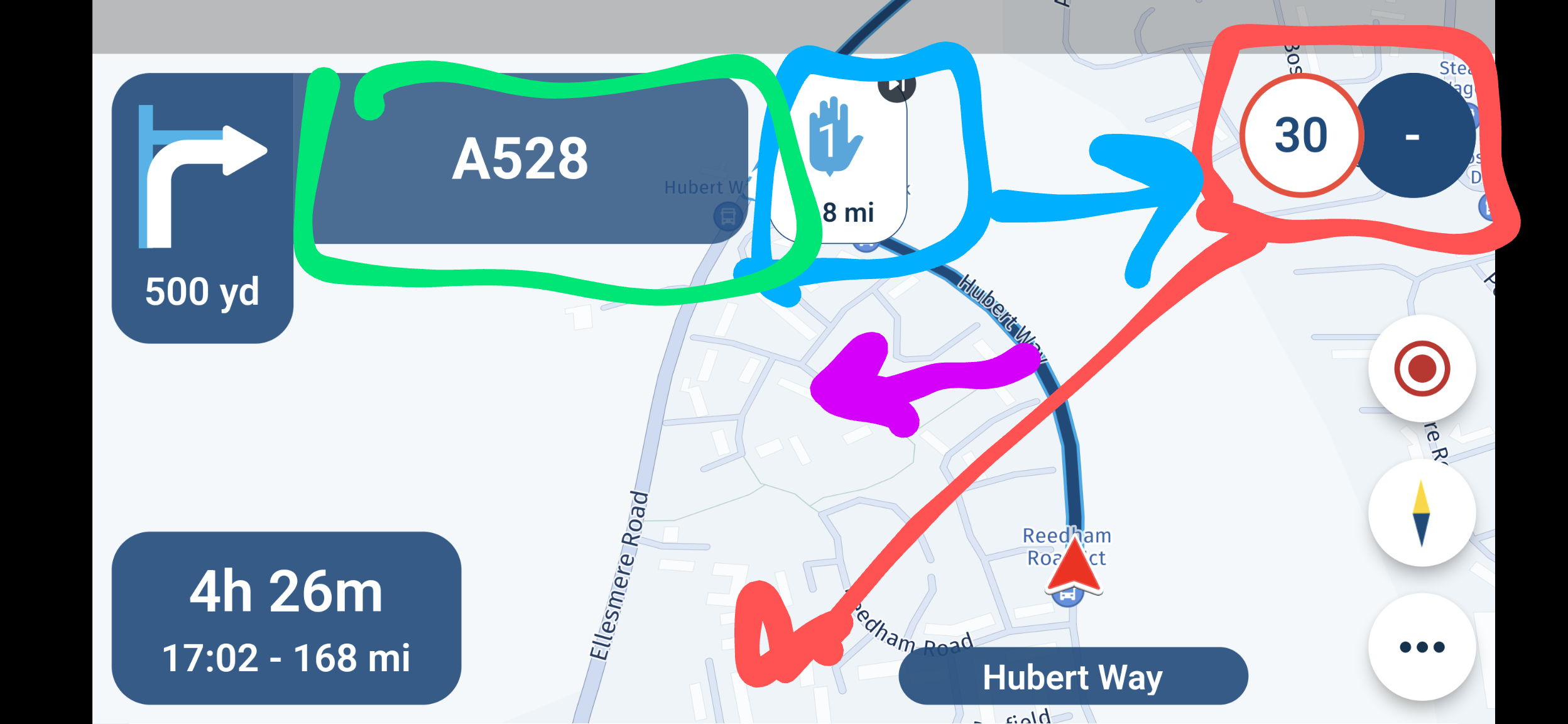
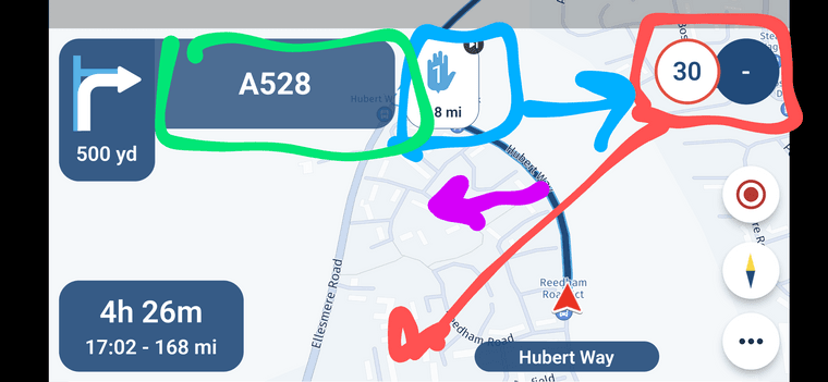
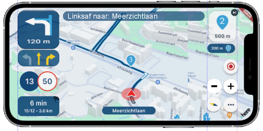
Great that the team are looking to change /review the layout in landscape view - my default orientation on the bike. I like that the waypoint time and distance box has moved to bottom left and enables easy left hand operation However, a few thoughts against this screenshot:
-
Red - I not sure about the speed/speed limit indicator at the top right and would suggest placing this indicator next to the street name - more 'in view' of the main central area.
-
Blue - the next point indicator box has been a personal irritation with its central position. Whilst really useful, the box obscures the route ahead and means the route line is more off centre - just does not look right. I would prefer this to be top right where the speed/speed limit indicators were.
-
Purple - move of the next point box would allow the route line to go central.
-
Green - the road/street/instruction box next to the turn indication is way too big and takes over the screen.
Just some thoughts about the new landscape layout having used the new layout the last few days. My thoughts are based on which areas I tend to look at more frequently and where I would like to see them. I know there have been some other similar thoughts passed on the landscape view Portrait layout is great though. Keep up the great work.
I think that for the most part you are spot on the only thing that I would do different is the box you have circled in green I would like to be able to deselect it in the setting as for the most part it is unnecessary information wile riding.
-
-
Great that the team are looking to change /review the layout in landscape view - my default orientation on the bike. I like that the waypoint time and distance box has moved to bottom left and enables easy left hand operation However, a few thoughts against this screenshot:
-
Red - I not sure about the speed/speed limit indicator at the top right and would suggest placing this indicator next to the street name - more 'in view' of the main central area.
-
Blue - the next point indicator box has been a personal irritation with its central position. Whilst really useful, the box obscures the route ahead and means the route line is more off centre - just does not look right. I would prefer this to be top right where the speed/speed limit indicators were.
-
Purple - move of the next point box would allow the route line to go central.
-
Green - the road/street/instruction box next to the turn indication is way too big and takes over the screen.
Just some thoughts about the new landscape layout having used the new layout the last few days. My thoughts are based on which areas I tend to look at more frequently and where I would like to see them. I know there have been some other similar thoughts passed on the landscape view Portrait layout is great though. Keep up the great work.
@Dave-J-0 thanks for sharing!
The difficult thing is, at this point I believe quite some people are happy with how it is (like you indicate we continuously keep improving). So it’s hard to just change it all after a post as you can imagine.
I used to drive in portrait only - now it’s landscape only
")
I’m pretty happy with how it is now but I can totally live with your suggestion too.
So if the community really thinks the suggestions as posted here by @Dave-J-0 are the real deal or have additions to this, I would very much like to hear that
Note: making the UI fully configurable is not an option at this point in time. Obviously that would make everyone happy
-
-
@Dave-J-0 thanks for sharing!
The difficult thing is, at this point I believe quite some people are happy with how it is (like you indicate we continuously keep improving). So it’s hard to just change it all after a post as you can imagine.
I used to drive in portrait only - now it’s landscape only
I’m pretty happy with how it is now but I can totally live with your suggestion too.
So if the community really thinks the suggestions as posted here by @Dave-J-0 are the real deal or have additions to this, I would very much like to hear that
Note: making the UI fully configurable is not an option at this point in time. Obviously that would make everyone happy
@Corjan-Meijerink With my good looks, I’m a portrait guy
 Although you can see more of me in landscape
-
I always navigate in portrait but the suggested changes seem to make sense and provide more view of the route.
-
@Dave-J-0 thanks for sharing!
The difficult thing is, at this point I believe quite some people are happy with how it is (like you indicate we continuously keep improving). So it’s hard to just change it all after a post as you can imagine.
I used to drive in portrait only - now it’s landscape only
I’m pretty happy with how it is now but I can totally live with your suggestion too.
So if the community really thinks the suggestions as posted here by @Dave-J-0 are the real deal or have additions to this, I would very much like to hear that
Note: making the UI fully configurable is not an option at this point in time. Obviously that would make everyone happy
@Corjan-Meijerink I remember myself also requesting (feedback on the first beta release) the routeline to be centered instead of off-centre like it is now. The suggested layout by TS suits me fine, as long as it allows the routeline to be centered. For me, that is the most important issue I have with the landscape layout. I only use landscape.
-
@Dave-J-0 thanks for sharing!
The difficult thing is, at this point I believe quite some people are happy with how it is (like you indicate we continuously keep improving). So it’s hard to just change it all after a post as you can imagine.
I used to drive in portrait only - now it’s landscape only
I’m pretty happy with how it is now but I can totally live with your suggestion too.
So if the community really thinks the suggestions as posted here by @Dave-J-0 are the real deal or have additions to this, I would very much like to hear that
Note: making the UI fully configurable is not an option at this point in time. Obviously that would make everyone happy
@Corjan-Meijerink, many of the suggestions above have been given by myself throughout the whole beta period. Funny that you have switched to landscape. For me it is vice-versa, because I think the top left infobox is throwing the center of the route (the flyer) much to much to the right. I really don't think that many seem happy with the lanscape layout at all. I do think that there are probably not many users trying to use landscape at all...
Smartphones seem to have peoples sight turned around from the natural landscape to the portrait preference, which is annoying, since most people have their eyes beside each other and not above each other...
I am just an enthusiastic MRA user, and hope you will be one too!
Most motorcycle problems are caused by the nut that connects the handlebar to the saddle.
Check out RideSleepRepeat.eu, a biker community for sharing stays across Europe
-
@Corjan-Meijerink, many of the suggestions above have been given by myself throughout the whole beta period. Funny that you have switched to landscape. For me it is vice-versa, because I think the top left infobox is throwing the center of the route (the flyer) much to much to the right. I really don't think that many seem happy with the lanscape layout at all. I do think that there are probably not many users trying to use landscape at all...
Smartphones seem to have peoples sight turned around from the natural landscape to the portrait preference, which is annoying, since most people have their eyes beside each other and not above each other...
@Con-Hennekens totally agree with the route line needing to be central , and the top left information could hopefully be made smaller to allow this aswell as being more transparent to allow users to see the map underneath
-
@Con-Hennekens totally agree with the route line needing to be central , and the top left information could hopefully be made smaller to allow this aswell as being more transparent to allow users to see the map underneath
@Ian-foster-0, Wel I don't think the position must be central persé, it will always depend on what is on screen. But the current position simply leaves not enough map-area on the right.
-
Just a friendly reminder that this is exactly what Beta testing is about.
The feedback you're all delivering about this will very likely result in another iteration. I'm happy with this thread. @Dave-J-0 Thanks for starting it.Keep the conversation going
-
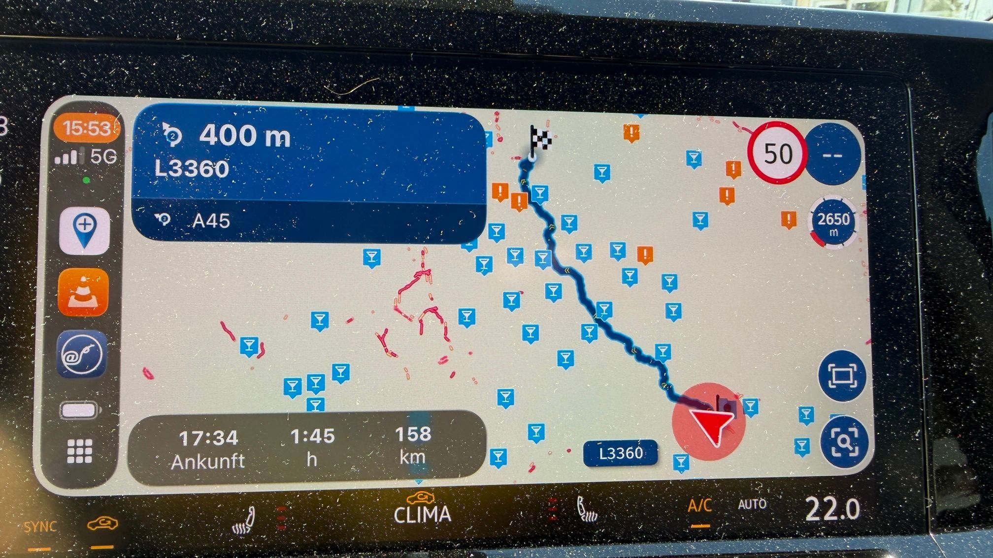
It was a beautiful day for some programming

How do you like this?
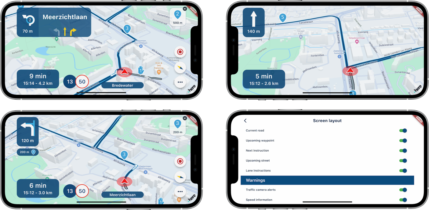
Changes
Listened to all your feedback :
:- upcoming street is a little less wide
- upcoming waypoint box moved to top right
- added opacity to upcoming waypoint to ensure map / route behind is can still be seen
- speed indicators moved next to eta information
- moved position indicator a little more back towards the center. Completely in the center of the screen is not desired.
Extra configuration change
You can now hide the upcoming street info box to enable a truly minimal UI.
Note: lane instructions can't be used when this UI element is disabled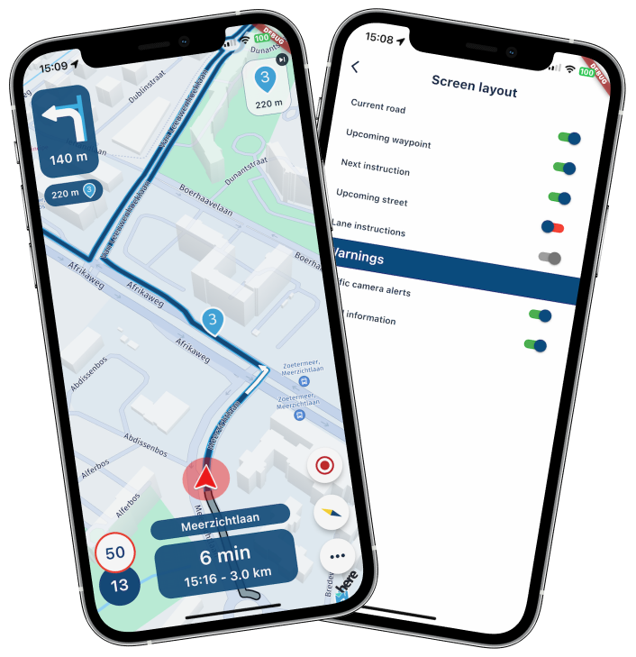
In the above image(s) you can see just the amount of extra map information becomes available when you turn off the upcoming street UI element. Something that was already suggested in Januari by @Con-Hennekens (and others maybe) here https://forum.myrouteapp.com/topic/3125/hide-streetname-in-direction.
In the top right landscape image you see the amount of map that becomes visible when turning off all UI elements
Hope you are happy with this. If so, I will add this to the next update

Have a great remainder of your weekend!
-
It was a beautiful day for some programming
How do you like this?
Changes
Listened to all your feedback:- upcoming street is a little less wide
- upcoming waypoint box moved to top right
- added opacity to upcoming waypoint to ensure map / route behind is can still be seen
- speed indicators moved next to eta information
- moved position indicator a little more back towards the center. Completely in the center of the screen is not desired.
Extra configuration change
You can now hide the upcoming street info box to enable a truly minimal UI.
Note: lane instructions can't be used when this UI element is disabledIn the above image(s) you can see just the amount of extra map information becomes available when you turn off the upcoming street UI element. Something that was already suggested in Januari by @Con-Hennekens (and others maybe) here https://forum.myrouteapp.com/topic/3125/hide-streetname-in-direction.
In the top right landscape image you see the amount of map that becomes visible when turning off all UI elements
Hope you are happy with this. If so, I will add this to the next update
Have a great remainder of your weekend!
@Corjan-Meijerink
I look forward to these new changes. I prefer landscape mode and the changes would be a great improvement.
-
It was a beautiful day for some programming
How do you like this?
Changes
Listened to all your feedback:- upcoming street is a little less wide
- upcoming waypoint box moved to top right
- added opacity to upcoming waypoint to ensure map / route behind is can still be seen
- speed indicators moved next to eta information
- moved position indicator a little more back towards the center. Completely in the center of the screen is not desired.
Extra configuration change
You can now hide the upcoming street info box to enable a truly minimal UI.
Note: lane instructions can't be used when this UI element is disabledIn the above image(s) you can see just the amount of extra map information becomes available when you turn off the upcoming street UI element. Something that was already suggested in Januari by @Con-Hennekens (and others maybe) here https://forum.myrouteapp.com/topic/3125/hide-streetname-in-direction.
In the top right landscape image you see the amount of map that becomes visible when turning off all UI elements
Hope you are happy with this. If so, I will add this to the next update
Have a great remainder of your weekend!
@Corjan-Meijerink Awesome changes. Could have done with that layout format today but cannot wait until the next update. Great work.
-
It was a beautiful day for some programming
How do you like this?
Changes
Listened to all your feedback:- upcoming street is a little less wide
- upcoming waypoint box moved to top right
- added opacity to upcoming waypoint to ensure map / route behind is can still be seen
- speed indicators moved next to eta information
- moved position indicator a little more back towards the center. Completely in the center of the screen is not desired.
Extra configuration change
You can now hide the upcoming street info box to enable a truly minimal UI.
Note: lane instructions can't be used when this UI element is disabledIn the above image(s) you can see just the amount of extra map information becomes available when you turn off the upcoming street UI element. Something that was already suggested in Januari by @Con-Hennekens (and others maybe) here https://forum.myrouteapp.com/topic/3125/hide-streetname-in-direction.
In the top right landscape image you see the amount of map that becomes visible when turning off all UI elements
Hope you are happy with this. If so, I will add this to the next update
Have a great remainder of your weekend!
@Corjan-Meijerink said in Landscape Layout - Suggestion:
It was a beautiful day for some programming
How do you like this?
That looks brilliant!
-
Thanks for the feedback! Given all the positive remarks, we'll make this available in the next update
-
It was a beautiful day for some programming
How do you like this?
Changes
Listened to all your feedback:- upcoming street is a little less wide
- upcoming waypoint box moved to top right
- added opacity to upcoming waypoint to ensure map / route behind is can still be seen
- speed indicators moved next to eta information
- moved position indicator a little more back towards the center. Completely in the center of the screen is not desired.
Extra configuration change
You can now hide the upcoming street info box to enable a truly minimal UI.
Note: lane instructions can't be used when this UI element is disabledIn the above image(s) you can see just the amount of extra map information becomes available when you turn off the upcoming street UI element. Something that was already suggested in Januari by @Con-Hennekens (and others maybe) here https://forum.myrouteapp.com/topic/3125/hide-streetname-in-direction.
In the top right landscape image you see the amount of map that becomes visible when turning off all UI elements
Hope you are happy with this. If so, I will add this to the next update
Have a great remainder of your weekend!
@Corjan-Meijerink, Corjan, let me first applaud your efforts. I really think we made progress! This landscape looks really a lot better! But I am going to be a bit blunt, forgive me, and please bare with me
The different elements look like they have been taken from different sources. With different shades, different transparencies and different sizes. I have been trying to draw a mock-up in which I tried the elements to look a bit more like they belong to each other, mainly because of their sizes compared to each other. Also I tried to fit in the lane-assist tile again. It would be pety to lose that one. The top bar is also re-introduced, and benefits from the possibility of being hidden, like you suggested, but in my view it is a lot less intrusive this way, and bares similarity to the bar below, of the road you are currently on. Also I took the liberty to add the zoom-buttons.
Now that the elements are sized comparably, they sort of form logical clusters and it gives more ease to the eyes to read them, and more confidence in their positions. The left info bar is comparably wide to the right button bar, and therefore the map can be placed in the middle of the screen.
It's just meant to be an example, it is not meant to be just criticism. I am really interested in your opinion on this layout. And of course I know reality is more difficult than CorelDraw is patient
EDIT:
coming to think of it, I would switch the positions of the speed indicators and the distance to WP if I were to start overI am just an enthusiastic MRA user, and hope you will be one too!
Most motorcycle problems are caused by the nut that connects the handlebar to the saddle.
Check out RideSleepRepeat.eu, a biker community for sharing stays across Europe
-
@Corjan-Meijerink, Corjan, let me first applaud your efforts. I really think we made progress! This landscape looks really a lot better! But I am going to be a bit blunt, forgive me, and please bare with me
The different elements look like they have been taken from different sources. With different shades, different transparencies and different sizes. I have been trying to draw a mock-up in which I tried the elements to look a bit more like they belong to each other, mainly because of their sizes compared to each other. Also I tried to fit in the lane-assist tile again. It would be pety to lose that one. The top bar is also re-introduced, and benefits from the possibility of being hidden, like you suggested, but in my view it is a lot less intrusive this way, and bares similarity to the bar below, of the road you are currently on. Also I took the liberty to add the zoom-buttons.
Now that the elements are sized comparably, they sort of form logical clusters and it gives more ease to the eyes to read them, and more confidence in their positions. The left info bar is comparably wide to the right button bar, and therefore the map can be placed in the middle of the screen.
It's just meant to be an example, it is not meant to be just criticism. I am really interested in your opinion on this layout. And of course I know reality is more difficult than CorelDraw is patient
EDIT:
coming to think of it, I would switch the positions of the speed indicators and the distance to WP if I were to start over@Con-Hennekens like the small top bar but I was hoping the zoom buttons would go where you have placed the speed indicators - this would be better for left hand operation in my view. I would also like to keep the waypoint marker where it is for the same reason. You could split the speed indicators and put them either side of the road name at the bottom
Agree with the consistency of box size etc. -
@Corjan-Meijerink, Corjan, let me first applaud your efforts. I really think we made progress! This landscape looks really a lot better! But I am going to be a bit blunt, forgive me, and please bare with me
The different elements look like they have been taken from different sources. With different shades, different transparencies and different sizes. I have been trying to draw a mock-up in which I tried the elements to look a bit more like they belong to each other, mainly because of their sizes compared to each other. Also I tried to fit in the lane-assist tile again. It would be pety to lose that one. The top bar is also re-introduced, and benefits from the possibility of being hidden, like you suggested, but in my view it is a lot less intrusive this way, and bares similarity to the bar below, of the road you are currently on. Also I took the liberty to add the zoom-buttons.
Now that the elements are sized comparably, they sort of form logical clusters and it gives more ease to the eyes to read them, and more confidence in their positions. The left info bar is comparably wide to the right button bar, and therefore the map can be placed in the middle of the screen.
It's just meant to be an example, it is not meant to be just criticism. I am really interested in your opinion on this layout. And of course I know reality is more difficult than CorelDraw is patient
EDIT:
coming to think of it, I would switch the positions of the speed indicators and the distance to WP if I were to start over@Con-Hennekens Thanks a lot for even more feedback.
I think what you've drawn here might indeed be a great idea for a final designHowever with the complex layout you immediately touch upon my initial remark:
Note: making the UI fully configurable is not an option at this point in time. Obviously that would make everyone happy
The issue is, that the mockup you've made is within an iPhone 12 Pro Max.
Now fit this in an iPhone SE
On smaller devices the amount of vertical space in landscape mode decreases rapdily. So the mockup would work great on a big phone / tablet but on smaller phones it would be absolute hell.Yes, that could be fixed too but that simply costs too much resources at this point. We also need to make Android Auto and fix quite some crucial things too
 I wish we had a dedicated person for UI only. Currently it's my main responsibility and scalable layout across all devices is really quite difficult.
In the initial beta release (late 2022) - one major feedback point was that almost all UI elements needed to be increased in size. The top bar you've drawn (great effort
) would just not work.Also, imagine if tracking is turned, you'd need to add 3 more buttons on the screen

@Con-Hennekens said:
I really think we made progress!
Enough to satisfaction?
I hope my explanation is to your satisfaction and that it gives some more insight in the decisions we make. The current improvements automatically scale well acrossallmost display sizes and doesn't cost weeks of development. -
It was a beautiful day for some programming
How do you like this?
Changes
Listened to all your feedback:- upcoming street is a little less wide
- upcoming waypoint box moved to top right
- added opacity to upcoming waypoint to ensure map / route behind is can still be seen
- speed indicators moved next to eta information
- moved position indicator a little more back towards the center. Completely in the center of the screen is not desired.
Extra configuration change
You can now hide the upcoming street info box to enable a truly minimal UI.
Note: lane instructions can't be used when this UI element is disabledIn the above image(s) you can see just the amount of extra map information becomes available when you turn off the upcoming street UI element. Something that was already suggested in Januari by @Con-Hennekens (and others maybe) here https://forum.myrouteapp.com/topic/3125/hide-streetname-in-direction.
In the top right landscape image you see the amount of map that becomes visible when turning off all UI elements
Hope you are happy with this. If so, I will add this to the next update
Have a great remainder of your weekend!
@Corjan-Meijerink Do you get paid 200% for work on sundays?

All joking aside. Gosh, nice improvements! I like them!I do really like that the upcoming street can now be hidden, UNTIL I read the sneaky note underneath.
@Corjan-Meijerink said in Landscape Layout - Suggestion:Note: lane instructions can't be used when this UI element is disabled
For me, not having the lane instructions, is even worse than having the upcoming street permanently on screen.
- Is there a way of showing the upcoming street and their lane instructions only when lane instructions are applicable?
- Is there a way of only showing the lane instructions, without the upcoming street?
- Since we're talking lane instructions as well here: can we expect the 'big TomTom like lane instruction screen layout' for highway riding? The current app does support those instructions and make it very clear on these typically high speed roads.
Awesome programming on mothersday @Corjan-Meijerink, we all can simply be satisfied and positive about your contributions not only in the app, but also here on the forum.
Manks bu'j te bange.
-
@Corjan-Meijerink Do you get paid 200% for work on sundays?
All joking aside. Gosh, nice improvements! I like them!I do really like that the upcoming street can now be hidden, UNTIL I read the sneaky note underneath.
@Corjan-Meijerink said in Landscape Layout - Suggestion:Note: lane instructions can't be used when this UI element is disabled
For me, not having the lane instructions, is even worse than having the upcoming street permanently on screen.
- Is there a way of showing the upcoming street and their lane instructions only when lane instructions are applicable?
- Is there a way of only showing the lane instructions, without the upcoming street?
- Since we're talking lane instructions as well here: can we expect the 'big TomTom like lane instruction screen layout' for highway riding? The current app does support those instructions and make it very clear on these typically high speed roads.
Awesome programming on mothersday @Corjan-Meijerink, we all can simply be satisfied and positive about your contributions not only in the app, but also here on the forum.
@StefanHummelink Thanks for your kind words
I'd give another thought about the lane instructions.
- that could indeed be a good compromise - the upcoming street info would actually contribute to the lane instructions
- tried that one! Looked hideous in the existing layout
- we hope to add that later! (most likely after release - it hasn't been a great request yet. We're also quite slammed with tasks till the release to be fair).
Fun fact about this:
@StefanHummelink said:Awesome programming on mothersday
I actually thought mothersday was last week so I visited mum with flowers and dinner only to discover it wasn't mothersday. Anyhow: no obligations today

I truly love participating on the forum - you together as community made me enjoy it!

-
@Con-Hennekens Thanks a lot for even more feedback.
I think what you've drawn here might indeed be a great idea for a final designHowever with the complex layout you immediately touch upon my initial remark:
Note: making the UI fully configurable is not an option at this point in time. Obviously that would make everyone happy
The issue is, that the mockup you've made is within an iPhone 12 Pro Max.
Now fit this in an iPhone SE
On smaller devices the amount of vertical space in landscape mode decreases rapdily. So the mockup would work great on a big phone / tablet but on smaller phones it would be absolute hell.Yes, that could be fixed too but that simply costs too much resources at this point. We also need to make Android Auto and fix quite some crucial things too
I wish we had a dedicated person for UI only. Currently it's my main responsibility and scalable layout across all devices is really quite difficult.In the initial beta release (late 2022) - one major feedback point was that almost all UI elements needed to be increased in size. The top bar you've drawn (great effort
) would just not work.Also, imagine if tracking is turned, you'd need to add 3 more buttons on the screen
@Con-Hennekens said:
I really think we made progress!
Enough to satisfaction?
I hope my explanation is to your satisfaction and that it gives some more insight in the decisions we make. The current improvements automatically scale well acrossallmost display sizes and doesn't cost weeks of development.@Corjan-Meijerink, yes, I know the reality is more complex than a mock-up ;-). I do think however that when elements are comparable in size, it is more easy to fit them in a logical way. And indeed I have a phone of my own that has a rather stretched screen aspect that would make my own drawing impossible. Also I do think the landscape screen should be optimized for sensible screen aspects. If a device is not fitted for it (like my daily phone) it will not work satisfactory anyhow. With a lot of features turned on, we will need to give back some screen estate. There is no substitute for that. And iPhones SE, yeah if people use small phones they get small letters and icons. I think everyone understands that. People are using 4" garmins and tomtoms with only 600x 480 pixels for decades. I am sure we can come up with something better
My mock-up consists of an info-bar (left) and a function-bar (right). The flyer centered in between. I am not pushing my own idea (well, a bit maybe ) but I understand completely that it takes time, and will not be addressed before release, and maybe never. I am just trying to show the pro's of a more even screen estate usage.Like I said, I am already very happy with the progress you showed in your update!
I am just an enthusiastic MRA user, and hope you will be one too!
Most motorcycle problems are caused by the nut that connects the handlebar to the saddle.
Check out RideSleepRepeat.eu, a biker community for sharing stays across Europe
Hello! It looks like you're interested in this conversation, but you don't have an account yet.
Getting fed up of having to scroll through the same posts each visit? When you register for an account, you'll always come back to exactly where you were before, and choose to be notified of new replies (either via email, or push notification). You'll also be able to save bookmarks and upvote posts to show your appreciation to other community members.
With your input, this post could be even better 💗
Register Login-
0890
-
0578
-
011236
-
0476
-
1413216
-
0371
-
0331
-
0357