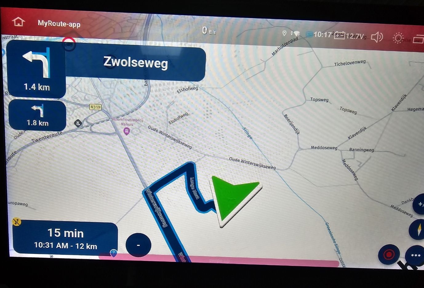
Position indicator ridiculously large on android head unit in camper
-
I am running the navigation app on and Android head unit in my camper (Not android auto, an actual android 13 device). Everything on the map display looks normal, except for the position indicator. It is ridiculously large. I have tried changing the color, but makes no difference. It is terribly confusing because the actual position of the camper is the center of the arrow. The point of the arrow is like 50 meters ahead of my position. When there are many side streets I often misjudge where I need to turn.
Has anyone had this problem and possibly a solution? -
I am running the navigation app on and Android head unit in my camper (Not android auto, an actual android 13 device). Everything on the map display looks normal, except for the position indicator. It is ridiculously large. I have tried changing the color, but makes no difference. It is terribly confusing because the actual position of the camper is the center of the arrow. The point of the arrow is like 50 meters ahead of my position. When there are many side streets I often misjudge where I need to turn.
Has anyone had this problem and possibly a solution?@Afterforever666 Feel free to add a screenshot

When it's about size, we tend to exaggerate! -
@Afterforever666 Feel free to add a screenshot

When it's about size, we tend to exaggerate! -
@Afterforever666 that’s amazing

No clue! You are indeed blessed with a large one -
@Afterforever666 that’s amazing

No clue! You are indeed blessed with a large one -
Just a guess.
Did you fiddle with the size of the text in your headunit or phone? -
Just a guess.
Did you fiddle with the size of the text in your headunit or phone?@M-Schrijver no, I didn't.
-
@Afterforever666 that’s amazing

No clue! You are indeed blessed with a large one@Corjan-Meijerink Just a thought : Chinese android head units are becoming increasingly popular. Witness to that the huge amount of YouTube channels covering this.
I also jumped the bandwagon and wouldn't want to return to A-brand devices anymore or to a dedicated nav-device (I have a garmin camper gathering dust and a zenec too).
Unfortunately, these chinese brands tend to mess a bit with the underlying android to make it automotive suitable and occasionally this results in quirks. Like for example the large position indicator. Must have something to do with the screen dpi I think.
Now as for my thought : if you are not already doing so, perhaps you could do some basic testing on such units. The position indicator scaling mechanism can likely be made smarter so that these units are served better by the app.
I'm by the way quite happy I bought the lifetime gold. I see the potential of this app becoming a reference suite for the purpose of planning and navigation and I especially like the development dynamics. Please do take this as a compliment.


