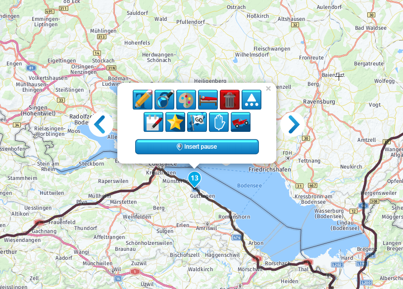
New icons...
-
Guys,
Maybe it is just me...
But I do not like those new icons...
Not clear. Hard to recognize. Too bold...
Maybe this blue pattern or something...Older version was more "obvious"


-
Guys,
Maybe it is just me...
But I do not like those new icons...
Not clear. Hard to recognize. Too bold...
Maybe this blue pattern or something...Older version was more "obvious"


@Spili I have to disagree, I like the new icons, they’re modern and dynamic. You’ll get used to them after a short time.
-
Ik moest er ook even aan wennen. Maar heb ze nu zoveel gebruikt dat ik ze eigenlijk blindelings kan vinden.

Moet je eerlijk bekennen dat ik ook niet meer zou weten hoe de oude er uit zien....
Het is dus precies zoals Nick zegt, na een tijdje ben je er aan gewend. -
Ik moest er ook even aan wennen. Maar heb ze nu zoveel gebruikt dat ik ze eigenlijk blindelings kan vinden.

Moet je eerlijk bekennen dat ik ook niet meer zou weten hoe de oude er uit zien....
Het is dus precies zoals Nick zegt, na een tijdje ben je er aan gewend.@Nick-Carthew @Arno-van-Lochem I sort of have to agree with OP, imho the current icons are too "busy" for my liking. The blue background is a bit too overwhelming. Making the background a bit more opaque/transparency at 40%, would improve readability a lot. Offcourse I can dream the icons and their location so for me it does not matter even if the icons were blacked out haha, but for new users I think the old designs make more sense. In the end an icon should make the message clear at first glance.:-)
I do however give kudos to the development team for taking the effort to better the icons. Definitely no hard feelings or criticism:-).
-
Hi Spili,
These new icons fit perfectly into the new design, which is being worked hard on, see the Roadmap. Of course the house designer reads on the forum and takes the feedback into his designs and where possible he will make adjustments if it fits the overall picture.
-
Hi Spili,
These new icons fit perfectly into the new design, which is being worked hard on, see the Roadmap. Of course the house designer reads on the forum and takes the feedback into his designs and where possible he will make adjustments if it fits the overall picture.
@Hans-van-de-Ven-MRA-Master I am not a graphical designer, my programming skills were honed back in times where a computer delivered "output" under form of "listings" which were endless lengths of paper with a chain of small holes left and right to pull that paper through the printer.
Anything better than that is fine in my book

Bu that aside, i kind of like that those buttons, they have a joly look. I would however love to see the pop up a bit different. When it opens, halve of the buttons are hidden and one needs to pushh the "triangle with three dots" to open it up fully. I would hugely prefer to see all buttons in one go.
-
I have to say I was one of those "sceptical" ones when the update was rolled out and didn't like the icons, but as has been mentioned you adjust to it. I've been using MRA a lot recently and the icons have become embedded and actually now I think are a huge improvement as they stand out and are intuitive. Just give it some time and as humans we will all need a different amount to adjust!
-
@Hans-van-de-Ven-MRA-Master I am not a graphical designer, my programming skills were honed back in times where a computer delivered "output" under form of "listings" which were endless lengths of paper with a chain of small holes left and right to pull that paper through the printer.
Anything better than that is fine in my book

Bu that aside, i kind of like that those buttons, they have a joly look. I would however love to see the pop up a bit different. When it opens, halve of the buttons are hidden and one needs to pushh the "triangle with three dots" to open it up fully. I would hugely prefer to see all buttons in one go.
@Drabslab said in New icons...:
@Hans-van-de-Ven-MRA-Master I am not a graphical designer, my programming skills were honed back in times where a computer delivered "output" under form of "listings" which were endless lengths of paper with a chain of small holes left and right to pull that paper through the printer.
Anything better than that is fine in my book
Bu that aside, i kind of like that those buttons, they have a joly look. I would however love to see the pop up a bit different. When it opens, halve of the buttons are hidden and one needs to pushh the "triangle with three dots" to open it up fully. I would hugely prefer to see all buttons in one go.I will pass it on so that the programmers can look at the device (resolution) in which the scheduler will open whether the icons can be displayed in 1 row or in 2 rows.
-
Guys,
Maybe it is just me...
But I do not like those new icons...
Not clear. Hard to recognize. Too bold...
Maybe this blue pattern or something...Older version was more "obvious"


@Spili Personally i like the new icons very clear and add a bit of fun to your route.
-
I totally agree with you. The older and simpler icons were more obvious. Now they are restless / busy. OK, you will get used to it, but still the older ones were more clear and obvious.
Hello! It looks like you're interested in this conversation, but you don't have an account yet.
Getting fed up of having to scroll through the same posts each visit? When you register for an account, you'll always come back to exactly where you were before, and choose to be notified of new replies (either via email, or push notification). You'll also be able to save bookmarks and upvote posts to show your appreciation to other community members.
With your input, this post could be even better 💗
Register Login