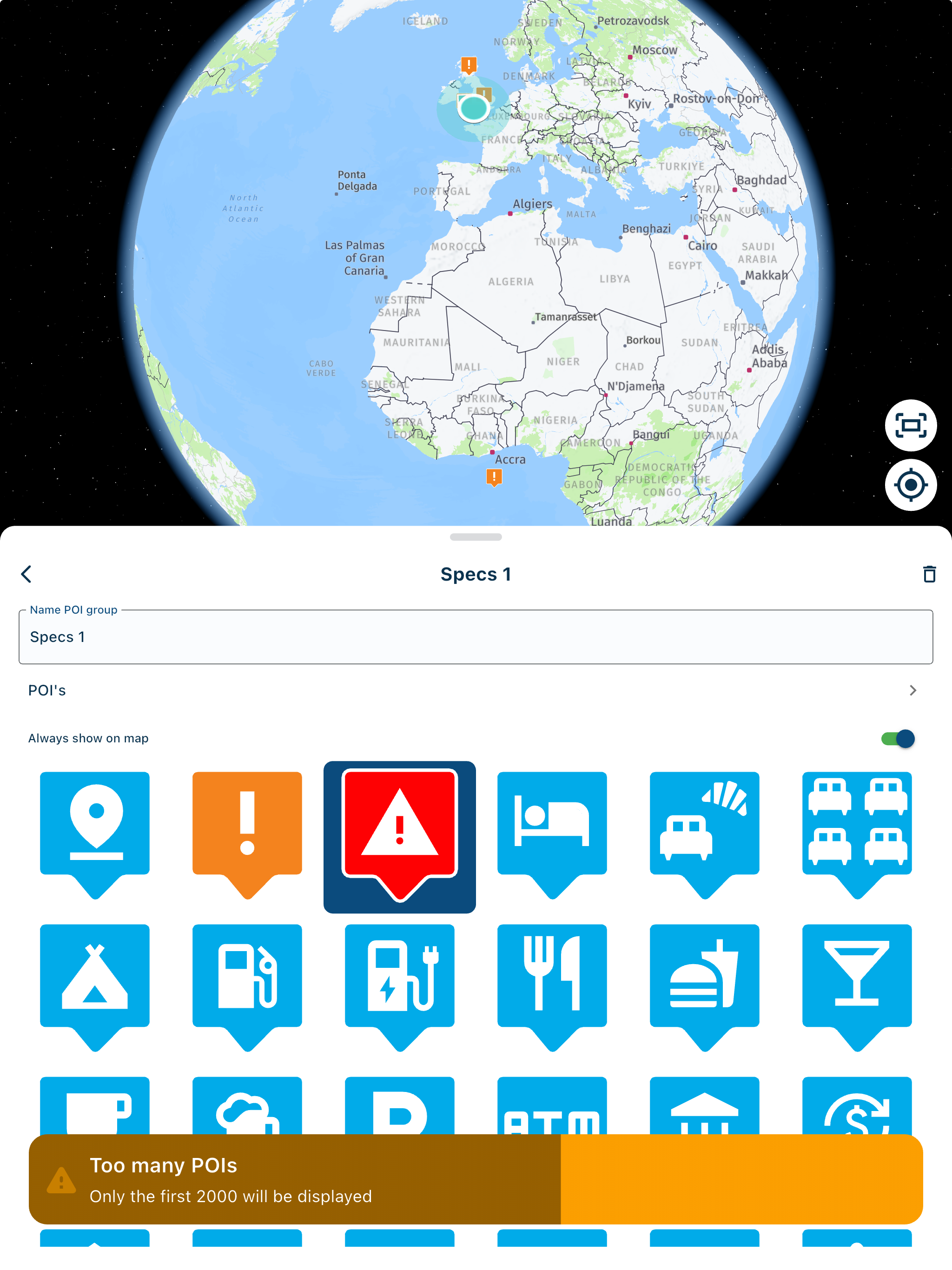
Revert to old icons for way points and waypoint management
-
I agree with drabslab that a wiki detailing the changes with release 1.1 would have been useful, for example a mention to say that Stops would now be called Shaping would have saved some confusion, the 1.1 release was just dropped in without any explanations.
-
I agree with drabslab that a wiki detailing the changes with release 1.1 would have been useful, for example a mention to say that Stops would now be called Shaping would have saved some confusion, the 1.1 release was just dropped in without any explanations.
@speedup100 said: the 1.1 release was just dropped in without any explanations.
True, but it was very welcome nevertheless.
")
Change managment is a subject on its own. Documentation is usually one of the last considerations, and has the habit of becoming outdated very fast.
-
Really great to see new features to expand the usability of the software, however, I'm also a little frustrated at this release as a Garmin user. By default it appears that only the start and finish points are set as "announced way points" and all the in between points are automatically "shaping points". I don't like using "shaping points". I know I can go and change each point to get my desired route all as "announced way points" but this is a real ball ache especially on long routes and time consuming. An option to set the default behaviour of points so we have a choice rather than be forced one way or the other would be preferable.
As a workaround, would I be correct in saying that if I were to just export to GPX1.0 format, all points are automatically "announced way points" as 1.0 doesn't support "shaping points"?
@Will-Brooks said: By default it appears that only the start and finish points are set as "announced way points" and all the in between points are automatically "shaping points".
Please don’t introduce another term for the Stop/Via waypoint argument

-
Have been playing about and to answer my own question it appears that if I save a route as GPX 1.0 then all points in MRA planner default to "announced way points" or via points - whatever terminology you wish to use
")
The Beta GPX 1.1 works well for shaping points on my Garmin XT and behaves as you would expect. The standard GPX 1.1 (Route, track and POI) just draws straight lines, but the old trick of changing the route calculation in the Garmin from fastest to shortest and then back to fastest makes it behave like the Beta GPX 1.1 (One caveat - I've only tried it on a very short simple route with 7 points)
-
I noticed today the the default waypoint icon has changed from a pin to what looks a little bit like a hand. And when you click the way point, the balloon now shows a bunch of redesigned icons which seem to have been lifted straight out of Windows 95 or some other app of that era!
The old icon set was more modern, cleaner, and more useful. Is there a configuration setting to revert to the old icons. If not, can there be please? This update has reduced usability and the visual identify of the app, not improved it.
I completely agree with your feedback, espacially regarding lack of usabiliy of the new icons. This is in particular true for the way point icon: the old icon was easy to place exactly on the road where you want to drive, the new icon is always off the route, so that I always need to move the icon on the road after I have placed it.
My minimum requirement is to be able to configure in my settings if I want to use the old or the new style. The new style is - my personal opinion - not even pretty, but a very rough design.
But most important: Nice looking is not the same as usability! It should be much easier for users to do the most frequent use case which is to plan a route by setting way points where they shall be - not on a minor street next to it!
So strong like for Ben's feedback from my end!
Freddy -
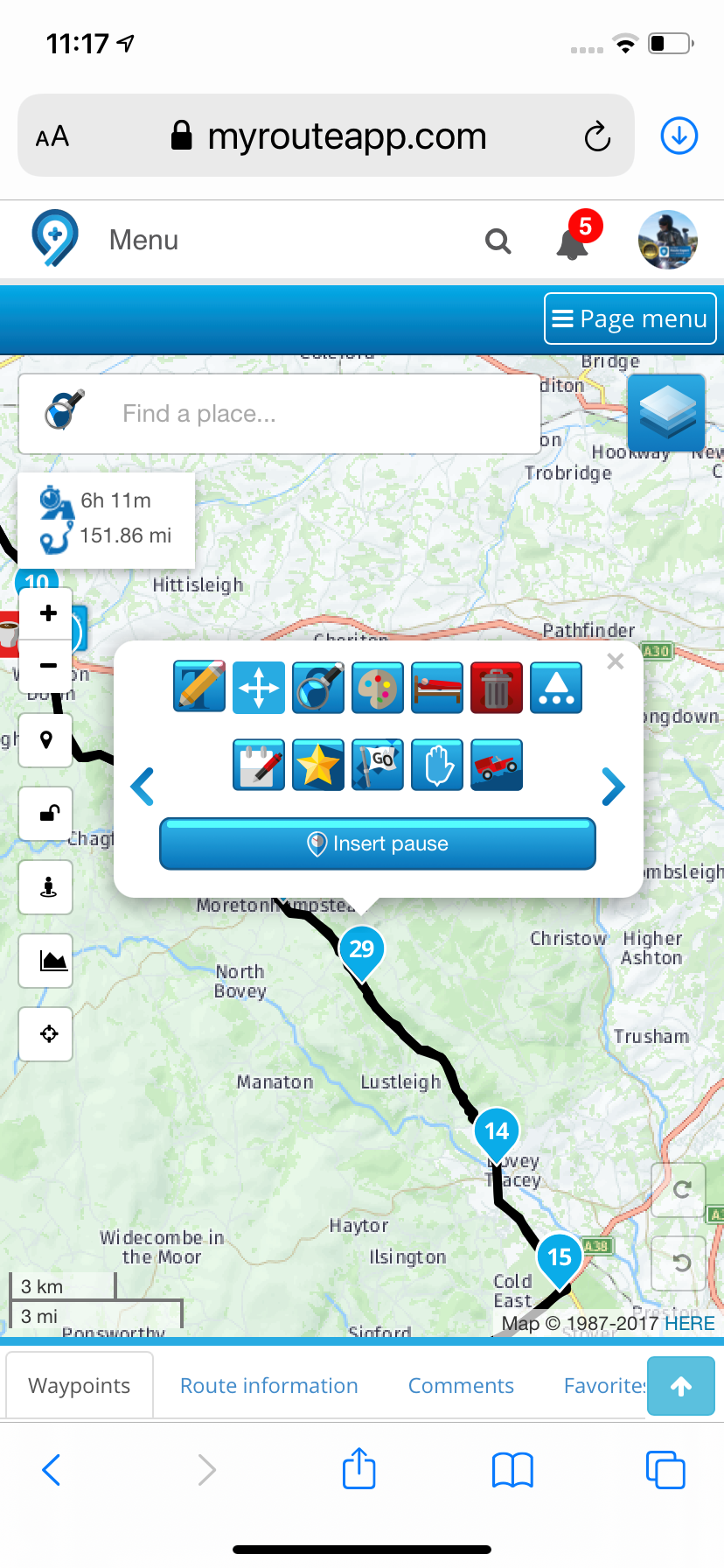
I agree that the waypoint icons are very difficult to locate accurately - the finger used to move them hides them. This is plain daft! Other than that, I’m ok with the icons, apart from the final one on ‘more icons’…
Firstly the icon is obscure - it’s a bit of a stretch to arrive at ‘skip’ from an image of a Land Rover going up a hill!
However, launching us straight back into ‘daft’ territory, is the fact that when the ‘more icons’ icon is selected, the ‘skip’ icon is totally obscured by a black box with the words ‘more icons’ writ large upon it… that only appears after you hit the ‘more icons’ icon!!! THAT is nothing short of pitiful. Thankfully in a laughable kind of way!
-
I agree that the waypoint icons are very difficult to locate accurately - the finger used to move them hides them. This is plain daft! Other than that, I’m ok with the icons, apart from the final one on ‘more icons’…
Firstly the icon is obscure - it’s a bit of a stretch to arrive at ‘skip’ from an image of a Land Rover going up a hill!
However, launching us straight back into ‘daft’ territory, is the fact that when the ‘more icons’ icon is selected, the ‘skip’ icon is totally obscured by a black box with the words ‘more icons’ writ large upon it… that only appears after you hit the ‘more icons’ icon!!! THAT is nothing short of pitiful. Thankfully in a laughable kind of way!
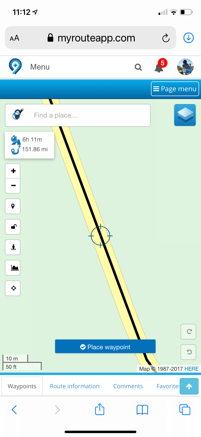
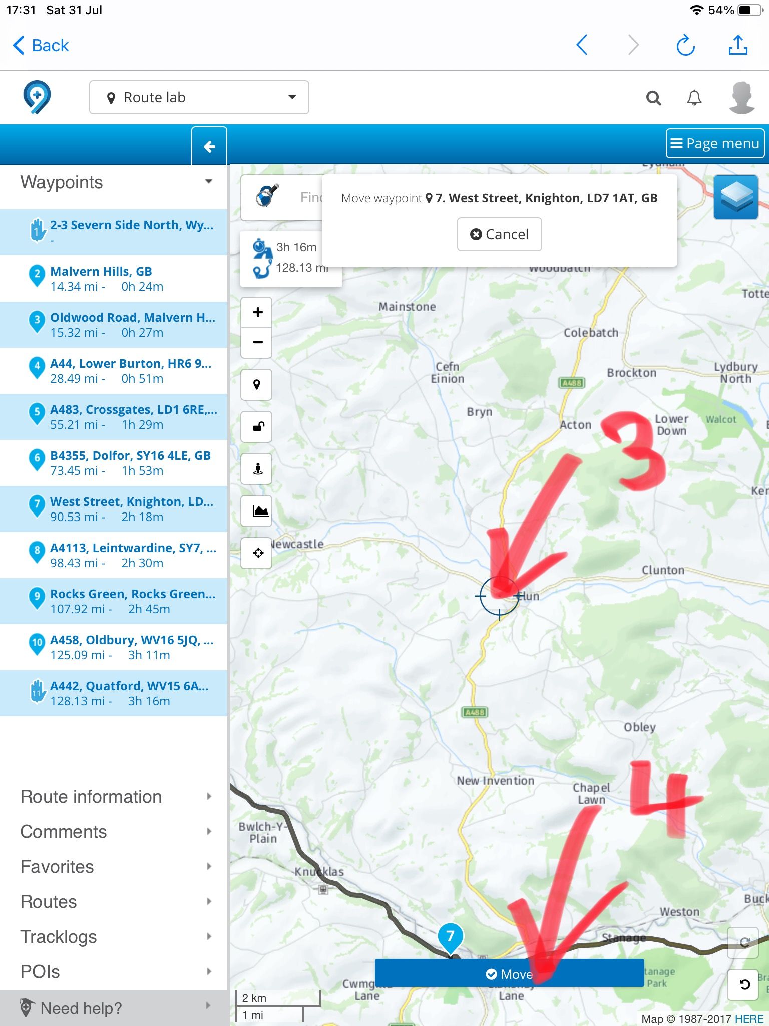
@PAD-0 Turn on “Place Waypoint Button” in the toolkit. This way you have crosshairs to accurately line up the position.
Always willing to help if I can.
Triumph Tiger 1200 XRT called Tina.
MRA Navigation Next and SilverFox BJ8 -
I agree that the waypoint icons are very difficult to locate accurately - the finger used to move them hides them. This is plain daft! Other than that, I’m ok with the icons, apart from the final one on ‘more icons’…
Firstly the icon is obscure - it’s a bit of a stretch to arrive at ‘skip’ from an image of a Land Rover going up a hill!
However, launching us straight back into ‘daft’ territory, is the fact that when the ‘more icons’ icon is selected, the ‘skip’ icon is totally obscured by a black box with the words ‘more icons’ writ large upon it… that only appears after you hit the ‘more icons’ icon!!! THAT is nothing short of pitiful. Thankfully in a laughable kind of way!
@PAD-0 Click on the route point box after clicking more options and the black box disappears.
Always willing to help if I can.
Triumph Tiger 1200 XRT called Tina.
MRA Navigation Next and SilverFox BJ8 -
@PAD-0 Turn on “Place Waypoint Button” in the toolkit. This way you have crosshairs to accurately line up the position.
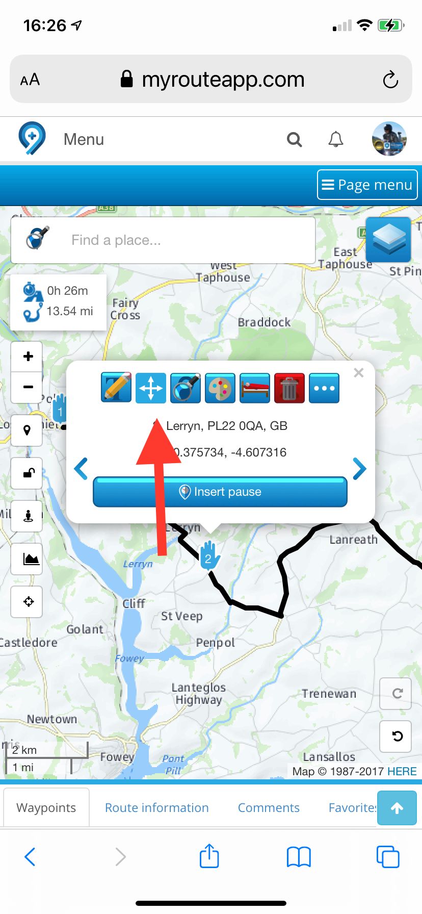
@Nick-Carthew Thank you for your suggestion, but I have that on already - it would be quite challenging to create routes at all without it I think. What I was addressing was the modification of a route by moving existing waypoints. On a PC, using a mouse, this isn’t an issue, but it’s a real pain on touch screens. Clearly, much bigger markers might be undesirable in some circumstances, so that’s probably not an easy fix. A longer ‘tail’ to the waypoint marker might help? Or use of pin or flag icons? Just enough to avoid the ‘business end’ of the icon being obscured. I should, perhaps, add that I don’t have great, fat fingers by any means!
-
@PAD-0 Click on the route point box after clicking more options and the black box disappears.
@Nick-Carthew I do know that, although I find the box needs some coaxing to go away. Question is, why clutter up the app with strings of code, the effect of which are post hoc?
-
@Nick-Carthew Thank you for your suggestion, but I have that on already - it would be quite challenging to create routes at all without it I think. What I was addressing was the modification of a route by moving existing waypoints. On a PC, using a mouse, this isn’t an issue, but it’s a real pain on touch screens. Clearly, much bigger markers might be undesirable in some circumstances, so that’s probably not an easy fix. A longer ‘tail’ to the waypoint marker might help? Or use of pin or flag icons? Just enough to avoid the ‘business end’ of the icon being obscured. I should, perhaps, add that I don’t have great, fat fingers by any means!
@PAD-0 said in Revert to old icons for way points and waypoint management:
What I was addressing was the modification of a route by moving existing waypoints. On a PC, using a mouse, this isn’t an issue, but it’s a real pain on touch screens.
When moving a route point click the arrowed icon to use the crosshairs and add button.
Always willing to help if I can.
Triumph Tiger 1200 XRT called Tina.
MRA Navigation Next and SilverFox BJ8 -
@PAD-0 said in Revert to old icons for way points and waypoint management:
What I was addressing was the modification of a route by moving existing waypoints. On a PC, using a mouse, this isn’t an issue, but it’s a real pain on touch screens.
When moving a route point click the arrowed icon to use the crosshairs and add button.
@Nick-Carthew Ohhhh! Brilliant! Thank you sir!
-
That’s as in:
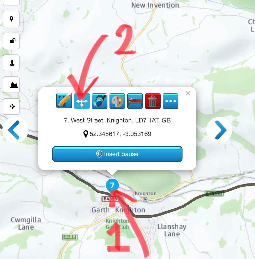
For anyone else who might have missed this.
Not altogether ‘intuitive’ but, once pointed out, it’s something I’ll work with very happily indeed.
My interpretation of the UI was that selecting the move icon rendered the waypoint moveable by ‘picking it up’ and moving/placing it by hand (well, finger!).
Hello! It looks like you're interested in this conversation, but you don't have an account yet.
Getting fed up of having to scroll through the same posts each visit? When you register for an account, you'll always come back to exactly where you were before, and choose to be notified of new replies (either via email, or push notification). You'll also be able to save bookmarks and upvote posts to show your appreciation to other community members.
With your input, this post could be even better 💗
Register Login-
1936.3k
-
0466
-
014215
-
0253
-
17438.7k
-
255613.0k
-
0948
-
04120