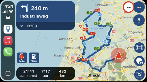
Suggestions for 'Next turn' box
-
Right now, in the current beta, the position update is somewhat delayed, so I'm using the turn information a lot more than normal, and these modifications would greatly help decision-making on the fly.
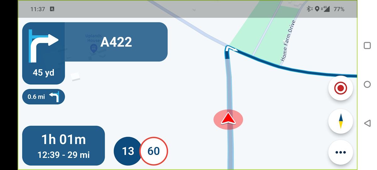
The 'next turn' box - top left - could be improved in two ways (at least on a motorbike), and I think they would be useful in future too, not just with the current beta:Existing layout:
Improved 'next turn' box for a T-junction to the right:
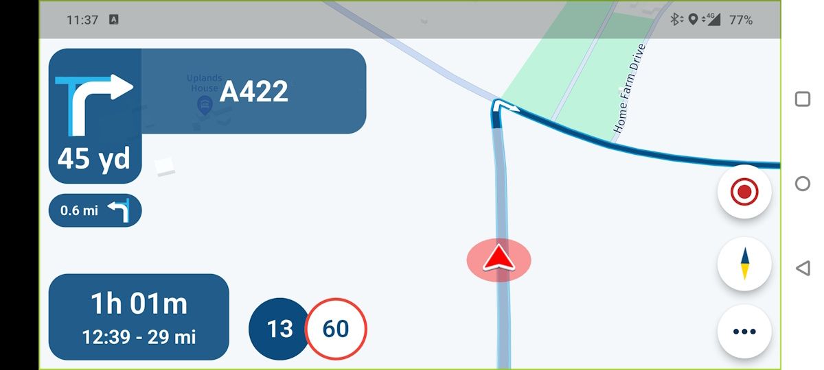
Changes are:
-
The 'next turn' icon should accurately indicate the junction type. Left or right is not always enough in some situations. If you can show the turn type, that's extremely useful extra information when planning ahead - knowing it's a side exit off the current road, rather than a T-junction for example.
-
The font for the distance to the next turn should be as large as the road number & ETA texts.
Rationale:
- on the navigation screen, the 3 most used pieces of information are:
- the current position
- the 'next turn' graphic and
- the 'next turn' box. Right now, it seems a little 'undersold'
If space is tight, what to compromise:
- shrink the 'yd' / 'mi' / 'km' unit information since you can distinguish between those by their shape without needing to accurately read the letters
- shrink the ETA information a little. It probably only gets read every 10-30 minutes, whereas the turn information can be read every 10-30 seconds especially when close to a turn
Apart from that, a successful ride today. Good work on the stability!
-
-
Right now, in the current beta, the position update is somewhat delayed, so I'm using the turn information a lot more than normal, and these modifications would greatly help decision-making on the fly.
The 'next turn' box - top left - could be improved in two ways (at least on a motorbike), and I think they would be useful in future too, not just with the current beta:Existing layout:

Improved 'next turn' box for a T-junction to the right:

Changes are:
-
The 'next turn' icon should accurately indicate the junction type. Left or right is not always enough in some situations. If you can show the turn type, that's extremely useful extra information when planning ahead - knowing it's a side exit off the current road, rather than a T-junction for example.
-
The font for the distance to the next turn should be as large as the road number & ETA texts.
Rationale:
- on the navigation screen, the 3 most used pieces of information are:
- the current position
- the 'next turn' graphic and
- the 'next turn' box. Right now, it seems a little 'undersold'
If space is tight, what to compromise:
- shrink the 'yd' / 'mi' / 'km' unit information since you can distinguish between those by their shape without needing to accurately read the letters
- shrink the ETA information a little. It probably only gets read every 10-30 minutes, whereas the turn information can be read every 10-30 seconds especially when close to a turn
Apart from that, a successful ride today. Good work on the stability!
@richtea999 I needed some time before I was able to respond to this, sorry

Thanks a lot for thinking along with us!Happy to tell you the position delay will be fixed in the update of this week
 You other points of feedback are taken into consideration but not directly implemented.
 -
-
 undefined richtea999 referenced this topic on
Hello! It looks like you're interested in this conversation, but you don't have an account yet.
Getting fed up of having to scroll through the same posts each visit? When you register for an account, you'll always come back to exactly where you were before, and choose to be notified of new replies (either via email, or push notification). You'll also be able to save bookmarks and upvote posts to show your appreciation to other community members.
With your input, this post could be even better 💗
Register Login
