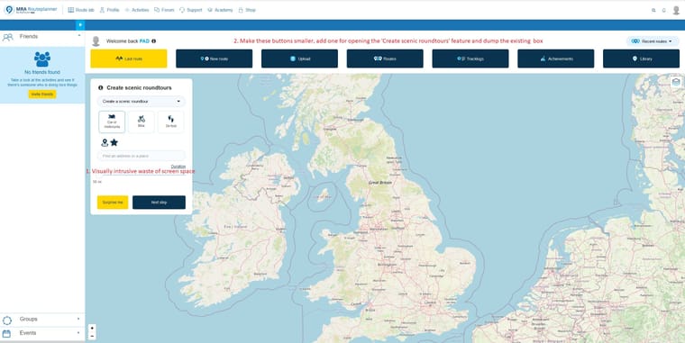
Routeplanner Windows Home Screen
-
Just a suggestion regarding this screen's latest incarnation (click on image for better view):

Cluttered map views are bad map views!
Or, better still, dispense with the map and using the vast majority of the screen pushing a single feature (which I, for one, have absolutely no interest in whatsoever and would never use) and put useful information and links to promote MRA’s diversity instead.
-
I agree. The scenic route option could be integrated with the "New Route" menu. That's basically what you do anyway, when using the scenic route option.
On the other hand, the map you look at at this page is more of a wallpaper without real function. It is not like you are looking at the library map or anything. So yes, the screens is cluttered, but you don't mis any info behind the scenic route window.
@con-hennekens Yes, I concluded that eventually. I very rarely look at Routeplanner on PC so was a little surprised to see that as a home page. But I still think its a waste of space and far, far too focussed on one feature when the page could easily be promoting several features and developments - maybe some of a more technical and creative nature instead of this dumbed down, lazy, ‘community’/social meejah stuff that MRA seem to have become fixated with.
-
@con-hennekens Yes, I concluded that eventually. I very rarely look at Routeplanner on PC so was a little surprised to see that as a home page. But I still think its a waste of space and far, far too focussed on one feature when the page could easily be promoting several features and developments - maybe some of a more technical and creative nature instead of this dumbed down, lazy, ‘community’/social meejah stuff that MRA seem to have become fixated with.
@pad-0 said in Routeplanner Windows Home Screen:
dumbed down, lazy, ‘community’/social meejah stuff that MRA seem to have become fixated with.
Community and Social Media is more like the foundation on which the planner has been built. It was always meant as a platform for easy sharing of routes in the first place.
-
@con-hennekens Yes, I concluded that eventually. I very rarely look at Routeplanner on PC so was a little surprised to see that as a home page. But I still think its a waste of space and far, far too focussed on one feature when the page could easily be promoting several features and developments - maybe some of a more technical and creative nature instead of this dumbed down, lazy, ‘community’/social meejah stuff that MRA seem to have become fixated with.
@pad-0 How is a configurable route-generator a "Community/Social Media" feature? It's not like it's a giant "Share on Facebook" dialog that pops up every time you make a change to a route.
It's probably not going to be a feature I'll use myself, as I too prefer to hand-craft my routes, but neither does it get in the way of how I tend to use the platform. I can see how it might be an attractive feature for newcomers, though. It's a very accessible way for people to get into route planning with MRA that could well attract new customers.
-
@pad-0 How is a configurable route-generator a "Community/Social Media" feature? It's not like it's a giant "Share on Facebook" dialog that pops up every time you make a change to a route.
It's probably not going to be a feature I'll use myself, as I too prefer to hand-craft my routes, but neither does it get in the way of how I tend to use the platform. I can see how it might be an attractive feature for newcomers, though. It's a very accessible way for people to get into route planning with MRA that could well attract new customers.
@herko-ter-horst I think it has a community basis in that it’s a source that can be accessed widely and is, thus a shared resource. I think of it as dumbed down, but not ‘social media’ per se. Though it does sit close to it in my view. My previous comment was a general one about the direction MRA has taken. And that’s fine by me once such developments aren’t made to the exclusion of more ‘technical’, creative features and, indeed, to the detriment of support functions. And here I include the Navigation app which, for me at least, is a vital aspect of MRA. No navigation? No good!
-
@pad-0 said in Routeplanner Windows Home Screen:
dumbed down, lazy, ‘community’/social meejah stuff that MRA seem to have become fixated with.
Community and Social Media is more like the foundation on which the planner has been built. It was always meant as a platform for easy sharing of routes in the first place.
@con-hennekens And as I say above, that’s fine by me once it doesn’t compromise other aspects. Which is very much what appears to be the case.
