Suggestion: Change colour and transparency of main route
-
When you plot a route the route line is fixed as black and transparency level. Being able to change the colour and transparency of the route line would be really helpful to suit the different colours used by TomTom, Here and Google maps.
We can change colour and transparency of routes that you add into an existing route using the "Add Route" function in the left hand menu.
-
Hi Will, thanks for this suggestion. I'm adding it to the great list.
-
When you plot a route the route line is fixed as black and transparency level. Being able to change the colour and transparency of the route line would be really helpful to suit the different colours used by TomTom, Here and Google maps.
We can change colour and transparency of routes that you add into an existing route using the "Add Route" function in the left hand menu.
@Will-Brooks You can adjust the transparency using a tool in the toolkit.
-
Is the change of the route colour still not possible ?
-
@sven-v No, not yet but as I answered above, the transparency can be adjusted.
-
@sven-v No, not yet but as I answered above, the transparency can be adjusted.
@nick-carthew will it come anytime soon now? Changing route line color?
-
@nick-carthew will it come anytime soon now? Changing route line color?
@martin-van-der-linden I don’t think so. It isn’t on the current roadmap. https://myrouteapp.ac-page.com/roadmap-main-page
-
@nick-carthew will it come anytime soon now? Changing route line color?
@martin-van-der-linden said in Suggestion: Change colour and transparency of main route:
@nick-carthew will it come anytime soon now? Changing route line color?
I have looked at the route line color on the different maps, and it has good visibility on all maps as it is. Maybe if you explain why this is an urgent matter for you, people would understand the improvement it could bring. For now I don't see the urgency but that can change with a good motivation.
-
@martin-van-der-linden said in Suggestion: Change colour and transparency of main route:
@nick-carthew will it come anytime soon now? Changing route line color?
I have looked at the route line color on the different maps, and it has good visibility on all maps as it is. Maybe if you explain why this is an urgent matter for you, people would understand the improvement it could bring. For now I don't see the urgency but that can change with a good motivation.
@con-hennekens I wouldn’t want to speak for @Martin-van-der-Linden, but for me this goes hand in hand with planning/working with/presenting multiple routes, multi day routes and route segments. For instance, a long group ride route that might deter some, with options to take short cuts to a selection of rendezvous points. It’s all basic BaseCamp stuff really. All routes being visible on the map view when a ‘parent’ folder is selected being another related feature that is missing.
Such things are of vastly greater value and use to me, and I suspect for many others too, than all this press a button, ‘lucky dip’ approach that quickly yields a route of sorts. How do you know it’s a good route? What are the criteria used and how do they compare to an individual’s? How well did the originator(s) of such auto-generated routes know the region? I’ve looked at such things from MRA and numerous other sources and they always fall short. There’s no substitute for a bit of effort.
-
@con-hennekens I wouldn’t want to speak for @Martin-van-der-Linden, but for me this goes hand in hand with planning/working with/presenting multiple routes, multi day routes and route segments. For instance, a long group ride route that might deter some, with options to take short cuts to a selection of rendezvous points. It’s all basic BaseCamp stuff really. All routes being visible on the map view when a ‘parent’ folder is selected being another related feature that is missing.
Such things are of vastly greater value and use to me, and I suspect for many others too, than all this press a button, ‘lucky dip’ approach that quickly yields a route of sorts. How do you know it’s a good route? What are the criteria used and how do they compare to an individual’s? How well did the originator(s) of such auto-generated routes know the region? I’ve looked at such things from MRA and numerous other sources and they always fall short. There’s no substitute for a bit of effort.
@pad-0 said in Suggestion: Change colour and transparency of main route:
for me this goes hand in hand with planning/working with/presenting multiple routes, multi day routes and route segments. For instance, a long group ride route that might deter some, with options to take short cuts to a selection of rendezvous points. It’s all basic BaseCamp stuff really. All routes being visible on the map view when a ‘parent’ folder is selected being another related feature that is missing.
Absolutely agree with this - would love these options as well - especially "All routes being visible on the map view when a ‘parent’ folder is selected "
-
@con-hennekens I wouldn’t want to speak for @Martin-van-der-Linden, but for me this goes hand in hand with planning/working with/presenting multiple routes, multi day routes and route segments. For instance, a long group ride route that might deter some, with options to take short cuts to a selection of rendezvous points. It’s all basic BaseCamp stuff really. All routes being visible on the map view when a ‘parent’ folder is selected being another related feature that is missing.
Such things are of vastly greater value and use to me, and I suspect for many others too, than all this press a button, ‘lucky dip’ approach that quickly yields a route of sorts. How do you know it’s a good route? What are the criteria used and how do they compare to an individual’s? How well did the originator(s) of such auto-generated routes know the region? I’ve looked at such things from MRA and numerous other sources and they always fall short. There’s no substitute for a bit of effort.
@pad-0 said in Suggestion: Change colour and transparency of main route:
For instance, a long group ride route that might deter some, with options to take short cuts to a selection of rendezvous points. It’s all basic BaseCamp stuff really. All routes being visible on the map view when a ‘parent’ folder is selected being another related feature that is missing.
Like I said, urgency can change with good motivation

Especially the "all routes being visible when a parrent folder is selected" would be quite useful, and make coloring the individual routes meaningful.I do have some experience with Basecamp (mostly agonizing...), but from some years ago. I have never seen (or forgotten about) anything like the described feature in Basecamp though.
-
@pad-0 said in Suggestion: Change colour and transparency of main route:
For instance, a long group ride route that might deter some, with options to take short cuts to a selection of rendezvous points. It’s all basic BaseCamp stuff really. All routes being visible on the map view when a ‘parent’ folder is selected being another related feature that is missing.
Like I said, urgency can change with good motivation

Especially the "all routes being visible when a parrent folder is selected" would be quite useful, and make coloring the individual routes meaningful.I do have some experience with Basecamp (mostly agonizing...), but from some years ago. I have never seen (or forgotten about) anything like the described feature in Basecamp though.
@con-hennekens said in Suggestion: Change colour and transparency of main route:
I do have some experience with Basecamp (mostly agonizing...), but from some years ago. I have never seen (or forgotten about) anything like the described feature in Basecamp though.
Do you mean like this.
Screenshot from Basecamp. Life Wales routes in one folder with different colors.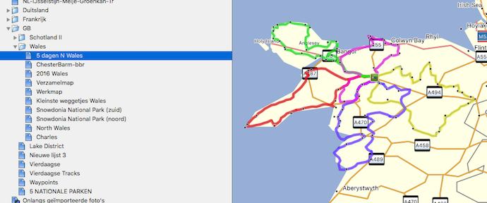
-
@pad-0 said in Suggestion: Change colour and transparency of main route:
For instance, a long group ride route that might deter some, with options to take short cuts to a selection of rendezvous points. It’s all basic BaseCamp stuff really. All routes being visible on the map view when a ‘parent’ folder is selected being another related feature that is missing.
Like I said, urgency can change with good motivation

Especially the "all routes being visible when a parrent folder is selected" would be quite useful, and make coloring the individual routes meaningful.I do have some experience with Basecamp (mostly agonizing...), but from some years ago. I have never seen (or forgotten about) anything like the described feature in Basecamp though.
@con-hennekens said in Suggestion: Change colour and transparency of main route:
Like I said, urgency can change with good motivation

And if you are a RouteExpert
@jack-van-tilburg said in MRA Navigation and downloaded maps.:
I often read between the lines that requests from RouteExperts are highly valued.
Does that concern the entire group of Experts?you read it right


-
@pad-0 said in Suggestion: Change colour and transparency of main route:
For instance, a long group ride route that might deter some, with options to take short cuts to a selection of rendezvous points. It’s all basic BaseCamp stuff really. All routes being visible on the map view when a ‘parent’ folder is selected being another related feature that is missing.
Like I said, urgency can change with good motivation

Especially the "all routes being visible when a parrent folder is selected" would be quite useful, and make coloring the individual routes meaningful.I do have some experience with Basecamp (mostly agonizing...), but from some years ago. I have never seen (or forgotten about) anything like the described feature in Basecamp though.
@con-hennekens I have always got on fine with BaseCamp, but readily admit that it has a steep learning curve. Probably several! Time and effort invested bring worthwhile rewards in my experience though. But here’s the thing… As I said recently, MRA’s studying and including BaseCamp features but making them more intuitive and accessible has to be a very attractive prospect for generating new subscribers, surely?

-
@con-hennekens I have always got on fine with BaseCamp, but readily admit that it has a steep learning curve. Probably several! Time and effort invested bring worthwhile rewards in my experience though. But here’s the thing… As I said recently, MRA’s studying and including BaseCamp features but making them more intuitive and accessible has to be a very attractive prospect for generating new subscribers, surely?

@pad-0 said in Suggestion: Change colour and transparency of main route:
I have always got on fine with BaseCamp, but readily admit that it has a steep learning curve. Probably several!
I always fell off the learning curve during the winter months. Had to start over watching tuturials over and over again each season
 And that while I am quite handy with lots of other software, being an IT guy... I don't have that problem with MRA.
@pad-0 said in Suggestion: Change colour and transparency of main route:
As I said recently, MRA’s studying and including BaseCamp features but making them more intuitive and accessible has to be a very attractive prospect for generating new subscribers, surely?

I think MRA development is best done by MRA's own vision, but surely they are peeking at others and the community as well. They could probably balance the priorities a bit better indeed.
-
@pad-0 said in Suggestion: Change colour and transparency of main route:
I have always got on fine with BaseCamp, but readily admit that it has a steep learning curve. Probably several!
I always fell off the learning curve during the winter months. Had to start over watching tuturials over and over again each season
 And that while I am quite handy with lots of other software, being an IT guy... I don't have that problem with MRA.
@pad-0 said in Suggestion: Change colour and transparency of main route:
As I said recently, MRA’s studying and including BaseCamp features but making them more intuitive and accessible has to be a very attractive prospect for generating new subscribers, surely?

I think MRA development is best done by MRA's own vision, but surely they are peeking at others and the community as well. They could probably balance the priorities a bit better indeed.
@con-hennekens Sure, BaseCamp is anything but intuitive. At the time I started using it, I rode quite high annual mileage and all year round so no winter layoffs. Now it”s ingrained. Though, even after all this time, I still find and am pointed to new tricks and even features! Routeplanner is streets ahead (sorry, bad pun) in ease of use.
-
Hello everyone,
if the option to change the route colour has lower priority in the feature roadmap - which I completely understand - I would however request that MRA changes the colour of blocked streets:
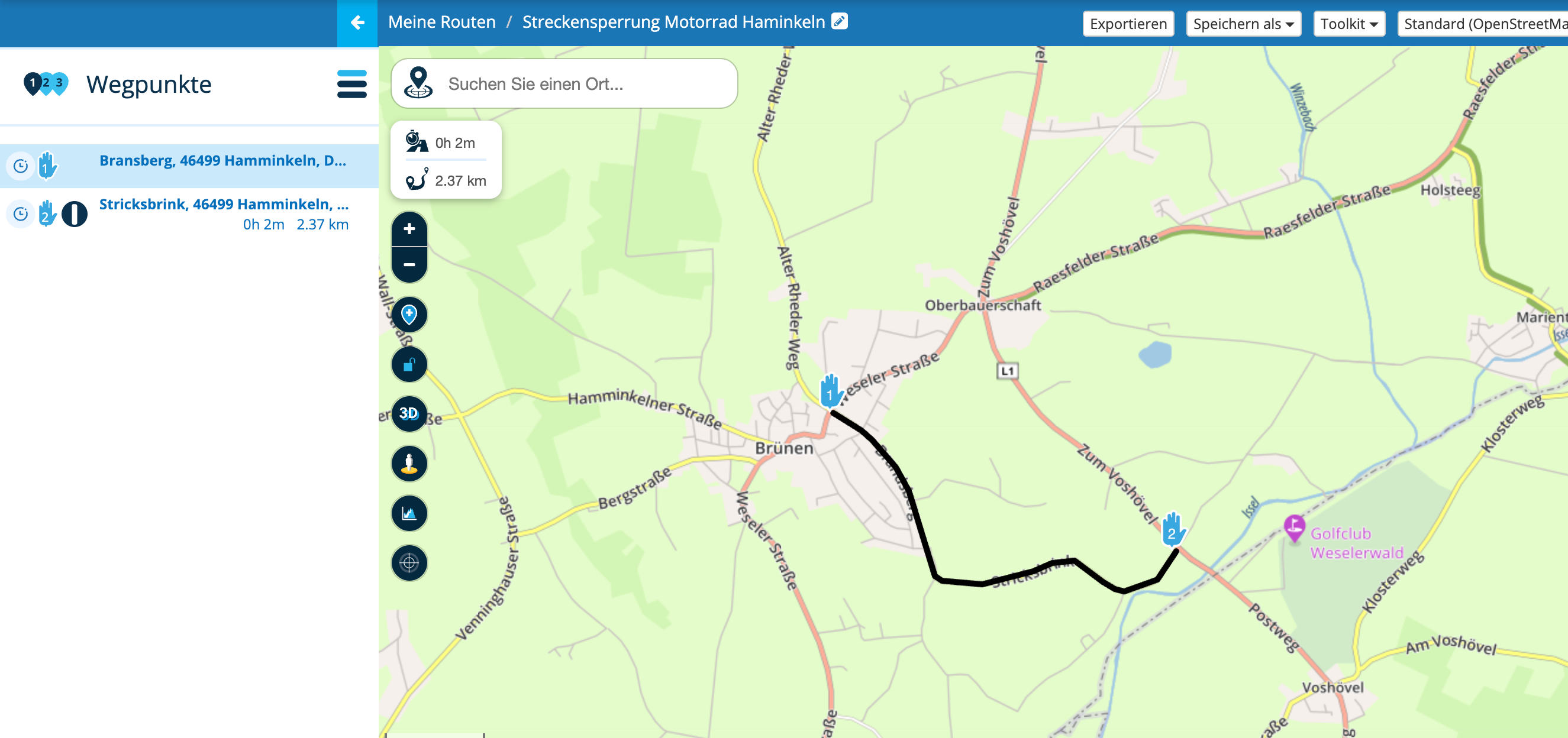
Blocked streets are currently shown in black, i.e. in the same colour like the route (with 0% or 20% transparency). See attached example with the blocked street right to my route.
Like other maps, I suggest that MRA shows blocked streets in red colour and wider than the route line, so that one can see them immediately when planning a route. Currently, I don't see a blocked street on my planned route. So eventually my GPS notifies when I start my ride, which is when I everytime get mad about MRA.
Looking forward to MRA's feedback.
Best regards
Freddy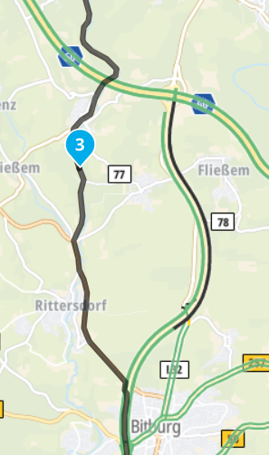
Hello! It looks like you're interested in this conversation, but you don't have an account yet.
Getting fed up of having to scroll through the same posts each visit? When you register for an account, you'll always come back to exactly where you were before, and choose to be notified of new replies (either via email, or push notification). You'll also be able to save bookmarks and upvote posts to show your appreciation to other community members.
With your input, this post could be even better 💗
Register Login
