Car Play - White Washed Map Colours
-
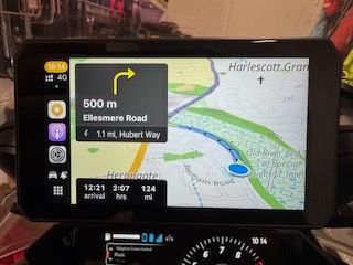
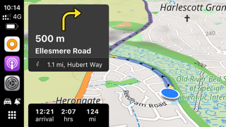
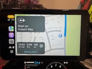
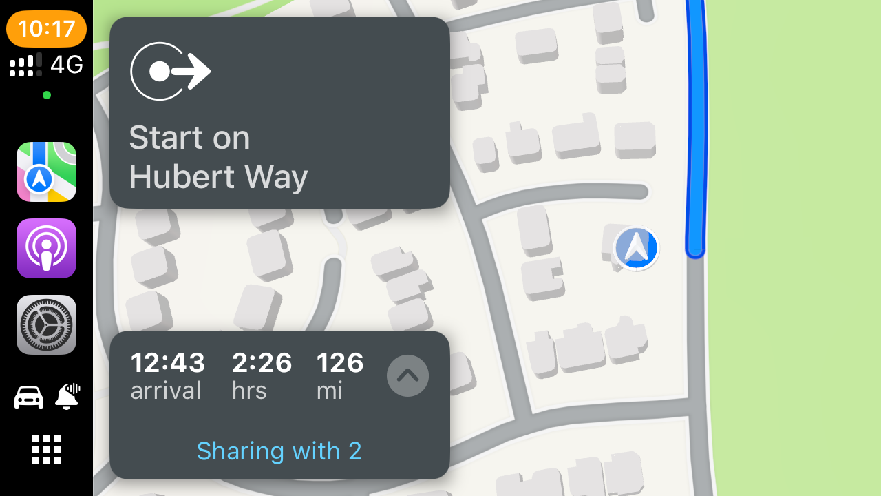
Loving the version 4.3.0 (330) and the new maps that are now available. Whilst these maps look good on the iPhone and CarPlay screenshot, they display as though washed out a bit and need more vibrancy. This is the same for both my car’s CarPlay display and the Chigee AIO-5 Play on my bike.
CarPlay screenshot:
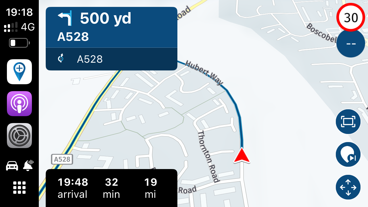
Photo of display:
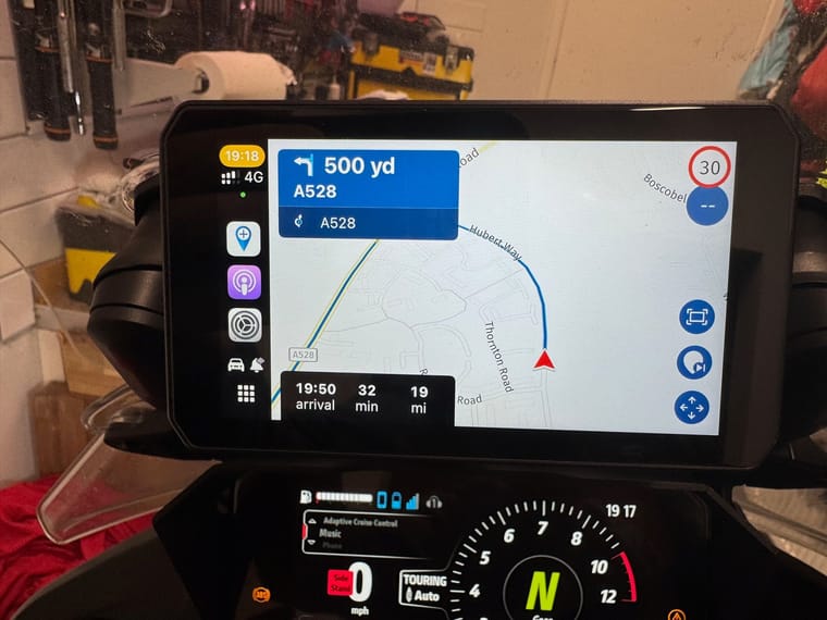
This was the same with the previous build 4.3.0 (328). Is there anything that can be done for improving the colours on the CarPlay displays?
-
Loving the version 4.3.0 (330) and the new maps that are now available. Whilst these maps look good on the iPhone and CarPlay screenshot, they display as though washed out a bit and need more vibrancy. This is the same for both my car’s CarPlay display and the Chigee AIO-5 Play on my bike.
CarPlay screenshot:

Photo of display:

This was the same with the previous build 4.3.0 (328). Is there anything that can be done for improving the colours on the CarPlay displays?
@Dave-J-0 how do other apps look? Seems like the display simply lacks contrast
-
@Dave-J-0 how do other apps look? Seems like the display simply lacks contrast
@Corjan-Meijerink Other apps are fine. This is on both my car’s CarPlay display and the bike one in the picture.
-
@Corjan-Meijerink Other apps are fine. This is on both my car’s CarPlay display and the bike one in the picture.
@Dave-J-0 Can you adjust brightness?
-
@Jörgen I can turn off auto and select the brightness manually. But the other apps are ok and it is the same in my car’s CarPlay. Difficult to see from the picture but the main roads are ok, it is really just the grey with fine black and white back roads. I have tried some of the other maps/colours but, again, it is the minor roads that are difficult to see.
I will have a look at other apps again for comparison.
-
I tried CarPlay yesterday in my SEAT Arona and it is a great improvement in visibility. Can you try another iphone?
-
I feel the same about the colours. I find using MRA over Android Auto from my Samsung to a Chigee AIO-5 is like looking at a thin blue road over a pale grey, featureless desert. It's functional, but switching to something like Tomtom GO shows how exciting the map could look.
However, I did see a thread recently that suggested that some other colour options were in the pipeline so I'm hoping that there will be some alternative looks soon.
@Tim-Watson can you show this with some pictures?
-
I feel the same about the colours. I find using MRA over Android Auto from my Samsung to a Chigee AIO-5 is like looking at a thin blue road over a pale grey, featureless desert. It's functional, but switching to something like Tomtom GO shows how exciting the map could look.
However, I did see a thread recently that suggested that some other colour options were in the pipeline so I'm hoping that there will be some alternative looks soon.
@Tim-Watson these options are the new colour options I am talking about. They are good but I appear to have a problem on the Chigee. Just wondered if others had noticed this with the new colours.
I have also raised a ticket with Chigee as they are still developing their firmware and appear to be responsive to their customers. I will see what comes back from them. As well.
-
@Tim-Watson can you show this with some pictures?
@Jörgen Will do this weekend!
-
I tried CarPlay yesterday in my SEAT Arona and it is a great improvement in visibility. Can you try another iphone?
@Jörgen Unfortunately, I only have the one iPhone. I will do some more testing later with other apps for comparison. With Scenic, I can create a custom colour scheme and the palette I have used there works well.
-
@Tim-Watson these options are the new colour options I am talking about. They are good but I appear to have a problem on the Chigee. Just wondered if others had noticed this with the new colours.
I have also raised a ticket with Chigee as they are still developing their firmware and appear to be responsive to their customers. I will see what comes back from them. As well.
@Dave-J-0 I haven't seen any colour options in the app. Are you on a beta?
In general I find the Chigee display to be bright and colourful. Certainly Tomtom and Waze look great. I just think the default HERE palette is a bit bland. Not MRA's fault.
-
@Dave-J-0 I haven't seen any colour options in the app. Are you on a beta?
In general I find the Chigee display to be bright and colourful. Certainly Tomtom and Waze look great. I just think the default HERE palette is a bit bland. Not MRA's fault.
@Tim-Watson yes, I am a beta tester. Just been providing feedback on the new schemes. They are good and look great on the iPhone but I would personally, like to see more vibrancy but the schemes are a great move forward.
-
@Tim-Watson yes, I am a beta tester. Just been providing feedback on the new schemes. They are good and look great on the iPhone but I would personally, like to see more vibrancy but the schemes are a great move forward.
@Dave-J-0 Ah OK. I'd only seen a couple of screenshots in another thread. It's great that they are close, but a shame you don't find them bold on the Chigee screen. Have you tried some other apps for visual comparison? Tomtom GO, OsmAnd etc? I just found them so much more visually stimulating, but maybe the new palettes will be enough for me.
-
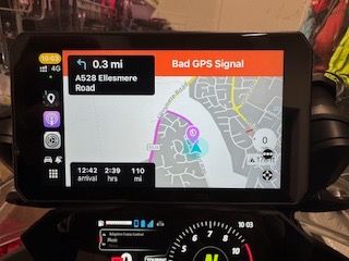
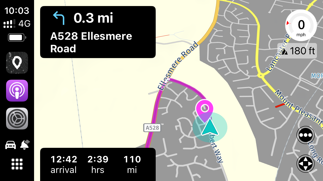
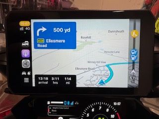
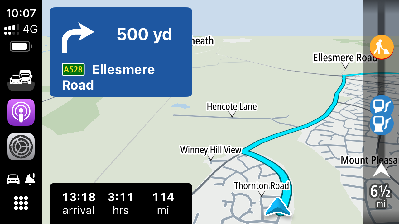
Some App colour comparisons (Bike view and then screenshot from the iPhone):
-
Scenic (custom):
-
TomTom Go:
-
Sygic:
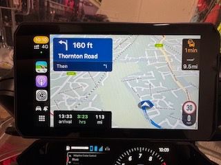
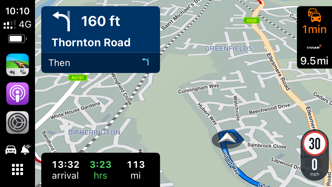
-
Osmand:
-
Google Maps:
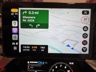
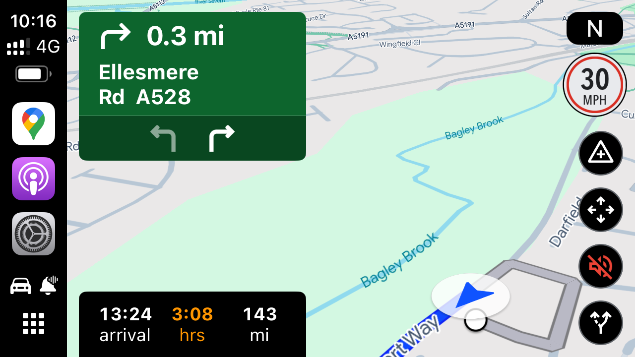
-
Apple Maps
I am no expert but colour is quite key when on the bike. Grey works really well for the minor roads as do bold colours for everything else. Great that we have new options with some customisation but I think the current pallets could do with a vibrancy option for CarPlay/AA.
Just a suggestion/thought. Love what the team are doing.
-
-
@Peter-Schiefer Thanks for your comments but what I am trying to put forward, as you have too, is that we all have different requirements from the MRA app. For me, this will depend, on where I am navigating and what I want to achieve from the route. I frequently travel into Wales from Shropshire and there, I want to see all the minor roads and features because of the road system in Wales and not always wanting to follow the blue line from what I find on route. If I am travelling through a major city, then I am not quite so bothered about the minor roads.
My settings are generally as you have but I could do with a custom option to give me a vibrant picture (like Scenic) or a vibrant Wong for Explore, Topographic and logistics.
Love that we have different maps and the options now being tried. I would just like a vibrant colour map that works well on the iPhone, particularly as the colours on my Pixel 6 Pro screen are far more intense. All screens are different, so it would be great to have that choice.
-
@Peter-Schiefer you have your opinion and I have mine. Neither of us is right or wrong, we just have a difference of opinions. Moreover, what I have always liked about MRA is that they try and cater for all approaches to navigation and how people want to use their systems - unlike Garmin and TomTom!
You appear to have wandered off topic to make some point - I do not know why and I do not need another response stating how and why etc. this thread is purely about colouration.
My request to the MRA Team is that I would really like one of the set of three coloration options to be really bold and contrasting or a custom option. This would cater for a variety of screens/displays that render colours differently.
-
Some App colour comparisons (Bike view and then screenshot from the iPhone):
-
Scenic (custom):


-
TomTom Go:


-
Sygic:


-
Osmand:


-
Google Maps:


-
Apple Maps


I am no expert but colour is quite key when on the bike. Grey works really well for the minor roads as do bold colours for everything else. Great that we have new options with some customisation but I think the current pallets could do with a vibrancy option for CarPlay/AA.
Just a suggestion/thought. Love what the team are doing.
@Dave-J-0 Thanks for the elaborate comparison!

To be honest, I have no clue what could be the cause.
But I'll give it some thoughts! -
-
@Dave-J-0 Thanks for the elaborate comparison!

To be honest, I have no clue what could be the cause.
But I'll give it some thoughts!@Corjan-Meijerink thank you for your reply and for giving the matter some thought. To be honest, I think it is just different displays but CHIGEE did get back to me and the matter is with their technical team for a possible contrast setting downstream. Nonetheless, I think my ask would be for a map colour option that is either customisable (like Scenic) or a more vibrant set of colours with contrast. The Dart setting is a little too similar across the palette although I quite like Wong (except the minor roads).
Great work with this last update though.
-
 undefined Dave J 0 referenced this topic on
