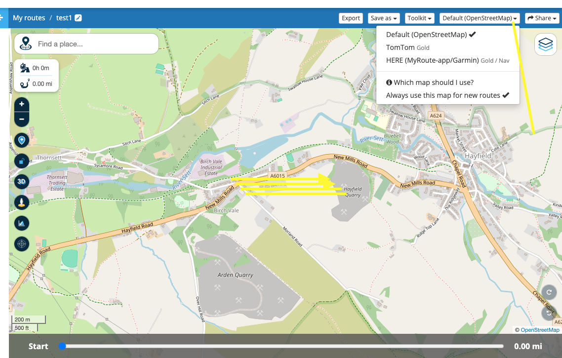
Overlay Maps
-
Suggest being able to set the overlay map, that an individual prefers, be able to be set so that it appears everytime the routeplanner is opened.
Currently, it always defaults to HERE, which provides very little map detail - especially when compared to Google Maps.
-
hi
do you mean when planning a route, or when the web planner opens, or the navigation next app. -
hi
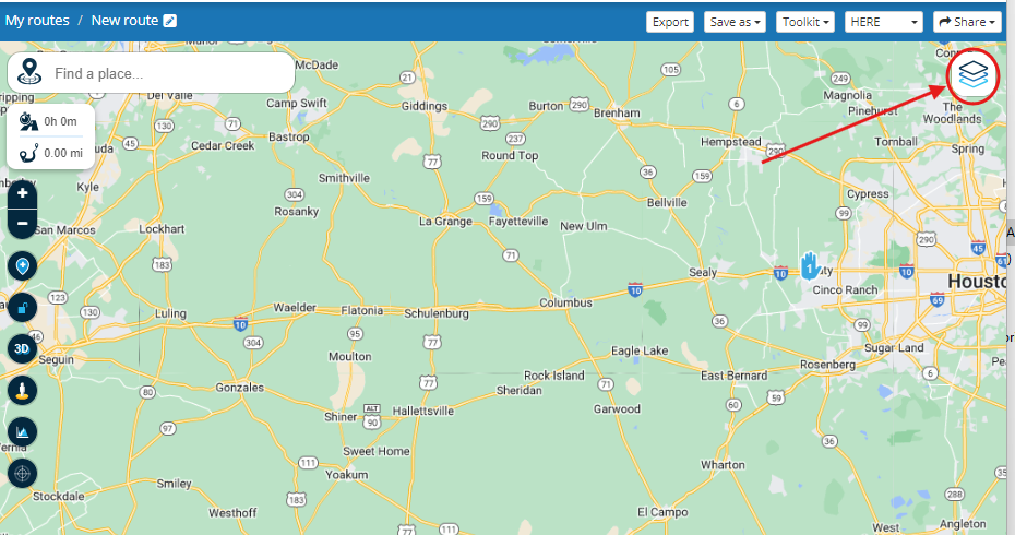
do you mean when planning a route, or when the web planner opens, or the navigation next app.@paul69 when planning a route on the web planner. I use HERE as the planning map, but like to see a more detailed overlay to aid in planning.
-
@paul69 when planning a route on the web planner. I use HERE as the planning map, but like to see a more detailed overlay to aid in planning.

@GT-JWR in the web planner it is not perfectly clear & obvious but
the default Overlay follows the choice of the routing algorithm
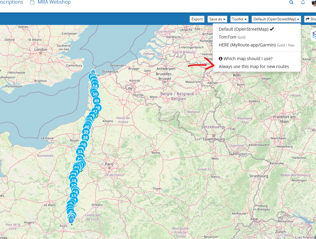
the default is your choice of Here, TomTom or Openstreetmap,
unfortunately you don't have the option to chose the Overlay separately from the routing algorithm -
-
@paul69
sorry ignore the multiple yellow lines in the middle of the screen -
@paul69 right, and I have that set for HERE, simply for ease of planning and with the intention of using the Nav app.
If it's possible, it would be a great enhancement to select the Overlay view of choice and have it default as selected, instead of auto defaulting to HERE.
-
@paul69 right, and I have that set for HERE, simply for ease of planning and with the intention of using the Nav app.
If it's possible, it would be a great enhancement to select the Overlay view of choice and have it default as selected, instead of auto defaulting to HERE.
@GT-JWR said in Overlay Maps:
simply for ease of planning and with the intention of using the Nav app.
hi yes i agree with that, but you can still plan using OSM and use the compare with, in the tools menu.
this is what i do as i have friends who use tomtom, so i also compare with that, and amend the waypoints accordingly -
@paul69 right, and I have that set for HERE, simply for ease of planning and with the intention of using the Nav app.
If it's possible, it would be a great enhancement to select the Overlay view of choice and have it default as selected, instead of auto defaulting to HERE.
Hi @GT-JWR it does not auto default to Here, it defaults to your choice of routing algorithm which kind of makes sense. If your planning a route with a certain routing algorithm you would probably want to be viewing that Overlay
I believe what your asking for is an additionally default for the overlay that would not match the routing algorithm
-
Hi @GT-JWR it does not auto default to Here, it defaults to your choice of routing algorithm which kind of makes sense. If your planning a route with a certain routing algorithm you would probably want to be viewing that Overlay
I believe what your asking for is an additionally default for the overlay that would not match the routing algorithm
@Brian-McG right, and that is my assumption as well. And being MRA is HERE based (and I also have a Garmin ZUMO XT), I mainly plan on the HERE map.
However, in terms of overlay, HERE is terrible - see the comparison by only swithching the overlay. Planning with more detail, I would hope, is much preferred - but, only my opinion.
I realize I can switch algorythm's to plan, then compare to HERE and adjust the route to match - but why go through all the extra steps if the overlay can show the detail.
Using the HERE default planning algorythm and the HERE default in overlay:
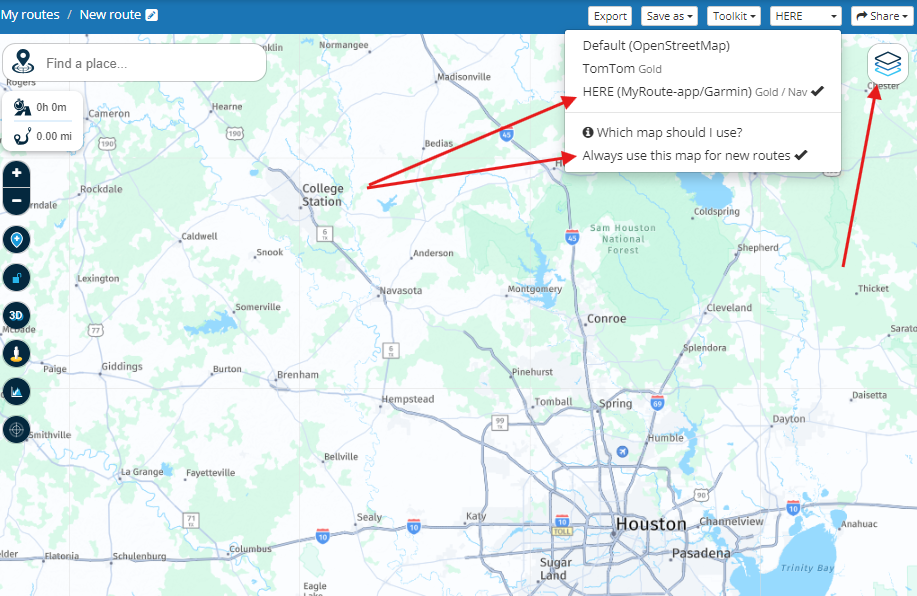
Using HERE default planning algorythm and Google Maps overlay:
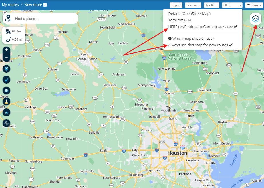
Drastic difference in detail - and it's not even zoomed in!
-
@Brian-McG right, and that is my assumption as well. And being MRA is HERE based (and I also have a Garmin ZUMO XT), I mainly plan on the HERE map.
However, in terms of overlay, HERE is terrible - see the comparison by only swithching the overlay. Planning with more detail, I would hope, is much preferred - but, only my opinion.
I realize I can switch algorythm's to plan, then compare to HERE and adjust the route to match - but why go through all the extra steps if the overlay can show the detail.
Using the HERE default planning algorythm and the HERE default in overlay:

Using HERE default planning algorythm and Google Maps overlay:

Drastic difference in detail - and it's not even zoomed in!
@GT-JWR yes I agree, was just trying to understand & make clear your request
In the web planner the default Here Overlay is very bland, it has very little contrast. The Here Terrain is a bit nicer but cannot be seleceted as default
For planning, like you I switch the Overlay, normally for me it is to OpenstreetMap or Michelin or OpenTopoIn the Navgation app the Here map overlay is terrible, just a washed out white/grey

-
hi @GT-JWR
just for info, whenever i open the web planner, the map always shows the last overlay used, which in my case is Michelin, when planning.
-
hi @GT-JWR
just for info, whenever i open the web planner, the map always shows the last overlay used, which in my case is Michelin, when planning.
@paul69 nice! Now how did you make that happen!!
-
i may have misled you there, i am talking about when i open MRA web site the map shows michelin for me, but if i start to plan a new route, it defaults to OSM and i have to click michelin overlay, sorry my bad.
-
is it just me or has the actual google maps gone a bit wishy washy, similar to here, or am i doing something wrong.
i know this has nothing to do with the OP, only an observation.
how does MRA manage to use the old google map colours.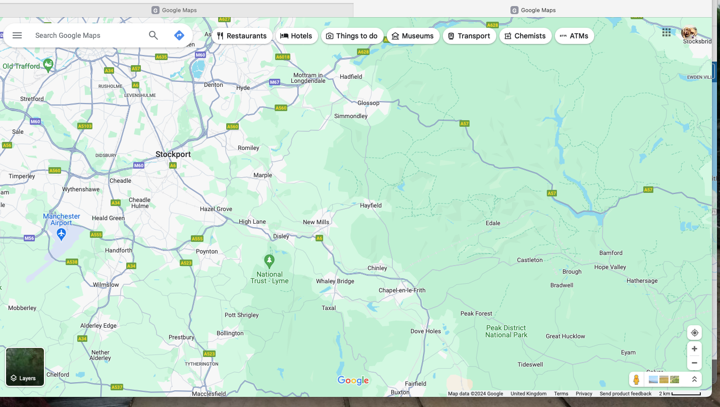
-
is it just me or has the actual google maps gone a bit wishy washy, similar to here, or am i doing something wrong.
i know this has nothing to do with the OP, only an observation.
how does MRA manage to use the old google map colours.
@paul69 yes, I've noticed that on the google maps website. I like the older color scheme myself. In any event, it still has more detail than HERE!
-
@Peter-Schiefer I don't understand the design choices either.
But all map suppliers use a less contrasting colour scheme now.

