Text size indicating waypoint distance
-
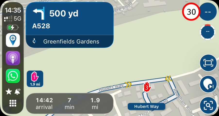
It would be appreciated if the font size of the field indicating the distance to the next waypoint was larger.
It is very difficult to read on the motorcycle in bright sunlight.
Thank you. -
It would be appreciated if the font size of the field indicating the distance to the next waypoint was larger.
It is very difficult to read on the motorcycle in bright sunlight.
Thank you.@Antonio-1k Thanks for sharing!
-
It would be appreciated if the font size of the field indicating the distance to the next waypoint was larger.
It is very difficult to read on the motorcycle in bright sunlight.
Thank you.@Antonio-1k
Agree with Antonio. Maybe also an option to choose bigger numbers for distance or for time left.
Otherwise very happy for Navigation app. Thank you guys! -
@Antonio-1k
Agree with Antonio. Maybe also an option to choose bigger numbers for distance or for time left.
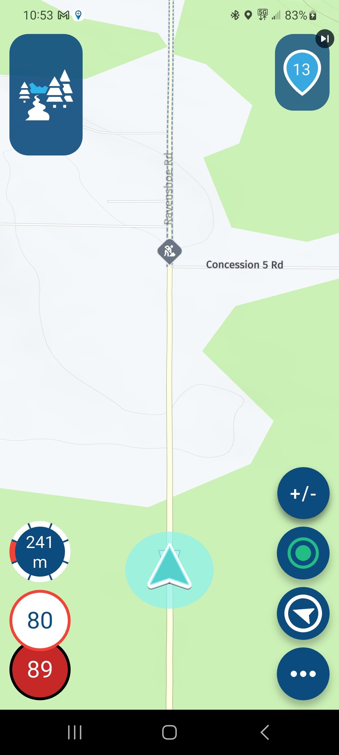
Otherwise very happy for Navigation app. Thank you guys!@Tina-R I know this thread if a few months old, but I'd like to revive it. I just started trialing the app, and straight away my biggest niggle with it is how hard it often is to read the distance numbers. I too would love an option to make them bigger.
--
Jorge -
@Tina-R I know this thread if a few months old, but I'd like to revive it. I just started trialing the app, and straight away my biggest niggle with it is how hard it often is to read the distance numbers. I too would love an option to make them bigger.
@Jorge-del-Valle that is the reason that i use Carpuride with 7“ monitor
https://youtu.be/OneMTh8n_cc?si=TcCqmYl-eYn5iGyZBest Regards - cu on my channel
https://www.youtube.com/@rideonwithfriendsJuergen
-
@Jorge-del-Valle that is the reason that i use Carpuride with 7“ monitor
https://youtu.be/OneMTh8n_cc?si=TcCqmYl-eYn5iGyZ@RideOnWithFriends Thanks, looks like a great device. However I'd suggest to the developers that if people feel like they need to buy a dedicated tablet just to guarantee that the distance text is always legible, perhaps the way they display that distance text needs a rethink.
Hello! It looks like you're interested in this conversation, but you don't have an account yet.
Getting fed up of having to scroll through the same posts each visit? When you register for an account, you'll always come back to exactly where you were before, and choose to be notified of new replies (either via email, or push notification). You'll also be able to save bookmarks and upvote posts to show your appreciation to other community members.
With your input, this post could be even better 💗
Register Login-
028694
-
723216
-
0531
-
04136
-
0372
-
08166
-
0227
-
0268