POI and Favorites should have same workflow in structure
-

I searched, but could not found similar suggestion:
I will not descibe as bug, becuase it works - but it's not working ideal:
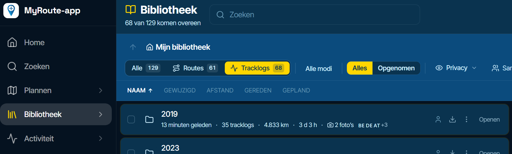
If you enter Library / POIs, then you see a folder / group structure; that's what users expects.
Getting a headline to see clear you are in POI section would be nice.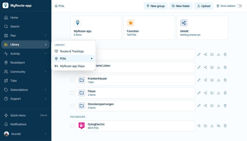
But if you click the Button "Favorites", you will not see the expected entry point with Folder and Group structure, like you just saw for POI. You will see ALL Favorites in a flat structure:
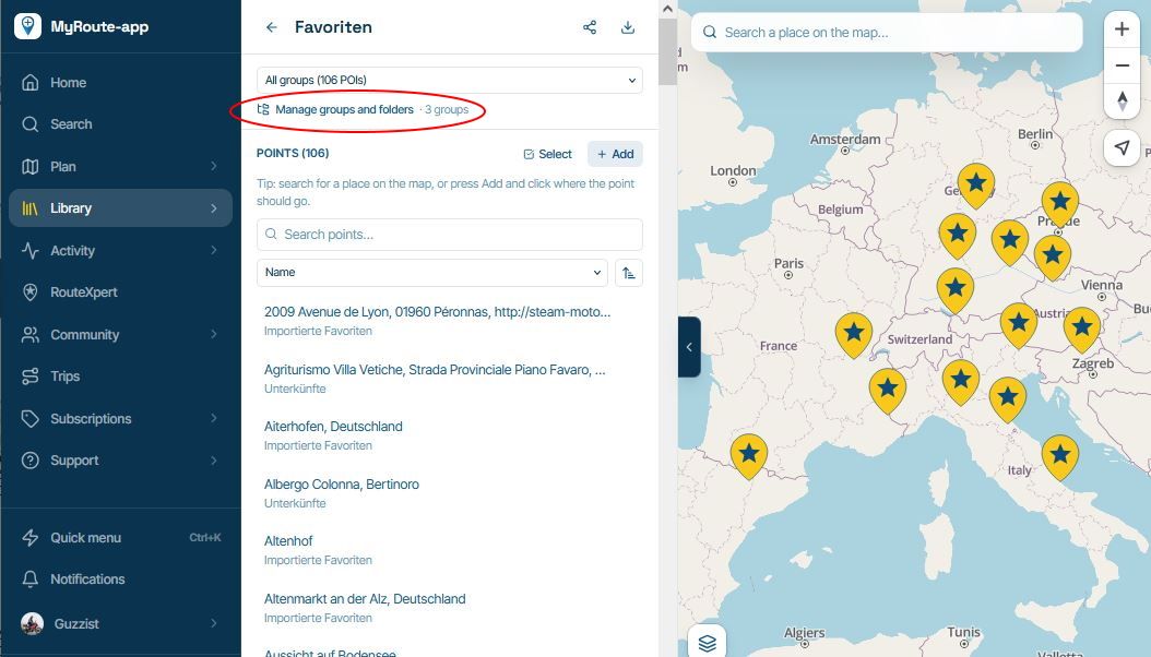
...just there is a link to get the overview with structure of Folders and Groups like you get it for POI.
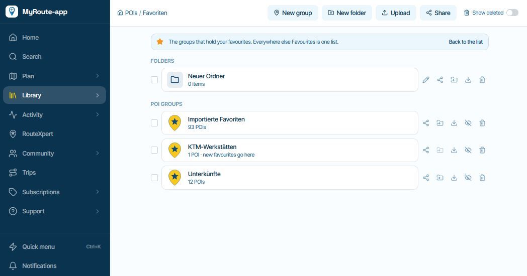
I mean, now in the Beta, usage/possibilities of POIs and Favs are the same. But why handling / editing are different?
Not a big thing, but it would be more intuitive, if both sections have the same workflow, look and feel.And a second thing (I'know, we should make another thread for a second one
 )
If now POI and Fav are nearly the same, the users could think, why then we still have Favorites?
For me, it's easy to differentiate: b.e. a brand selection of Biker-Hotels, I keep as group in POIs. But only a couple of them I do really like, I will keep additionally as Favorites. To finde them in planning or riding is then much more easy.
Hello! It looks like you're interested in this conversation, but you don't have an account yet.
Getting fed up of having to scroll through the same posts each visit? When you register for an account, you'll always come back to exactly where you were before, and choose to be notified of new replies (either via email, or push notification). You'll also be able to save bookmarks and upvote posts to show your appreciation to other community members.
With your input, this post could be even better 💗
Register Login-
 020287
-
 01351
-
 01146
-
 2201.5k
-
0833
-
08117
-
 0729
-
0745