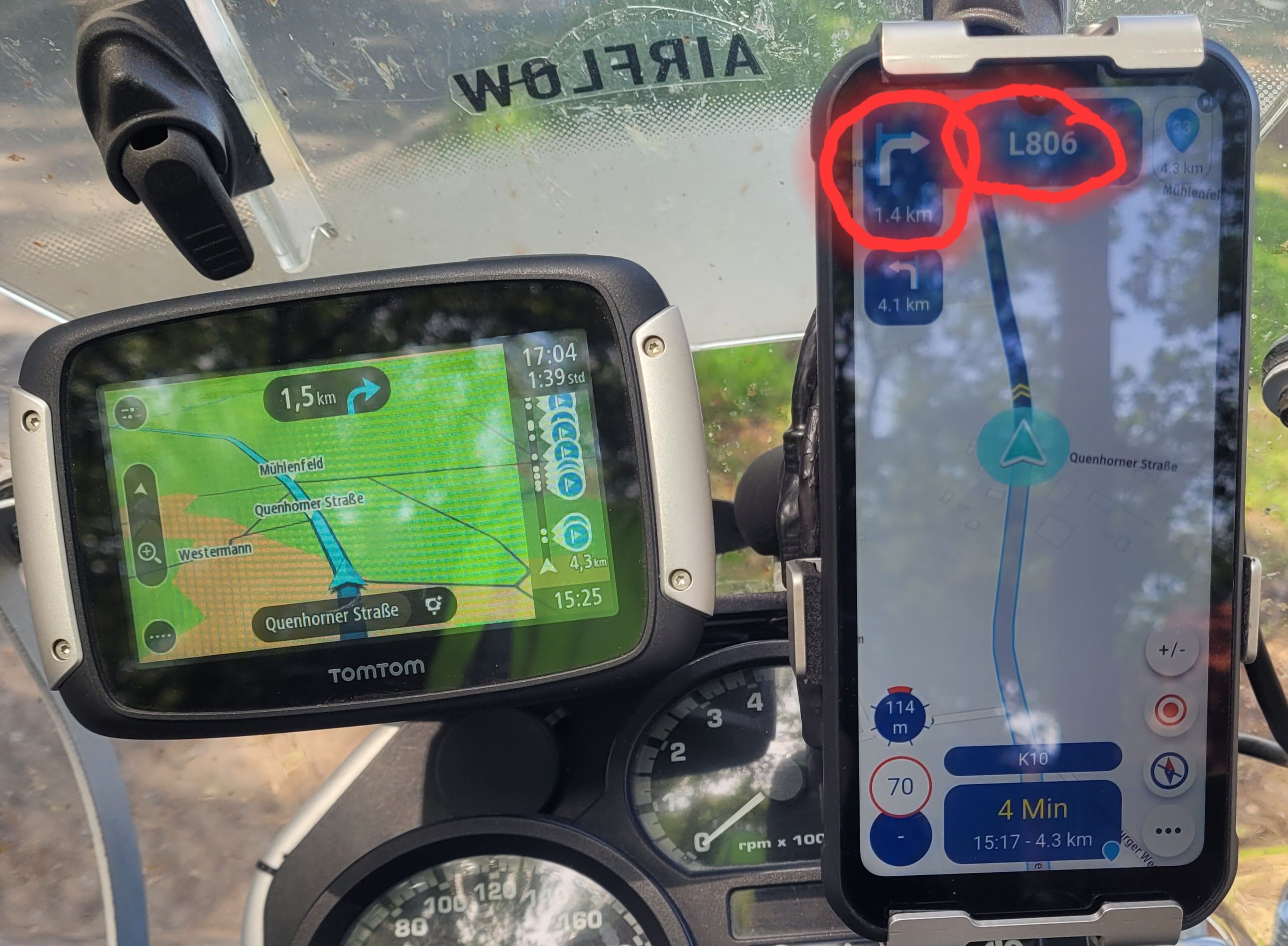
MRA V5.0.3 (449) The contrast is not sufficient
-
-
The contrast is unfortunately chosen...
The small white streets are not really good to spontaneously conquer a beautiful little street unplanned...
Direction stretched by 180"
-
I also would like to add, as in comment #19 from Hubert, that those small white roads are really not very good to see. Maybe a litte bit different color could already help to make them see better.
-
Adding my support to this - the low contrast in the standard maps does make me keep looking at other apps like scenic or OsmAnd
-
Adding my support to this - the low contrast in the standard maps does make me keep looking at other apps like scenic or OsmAnd
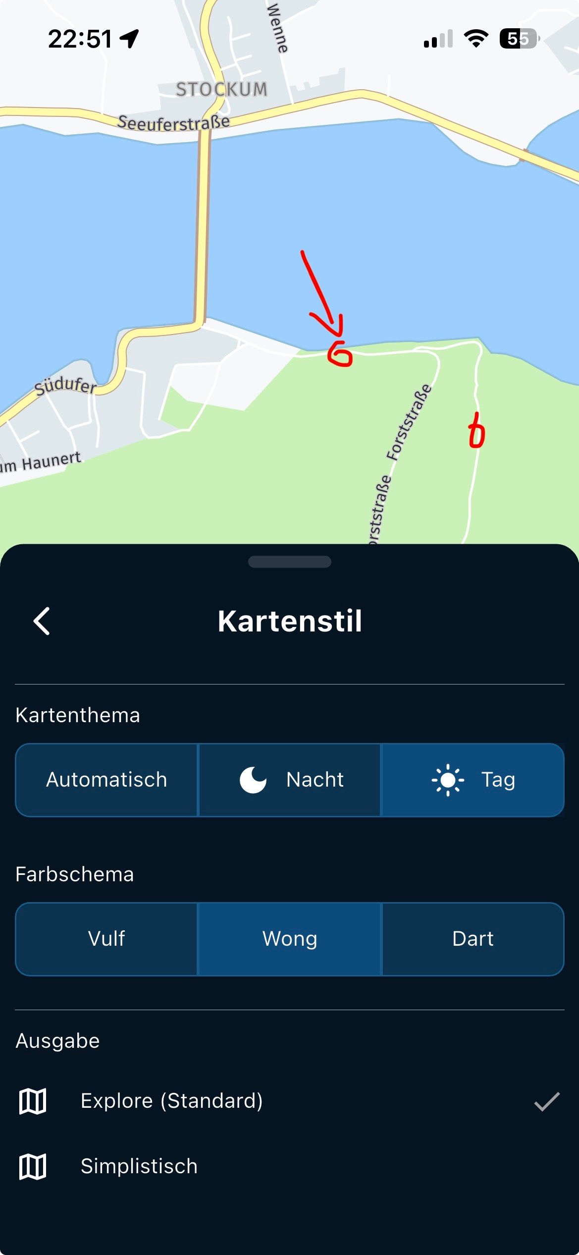
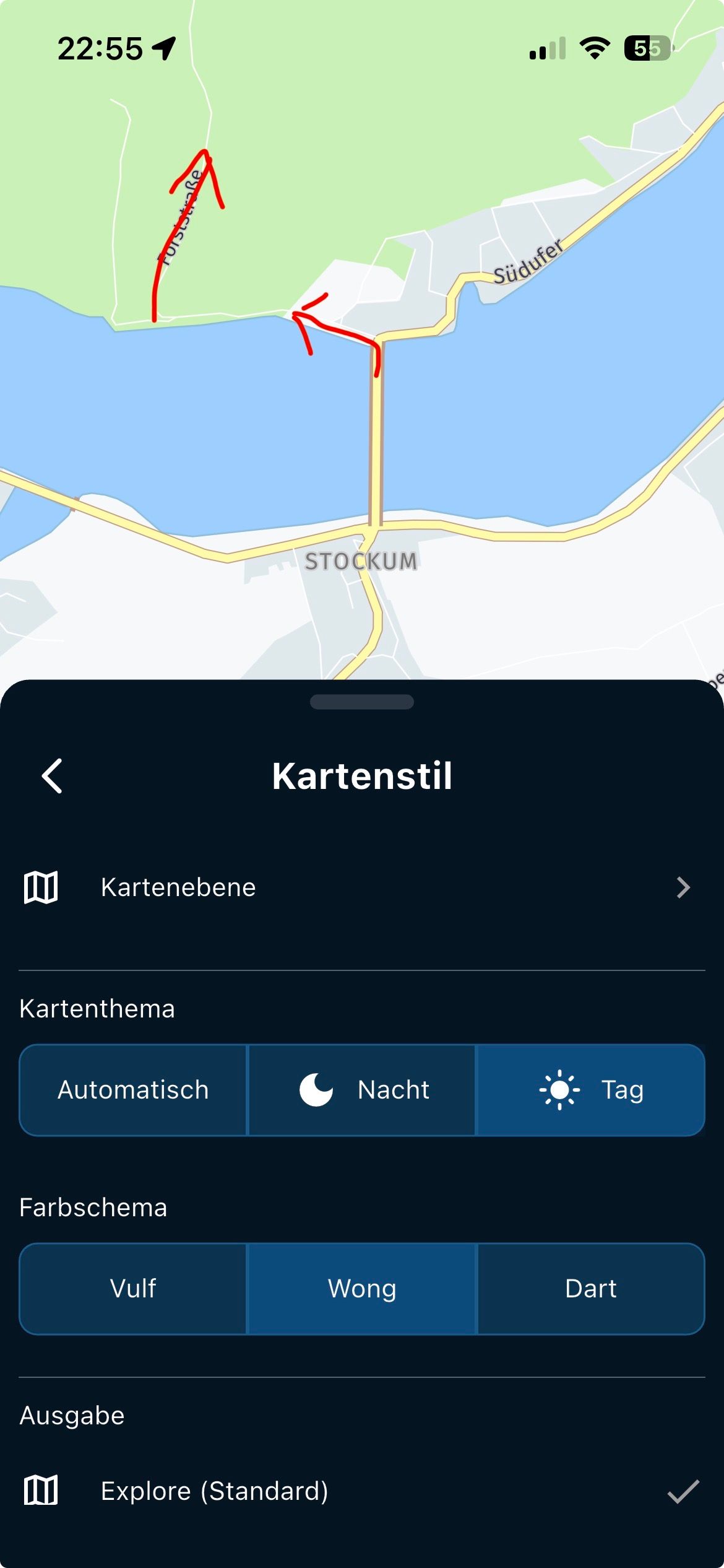
@Steve-2v, Tried the different map-styles yet?
I am just an enthusiastic MRA user, and hope you will be one too!
Most motorcycle problems are caused by the nut that connects the handlebar to the saddle.
Check out RideSleepRepeat.eu, a biker community for sharing stays across Europe
-
@Steve-2v, Tried the different map-styles yet?
@Con-Hennekens : They all behave the same, the matching map with more contrast is missing to be able to see the small streets well ...
-
@Steve-2v, Tried the different map-styles yet?
Yes, tried the different options. Ideally a map style like the DMD2 high contrast would be perfect. The use of light white roads on any of the maps that identify different road classes with colour like Wong for example are just hard to see. If they were grey (no other changes) i think it would solve a lot of the issues.
I’ve ended up using a combo of DMD2 for most of my riding, but still use MRA now when I need traffic info to be factored in.
-
I confirm too - all 3 possible map styles do have too les contrast; the colour are too pastel.
Suggestion for development: a config file like GARMIN has, by which a user can modify all used colours. Easiest way is in that, to alter the colours for street borders to a darker colour. -
While I can agree that the map could use a high contrast and a more topological view, I think having it completely customizable is too much complexity almost no one uses. Also Garmin users seldomly use those features.
-
@Con-Hennekens : To your statement, do you think this will somehow help, ...
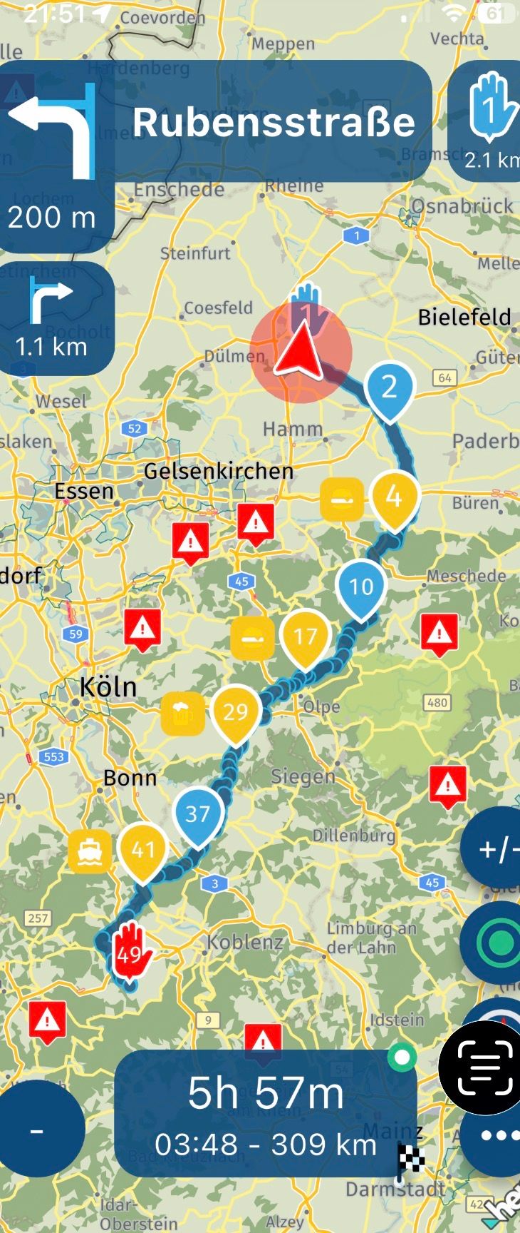
The fact is that the roads without route and sun are not really easy to see on the display, if I stubbornly follow a planned route, it almost doesn't matter what else is shown there .. since the route dominates strongly blue


VG Hubert
Beta Test "Next App" dazu die Hardware .
iPad 9. Gen iOS 26.5 / iPhone 16e iOS 26.5/ Navi iPhone Xr iOS 18.7.9 / PC mit MS Win11 /❗️MyRoute-App im Cradel und Remotek-One❗️ Info zu MRA & Remotek One -
...for example, I can't understand if land areas are in color of grey pattern - why city names are in grey font color too? Why not in black to get more contrast?
-
@Con-Hennekens : To your statement, do you think this will somehow help, ...
The fact is that the roads without route and sun are not really easy to see on the display, if I stubbornly follow a planned route, it almost doesn't matter what else is shown there .. since the route dominates strongly blue
@Hubert-Thoring said in MRA V5.0.3 (449) The contrast is not sufficient:
The fact is that the roads without route and sun are not really easy to see on the display, if I stubbornly follow a planned route, it almost doesn't matter what else is shown there .. since the route dominates strongly blue
I don't agree with that, because you also want to see cross roads!
Hello! It looks like you're interested in this conversation, but you don't have an account yet.
Getting fed up of having to scroll through the same posts each visit? When you register for an account, you'll always come back to exactly where you were before, and choose to be notified of new replies (either via email, or push notification). You'll also be able to save bookmarks and upvote posts to show your appreciation to other community members.
With your input, this post could be even better 💗
Register Login-
0865
-
09173
-
07142
-
0440
-
1424
-
2381.0k
-
0489
-
04109