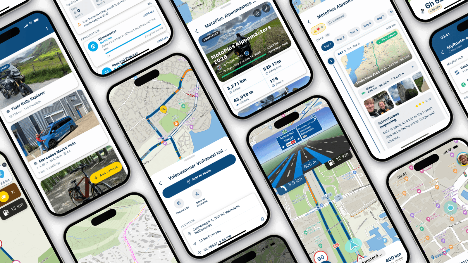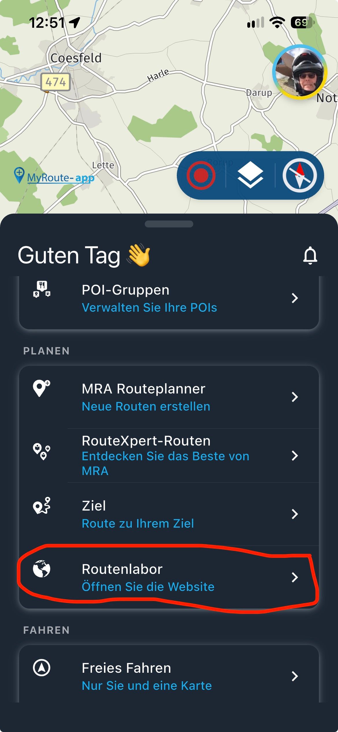
Some minor improvements ;-)
-

Hi,
in keeping with the motto ‘Putting the finishing touches to the diamond.’
(I nicked that from the internet.)I’d like to make a few more minor improvements to the new version 526
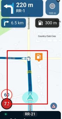
- It is still difficult for me to read the arrival time; the light grey font color does not give enough contrast. It would help if it were a bit brighter or bigger. It doesn’t make any difference whether you use the dark or light version.
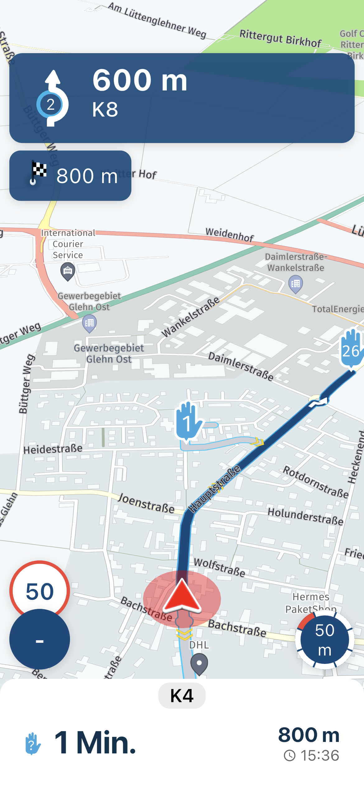
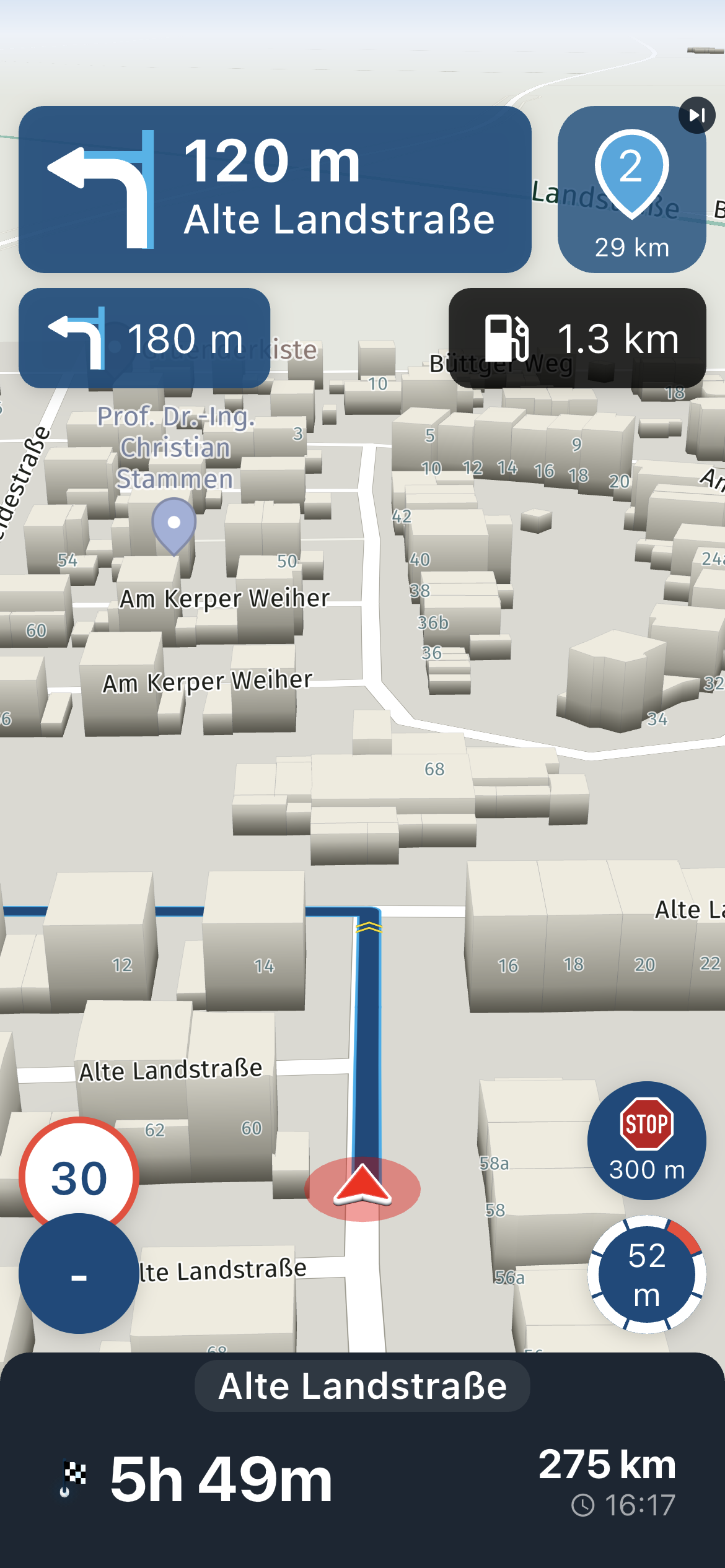
- It is sometimes difficult to open the menu. It is not clear for me when to tap and when to swipe to open the menu. In some modes it is possible to tap on the upper frame, but it is not clear in which area.
In the sample pic there is no tap possible; only a swipe opens the menu.
This request may be down to my age, but I think many users would welcome it.
Is it possible to use swipe and tap always?
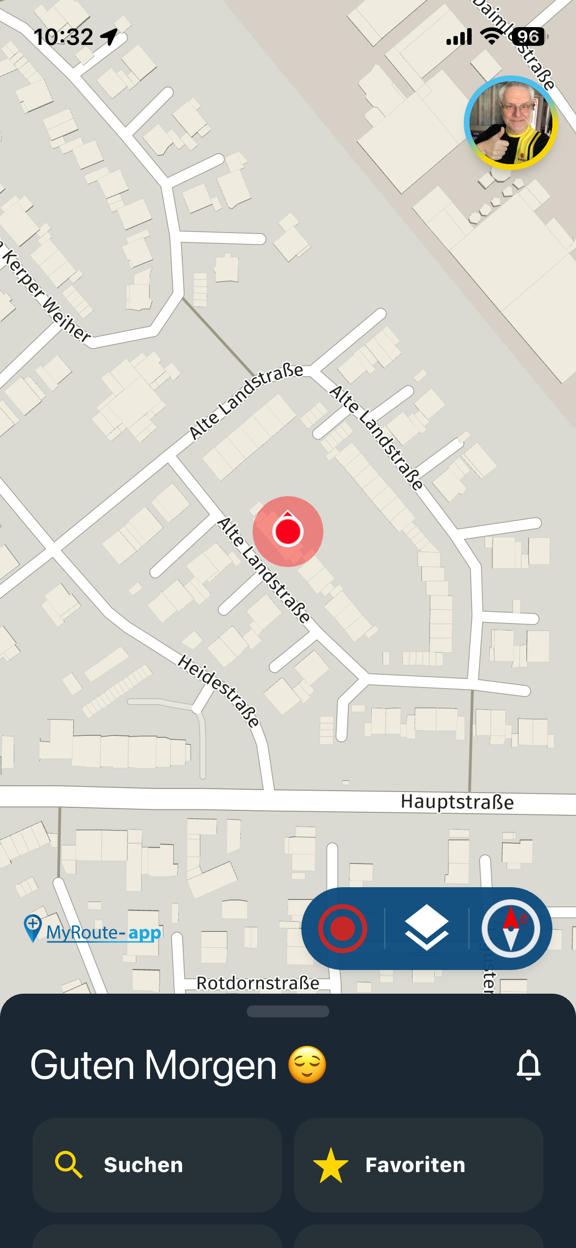
Just a few more bits and pieces.
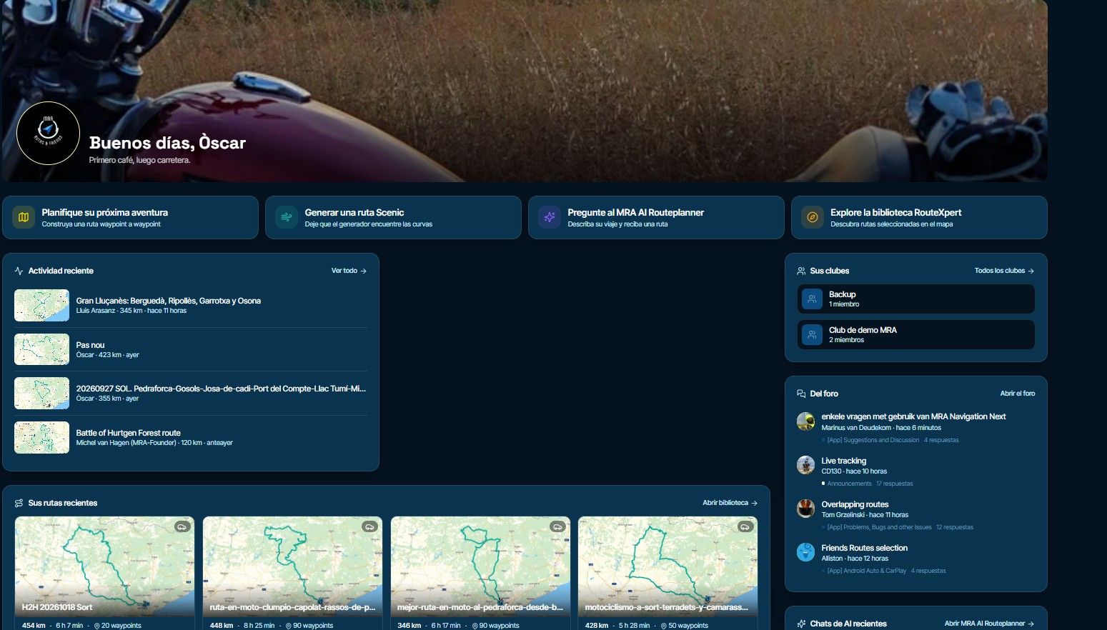
- Here, you’re supposed to select travel mode or a vehicle.
But it also says ‘without a vehicle.'
However, there isn’t a ‘without a vehicle’ option; you can only ever select one.
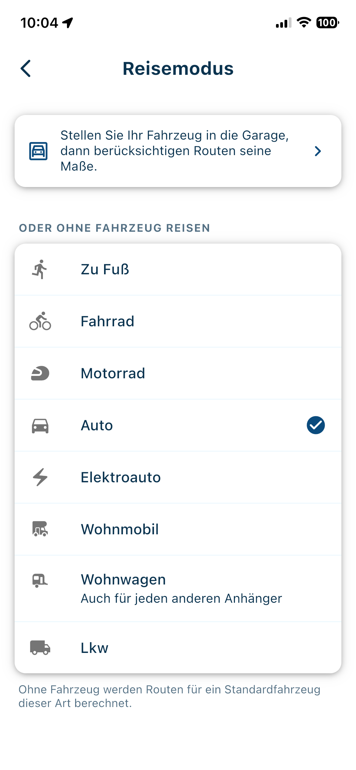
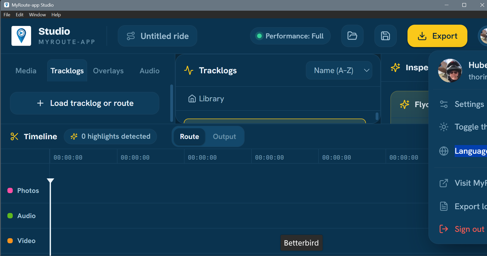
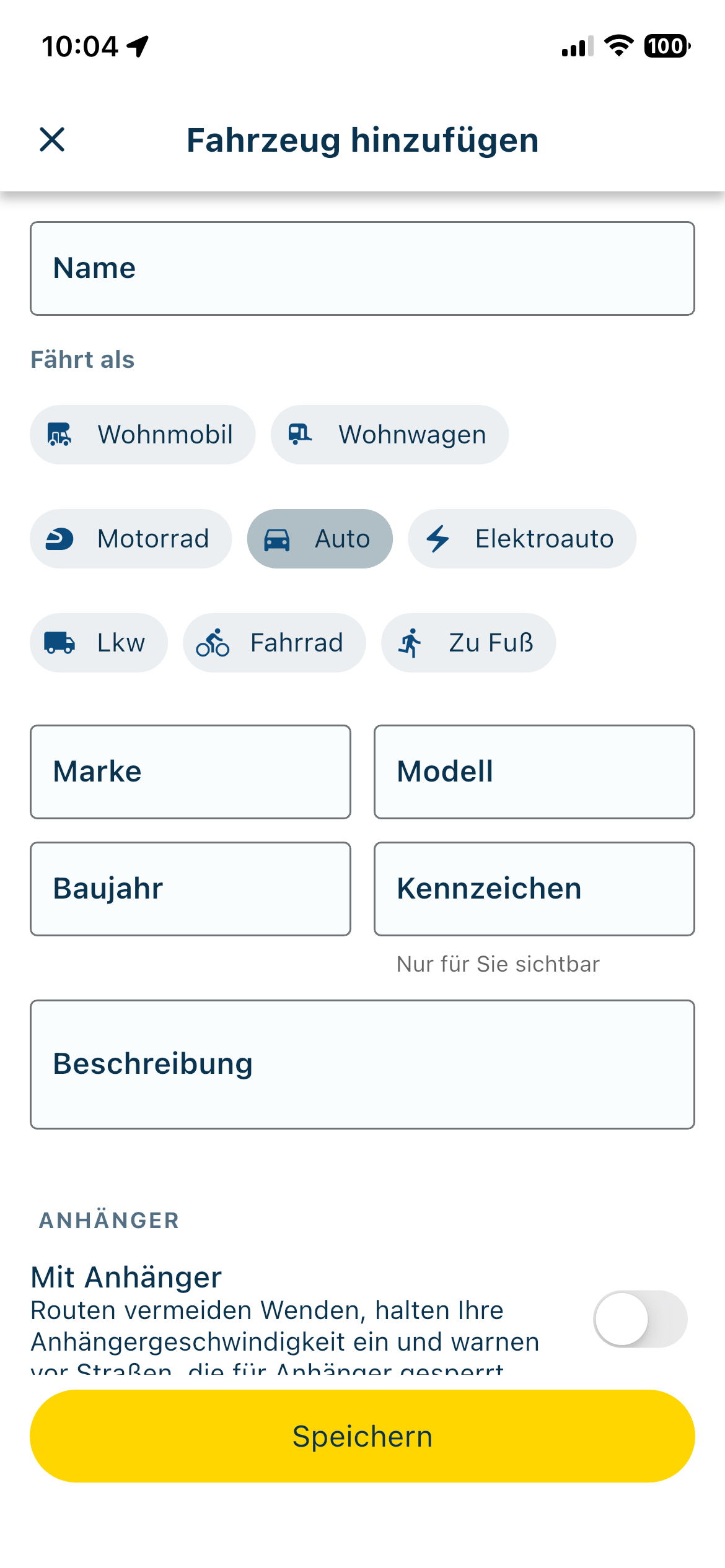
- Here’s another small point that could be translated better into German.
You’re supposed to add a vehicle here and select it using ‘Travels as’. (Fährt als)
That doesn’t sit well with ‘on foot’. (You can not drive on foot)
I’d use ‘Fortbewegung’ in the heading, and then leave out ‘Travels as’.
That would then fit better with car, motorbike, etc. and on foot.
The new version has turned out really well; I found everything straight away, and it’s easier to use.
I’m already looking forward to the next tour. I just hope the Android version doesn’t take too long to come out.
@corjan-meijerink well done.
-

- I agree with you on that. The text is very small.
- I haven’t experienced that myself so far.
- If you don’t have a vehicle in your garage, then you choose a default riding mode.
- No idea

🏍️ Tiger: DMD Nor7e + SilverFox controller
🏍️ Bobber: iPhone 15 Pro + Quad Lock mount
🚗 Car: iPhone 15 Pro with wireless Apple CarPlay -
- I agree with you on that. The text is very small.
- I haven’t experienced that myself so far.
- If you don’t have a vehicle in your garage, then you choose a default riding mode.
- No idea

- I agree with you on that. The text is very small.
No harm in having the same font size and colour as the distance. There seems to be enough space.
-
Regarding 2. I noticed a difference with iOS and Android.

-

Thanks, applied all feedback
Hello! It looks like you're interested in this conversation, but you don't have an account yet.
Getting fed up of having to scroll through the same posts each visit? When you register for an account, you'll always come back to exactly where you were before, and choose to be notified of new replies (either via email, or push notification). You'll also be able to save bookmarks and upvote posts to show your appreciation to other community members.
With your input, this post could be even better 💗
Register Login-
 1318142
-
01123
-
21156
-
 0621
0621
-
0522
-
 8640
8640
-
0457
-
0313