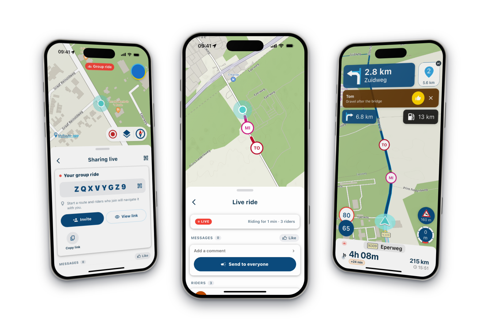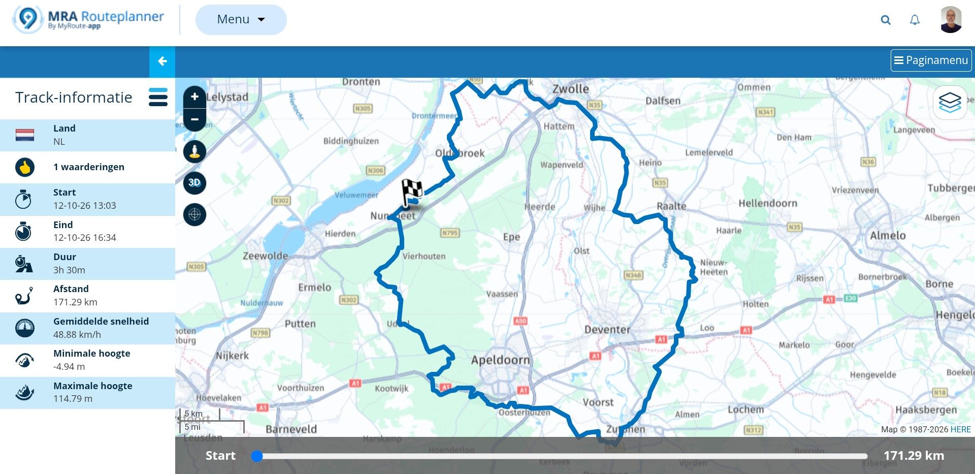
screen
-

Goggle traduction
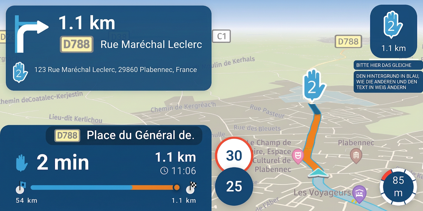
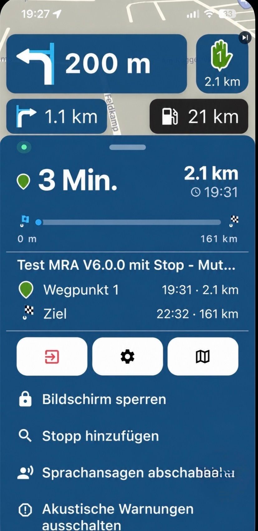
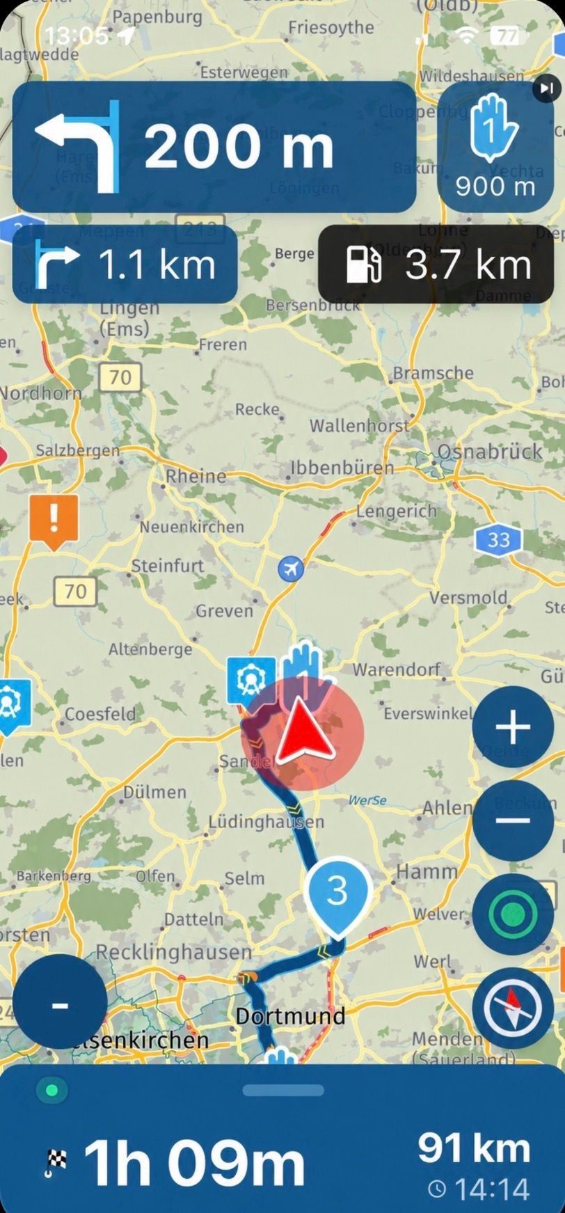
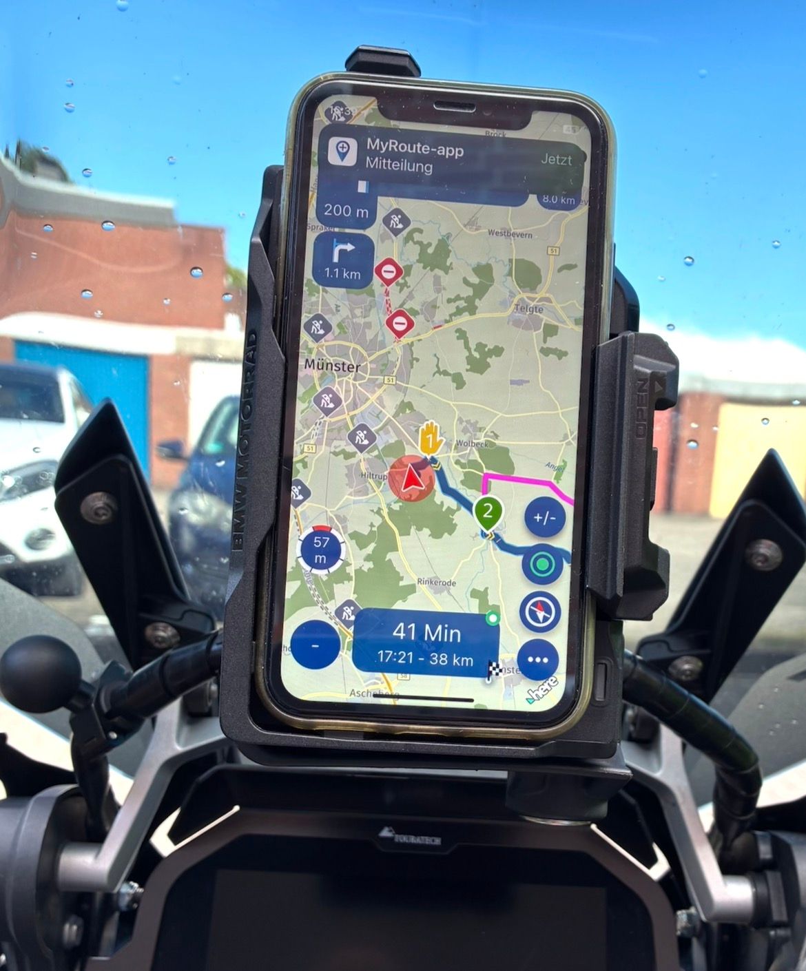
Map visibility on the screen in landscape mode is spoiled by the oversized white box displaying the mileage and the bar graph—which, in my opinion, is of little use.
The white color of this box should be changed to light blue to better match the app's color scheme.
I am experiencing map rotation issues when the vehicle is stationary.![Screenshot_20261013-110447[1].png](/assets/uploads/files/1791889191411-screenshot_20261013-110447-1.png)
![Screenshot_20261013-111032[1].png](/assets/uploads/files/1791889234408-screenshot_20261013-111032-1.png)
![Screenshot_20261013-121634[1].png](/assets/uploads/files/1791889268801-screenshot_20261013-121634-1.png)
-

I agree to change the white boxes to blue.
-
That’s a good suggestion—using blue instead of black! There’s actually already a proposal for that...
When used in a vertical orientation, you can move the menu further down so it no longer gets in the way.
https://forum.myrouteapp.com/post/84130
https://forum.myrouteapp.com/post/84439
-

Just to stop the discussion on blue.
That's not going to happen.
It looks extremely ugly and invasive. -
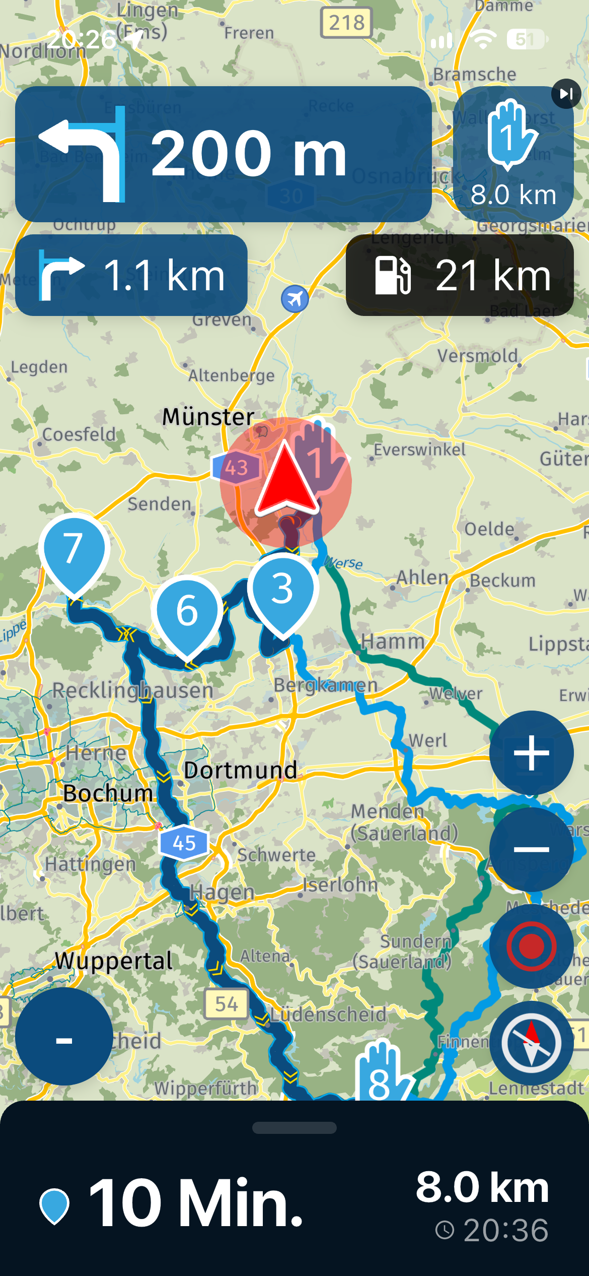
However, the black in dark mode is actually much uglier (sorry); this applies to the standard "Dark" setting on the phone as well as the "Night" theme within the app itself.
Regarding dark mode:
For me, it is the better solution for reading, as it offers higher contrast—something that unfortunately becomes necessary as one gets older (I am 66).
Perhaps there is a way within the MRA app to switch from the phone's black (Dark) mode to a blue setting. That blue is a great color—it looks really cool in the app and provides better contrast.You decide; we’re just passing on one perspective to the fantastic MRA team!!
-
Goggle traduction
Map visibility on the screen in landscape mode is spoiled by the oversized white box displaying the mileage and the bar graph—which, in my opinion, is of little use.
The white color of this box should be changed to light blue to better match the app's color scheme.
I am experiencing map rotation issues when the vehicle is stationary.
the oversized white box displaying the mileage and the bar graph
I am just waiting for the first comment te make it bigger, because they can't read it...

-
Different people have different tastes, and that’s a good thing.

-

Try getting used to the app first instead of immediately suggesting all kinds of GUI changes! Apparently, a certain design approach has been chosen.
The alpha group, which gets to try out the app first, includes all age groups: 20s/30s, 40s/50s, and 60+. I belong to the last category and often get a “boomer comment” thrown at me, even though I don’t even have one of those boomer-style flip cases around my phone!

That said, I can take it perfectly well and am more than capable of firing back with a few comebacks of my own
Personally, I think the entire layout, as it stands now, is a remarkable feat of programming! Could it be improved? Absolutely. Will the team listen to suggestions? You bet!
🏍️ BMW K1600GT-P (2013) | Nolan N100-5 with Sena 30K
📱 iOS on iPhone 13 & 16 (mounted on Quadlock or AliExpress extention on BMW-cradle)
🚙 Apple CarPlay in VW T-Roc
💻 Routelab on MacBook Air & iMac (Golden Gate & Ventura) -
Try getting used to the app first instead of immediately suggesting all kinds of GUI changes! Apparently, a certain design approach has been chosen.
The alpha group, which gets to try out the app first, includes all age groups: 20s/30s, 40s/50s, and 60+. I belong to the last category and often get a “boomer comment” thrown at me, even though I don’t even have one of those boomer-style flip cases around my phone!
That said, I can take it perfectly well and am more than capable of firing back with a few comebacks of my own
Personally, I think the entire layout, as it stands now, is a remarkable feat of programming! Could it be improved? Absolutely. Will the team listen to suggestions? You bet!

30s
Best generation of the Alpha's (duhh)!

That being said, I did have an opinion on the size of the ETA and progress field as I find it too large reducing the nav screen too much.
We discussed about it and understood the considerations by the team, but overall it makes me probably go portrait mode on the bike, as the portrait screen simply shows approximately 10 to 15% (or so) more "usable" nav screen. Imho the landscape view has the position flyer so far off center, it narrows the usable screen down to about 50% of the total screen whereas portrait only has a top and bottom screen part cut off.

Why do I say this here openly you may wonder? That is to emphasize that also us Alpha's have different use cases, opinions and considerations and have no direct influence on the decision making of MRA which may be contrary to common beliefs haha.
-
No matter how the app design is, the app is what we always want to have ..
An ingenious navigation for motorcyclists and much more.
Thank you for that.
-
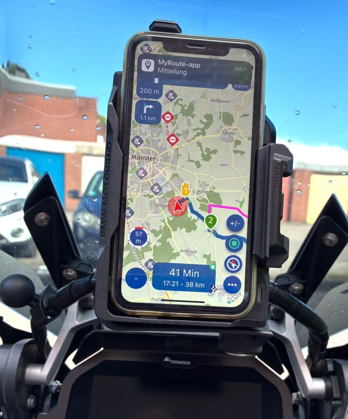
Yes, that's exactly why I converted it to the original GS Navi holder, I could gladly convey it who needs it here.
Adjustable from horizontal easily to vertically ... in 60 seconds.
-
I can admit that I currently changed the size in landscape.
On smaller devices the progress bar is hidden (like on portrait).
On tablets, the progress bar is shown. -
Sorry Sorry Sorry: The MRA blue was and is perfect and wonderful, I miss it in the menu.. we it was back then ..
VG Hubert
Beta Test "Next App" dazu die Hardware .
iPad 9. Gen iOS 27.0.1/ iPhone 16e iOS 27.0.1/ Navi iPhone Xr iOS 18.7.10 / PC mit MS Win11 /❗️MyRoute-App im Cradel und Remotek-One❗️ Info zu MRA & Remotek One -
Sorry Sorry Sorry: The MRA blue was and is perfect and wonderful, I miss it in the menu.. we it was back then ..
@Hubert-Thoring now you really need to stop
Hello! It looks like you're interested in this conversation, but you don't have an account yet.
Getting fed up of having to scroll through the same posts each visit? When you register for an account, you'll always come back to exactly where you were before, and choose to be notified of new replies (either via email, or push notification). You'll also be able to save bookmarks and upvote posts to show your appreciation to other community members.
With your input, this post could be even better 💗
Register Login-
01468
-
 1212179
-
11074
-
 013208
-
 0639
0639
-
16128
-
 15158
15158
-
04145