screen
-
Goggle traduction
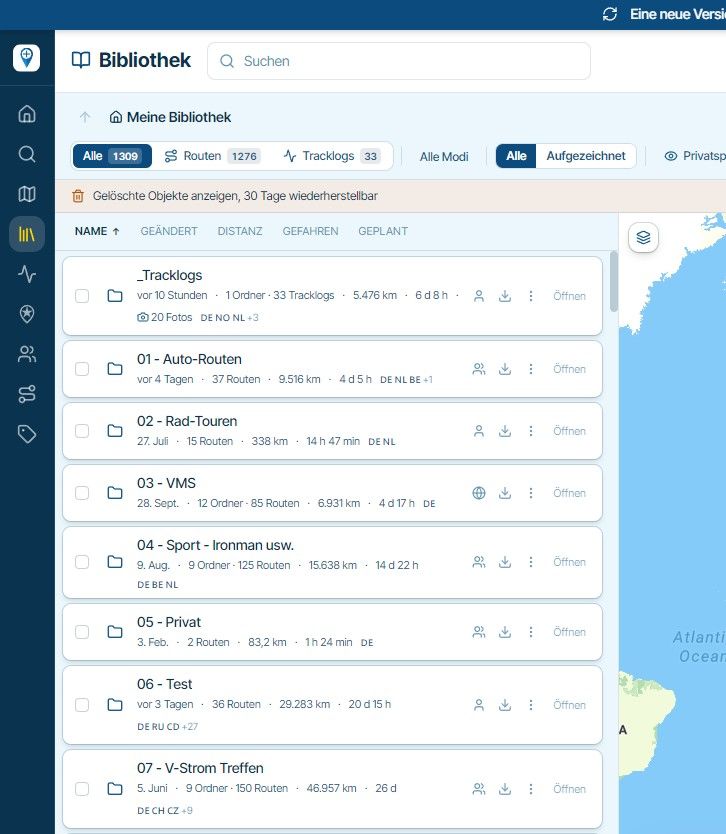
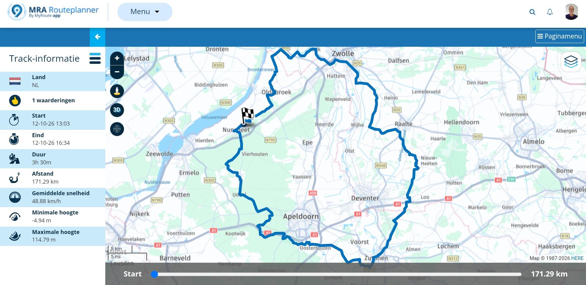
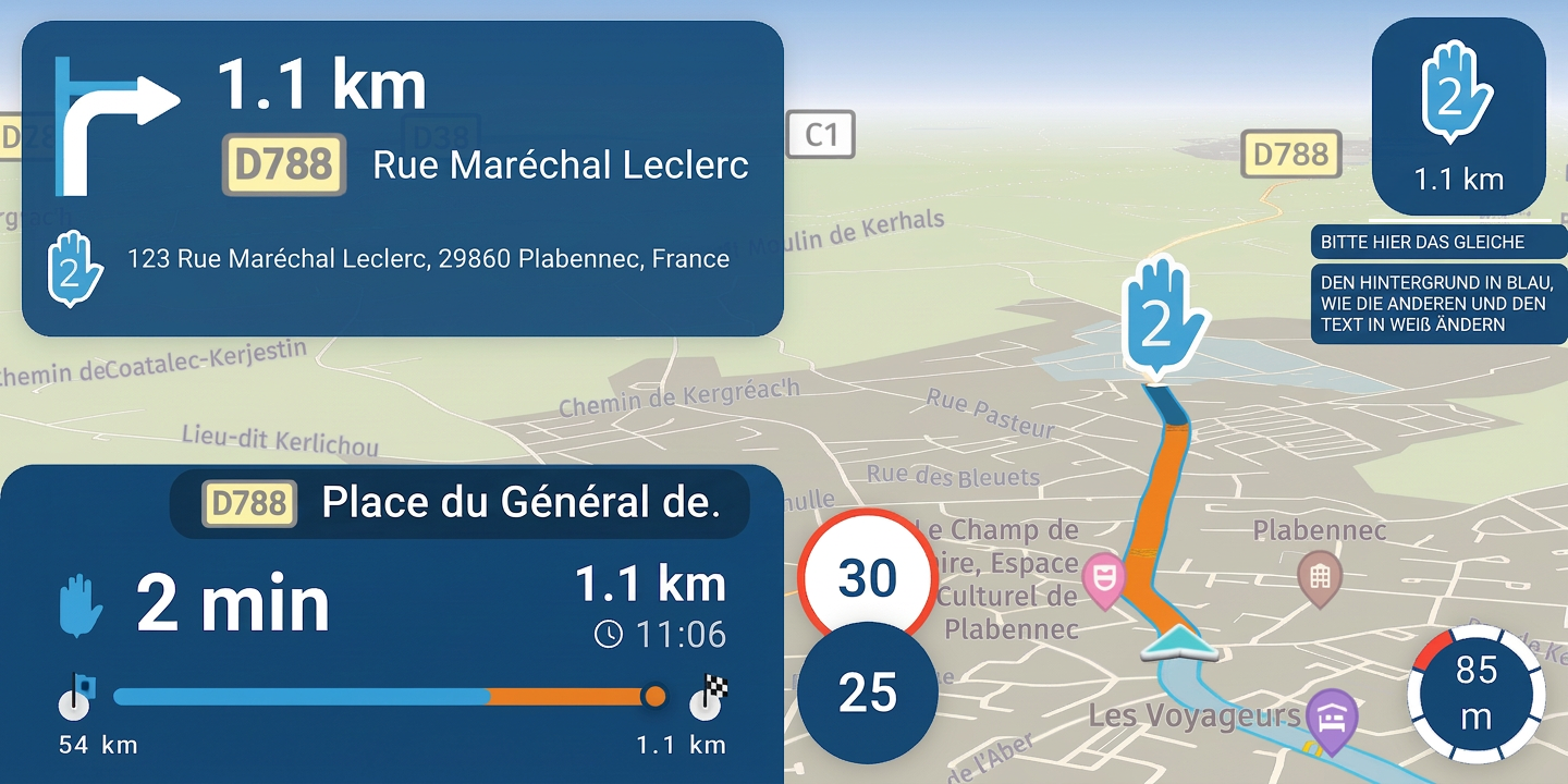
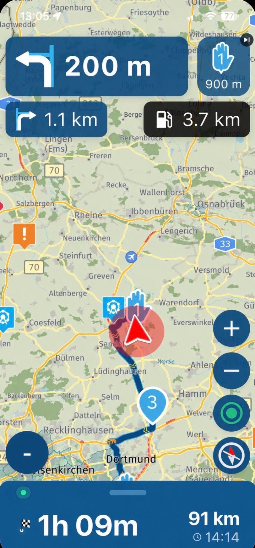
Map visibility on the screen in landscape mode is spoiled by the oversized white box displaying the mileage and the bar graph—which, in my opinion, is of little use.
The white color of this box should be changed to light blue to better match the app's color scheme.
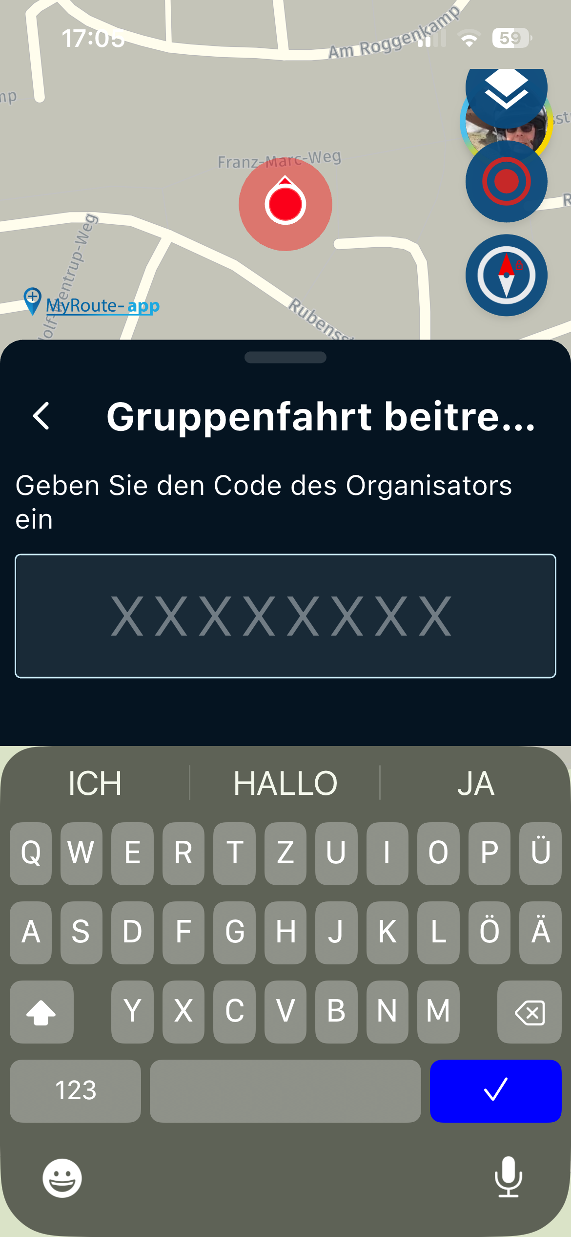
I am experiencing map rotation issues when the vehicle is stationary.![Screenshot_20261013-110447[1].png](/assets/uploads/files/1791889191411-screenshot_20261013-110447-1.png)
![Screenshot_20261013-111032[1].png](/assets/uploads/files/1791889234408-screenshot_20261013-111032-1.png)
![Screenshot_20261013-121634[1].png](/assets/uploads/files/1791889268801-screenshot_20261013-121634-1.png)
-

I agree to change the white boxes to blue.
-
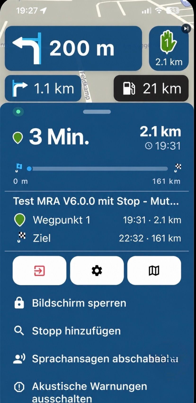
That’s a good suggestion—using blue instead of black! There’s actually already a proposal for that...
When used in a vertical orientation, you can move the menu further down so it no longer gets in the way.
https://forum.myrouteapp.com/post/84130
https://forum.myrouteapp.com/post/84439
-

Just to stop the discussion on blue.
That's not going to happen.
It looks extremely ugly and invasive.
Hello! It looks like you're interested in this conversation, but you don't have an account yet.
Getting fed up of having to scroll through the same posts each visit? When you register for an account, you'll always come back to exactly where you were before, and choose to be notified of new replies (either via email, or push notification). You'll also be able to save bookmarks and upvote posts to show your appreciation to other community members.
With your input, this post could be even better 💗
Register Login-
 02041
02041
-
 013198
-
0732
-
 011728
-
 15133
15133
-
 08325
08325
-
 0521
0521
-
0421