map contrast issues
-
Does anyone else have issues being unable to make out the roads on the Nav app?
I'm using Chigee and all I can see is the navigation line on a white background, the definition of the map is so faint, its nothing like the map displayed on the phone. It is marginally better in my car's car play system but the definition of the map is still very faint. -
Does anyone else have issues being unable to make out the roads on the Nav app?
I'm using Chigee and all I can see is the navigation line on a white background, the definition of the map is so faint, its nothing like the map displayed on the phone. It is marginally better in my car's car play system but the definition of the map is still very faint.@Sharon-Wilson No... the map is provided bij Here!
-
Does anyone else have issues being unable to make out the roads on the Nav app?
I'm using Chigee and all I can see is the navigation line on a white background, the definition of the map is so faint, its nothing like the map displayed on the phone. It is marginally better in my car's car play system but the definition of the map is still very faint.@Sharon-Wilson Do your CarPlay systems offer the possibility to adjust the contrast and/or brightness of the display? If so, maybe try playing around with that.
Sadly, the recent HERE map is rather low-contrast to begin with, and there's not much MRA can do about it. If your phone displays the map clearly, the issue is with your CarPlay systems/displays, nothing MRA can do about it.
-
@Sharon-Wilson Do your CarPlay systems offer the possibility to adjust the contrast and/or brightness of the display? If so, maybe try playing around with that.
Sadly, the recent HERE map is rather low-contrast to begin with, and there's not much MRA can do about it. If your phone displays the map clearly, the issue is with your CarPlay systems/displays, nothing MRA can do about it.
@Herko-ter-Horst The contrast is fine for Google maps and other compatible navigation apps within carplay. I only have this issue with MRA. the map on carplay looks a lot more basic with not as much definition as the mobile Here map even in my car system. Its completely washed out on the Chigee
-
@Sharon-Wilson No... the map is provided bij Here!
@Rob-Verhoeff I see the Here map using the app on my phone but its not the same on carplay, much more simple basic map with very little definition.
-
It’s one of the reasons I only use MRA for planning and Scenic (iOS only) for navigating - Scenic allows complete customisation of colours and also allows you to change font sizes and line/road thicknesses.
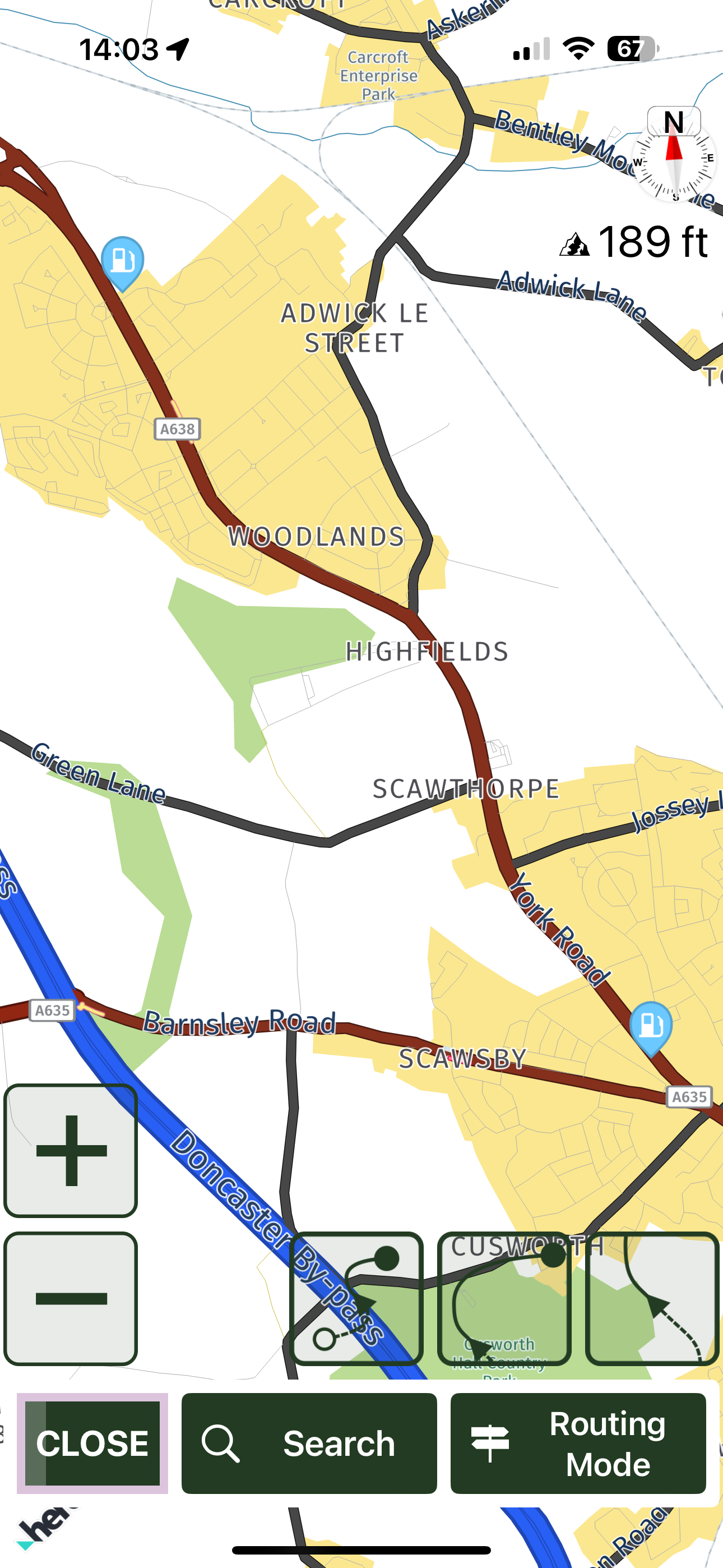
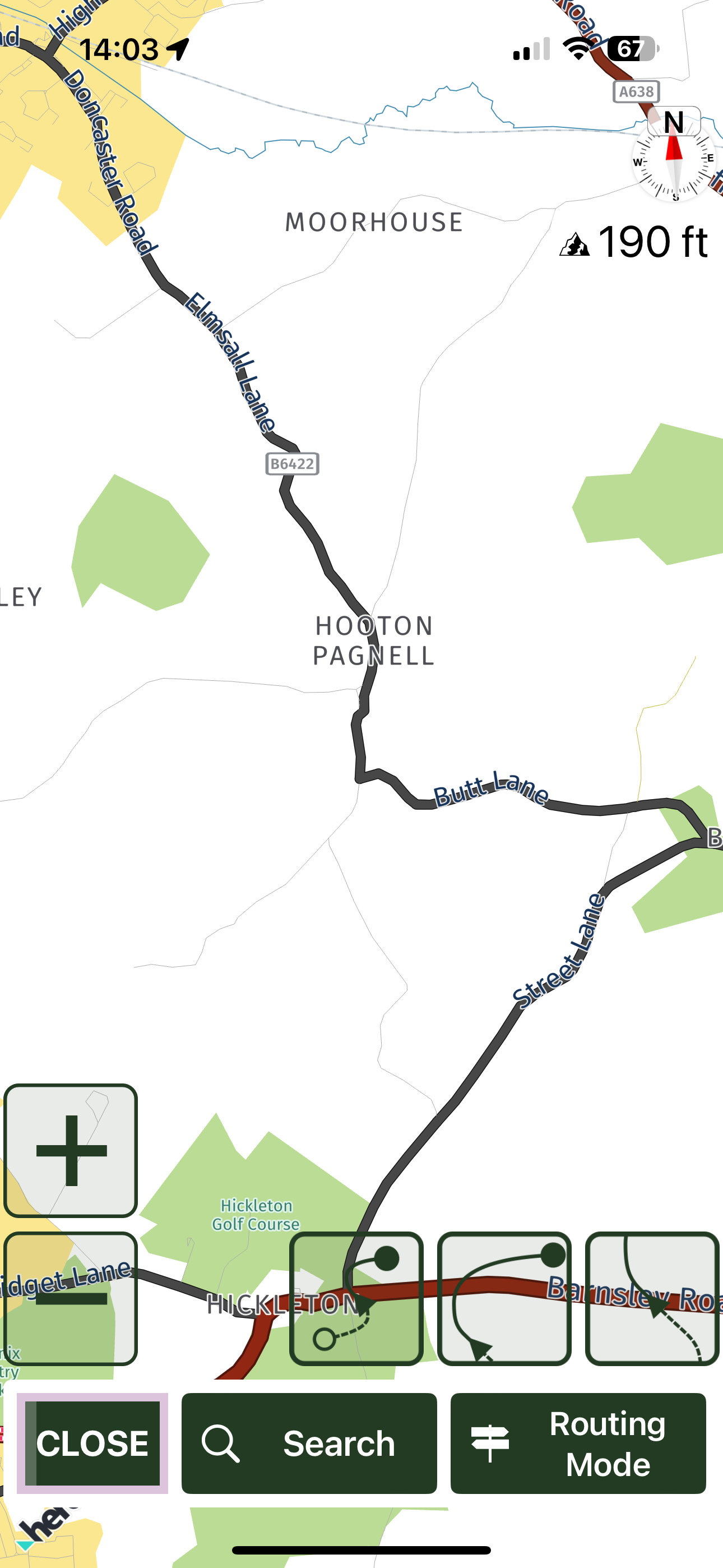
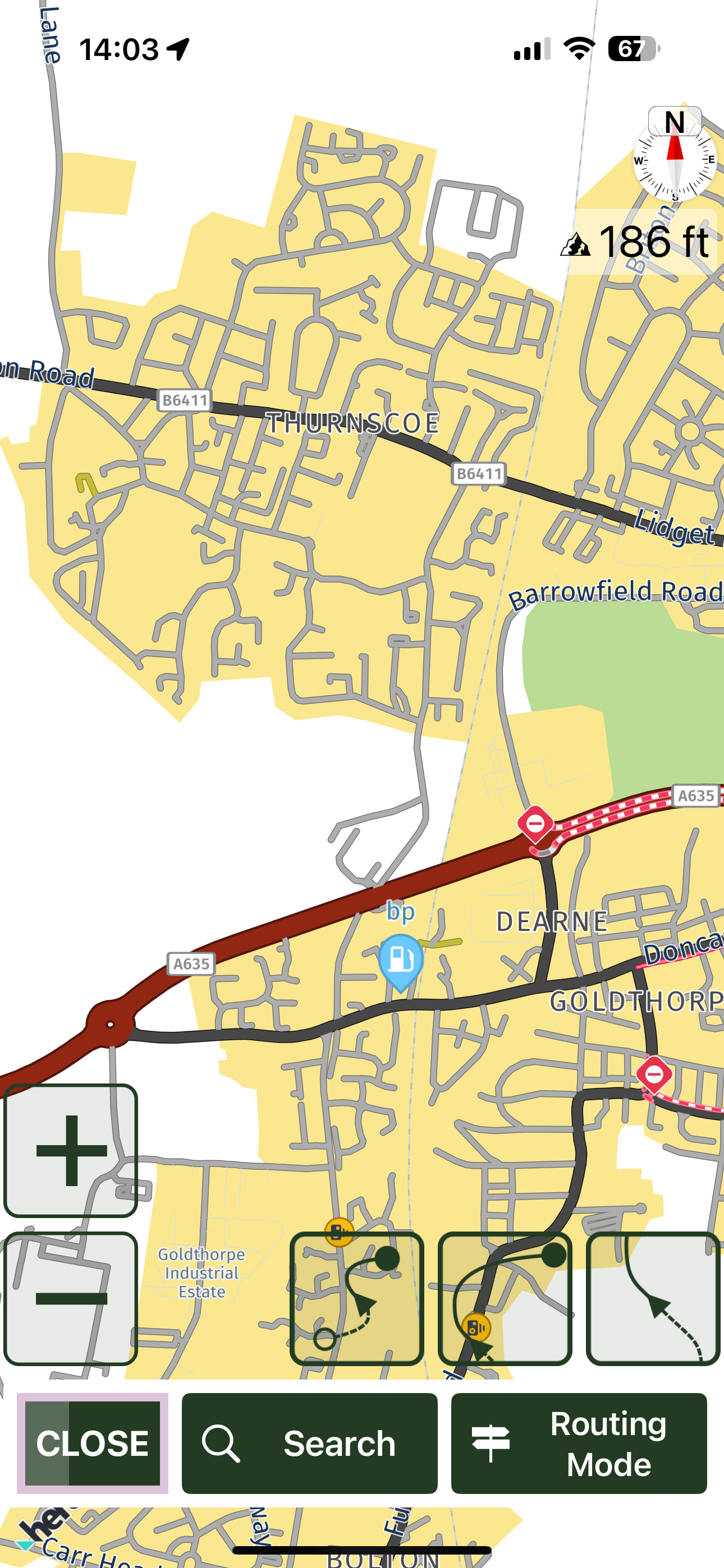
I had the same contrast issue with the default Here! colour scheme that Scenic was using, both using the iPhone as a navigation device and also using the Chigee CarPlay device. These are the colours I use now - not pretty but high contrast and totally readable on my Chigee even in the brightest direct sunshine.
The following are zoomed out quite far - you can see a lot of detail clearly when zoomed in more


@Dae-0 Thanks, I have the Scenic, I'll give it a try.

Hopefully though MRA will address this, I purchased the Nav add on to keep it simple and have everything in one place, MRA Routplanner is useless if the map is unreadable.
-
i have the same problem with Here maps. my wish is to have color selection but i do not know if it will come on the list.
-
@Peter-Schiefer good to hear you have no problem. i have the problem also the white track line and the white landscape background. i hope there will be a solution for that. route (blue) and recorded trackline (yellow) are good but origonal track line (white) is hard to see.
-
@Dae-0 Thanks, I have the Scenic, I'll give it a try.

Hopefully though MRA will address this, I purchased the Nav add on to keep it simple and have everything in one place, MRA Routplanner is useless if the map is unreadable.
@Sharon-Wilson said in map contrast issues:
@Dae-0 Thanks, I have the Scenic, I'll give it a try.

Hopefully though MRA will address this, I purchased the Nav add on to keep it simple and have everything in one place, MRA Routplanner is useless if the map is unreadable.
I know what you mean. I’d love to have MRA as my one-stop-shop, but sometimes you have to use tools that are perfect for their own task, rather than a multi-tool. MRA is unrivalled for planning, but Scenic is far more useable for actual navigation. I therefore plan everything in MRA, export as GPX1.2 and import it into Scenic. Scenic will even show you the original MRA route (blue line) and what it has calculated, allowing you to spot differences and correct them by adding waypoints to “pull” the route back on track to match the MRA one.
It’s definitely not a Chigee issue. My wife and I both used iPhones (different ones) and had the same low contrast issue, which is the same experience with the Chigee CarPlay. I created a custom colour set in Scenic, as when that got updated to the new Here! SDK it had the same issue. The Scenic personal colour scheme is honoured in CarPlay, meaning I get the same high-contrast whether I use my phone on its own or the Chigee.
The Chigee is a brilliant display and goes far brighter than the iPhone displays did. They also don’t suffer from the issue where the phone gets too warm and dims the display, making the low contrast even worse.
Hopefully you have some success until MRA makes the personalisation of colour/road width/font size that allows us all to adapt to our own vision capabilities. My work has highlighted that we all see things differently, and what may be brilliant for one person may be practically unusable for someone else. It’s easy to dismiss other people’s issues with “it works fine for me”, but that doesn’t help anyone.
-
It is a weird development but indeed all maps have gotten more pale

That said, the next app update will have a drastic improvement regarding this topic

More on that later!
-
It is a weird development but indeed all maps have gotten more pale

That said, the next app update will have a drastic improvement regarding this topic

More on that later!
@Corjan-Meijerink OMG, how long will this discussion go on? Let’s go ride our motorcycle. Much admiring the good work the team is doing. Later this year I will be in Iran, using MRA hopefully. WHO cares about the colors of the map? Keep enjoying your ride, whereever you are! Excuses for grammar mistakes, not using my glasses right now.
-
@Corjan-Meijerink OMG, how long will this discussion go on? Let’s go ride our motorcycle. Much admiring the good work the team is doing. Later this year I will be in Iran, using MRA hopefully. WHO cares about the colors of the map? Keep enjoying your ride, whereever you are! Excuses for grammar mistakes, not using my glasses right now.
@Rob-Veerman the colours are quite important to be honest

But for the app it will be a discussion of the past soon! -
@Rob-Veerman the colours are quite important to be honest

But for the app it will be a discussion of the past soon!@Corjan-Meijerink I sincerely hope so, not because of the colours, but because in plain Dutch: 'het commentaar over de kleuren is in mijn ogen soms een hoop geneuzel'. Waar hebben we het soms over als ik de commentaren lees. Ga als MRA-gebruiker gewoon lekker motorrijden (en ik heb het uiteraard niet over het team dat zijn/haar werk uitstekend verricht). Veel bewondering voor wat jullie doen in zo'n klein team en velen worden bij hun opmerkingen bijna onmiddellijk op hun wenken bediend.Complimenten daarvoor! Maar iedereen mag er natuurlijk zijn eigen mening over hebben: ik begrijp heel goed dat jullie een divers publiek moeten bedienen. Persoonlijk ben ik sinds 2017 een heel tevreden gebruiker. Jullie doen het echt uitstekend!!!
-
@Rob-Veerman Just a friendly reminder. We have once agreed to reply in the same language as the post begins.

-
@Rob-Veerman Just a friendly reminder. We have once agreed to reply in the same language as the post begins.

@Jörgen Request? Yes. Agreed? No. But I am aware of the famous German expression "Ordnung muss sein" (could be translated as 'there must be order').

-
@Jörgen Request? Yes. Agreed? No. But I am aware of the famous German expression "Ordnung muss sein" (could be translated as 'there must be order').

@Rob-Veerman said in map contrast issues:
Request? Yes. Agreed? No. But I am aware of the famous German expression "Ordnung muss sein" (could be translated as 'there must be order').
Nonsense, this is just a friendly gesture towards people who don't speak every language.
-
@Rob-Veerman said in map contrast issues:
Request? Yes. Agreed? No. But I am aware of the famous German expression "Ordnung muss sein" (could be translated as 'there must be order').
Nonsense, this is just a friendly gesture towards people who don't speak every language.
@Jörgen Come on Jörgen, you're sensitive. I was just teasing you a bit using that expression. Don't feel offended.
-
@Jörgen Come on Jörgen, you're sensitive. I was just teasing you a bit using that expression. Don't feel offended.
@Rob-Veerman said in map contrast issues:
I was just teasing you a bit using that expression. Don't feel offended.
Don´t worry I am not offended, I am a friendly person like Dutch people.
-
It’s one of the reasons I only use MRA for planning and Scenic (iOS only) for navigating - Scenic allows complete customisation of colours and also allows you to change font sizes and line/road thicknesses.
I had the same contrast issue with the default Here! colour scheme that Scenic was using, both using the iPhone as a navigation device and also using the Chigee CarPlay device. These are the colours I use now - not pretty but high contrast and totally readable on my Chigee even in the brightest direct sunshine.
The following are zoomed out quite far - you can see a lot of detail clearly when zoomed in more


@Dae-0 Thanks, I'd not looked at Senic, but currently it seems to have advantages over MRA.
Direct record in CarPlay, provision of stats for each ride , ave mph, distance, total ride distance etc.
Things I missed on my Triumph which I had in the BMW app.Will have to see if these get developed in MRA as this also leaves me using multiple apps.
