Size of confirmation buttons
-
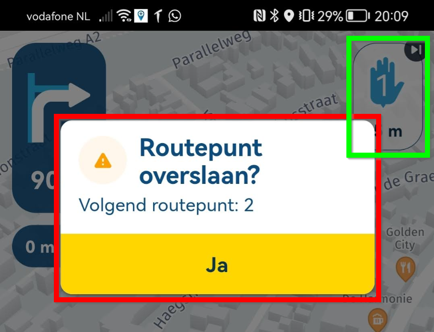
Imagine driving MC using gloves. The waypoints does not disappear when you have passed them and Navigator tries to get you back on track. You want to delete/forget waypoint and just continue. You press the waypoint icon top right corner and a tiny confirmation box pops up and ask you Do you really want to .... "yes". Today it took me apx 25 attempts to remove the waypoint when driving. WHY??? is it so small. You could fill the screen with the box. It is just Yes or No and then it goes away. What is it with UX designers ??? Do they never try their own design ?
Regards
QA/SW-tester. -
Imagine driving MC using gloves. The waypoints does not disappear when you have passed them and Navigator tries to get you back on track. You want to delete/forget waypoint and just continue. You press the waypoint icon top right corner and a tiny confirmation box pops up and ask you Do you really want to .... "yes". Today it took me apx 25 attempts to remove the waypoint when driving. WHY??? is it so small. You could fill the screen with the box. It is just Yes or No and then it goes away. What is it with UX designers ??? Do they never try their own design ?
Regards
QA/SW-tester.@Tore-Teigene hi,
Yes, we test the designs.
Not only ourselves but together with the entire beta group.Why the confirmation? Imagine driving MC using gloves and a drop of rain triggers the button and waypoints just get skipped continuously.
So we as beta community decided the following:
- long pressing the skip waypoint button will not show the confirmation
- if the confirmation box is only a confirm action, tapping anywhere on the prompt will confirm your action
Hope that helps

Regards
Lead Developer / UX guy / Marketeer -
Imagine driving MC using gloves. The waypoints does not disappear when you have passed them and Navigator tries to get you back on track. You want to delete/forget waypoint and just continue. You press the waypoint icon top right corner and a tiny confirmation box pops up and ask you Do you really want to .... "yes". Today it took me apx 25 attempts to remove the waypoint when driving. WHY??? is it so small. You could fill the screen with the box. It is just Yes or No and then it goes away. What is it with UX designers ??? Do they never try their own design ?
Regards
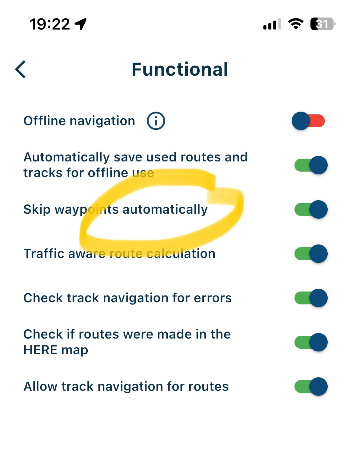
QA/SW-tester.@Tore-Teigene In addition to @Corjan-Meijerink's comments: why not skip automatically? That way, you wouldn't have to click anywhere.

-
Lead Developer / UX guy / Marketeer and a nice person

-
Imagine driving MC using gloves. The waypoints does not disappear when you have passed them and Navigator tries to get you back on track. You want to delete/forget waypoint and just continue. You press the waypoint icon top right corner and a tiny confirmation box pops up and ask you Do you really want to .... "yes". Today it took me apx 25 attempts to remove the waypoint when driving. WHY??? is it so small. You could fill the screen with the box. It is just Yes or No and then it goes away. What is it with UX designers ??? Do they never try their own design ?
Regards
QA/SW-tester.@Tore-Teigene, I could place a funny comment about size but I restrained myself

Instead some seriousness: The shape, size and function of that confirmation box has been altered numerous times, based on the beta-group input. So there is some consensus about it working fine. UX designers all have their own ideas, just like car designers. It has 4 wheels, and a steering wheel, yet they all look different. If you know how it works, one attempt is enough. Just tap anywhere in the box to confirm (even on the message itself!), or outside the box to abort. That area is about 8 times bigger (on my phone) then the one you tapped to enter the functionality in the first place.
Hello! It looks like you're interested in this conversation, but you don't have an account yet.
Getting fed up of having to scroll through the same posts each visit? When you register for an account, you'll always come back to exactly where you were before, and choose to be notified of new replies (either via email, or push notification). You'll also be able to save bookmarks and upvote posts to show your appreciation to other community members.
With your input, this post could be even better 💗
Register Login
