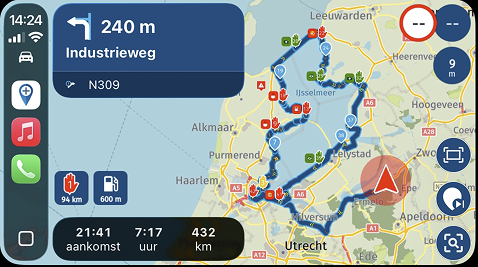
Bigger fontsize
-
Perhaps it would be possible to use a larger font for the distance indication on the display.
During my rides it is hard to read.
Twice the size of the current font would be nice.
On my Zumo XT it looks fine. I don't know what font size that is.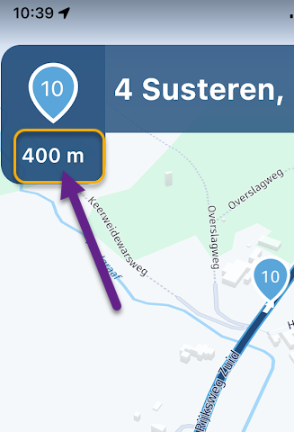
-
Perhaps it would be possible to use a larger font for the distance indication on the display.
During my rides it is hard to read.
Twice the size of the current font would be nice.
On my Zumo XT it looks fine. I don't know what font size that is.
@Albert-van-den-Elsen thanks for sharing
-
I don't have a problem with reading the distance or other displays on the screen ... but I find the street names and POIs to be almost impossible to read. Perhaps we are all getting too old. I do find that different sun glasses have a greater or lesser impact on reading the screen. Must be the different filters.
-
It should be configurable because everyone sees it in a different way depending on the size of the phone or tablet, the need is different. I only see one parameter to satisfy all users.
-
It should be configurable because everyone sees it in a different way depending on the size of the phone or tablet, the need is different. I only see one parameter to satisfy all users.
@Calibos, it's not easy to make that configurable. People will set things big and thing will not fit in their designated space. It is always a compromise. It helps to choose a device with a not too large aspect. A lot of modern phones are very stretched in length and that does not help with readability. A small tablet is probably preferable in that regard.
-
Maybe like this?
https://forum.myrouteapp.com/topic/4307/suggestions-for-next-turn-box(and decrease the yds / m part of the text if space is tight, since it's the number that matters)
-
Personally I use an 8 inch samsung tablet in landscape format. To give a concrete example. I use Osmand for free navigation since MRA does not do it yet and so I simply set the map zoom to 150% and the text zoom at 120% and I perfectly distinguish all the displays without problems whereas on MRA I often have to take off my sun visor or even get closer to see what I want. This is not a complaint, it is an observation and in view of the many posts on this subject I think that there is a consensus.
-
Maybe like this?
https://forum.myrouteapp.com/topic/4307/suggestions-for-next-turn-box(and decrease the yds / m part of the text if space is tight, since it's the number that matters)
@richtea999, In that example, how would you show 450 yards?
-
Personally I use an 8 inch samsung tablet in landscape format. To give a concrete example. I use Osmand for free navigation since MRA does not do it yet and so I simply set the map zoom to 150% and the text zoom at 120% and I perfectly distinguish all the displays without problems whereas on MRA I often have to take off my sun visor or even get closer to see what I want. This is not a complaint, it is an observation and in view of the many posts on this subject I think that there is a consensus.
@Calibos, I have that on my 5,6" phone indeed. I don't want to be offensive, but if I had that on an 8"tablet, I would look for a optometrist I guess

-
If everything goes well for everyone, let's not change anything. What I share is an experience not a feeling.
If you read carefully with interest, you will realize that this is a request that comes up often.
If you think you don't need it, I'm very happy, but probably not everyone. -
I don't know what bikers think about it but for me, the less time I take my eyes off the road to see my displays, the better it is for my safety.
-
If everything goes well for everyone, let's not change anything. What I share is an experience not a feeling.
If you read carefully with interest, you will realize that this is a request that comes up often.
If you think you don't need it, I'm very happy, but probably not everyone.
I am not the bragging type, but I think I may say that I read this forum with UTTER interest...
What you might not know is how many times changes are already made concerning the font sizes and sizes of the boxes that show these texts. The fonts needs to be bigger, the boxes need to be smaller to not overlap the map too much. This discussion is endless.
Do me a favor please. Take a screenshot from your tablet showing the navigation map. I will print it out real size and stick it to my bike. Perhaps I need to take back my comment and agree with you. If not, please take my suggestion above seriously, because then it wil be safer for everyone

-
@richtea999, In that example, how would you show 450 yards?
@Con-Hennekens I realize that having things in an open forum for feedback that there will ultimately be an unfathomable suggestions count....that said, I do 2nd the suggestion of increasing the smaller font sizes a bit, as it could also turn into a safety issue - if leading a group of bikes (or even if by yourself) in heavy traffic can lead to focusing on the wrong thing at the wrong time....yes, we should always pay attention to whats happening around us, however, realistically, who has not been guilty of getting caught up in a situation...
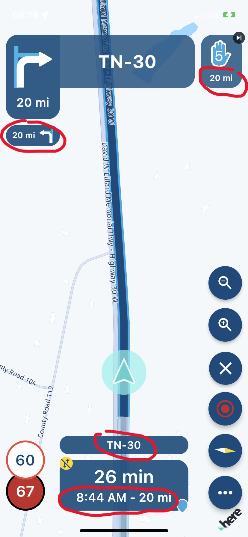
The ones I personally struggle to see are circled in the pic. Ironically enough, the pic snapshot caputred a perfect storm where by the same distance is in 4 spots as well - perhaps eliminating one would free up some space to increase font size. The '20mi' font not circled is readable. This could also be a safety issue
-
@Con-Hennekens I realize that having things in an open forum for feedback that there will ultimately be an unfathomable suggestions count....that said, I do 2nd the suggestion of increasing the smaller font sizes a bit, as it could also turn into a safety issue - if leading a group of bikes (or even if by yourself) in heavy traffic can lead to focusing on the wrong thing at the wrong time....yes, we should always pay attention to whats happening around us, however, realistically, who has not been guilty of getting caught up in a situation...
The ones I personally struggle to see are circled in the pic. Ironically enough, the pic snapshot caputred a perfect storm where by the same distance is in 4 spots as well - perhaps eliminating one would free up some space to increase font size. The '20mi' font not circled is readable. This could also be a safety issue

@GT-JWR, sure it is always a tradeoff. Typically the areas you circled I consider to be less important. Funny is that you circled the to areas in the bottom part, in which the font is equal in size to the next instruction you agree on to be readable fine

For the font to increase it is needed to enlarge the boxes, that costs screen-estate, and many forum posts over how bulky the boxes are, and contaminating the map underneath. I think a large part of this discussion is caused by how the devices are mounted, how steady it is on the mount, and how far they are mounted from the driver. That is also an area in which much improvement of readability is possible. Oh, and I almost forgot the lack of backlighting on many devices...
BTW: you are speeding...

-
@GT-JWR, sure it is always a tradeoff. Typically the areas you circled I consider to be less important. Funny is that you circled the to areas in the bottom part, in which the font is equal in size to the next instruction you agree on to be readable fine

For the font to increase it is needed to enlarge the boxes, that costs screen-estate, and many forum posts over how bulky the boxes are, and contaminating the map underneath. I think a large part of this discussion is caused by how the devices are mounted, how steady it is on the mount, and how far they are mounted from the driver. That is also an area in which much improvement of readability is possible. Oh, and I almost forgot the lack of backlighting on many devices...
BTW: you are speeding...

@Con-Hennekens yes, I realized that one of the circles had the same font, but I had deleted the original unedited picture and could not edit it again.

Yes - always a trade off! In my case, my iPhone is mounted on the handle bars, just in front of the brake reservoir, so not too far, and not too close. Yes, some can be attributed to wind and vibration, no doubt.
Backlighting - in the bright of the day, it is on full brightness. That also can create issues, especially if it is a very warm day...the combination of battery drain from the app (which I hope is still improvable), and having the phone charging causes the phone to get hot (if the ambient temp is 80-85 degF, common here in Texas) which causes the phone itself to go into somewhat of a protective mode.
In any event, if the developers decide font size is good, I will deal with it!
Thanks for the response - the app is constantly improving, which is the important part.
-
@richtea999, In that example, how would you show 450 yards?
@Con-Hennekens said in Bigger fontsize:
@richtea999, In that example, how would you show 450 yards?
Large digits, small 'yd' / 'm', like so:
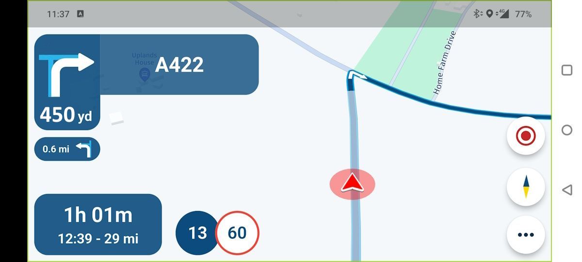
The distance digits are the same size as the road numbers, and the 'yd'/'m' stays as it currently is.
The 'yd' / 'm' can afford to stay small because you recognise the units almost subconciously after you've used the app once or twice.
-
@Con-Hennekens said in Bigger fontsize:
@richtea999, In that example, how would you show 450 yards?
Large digits, small 'yd' / 'm', like so:

The distance digits are the same size as the road numbers, and the 'yd'/'m' stays as it currently is.
The 'yd' / 'm' can afford to stay small because you recognise the units almost subconciously after you've used the app once or twice.
@richtea999, that would certainly help, but you catch my drift I guess.
-

I am not the bragging type, but I think I may say that I read this forum with UTTER interest...
What you might not know is how many times changes are already made concerning the font sizes and sizes of the boxes that show these texts. The fonts needs to be bigger, the boxes need to be smaller to not overlap the map too much. This discussion is endless.
Do me a favor please. Take a screenshot from your tablet showing the navigation map. I will print it out real size and stick it to my bike. Perhaps I need to take back my comment and agree with you. If not, please take my suggestion above seriously, because then it wil be safer for everyone

@Con-Hennekens
I'm sorry for not being able to make you understand that your opinion on my suggestion is of little interest to me.
You said yourself that several adaptations of font and window size have already been modified and apparently this does not yet satisfy everyone, which I can easily understand. So my suggestion to make this configurable should allow all users to find the comfort they are looking for.
I don't need to take a screenshot of my tablet in fact I know what would be more comfortable for me and again if the current size fits you that's fine but accept that it doesn't of all users. -
 undefined Corjan Meijerink locked this topic on
-
 undefined richtea999 referenced this topic on
-
 undefined richtea999 referenced this topic on
Hello! It looks like you're interested in this conversation, but you don't have an account yet.
Getting fed up of having to scroll through the same posts each visit? When you register for an account, you'll always come back to exactly where you were before, and choose to be notified of new replies (either via email, or push notification). You'll also be able to save bookmarks and upvote posts to show your appreciation to other community members.
With your input, this post could be even better 💗
Register Login

