Beta 3.2.15. First time on the bike
-
OnePlus 6
Hi @Corjan-Meijerink and Joost, and other beta partners-in -crime.
Today I had the opportunity to test the Next app on my bike. Previously all my tests were done in the car, for short distances. This time I took a 130km test drive and below you'll find my feedback based on the today's ride.
I've categorized the feedback by using <Operational, Significant and Minor>:
Operationals are aspects which I feel definitely need to be addressed before the release to at least make the Next app after launch, a decent replacement for the current Nav app. By decent I mean: the app shall be as good or better at the basic Navigation functions compared to the old nav app. That includes the overall behaviour of the app. Significants are to be solved within a month or so after the release, but leave preferably a remaining 2 months of in-season time with the Next app. Minors are things that can be fixed or introduced at any moment but are not hardcore and most likely user wishes.
The route I've driven: https://www.myrouteapp.com/nl/social/route/7502839?mode=share.
Operationals:
- Battery drain / power consumption.
Ya I know, this is very high on the priority list, but today I noticed that for me the issue is even bigger than reported by others before.
I started the first part of this route using the next app at full battery level and charging. As soon as we've reached the 1st stop, after about 65min or so, the battery was drained down to 67%!? That's a mind boggling 33%. Good grief. At that rate I can only manage to complete a 2.5h trip on my phone. Gosh.I enabled Battery Saving mode to check for effect, and noticed a bit less drain during the trip from 1st to 2nd stop, about 45 to 50 min or so, but still 64% to 40% is a drain of 24%, while charging...
Since the Next app depletes my battery so fast, I had to revert to the old Nav app, and that consumes a lot less power. (Offcourse, I already knew that since I've driven many km's with that app already, while keeping my battery fully charged on the same setup :)). But during the trip from 2nd stop to destination, using old Nav app, my battery charged from about 40% back to 56% or so in 43min.
I'm a bit worried that even if the power draw can be cut in half, yet the drainage is too high for my setup. Okay Okay, I hear you say: what charger do I use? Well I use an el-Cheapo USB charger from Amazon (Ya ya, it is fused... I installed my own fuse with LED lighting under my seat :)) but it was able to charge the phone by 16% in 43min or so, which comes down to a net charge current of 528mA, while using the Nav app! So the charger is decent enough (I expect a rough 1.3A output current from earlier tests/calculations).
Are we really expecting customers to install a heavy duty fast charger on their bike, only to facilitate the Next app? Wow, that would be a huge disclaimer in the webshop to be honest :).
That being said, I have full confidence that the Next app will be optimzed such that the power consumption will fall somehwere in the range of the current Nav app. Right? Otherwise, I'm screwed.

- Stating the obvious: positional delay of the cursor, but also the rotation of the map along with it.
No need to elaborate here. I just mentioned this one here as a reminder.
Although this issue should be fixed prior to the release, luckily today I did not have much discomfort from it, because the voice instructions are most of the time quite spot on.- The zoom angle / birds-eye view... or better said: the lack of it.
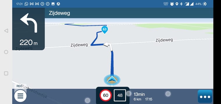
At least on my phone, the zoom angle / birds-eye view seems to be identical no matter the road situation. I absolute hate the horrendous 2d view from above. Corjan, please make me able to shut 2d off in its entirety! During long stretches of road, also utilize the birds-eye view please.
The current Nav app is simply maveless regarding these aspects. Please give back the zoom behaviour that is in the current Nav app.
Significants
-
Sometimes the instructions that follow the far distance instruction i.e. 'in 1000m take a right' are lost? I cannot pinpoint when this exactly happens but it occurred multiple times during my trip.
-
When I wanted to resume the route after the 1st stop, I utilized the recently introduced "Resume" message but found the app to not start from the last waypoint but instead starting from wp 1 again. Must be a small (lady)bug :).
-
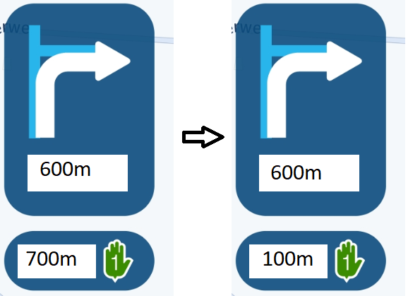
Make the 2nd instruction in the upcoming route maneauvres customizable between 'absolute' and 'relative' distance.
Today for the first time I had to 'use' these informatin fields and found that I'm having a trouble 'reading/understanding and-or using' the 2nd instruction field.
I.e.: i would like the 2nd instruction field to indicate the distance to the 2nd maneauver relative to the 1st maneauver, instead of telling me the distance from where I am now to the 2nd maneauver.
I.e.: 1st instruction: in 600m turn right, 2nd instruction in 700m turn left.
I would like the 2nd field to show: 100m turn left. Now I know that immediately after the 1st maneauver I have to turn left and prepare for that. This 100m indicator is now fixed and will not update along with distance to the 1st instruction. I found it very confusing to see the 1st and 2nd instruction being updated simultaneously. Offcourse it makes sense why it is implemented this way, but I would prefer the relative indicator. Can you please make that a user setting?
- If a track is paused, the 'resume navigation message' is shown on top of the edit-buttons of the track. haha! That needs some attention. Without pressing 'No' on the message, on cannot interact with the track functionality anymore.
Minors
-
Switch around the speed limit and actual speed.
Somehow it makes more sense to me to have my actual speed more in the middle. I might very well be that I'm simply accustomed to the current Nav app that has the proposed layout haha! -
Ask to proceed or stop the tracklog if the nav is 'stopped' for i.e. lunchbreak. Now these are uncoupled and one has to manually pause the track.
-
Introduce the screen lock setting and/or introduce a button to 'flip' the screen.
I have my phone mounted in landscape and it happened to me several times that I initiate the navigation in landscape, but as soon as i've twisted it onto my SP-Connect, it had turned into portrait again, due to the nature of the SP-Connect system, which is a 90degree twist lock. A button to flip the mode back to landscape would do the trick, or simply make me able to lock the orientation, just as the current nav app does.
Final verdict:
I am very pleased with the overall stability and looks of the new next app and also quite well with the customizations and interaction with the app. That being said, there are some major quirks that must be solved to call the Next app a full-on successor/replacement of the current Nav app. No graphical gimmicks, or customization settings can make up for an app that is simply only usable for 2hours muhaha.@Corjan-Meijerink and Joost, if my feedback seems 'harshly' written, that is not the intention, I'm sorry for that :D. I was simply speaking my mind to make all as clear as possible.
Hope to see the Operationals being fixed before the deadline in June :). Keep up the good work team, so far you've exceeded all of our expectations.
Kisses
 ,
,Stefan
-
OnePlus 6
Hi @Corjan-Meijerink and Joost, and other beta partners-in -crime.
Today I had the opportunity to test the Next app on my bike. Previously all my tests were done in the car, for short distances. This time I took a 130km test drive and below you'll find my feedback based on the today's ride.
I've categorized the feedback by using <Operational, Significant and Minor>:
Operationals are aspects which I feel definitely need to be addressed before the release to at least make the Next app after launch, a decent replacement for the current Nav app. By decent I mean: the app shall be as good or better at the basic Navigation functions compared to the old nav app. That includes the overall behaviour of the app. Significants are to be solved within a month or so after the release, but leave preferably a remaining 2 months of in-season time with the Next app. Minors are things that can be fixed or introduced at any moment but are not hardcore and most likely user wishes.
The route I've driven: https://www.myrouteapp.com/nl/social/route/7502839?mode=share.
Operationals:
- Battery drain / power consumption.
Ya I know, this is very high on the priority list, but today I noticed that for me the issue is even bigger than reported by others before.
I started the first part of this route using the next app at full battery level and charging. As soon as we've reached the 1st stop, after about 65min or so, the battery was drained down to 67%!? That's a mind boggling 33%. Good grief. At that rate I can only manage to complete a 2.5h trip on my phone. Gosh.I enabled Battery Saving mode to check for effect, and noticed a bit less drain during the trip from 1st to 2nd stop, about 45 to 50 min or so, but still 64% to 40% is a drain of 24%, while charging...
Since the Next app depletes my battery so fast, I had to revert to the old Nav app, and that consumes a lot less power. (Offcourse, I already knew that since I've driven many km's with that app already, while keeping my battery fully charged on the same setup :)). But during the trip from 2nd stop to destination, using old Nav app, my battery charged from about 40% back to 56% or so in 43min.
I'm a bit worried that even if the power draw can be cut in half, yet the drainage is too high for my setup. Okay Okay, I hear you say: what charger do I use? Well I use an el-Cheapo USB charger from Amazon (Ya ya, it is fused... I installed my own fuse with LED lighting under my seat :)) but it was able to charge the phone by 16% in 43min or so, which comes down to a net charge current of 528mA, while using the Nav app! So the charger is decent enough (I expect a rough 1.3A output current from earlier tests/calculations).
Are we really expecting customers to install a heavy duty fast charger on their bike, only to facilitate the Next app? Wow, that would be a huge disclaimer in the webshop to be honest :).
That being said, I have full confidence that the Next app will be optimzed such that the power consumption will fall somehwere in the range of the current Nav app. Right? Otherwise, I'm screwed.

- Stating the obvious: positional delay of the cursor, but also the rotation of the map along with it.
No need to elaborate here. I just mentioned this one here as a reminder.
Although this issue should be fixed prior to the release, luckily today I did not have much discomfort from it, because the voice instructions are most of the time quite spot on.- The zoom angle / birds-eye view... or better said: the lack of it.
At least on my phone, the zoom angle / birds-eye view seems to be identical no matter the road situation. I absolute hate the horrendous 2d view from above. Corjan, please make me able to shut 2d off in its entirety! During long stretches of road, also utilize the birds-eye view please.
The current Nav app is simply maveless regarding these aspects. Please give back the zoom behaviour that is in the current Nav app.

Significants
-
Sometimes the instructions that follow the far distance instruction i.e. 'in 1000m take a right' are lost? I cannot pinpoint when this exactly happens but it occurred multiple times during my trip.
-
When I wanted to resume the route after the 1st stop, I utilized the recently introduced "Resume" message but found the app to not start from the last waypoint but instead starting from wp 1 again. Must be a small (lady)bug :).
-
Make the 2nd instruction in the upcoming route maneauvres customizable between 'absolute' and 'relative' distance.
Today for the first time I had to 'use' these informatin fields and found that I'm having a trouble 'reading/understanding and-or using' the 2nd instruction field.
I.e.: i would like the 2nd instruction field to indicate the distance to the 2nd maneauver relative to the 1st maneauver, instead of telling me the distance from where I am now to the 2nd maneauver.
I.e.: 1st instruction: in 600m turn right, 2nd instruction in 700m turn left.
I would like the 2nd field to show: 100m turn left. Now I know that immediately after the 1st maneauver I have to turn left and prepare for that. This 100m indicator is now fixed and will not update along with distance to the 1st instruction. I found it very confusing to see the 1st and 2nd instruction being updated simultaneously. Offcourse it makes sense why it is implemented this way, but I would prefer the relative indicator. Can you please make that a user setting?

- If a track is paused, the 'resume navigation message' is shown on top of the edit-buttons of the track. haha! That needs some attention. Without pressing 'No' on the message, on cannot interact with the track functionality anymore.
Minors
-
Switch around the speed limit and actual speed.
Somehow it makes more sense to me to have my actual speed more in the middle. I might very well be that I'm simply accustomed to the current Nav app that has the proposed layout haha! -
Ask to proceed or stop the tracklog if the nav is 'stopped' for i.e. lunchbreak. Now these are uncoupled and one has to manually pause the track.
-
Introduce the screen lock setting and/or introduce a button to 'flip' the screen.
I have my phone mounted in landscape and it happened to me several times that I initiate the navigation in landscape, but as soon as i've twisted it onto my SP-Connect, it had turned into portrait again, due to the nature of the SP-Connect system, which is a 90degree twist lock. A button to flip the mode back to landscape would do the trick, or simply make me able to lock the orientation, just as the current nav app does.
Final verdict:
I am very pleased with the overall stability and looks of the new next app and also quite well with the customizations and interaction with the app. That being said, there are some major quirks that must be solved to call the Next app a full-on successor/replacement of the current Nav app. No graphical gimmicks, or customization settings can make up for an app that is simply only usable for 2hours muhaha.@Corjan-Meijerink and Joost, if my feedback seems 'harshly' written, that is not the intention, I'm sorry for that :D. I was simply speaking my mind to make all as clear as possible.
Hope to see the Operationals being fixed before the deadline in June :). Keep up the good work team, so far you've exceeded all of our expectations.
Kisses
 ,
,Stefan
@StefanHummelink, It is quite strange how experiences on battery drain differ from phone to phone. Last Saturday I have been driving about 125 KM when I noticed my battery (of the CAT phone) to be drained to about 40%. I checked and it seemed I forgot to switch on my charger. So I had been driving for over 2,5 hrs on battery only... My guess is that the slower the processor in your phone is, the less trouble you have with battery drain. Last wednesday in the Zoom meeting we learned that this problem is inherent to the Here SDK, and they are working on it. For some time already. They don't have a Corjan I guess...

I agree with you on the zoom angle, but I think you mistake the term birds-eye view. As far as I know that term refers to an angle of 90 degrees to the earth, so what we call 2D view. Me too would like to see a permanent angle looking forward. And you are totally correct that the old App's view is much more pleasant, with the horizon always just under the top of the screen. I would not call this an "Operational" issue though. Also contrast and detail of the map could be better.
-
OnePlus 6
Hi @Corjan-Meijerink and Joost, and other beta partners-in -crime.
Today I had the opportunity to test the Next app on my bike. Previously all my tests were done in the car, for short distances. This time I took a 130km test drive and below you'll find my feedback based on the today's ride.
I've categorized the feedback by using <Operational, Significant and Minor>:
Operationals are aspects which I feel definitely need to be addressed before the release to at least make the Next app after launch, a decent replacement for the current Nav app. By decent I mean: the app shall be as good or better at the basic Navigation functions compared to the old nav app. That includes the overall behaviour of the app. Significants are to be solved within a month or so after the release, but leave preferably a remaining 2 months of in-season time with the Next app. Minors are things that can be fixed or introduced at any moment but are not hardcore and most likely user wishes.
The route I've driven: https://www.myrouteapp.com/nl/social/route/7502839?mode=share.
Operationals:
- Battery drain / power consumption.
Ya I know, this is very high on the priority list, but today I noticed that for me the issue is even bigger than reported by others before.
I started the first part of this route using the next app at full battery level and charging. As soon as we've reached the 1st stop, after about 65min or so, the battery was drained down to 67%!? That's a mind boggling 33%. Good grief. At that rate I can only manage to complete a 2.5h trip on my phone. Gosh.I enabled Battery Saving mode to check for effect, and noticed a bit less drain during the trip from 1st to 2nd stop, about 45 to 50 min or so, but still 64% to 40% is a drain of 24%, while charging...
Since the Next app depletes my battery so fast, I had to revert to the old Nav app, and that consumes a lot less power. (Offcourse, I already knew that since I've driven many km's with that app already, while keeping my battery fully charged on the same setup :)). But during the trip from 2nd stop to destination, using old Nav app, my battery charged from about 40% back to 56% or so in 43min.
I'm a bit worried that even if the power draw can be cut in half, yet the drainage is too high for my setup. Okay Okay, I hear you say: what charger do I use? Well I use an el-Cheapo USB charger from Amazon (Ya ya, it is fused... I installed my own fuse with LED lighting under my seat :)) but it was able to charge the phone by 16% in 43min or so, which comes down to a net charge current of 528mA, while using the Nav app! So the charger is decent enough (I expect a rough 1.3A output current from earlier tests/calculations).
Are we really expecting customers to install a heavy duty fast charger on their bike, only to facilitate the Next app? Wow, that would be a huge disclaimer in the webshop to be honest :).
That being said, I have full confidence that the Next app will be optimzed such that the power consumption will fall somehwere in the range of the current Nav app. Right? Otherwise, I'm screwed.

- Stating the obvious: positional delay of the cursor, but also the rotation of the map along with it.
No need to elaborate here. I just mentioned this one here as a reminder.
Although this issue should be fixed prior to the release, luckily today I did not have much discomfort from it, because the voice instructions are most of the time quite spot on.- The zoom angle / birds-eye view... or better said: the lack of it.
At least on my phone, the zoom angle / birds-eye view seems to be identical no matter the road situation. I absolute hate the horrendous 2d view from above. Corjan, please make me able to shut 2d off in its entirety! During long stretches of road, also utilize the birds-eye view please.
The current Nav app is simply maveless regarding these aspects. Please give back the zoom behaviour that is in the current Nav app.

Significants
-
Sometimes the instructions that follow the far distance instruction i.e. 'in 1000m take a right' are lost? I cannot pinpoint when this exactly happens but it occurred multiple times during my trip.
-
When I wanted to resume the route after the 1st stop, I utilized the recently introduced "Resume" message but found the app to not start from the last waypoint but instead starting from wp 1 again. Must be a small (lady)bug :).
-
Make the 2nd instruction in the upcoming route maneauvres customizable between 'absolute' and 'relative' distance.
Today for the first time I had to 'use' these informatin fields and found that I'm having a trouble 'reading/understanding and-or using' the 2nd instruction field.
I.e.: i would like the 2nd instruction field to indicate the distance to the 2nd maneauver relative to the 1st maneauver, instead of telling me the distance from where I am now to the 2nd maneauver.
I.e.: 1st instruction: in 600m turn right, 2nd instruction in 700m turn left.
I would like the 2nd field to show: 100m turn left. Now I know that immediately after the 1st maneauver I have to turn left and prepare for that. This 100m indicator is now fixed and will not update along with distance to the 1st instruction. I found it very confusing to see the 1st and 2nd instruction being updated simultaneously. Offcourse it makes sense why it is implemented this way, but I would prefer the relative indicator. Can you please make that a user setting?

- If a track is paused, the 'resume navigation message' is shown on top of the edit-buttons of the track. haha! That needs some attention. Without pressing 'No' on the message, on cannot interact with the track functionality anymore.
Minors
-
Switch around the speed limit and actual speed.
Somehow it makes more sense to me to have my actual speed more in the middle. I might very well be that I'm simply accustomed to the current Nav app that has the proposed layout haha! -
Ask to proceed or stop the tracklog if the nav is 'stopped' for i.e. lunchbreak. Now these are uncoupled and one has to manually pause the track.
-
Introduce the screen lock setting and/or introduce a button to 'flip' the screen.
I have my phone mounted in landscape and it happened to me several times that I initiate the navigation in landscape, but as soon as i've twisted it onto my SP-Connect, it had turned into portrait again, due to the nature of the SP-Connect system, which is a 90degree twist lock. A button to flip the mode back to landscape would do the trick, or simply make me able to lock the orientation, just as the current nav app does.
Final verdict:
I am very pleased with the overall stability and looks of the new next app and also quite well with the customizations and interaction with the app. That being said, there are some major quirks that must be solved to call the Next app a full-on successor/replacement of the current Nav app. No graphical gimmicks, or customization settings can make up for an app that is simply only usable for 2hours muhaha.@Corjan-Meijerink and Joost, if my feedback seems 'harshly' written, that is not the intention, I'm sorry for that :D. I was simply speaking my mind to make all as clear as possible.
Hope to see the Operationals being fixed before the deadline in June :). Keep up the good work team, so far you've exceeded all of our expectations.
Kisses
 ,
,Stefan
@StefanHummelink Nice feedback! I agree with most points you make. When the app is launched I hope that many settings will be configurable or at least that it will be offered that way in the near future. As far as the battery drains while driving, the experiences are indeed very variable. My last route was not affected at all (simple USB cable connected to the standard USB outlet on my K). I'm more concerned about battery usage when the app is running in the background and there is no navigation activity at all. Fortunately, that is also full under investigation. And yes, an option to prevent the screen from tilting from landscape to portrait is almost a must.
-
@StefanHummelink, It is quite strange how experiences on battery drain differ from phone to phone. Last Saturday I have been driving about 125 KM when I noticed my battery (of the CAT phone) to be drained to about 40%. I checked and it seemed I forgot to switch on my charger. So I had been driving for over 2,5 hrs on battery only... My guess is that the slower the processor in your phone is, the less trouble you have with battery drain. Last wednesday in the Zoom meeting we learned that this problem is inherent to the Here SDK, and they are working on it. For some time already. They don't have a Corjan I guess...

I agree with you on the zoom angle, but I think you mistake the term birds-eye view. As far as I know that term refers to an angle of 90 degrees to the earth, so what we call 2D view. Me too would like to see a permanent angle looking forward. And you are totally correct that the old App's view is much more pleasant, with the horizon always just under the top of the screen. I would not call this an "Operational" issue though. Also contrast and detail of the map could be better.
@Con-Hennekens said in Beta 3.2.15. First time on the bike:
They don't have a Corjan I guess...
Wow, don't bring them up with ideas dude!
 What if Here steals @Corjan-Meijerink from us!
@Con-Hennekens said in Beta 3.2.15. First time on the bike:
but I think you mistake the term birds-eye view.
You're technically right I think, but yet, doesn't a bird also look ahead? Haha!?
@Con-Hennekens said in Beta 3.2.15. First time on the bike:
would not call this an "Operational" issue though.
I purposely depicted this one as Operational since it restricts me to see the beta app without that issue solved, as a full-on successor/replacement for the old nav app. That is subject to personal preference of-course. Think of it this way: what if current nav app but no beta users download the next app on the release date, they open the app, become very pleasantly surprised, and then press navigate only to find out they have this 2d view instead of their beloved angled view... I can only speak for myself but I would be very much negatively surprised, maybe even dissapointed. Just to point out: we know that this subject is on the priority list, but I don't know how high, that's why I've mentioned it here this way

-
@StefanHummelink Nice feedback! I agree with most points you make. When the app is launched I hope that many settings will be configurable or at least that it will be offered that way in the near future. As far as the battery drains while driving, the experiences are indeed very variable. My last route was not affected at all (simple USB cable connected to the standard USB outlet on my K). I'm more concerned about battery usage when the app is running in the background and there is no navigation activity at all. Fortunately, that is also full under investigation. And yes, an option to prevent the screen from tilting from landscape to portrait is almost a must.
@Rob-Verhoeff said in Beta 3.2.15. First time on the bike:
I'm more concerned about battery usage when the app is running in the background and there is no navigation activity at all.
Don't forget the 'location request' during 'off-mode' as well. Just got the notification that MRA Mobile requested my location while running in the background. Huh? This is also a known 'feature'
 .
. -
OnePlus 6
Hi @Corjan-Meijerink and Joost, and other beta partners-in -crime.
Today I had the opportunity to test the Next app on my bike. Previously all my tests were done in the car, for short distances. This time I took a 130km test drive and below you'll find my feedback based on the today's ride.
I've categorized the feedback by using <Operational, Significant and Minor>:
Operationals are aspects which I feel definitely need to be addressed before the release to at least make the Next app after launch, a decent replacement for the current Nav app. By decent I mean: the app shall be as good or better at the basic Navigation functions compared to the old nav app. That includes the overall behaviour of the app. Significants are to be solved within a month or so after the release, but leave preferably a remaining 2 months of in-season time with the Next app. Minors are things that can be fixed or introduced at any moment but are not hardcore and most likely user wishes.
The route I've driven: https://www.myrouteapp.com/nl/social/route/7502839?mode=share.
Operationals:
- Battery drain / power consumption.
Ya I know, this is very high on the priority list, but today I noticed that for me the issue is even bigger than reported by others before.
I started the first part of this route using the next app at full battery level and charging. As soon as we've reached the 1st stop, after about 65min or so, the battery was drained down to 67%!? That's a mind boggling 33%. Good grief. At that rate I can only manage to complete a 2.5h trip on my phone. Gosh.I enabled Battery Saving mode to check for effect, and noticed a bit less drain during the trip from 1st to 2nd stop, about 45 to 50 min or so, but still 64% to 40% is a drain of 24%, while charging...
Since the Next app depletes my battery so fast, I had to revert to the old Nav app, and that consumes a lot less power. (Offcourse, I already knew that since I've driven many km's with that app already, while keeping my battery fully charged on the same setup :)). But during the trip from 2nd stop to destination, using old Nav app, my battery charged from about 40% back to 56% or so in 43min.
I'm a bit worried that even if the power draw can be cut in half, yet the drainage is too high for my setup. Okay Okay, I hear you say: what charger do I use? Well I use an el-Cheapo USB charger from Amazon (Ya ya, it is fused... I installed my own fuse with LED lighting under my seat :)) but it was able to charge the phone by 16% in 43min or so, which comes down to a net charge current of 528mA, while using the Nav app! So the charger is decent enough (I expect a rough 1.3A output current from earlier tests/calculations).
Are we really expecting customers to install a heavy duty fast charger on their bike, only to facilitate the Next app? Wow, that would be a huge disclaimer in the webshop to be honest :).
That being said, I have full confidence that the Next app will be optimzed such that the power consumption will fall somehwere in the range of the current Nav app. Right? Otherwise, I'm screwed.

- Stating the obvious: positional delay of the cursor, but also the rotation of the map along with it.
No need to elaborate here. I just mentioned this one here as a reminder.
Although this issue should be fixed prior to the release, luckily today I did not have much discomfort from it, because the voice instructions are most of the time quite spot on.- The zoom angle / birds-eye view... or better said: the lack of it.
At least on my phone, the zoom angle / birds-eye view seems to be identical no matter the road situation. I absolute hate the horrendous 2d view from above. Corjan, please make me able to shut 2d off in its entirety! During long stretches of road, also utilize the birds-eye view please.
The current Nav app is simply maveless regarding these aspects. Please give back the zoom behaviour that is in the current Nav app.

Significants
-
Sometimes the instructions that follow the far distance instruction i.e. 'in 1000m take a right' are lost? I cannot pinpoint when this exactly happens but it occurred multiple times during my trip.
-
When I wanted to resume the route after the 1st stop, I utilized the recently introduced "Resume" message but found the app to not start from the last waypoint but instead starting from wp 1 again. Must be a small (lady)bug :).
-
Make the 2nd instruction in the upcoming route maneauvres customizable between 'absolute' and 'relative' distance.
Today for the first time I had to 'use' these informatin fields and found that I'm having a trouble 'reading/understanding and-or using' the 2nd instruction field.
I.e.: i would like the 2nd instruction field to indicate the distance to the 2nd maneauver relative to the 1st maneauver, instead of telling me the distance from where I am now to the 2nd maneauver.
I.e.: 1st instruction: in 600m turn right, 2nd instruction in 700m turn left.
I would like the 2nd field to show: 100m turn left. Now I know that immediately after the 1st maneauver I have to turn left and prepare for that. This 100m indicator is now fixed and will not update along with distance to the 1st instruction. I found it very confusing to see the 1st and 2nd instruction being updated simultaneously. Offcourse it makes sense why it is implemented this way, but I would prefer the relative indicator. Can you please make that a user setting?

- If a track is paused, the 'resume navigation message' is shown on top of the edit-buttons of the track. haha! That needs some attention. Without pressing 'No' on the message, on cannot interact with the track functionality anymore.
Minors
-
Switch around the speed limit and actual speed.
Somehow it makes more sense to me to have my actual speed more in the middle. I might very well be that I'm simply accustomed to the current Nav app that has the proposed layout haha! -
Ask to proceed or stop the tracklog if the nav is 'stopped' for i.e. lunchbreak. Now these are uncoupled and one has to manually pause the track.
-
Introduce the screen lock setting and/or introduce a button to 'flip' the screen.
I have my phone mounted in landscape and it happened to me several times that I initiate the navigation in landscape, but as soon as i've twisted it onto my SP-Connect, it had turned into portrait again, due to the nature of the SP-Connect system, which is a 90degree twist lock. A button to flip the mode back to landscape would do the trick, or simply make me able to lock the orientation, just as the current nav app does.
Final verdict:
I am very pleased with the overall stability and looks of the new next app and also quite well with the customizations and interaction with the app. That being said, there are some major quirks that must be solved to call the Next app a full-on successor/replacement of the current Nav app. No graphical gimmicks, or customization settings can make up for an app that is simply only usable for 2hours muhaha.@Corjan-Meijerink and Joost, if my feedback seems 'harshly' written, that is not the intention, I'm sorry for that :D. I was simply speaking my mind to make all as clear as possible.
Hope to see the Operationals being fixed before the deadline in June :). Keep up the good work team, so far you've exceeded all of our expectations.
Kisses
 ,
,Stefan
@StefanHummelink Thanks so much for this feedback

Greatly structured too and I agree with all your points.Battery drain / power consumption
Yes, working on it! Very hard and annoyed by the cause. I've been in touch with HERE during my leave to make sure stuff keeps happing regarding this issue.
Stating the obvious: positional delay of the cursor
Obviously

The zoom angle / birds-eye view
This indeeds need more tuning! It's actually kinda related to the battery drain too. Short summary: map rendering is the main source of power usage, tilt is configured very differently (internally in the SDK) for different zoom levels / different level of 3D rendering (I suspect tilt is actually limited to prevent a deep horizon as that would cause even more battery use) and thus some weird stuff happens. We try to enforce a tilted view but the SDK often disrespects our (potentially wrong?) configuration.
4: might be related to waypoint placement
5: numerous reports received and this will be researched
6: I understand the desire
7: Sharp I hate these layout issues
8: In all honestly, not gonna do this probably
9: We want to automate this entirely! Stop driving? Tracklog stops recording. Start driving again? Tracking starts too.
10: Will be added!Thanks for the verdict, not harsh at all!

-
@StefanHummelink Thanks so much for this feedback

Greatly structured too and I agree with all your points.Battery drain / power consumption
Yes, working on it! Very hard and annoyed by the cause. I've been in touch with HERE during my leave to make sure stuff keeps happing regarding this issue.
Stating the obvious: positional delay of the cursor
Obviously

The zoom angle / birds-eye view
This indeeds need more tuning! It's actually kinda related to the battery drain too. Short summary: map rendering is the main source of power usage, tilt is configured very differently (internally in the SDK) for different zoom levels / different level of 3D rendering (I suspect tilt is actually limited to prevent a deep horizon as that would cause even more battery use) and thus some weird stuff happens. We try to enforce a tilted view but the SDK often disrespects our (potentially wrong?) configuration.
4: might be related to waypoint placement
5: numerous reports received and this will be researched
6: I understand the desire
7: Sharp I hate these layout issues
8: In all honestly, not gonna do this probably
9: We want to automate this entirely! Stop driving? Tracklog stops recording. Start driving again? Tracking starts too.
10: Will be added!Thanks for the verdict, not harsh at all!

@Corjan-Meijerink said in Beta 3.2.15. First time on the bike:
Battery drain / power consumption
Yes, working on it! Very hard and annoyed by the cause. I've been in touch with HERE during my leave to make sure stuff keeps happing regarding this issue.
(zoom angle)
...It's actually kinda related to the battery drain too. Short summary: map rendering is the main source of power usage...I have seen statements that the new navigation app uses HERE Maps
The new app has the CHOICE of Maps, including Open Street Maps and HERE.Do some of these issues go away if OSM map layer is selected?
The "My Route app Default" layer has the appearance of OSM map without the house numbers.
If the new Navigation Next app "Uses HERE" what is the default?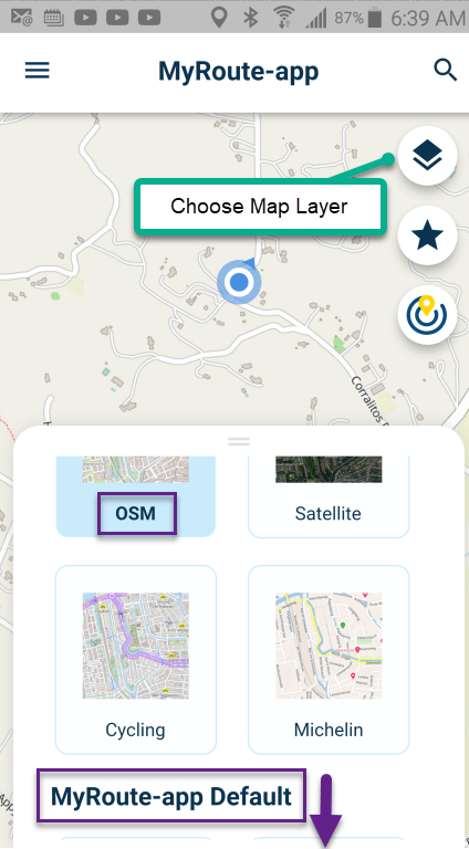
-
@Corjan-Meijerink said in Beta 3.2.15. First time on the bike:
Battery drain / power consumption
Yes, working on it! Very hard and annoyed by the cause. I've been in touch with HERE during my leave to make sure stuff keeps happing regarding this issue.
(zoom angle)
...It's actually kinda related to the battery drain too. Short summary: map rendering is the main source of power usage...I have seen statements that the new navigation app uses HERE Maps
The new app has the CHOICE of Maps, including Open Street Maps and HERE.Do some of these issues go away if OSM map layer is selected?
The "My Route app Default" layer has the appearance of OSM map without the house numbers.
If the new Navigation Next app "Uses HERE" what is the default?
@Bob-Harvey yeah, within that part of the app you can choose different map overlays (the visual part). Opening any route there will use the route calculation (line) as in the website.
However, when starting the navigation - you can only use HERE calculation and the maps (visual overlays) are also from HERE. This is because we developed the Navigation module using HERE software.
So what you show and the actual navigation are unrelated

-
@Bob-Harvey yeah, within that part of the app you can choose different map overlays (the visual part). Opening any route there will use the route calculation (line) as in the website.
However, when starting the navigation - you can only use HERE calculation and the maps (visual overlays) are also from HERE. This is because we developed the Navigation module using HERE software.
So what you show and the actual navigation are unrelated

@Corjan-Meijerink said in Beta 3.2.15. First time on the bike:
... when starting the navigation - you can only use HERE calculation and the maps (visual overlays) are also from HERE. This is because we developed the Navigation module using HERE software.
Thank you.
So there is no "Speed secret" if I try to navigate with Open Street Map layer in the Navigation App.
Choosing OSM will not behave like the original Navigation app because the entire platform has changed to HERE mapping rather than OSM. I get it. -
@Corjan-Meijerink said in Beta 3.2.15. First time on the bike:
... when starting the navigation - you can only use HERE calculation and the maps (visual overlays) are also from HERE. This is because we developed the Navigation module using HERE software.
Thank you.
So there is no "Speed secret" if I try to navigate with Open Street Map layer in the Navigation App.
Choosing OSM will not behave like the original Navigation app because the entire platform has changed to HERE mapping rather than OSM. I get it.@Bob-Harvey, I am curious... Where did you find an OSM layer within the Navigation Next part of the app?
-
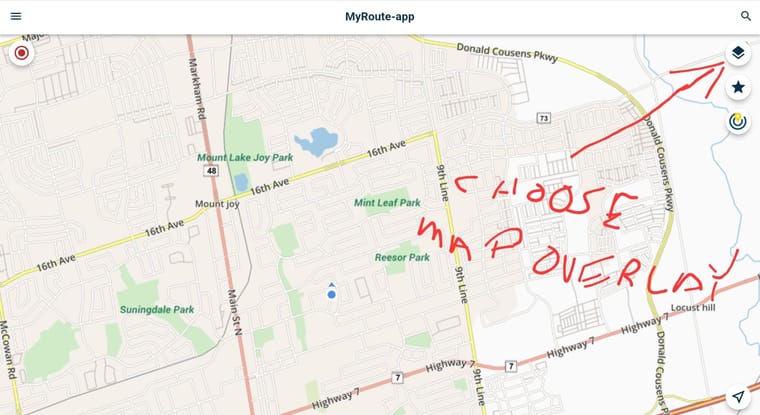
@Bob-Harvey, I am curious... Where did you find an OSM layer within the Navigation Next part of the app?
@Con-Hennekens sorry, my finger writing is poor.
-
@Bob-Harvey, I am curious... Where did you find an OSM layer within the Navigation Next part of the app?
@Con-Hennekens said in Beta 3.2.15. First time on the bike:
Where did you find an OSM layer within the Navigation Next part of the app?
Right, this is what you see when the app first opens, or when you open a route.
Once you start navigating, you no longer can choose the map layer.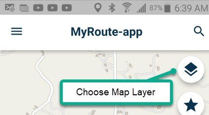
Are there benefits to HERE map that outweigh the challenges?
I have been familiar with them for many years on Garmin devices.For Android (or iPhone) navigation, using offline cell phone, it doesn't matter to me.
If OSM behaved better and was less bloated, I would be fine with OSM. -
@Con-Hennekens sorry, my finger writing is poor.

@Doug-Robinson, I was afraid of that
 but that is NOT the navigation part of the app. Navigation settings are under your profile icon. On the start screen press the hamburger menu / click the profile icon at the top right of the screen, scroll down to navigation settings.
 -
@Con-Hennekens said in Beta 3.2.15. First time on the bike:
Where did you find an OSM layer within the Navigation Next part of the app?
Right, this is what you see when the app first opens, or when you open a route.
Once you start navigating, you no longer can choose the map layer.
Are there benefits to HERE map that outweigh the challenges?
I have been familiar with them for many years on Garmin devices.For Android (or iPhone) navigation, using offline cell phone, it doesn't matter to me.
If OSM behaved better and was less bloated, I would be fine with OSM.@Bob-Harvey, there is A LOT to consider when choosing the platform for a navigation app. Once a choice is made, it is not easy to switch (you would be developing an entirely different app). Here offers a development kit. I don't know if OSM has something alike, but you can certainly not mix them in one app.
-
 undefined Rob Verhoeff referenced this topic on
