Navigation observations/questions...
-
I know that MRA Navigation is on it's way out, MRA Navigation Next is on it's way in, and in the interim, Navigation isn't likely to get much love. Not asking for it.
However... My observations on how Navigation works...
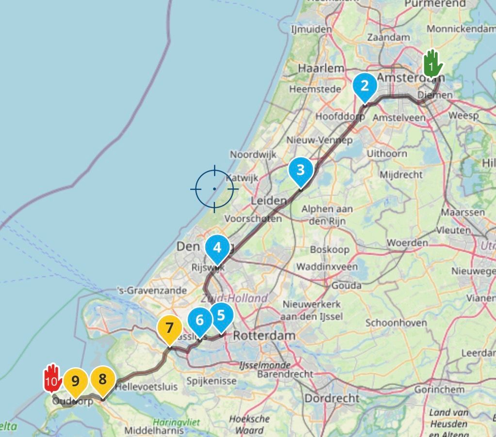
- It appears while navigating that you never see the distance to or the name of shaping points displayed at the top.
- Like in number 1, it appears that you don' t see the distance to or the names of vias (stops).
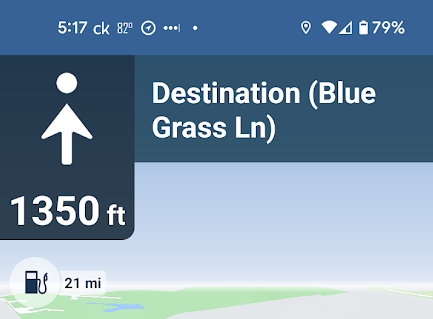
- If there is some distance before your next turn, it will just display a point with an arrow pointed straight up, a distance, and Destination (<route destination name>). Similar to this...

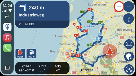
- When you get close to a turn - it will switch to displaying distance to the turn, direction of the turn, street name you are turning on, and lane assist.
Naturally, some of my observation may be in error (I may not have been paying close enough attention to what the apps is actually doing since I've been using it. So, if that's the case let me know). If my observations are correct, I got a couple of comments about 1 through 3...
I like #1.
#2 not so much. If this is indeed how it's mechanized, then I find it problematic. I missed a fuel stop on a trip a while back. I couldn't - for the life of me - figure out how I missed it when I had the Navigation app navigating right in front of me. Granted... when riding I tend to pay more attention to where I'm going and may have just missed it go by on the app. If this is what happened, I might suggest that it might be better if the app displayed distance to the stop (via) and the stop name (in this case, the gas station's name) well in advance of the stop (assuming it's the next navigation point to be encountered - no other turns between my current location and the stop etc.). Better yet would be if somewhere at the top of the screen the waypoint color and/or pause symbol was incorporated in the display somehow. I tend to use yellow for my fuel stops. I would hope that would get my attention.
As to #3... The screenshot that I included has the point fairly close. Generally, I think I normally see this when I have a fair distance to go before encountering then next navigation point. I assume what this display is telling me is - continue straight (or stay on the current road) for the distance indicated. There will be a navigation point (for example a turn) coming up in that distance. If I've interpreted this correctly, then good enough. But what I don't get is why it shows "Destination (<route destination name>)", especially since the final destination (via) may not be encountered until after many more waypoints are passed through in the route. Wouldn't it be better if it displayed the name of the road I'm supposed to continue straight on (up until it should start displaying an upcoming stop (via) or turn information)?
Anyway... tossing this out there so that 1) I might understand this thing better, and 2) it can be taken as a suggestion for the mechanization of the upcoming Next.
Thanks.
-
So it appears that I got an answer about my observations on #1 and #2 here...
It appears that my observations were correct. I'm good with #1. Disappointed with #2. On the upside, it appears that #2 is going to be addressed in Next. Great.
As to #3, assuming that my observations were correct, I hope it will also be addressed in Next.
-
 undefined MyRoute-app community moved this topic from [Beta] The MyRoute-app on
Hello! It looks like you're interested in this conversation, but you don't have an account yet.
Getting fed up of having to scroll through the same posts each visit? When you register for an account, you'll always come back to exactly where you were before, and choose to be notified of new replies (either via email, or push notification). You'll also be able to save bookmarks and upvote posts to show your appreciation to other community members.
With your input, this post could be even better 💗
Register Login

