MRA 6.0.0 (515) The Odd Text Field Not Correct
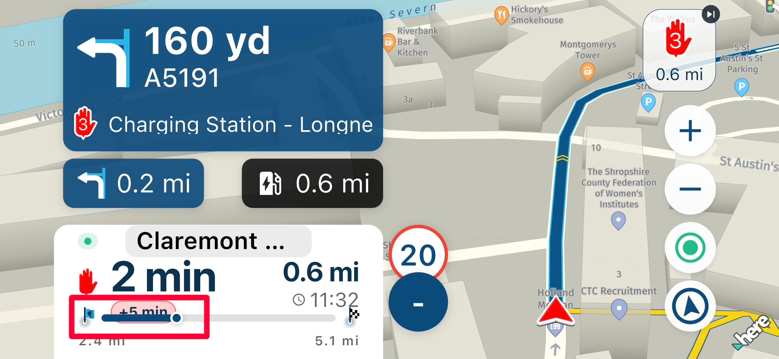
-

Using iOS 27 on IPhone 15 Pro, I have found three so far.
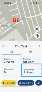
Travel Mode may well look better with just the symbol - I would be happy with just the symbol:
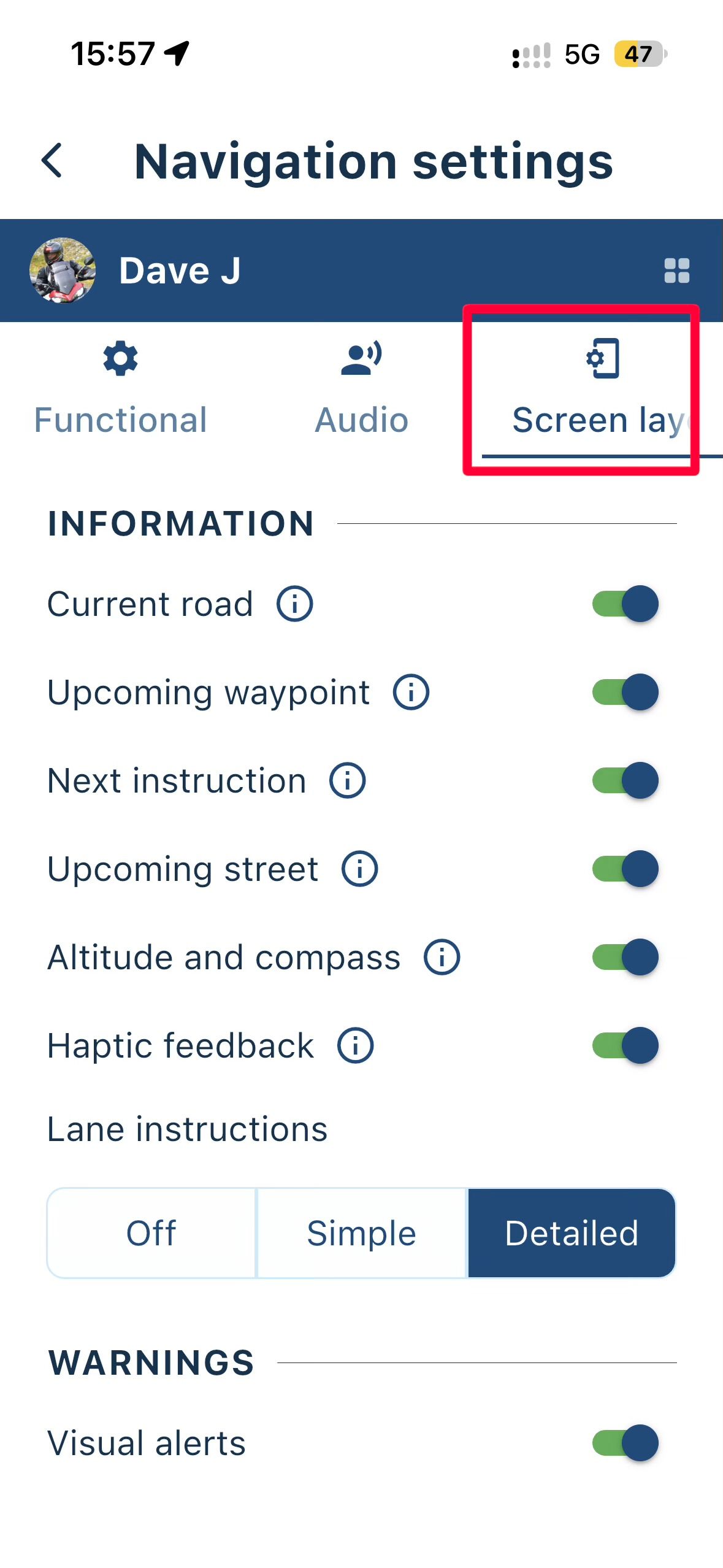
Screen Layout in Navigation Settings:
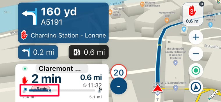
And the delay time when in landscape:
Might be due to my system settings but I thought I would flag this issue.
Kind Regards. Help where I can.
Ducati Multistrada V4 Rally
iPhone 18 Pro
CHIGEE AIO-6 LTE
Google Pixel 6 Pro - mounted on SP Connect Plus
Ex Garmin XT2 and XT1 as well as Ex TomTom Rider User -
Using iOS 27 on IPhone 15 Pro, I have found three so far.
Travel Mode may well look better with just the symbol - I would be happy with just the symbol:
Screen Layout in Navigation Settings:
And the delay time when in landscape:
Might be due to my system settings but I thought I would flag this issue.

@Dave-J-0 I agree with you that showing only an icon in the Travel Mode field might be sufficient to indicate which vehicle you are navigating with (or whether you are walking).
Actually, all of the screenshots have to do with your (and mine) iOS or Android settings. The larger you set the text, the less space there is available in the corresponding text field. If I remember correctly, we didn’t have scalable fonts in the app in the past (?) and with scalable fonts, this is something you have to deal with. Knowing that, it’s up to us to learn how to work with it

However, perhaps we could ask the devs to show only the icon for Travel Mode. The text could remain visible when selecting the mode, but perhaps it could be omitted when displaying the selected mode (?).
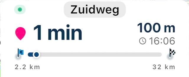
On the other hand, once you have selected the correct travel mode from the list, you will generally click Navigate straight away. So what would be the point of showing only the icon?I have set the font size so that the progress bar remains sufficiently visible. If you set the font size larger than that, the bar indeed runs through the text.
🏍️ BMW K1600GT-P (2013) | Nolan N100-5 with Sena 30K
📱 iOS on iPhone 13 & 16 (mounted on Quadlock or AliExpress extention on BMW-cradle)
🚙 Apple CarPlay in VW T-Roc
💻 Routelab on MacBook Air & iMac (Golden Gate & Ventura) -
@Dave-J-0 I agree with you that showing only an icon in the Travel Mode field might be sufficient to indicate which vehicle you are navigating with (or whether you are walking).
Actually, all of the screenshots have to do with your (and mine) iOS or Android settings. The larger you set the text, the less space there is available in the corresponding text field. If I remember correctly, we didn’t have scalable fonts in the app in the past (?) and with scalable fonts, this is something you have to deal with. Knowing that, it’s up to us to learn how to work with it
However, perhaps we could ask the devs to show only the icon for Travel Mode. The text could remain visible when selecting the mode, but perhaps it could be omitted when displaying the selected mode (?).
On the other hand, once you have selected the correct travel mode from the list, you will generally click Navigate straight away. So what would be the point of showing only the icon?I have set the font size so that the progress bar remains sufficiently visible. If you set the font size larger than that, the bar indeed runs through the text.
Thanks @Rob-Verhoeff I was aware that it was probably my settings but just wanted to flag to see if there was anything that could be done. Agree with your suggestion; I only want to see the Travel Mode before I navigate so that I can change the Mode if it is not what is needed.
Hello! It looks like you're interested in this conversation, but you don't have an account yet.
Getting fed up of having to scroll through the same posts each visit? When you register for an account, you'll always come back to exactly where you were before, and choose to be notified of new replies (either via email, or push notification). You'll also be able to save bookmarks and upvote posts to show your appreciation to other community members.
With your input, this post could be even better 💗
Register Login-
 01848
01848
-
 07149
07149
-
 06158
06158
-
 01045
01045
-
 1327355
-
0512
-
0522
-
0519