Font for the distance to the next turn to smal
-
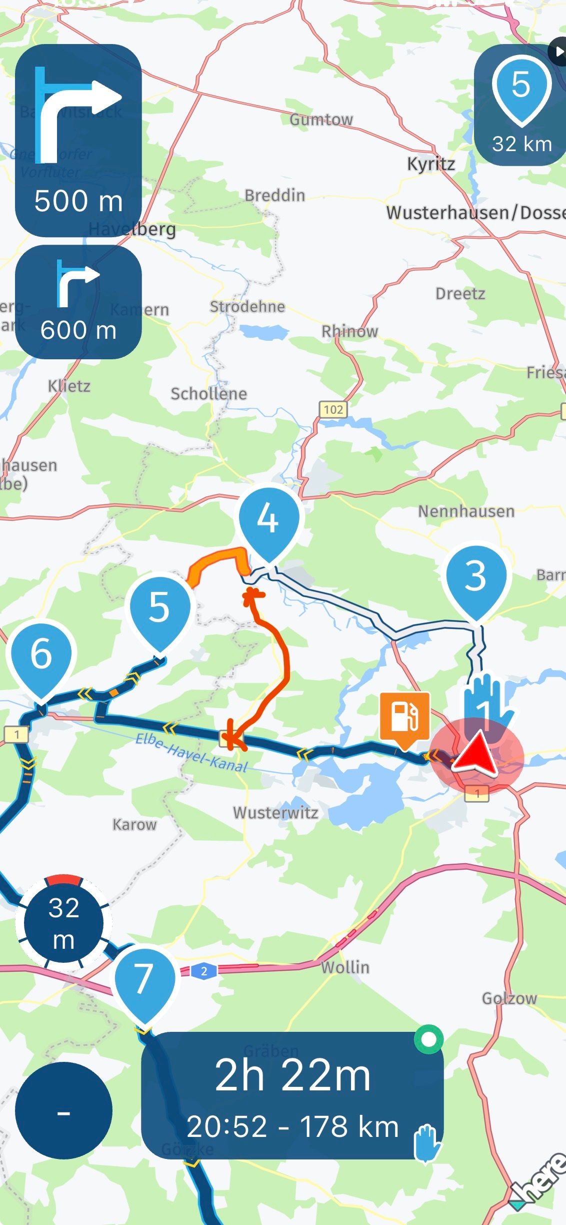
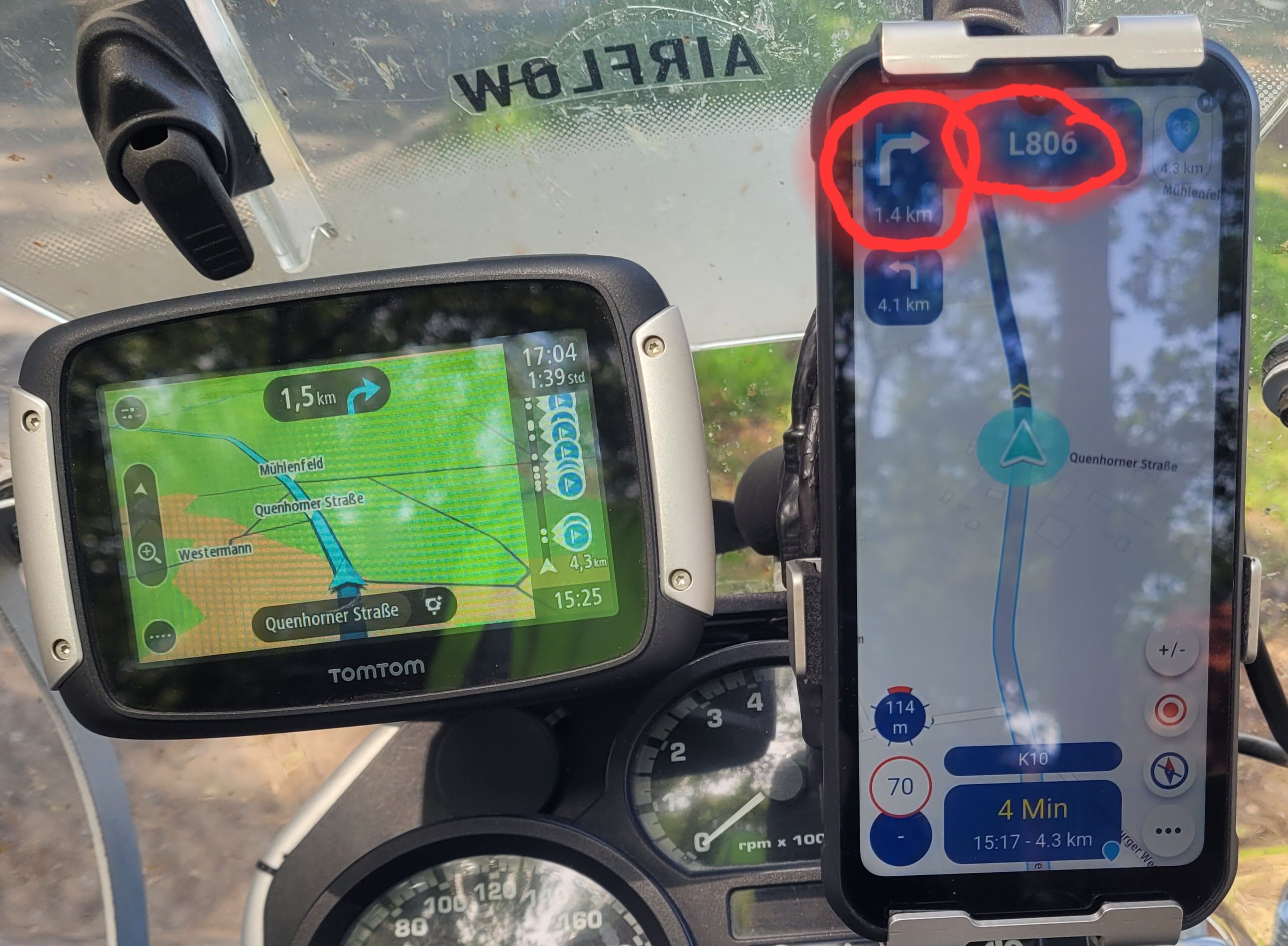
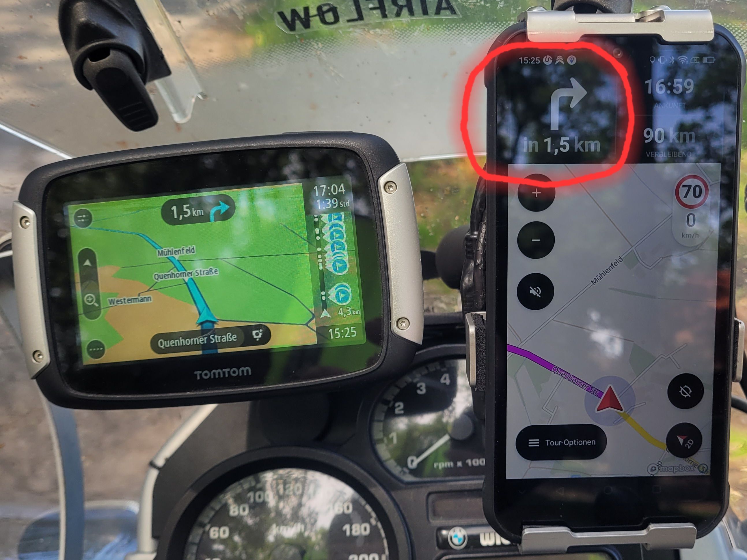
I have to agree that the font size of some elements is way too small. I use AA on a Honda NT1100 and with the new version, quickly glancing at the screen makes reading the speed and distance to next manoeuvre easy – no issues there. I also don’t face any difficulties with the distance to the subsequent manoeuvre but it seems others do. However, the distance to the next waypoint is too small. I have to lean forward quite a bit to read it which I think makes this unsafe. I like this new feature, but it’s current implementation is far from ideal. Similarly with the altitude. These are good and worthwhile features to have and we know about the issues with screen “real estate” and competing demands for clarity and more features, but having them when they can’t be read easily or safely strikes me as being an area for development. The exit number on the roundabout symbol is currently just too small to be of any use.
Hello! It looks like you're interested in this conversation, but you don't have an account yet.
Getting fed up of having to scroll through the same posts each visit? When you register for an account, you'll always come back to exactly where you were before, and choose to be notified of new replies (either via email, or push notification). You'll also be able to save bookmarks and upvote posts to show your appreciation to other community members.
With your input, this post could be even better 💗
Register Login-
01563
-
67114
-
0617
-
0524
-
08751
-
05105
-
0592
-
2449