Next viapoint on screen
-
Hello, this is an improvement that I proposed a long time ago and that I think has not been fully implemented. When you are arriving at a viapoint (I think 2km before), the information about that via point is shown on the screen, but I think it would be very interesting to know at all times what the next via point on the route is, including highlighted shaping points. Normally we use via points for stops to refuel, eat or take a photo and, although we may have information on the time or distance remaining to the next via point, it is important to know which one is next and its description. In a route that you have just created, it is probably easy to remember, but if you created the route a long time ago and you have several via points on the route, it is difficult to remember or know which is the next one that awaits you.
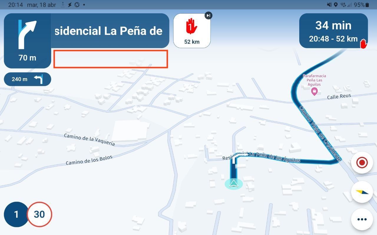
An example of where the waypoint name could be located would be where the red rectangle appears:
 -
Hi, I'm trying to understand the meaning and purpose of your suggestion, but it doesn't really make sense to me.
I can see this information via the waypoint list, can't I?
Arrival time and kilometers to the next viapoint are on the screen. -
I do understand what is meant.
What @bluetuz meant is a part of feature i like to have. TomTom uses this already for 10 years. This one of the best things i like of TomTom Rider (TomTom Go).
On bar instead of many buttons which gives you all the info you want to know when riding a route.It is the feature on the right side of the screen.
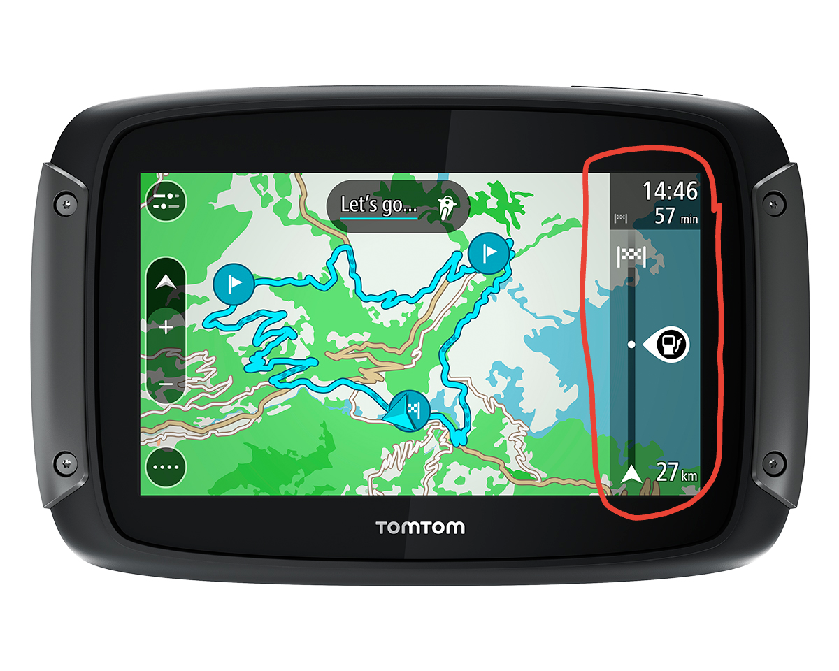
Here you have important information like:- Coming gasstations
- Coming all kind of traffic issues
- Coming Viapoints
- Time/distance to endpoint. And/or Time/distance to next Viapoint
- Etc
In case of TomTom this for the coming 50 km. For most people, this means for the next hour.
Ohh. The user can select which info he wants to see and which not.
-
Yes, what @M-Schrijver say would be fabulous. What I mean is that, although in the list of via points we can see which are the next ones, it would be good to have the name of the next one on the screen. I give an example: we are on a route with several via points and we think that the next one is a stop to refuel but we have actually scheduled a stop to take photos or something else. The functionality of TomTom would be the best, but I just want to know what the name of the next via point is
@bluetuz I agree it would be good to know the title at least of the next via point on carplay
-
Yes, what @M-Schrijver say would be fabulous. What I mean is that, although in the list of via points we can see which are the next ones, it would be good to have the name of the next one on the screen. I give an example: we are on a route with several via points and we think that the next one is a stop to refuel but we have actually scheduled a stop to take photos or something else. The functionality of TomTom would be the best, but I just want to know what the name of the next via point is
@bluetuz Add a fuel icon
 ️ or coffee icon
  ️ to the via point.
 -
@Peter-Schiefer I know that option and I use it, but I want to view the text (tittle) of the next via point on screen
-
@Corjan-Meijerink any possibility of implementing this feature?
-
Hello, this is an improvement that I proposed a long time ago and that I think has not been fully implemented. When you are arriving at a viapoint (I think 2km before), the information about that via point is shown on the screen, but I think it would be very interesting to know at all times what the next via point on the route is, including highlighted shaping points. Normally we use via points for stops to refuel, eat or take a photo and, although we may have information on the time or distance remaining to the next via point, it is important to know which one is next and its description. In a route that you have just created, it is probably easy to remember, but if you created the route a long time ago and you have several via points on the route, it is difficult to remember or know which is the next one that awaits you.
An example of where the waypoint name could be located would be where the red rectangle appears:
 
Hi @Corjan-Meijerink , is there any possibility of implementing this?
-
This is currently not planned

We believe the majority of the community is happy with the way it is implemented.Displaying the information all the time leads to a very busy UI.
Adding an icon to the point together with a colour gives a great indication of the upcoming waypoint at all times! -
This is currently not planned

We believe the majority of the community is happy with the way it is implemented.Displaying the information all the time leads to a very busy UI.
Adding an icon to the point together with a colour gives a great indication of the upcoming waypoint at all times!@Corjan-Meijerink How do you know which is the next viapoint without entering the waypoints list menu? Any way?
-
@Corjan-Meijerink How do you know which is the next viapoint without entering the waypoints list menu? Any way?
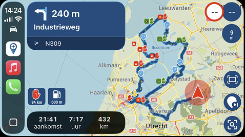
@bluetuz as you see in your original image, you always see the upcoming waypoint. In your case the red viapoint 1.
So you know the upcoming waypoint by type, colour, number and optional icon

-
Not in Android Auto.
You see nothing about the waypoints. You see the waypoints only when you are close to one of them.
With the bar you see different things for the coming hour or so.This bar (TomTom's version) works also in Android Auto. It is simply brilliant. According to many TomTom users. This is one of the best parts of their system.
I don't want only info about the next point. I want info about multiple points. So i can plan things while i'm riding.
When can i expect the next gasstation and the one after that one. Will there be a gasstation for the comming hour. So should i fill-up now or can it stilll wait.
When is a (planned) suitable coffee/lunch stop. Maybe i can combine this with a fuel stop. Or maybe the (planned) suitable coffee/lunch is still too far away. And i make a stop as soon as possible.
Why is my estimated finish time extended. Ahh. The sidebar tells me there is an accident about 45 min from now with a delay of 15 min.
When can i expect that beautiful viewpoint, which i put in the route.I like to know al that information. I like to plan things through the day. Not strictly but me and my wife like to know what to expect during the day.
-
This is currently not planned

We believe the majority of the community is happy with the way it is implemented.Displaying the information all the time leads to a very busy UI.
Adding an icon to the point together with a colour gives a great indication of the upcoming waypoint at all times!This post is deleted! -
@bluetuz as you see in your original image, you always see the upcoming waypoint. In your case the red viapoint 1.
So you know the upcoming waypoint by type, colour, number and optional icon

@Corjan-Meijerink said in Next viapoint on screen:
@bluetuz as you see in your original image, you always see the upcoming waypoint. In your case the red viapoint 1.
So you know the upcoming waypoint by type, colour, number and optional icon

I don't agree.
I gives you the opportunity to clean up the ui.
Now you have different buttons for info. You can put them all in one bar. And all visible at the same time. -
This is currently not planned

We believe the majority of the community is happy with the way it is implemented.Displaying the information all the time leads to a very busy UI.
Adding an icon to the point together with a colour gives a great indication of the upcoming waypoint at all times!@Corjan-Meijerink All you would need to do is add an option that allows the next waypoint name to be shown as it does when it’s close to be on all the time if wished. When I commute I have a round route with waypoints. Going to work as there is a turn ahead then the waypoint name only appears at the last moment (maybe a km or 2 away. On the way home after the last turn then the waypoint name is there all the time - so what I’m after is the ability ty for it to be like that all the time not just at the last part. It’s clearly in there and an option to keep it on would l make the behaviour consistent. This happens both on Android and ios
-
@bluetuz as you see in your original image, you always see the upcoming waypoint. In your case the red viapoint 1.
So you know the upcoming waypoint by type, colour, number and optional icon

@Corjan-Meijerink Hi Corjan, I agree with @M-Schrijver and @SHANNON MCDOUGALL 0
It is clear that we have the distance and time until the next Viapoint on the screen and that we must try to keep the interface clean, but I think that, in the absence of having an excellent solution like TomTom's, it is important to know which is the next Viapoint . If it is a stop to have coffee, if there is a stop for a photo beforehand, if there is a visit to a monument, a gas stop, etc., etc. Knowing that you have 50km or an hour left is fine, but it is better to know what that stop is for. I don't know how you see it, but for me it is very important and I see that there are users who think the same. As an alternative, this feature could be included and it could be selectable whether or not you want it to be displayed.
-
@bluetuz as you see in your original image, you always see the upcoming waypoint. In your case the red viapoint 1.
So you know the upcoming waypoint by type, colour, number and optional icon

@Corjan-Meijerink I can only agree with the opinion of the previous speakers. The lack of information about upcoming waypoints is the biggest shortcoming in the MyRoute app. There is no information at all in Carplay and in the app it is only a half-hearted solution.
I already presented a solution in January. Unfortunately, it has not been implemented for half a year.
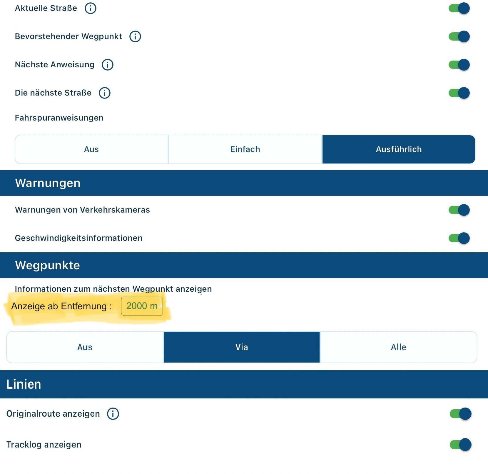
With the following option, every user could set the waypoint information according to their needs. With the value 0 m, the next waypoint is constantly displayed, as in version 4.0.2 from July 2023.
Hello! It looks like you're interested in this conversation, but you don't have an account yet.
Getting fed up of having to scroll through the same posts each visit? When you register for an account, you'll always come back to exactly where you were before, and choose to be notified of new replies (either via email, or push notification). You'll also be able to save bookmarks and upvote posts to show your appreciation to other community members.
With your input, this post could be even better 💗
Register Login
