Making CarPlay Zooming more effective
-
I have just purchased a Chigee AIO-5 Play BMW Edition and have started using CarPlay a lot more with MRA Navigation. The AIO-5 Play BMW Edition also allows you to navigate the CarPlay screen and MRA app using the BMW Wonder Wheel which makes using MRA much easier in a similar way to other BMW Motorrad navigation products, Navigator V, VI and the Connected Ride Navigator.
I have also tried some other navigation apps in particular TomTom GO and I think there is a way of improving the usability of MRA on CarPlay.
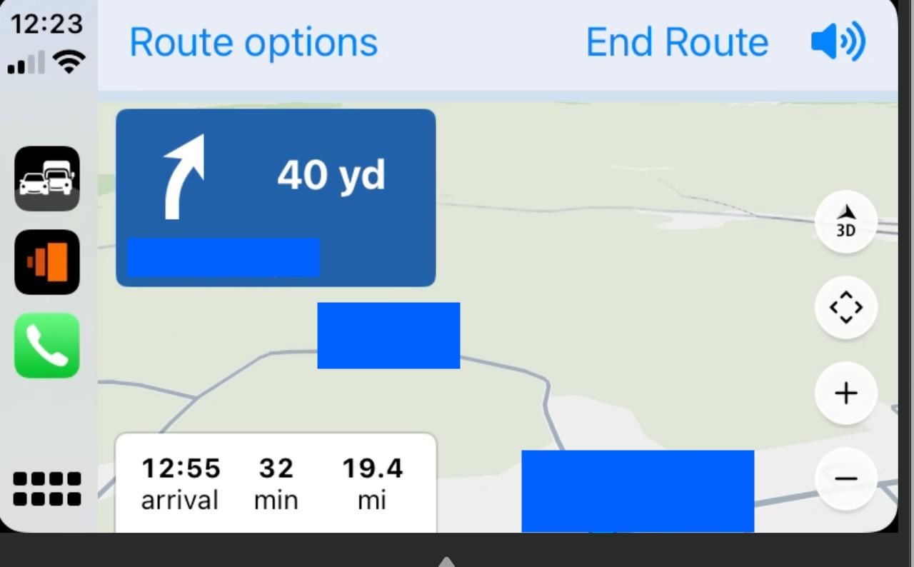
Here is a screenshot of the TomTom GO 'home screen' when navigating (I have blanked out the address details):

For TomTom GO the zoom buttons are on the home screen which means that it only needs a couple of turns to move to them using the BMW wheel and then a right click to zoom. More right clicks will zoom more and then one turn will select the other direction. After a few second TomTom GO will hide the buttons (as does MRA in CarPlay) but a single turn will bring back the buttons with the last position selected. In summary zooming on the TomTom GO interface is very easy and approaches the usability of the native BMW Navigation products on an RT or GS.
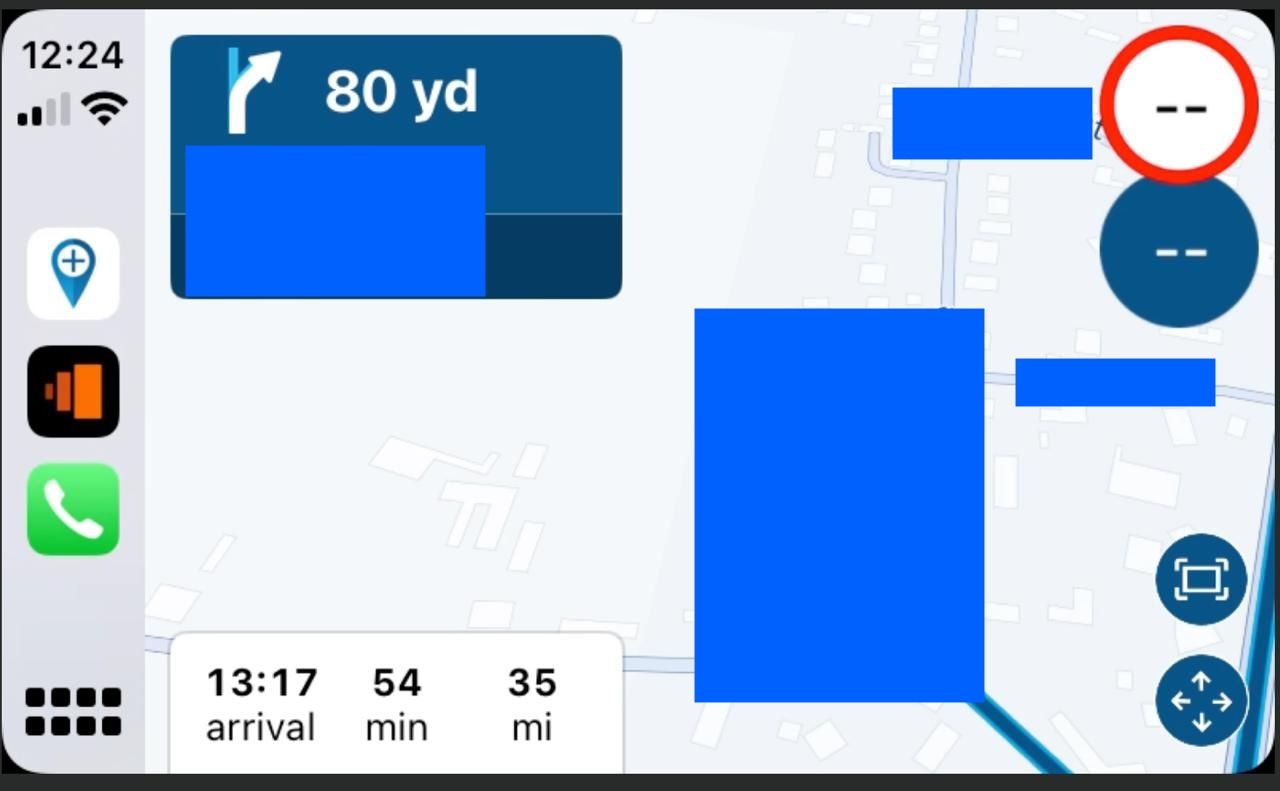
Here is a view of the MRA 'home screen' by contrast (again I have hidden the address details):

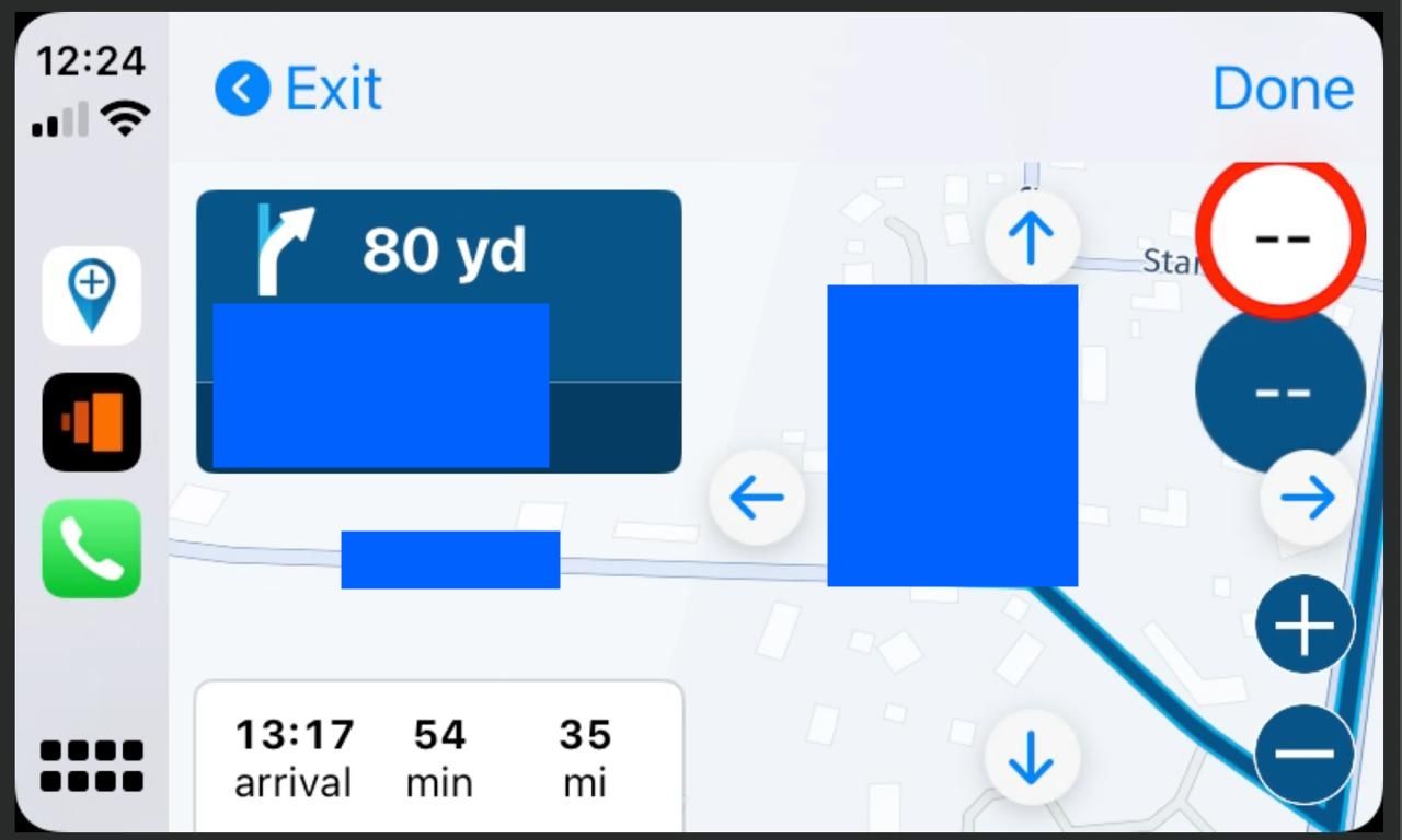
Now the zoom buttons are hidden. To get at the zoom buttons you need to navigate all the way around the screen to the bottom right corner and select the map move button. After that we get the map move arrows AND the zoom buttons combined:

There are a further four operations needed to navigate around the move buttons before alighting on the important zoom buttons. Once there operation is similar to TomTom GO.
As a rider I will often want to zoom the map when riding especially if there has been a road closure and MRA has rerouted the ride. I never try to move the map when I am riding and if I needed that I would probably stop and use my finger to scroll the map on the CarPlay screen.
I also note that when using MRA directly on a smartphone there is a +/- button so one click brings up the zoom buttons without the unneeded map scrolling arrows.
So my suggestion is quite simple please could you change the CarPlay interface to move the zoom buttons to the 'home screen' when navigating and if necessary hide the map move button. This would make MRA as usable as TomTom GO. (These buttons will disappear ion a few seconds after selection as the MRA app will clear the screen). Or as a second best could we have a dedicated +/- zoom button on the home screen as the MRA app has on the smartphones. If necessary this could be a selectable option for those riders that would prefer map moving to zooming on CarPlay/Android Auto?
I think this change would certainly improve the usability of MRA when zooming compared to other navigation apps such as TomTom where the control is done via the BMW wheel or else just by touching a zoom button on the screen.
I hope this will be a useful suggestion and apologies for the length of the post but I wanted to make clear what I was suggesting.
-
Thanks for your elaborate feedback!

We will work a bit more on AA / CP in the coming weeks and will take this into consideration.I am not sure what exactly will be possible within the timeframe but improvements can definitely be made!
-
Thanks for your elaborate feedback!

We will work a bit more on AA / CP in the coming weeks and will take this into consideration.I am not sure what exactly will be possible within the timeframe but improvements can definitely be made!
@Corjan-Meijerink thank you, I do hope you are able to make the improvements. I already find MRA very effective with the dedicated CarPlay Chigee and every small improvement makes the system even better. I need my iPhone for medical use so for me mounting the smartphone on the handlebars is not an option, I need to use CarPlay. Good luck with the future improvements and if there is anything I can do to assist please let me know. Steve
-
 undefined Dae 0 referenced this topic on
