Route Overview
-
Suggest to significantly reduce the width of the overview route line that shows - with such a wide line, using overview is pretty much pointless as it will not provide a good indication of the actual intended route because it 'blends' in so much of the surroundings/proximity to other nearby roads. It actually can make the route designed seem incorrect.
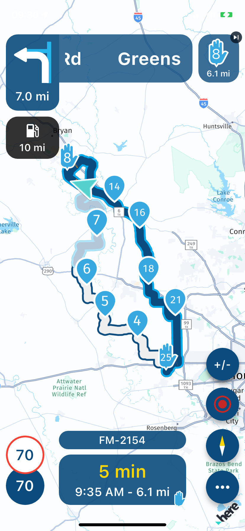
The line width that shows uo in screen prior to selecting the next function shows a much better overview in the 1/4 screen it shows the route.
-
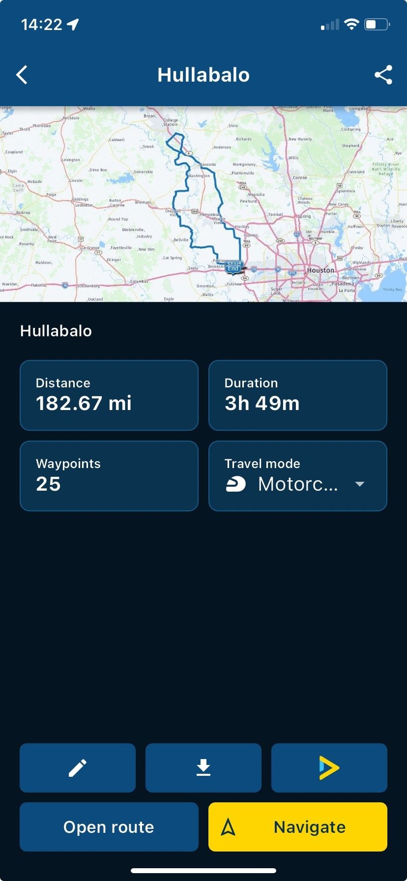
Suggest to significantly reduce the width of the overview route line that shows - with such a wide line, using overview is pretty much pointless as it will not provide a good indication of the actual intended route because it 'blends' in so much of the surroundings/proximity to other nearby roads. It actually can make the route designed seem incorrect.

The line width that shows uo in screen prior to selecting the next function shows a much better overview in the 1/4 screen it shows the route.

@GT-JWR, Your route-line seems thicker than mine:
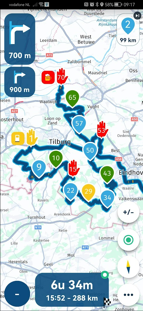
It does not bother me, but I guess it couldn't hurt to have it a bit thinner indeed.
-
I agree, one third or half as thick would be better.

-
@Jörgen 1/3 or less for sure!
