shortcut to route on homescreen
-
Hi all,
Thanks for this really great route planning tool. We have a small campervan and for planning our Ireland tour this year I came across MRA.
Now, while using it so far, I have noticed that we often make stops on our tours where I completely close the MRA app in order not to leave it running in the restaurant or during other activities. Now, when I am back in the vehicle, I would like to continue with the navigation and possibly the tracking. To do this, however, I have to search for the route in the menu and reload everything.
Is it therefore possible to have a link or a widget on the home screen where my desired route is stored directly and the app starts directly with the navigation and tracking? That way I can get in and continue with the push of a button.
Best regards
Tony -
@Gertrud-Bürstner said in shortcut to route on homescreen:
Is it therefore possible to have a link or a widget on the home screen where my desired route is stored directly and the app starts directly with the navigation and tracking? That way I can get in and continue with the push of a button.
Best regards
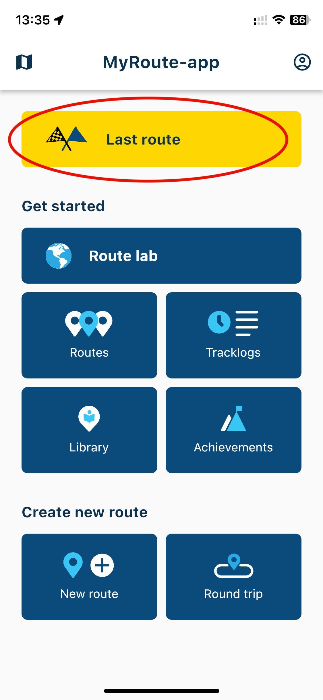
TonyIf I understand your request properly, this function is already available from the Mobile app.... it's at the top, shown as "Last Route" which opens the last route you had open and you can choose the Navigation button from there.

-
@Frappawotsit This is just a question: my understanding was that Last Route button will take you to the last route that was worked on using Webapp on the PC, not the last navigated route, no? It would be great if we had a button to return to the Last Navigated Route.
-
As MRA are great at giving its end users choices, I
suppose it makes sense to officially request that we also have the option to return to the last Navigated route as well.
As we are talking about the Navigating in the mobile app I guess this would not be a priority but maybe something for after the release? -
This sort of ties in with a suggestion I made.
We always put departure dates and times in routes, so it would be good to have the button (user configurable if desired) allow you to navigate the route that you should be on based on the current date/time. This would emulate the Garmin behaviour where the route that you “should be on” is at the top of the list of routes you want to select to navigate. The remaining routes are displayed in departure date order, most current at the top
-
I'm in favour of this - especially since the app could remember 1) the route wasn't completed, and 2) the route was used only xx minutes/hours ago, and therefore a good default would be to offer to resume the part-navigated route on the next opening of the app.
-
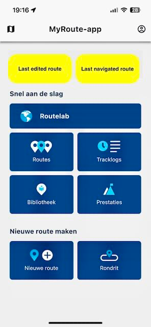
Option: two yellow chekboxes instead of one
left: last edited route
right: last navigated routeCouldn't find some ux-icons to go with the text. The flags are good for navigation?

-
@UltraStar My bad, you are indeed correct. Sorry for any confusion
-
Yes, we are thinking about this

Don’t want too much buttons or ambiguous behavior. Now it aligns perfectly with the same button on the website. -
I am pleased that my post has led to a small discussion and that there are other users with similar wishes.
I myself was thinking more of the possibility of selecting a route in the app and then making a shortcut on the homescreen. Similar to the playlists on Spotify.
But this is a function that can be further developed in the final version.Currently, the loading of the route itself is still a bit slow for me, although I have it available offline.
-
@Gertrud-Bürstner said in shortcut to route on homescreen:
the loading of the route itself is still a bit slow for me, although I have it available offline.
You need to access the downloaded routes via the "hamburger menu", then then enter the profile (the button on the absolute top right), and choose "Downloads". If you load the routes like you usually do through the Routes option, it will still get downloaded on accessing. This behavior is likely to get changed in an update (I hope
 )
) -
@Corjan-Meijerink said in shortcut to route on homescreen:
Don’t want too much buttons or ambiguous behavior.
Unfortunately I’d say that the button is already ambiguous, given many people don’t know if it means last used, last edited etc.
I personally wouldn’t expect the same buttons if in different modalities, e.g. navigation or route planning. They’re two very different activities and therefore I’d expect the buttons/menus/options to be relevant to the current use case.
-
@Dae-0, I agree. And I don't think that it will be a problem.
@Corjan-Meijerink Users of the navigation part of the app, find it very logical to use that button to start the latest driven route again. People who use different means of navigation, will not start any routes for navigation in the app, and the last edited route is openen by that same button (like it is now). When I access the planner to edit or create a new route (be it the mobile app planner or the online planner), I am perfectly fine with it when that route gets opened by that same button. So, I would say one button is enough, and needs to be redefined as "last edited OR driven route" (whichever comes last).