I gave the new Beta app another go today.
-
It all went pretty well, with no problems in the car.
Some comments (and probably some questions) to follow when I am home.
-
It all went pretty well, with no problems in the car.
Some comments (and probably some questions) to follow when I am home.
@Richard-18 happy to hear that

Looking forward to potential feedback! -
Comments / questions, all coming from today, running an iPhone 13 ProMax in a VW Polo, powered by a standard Apple lead from the cigarette lighter socket. I confess some of these might well be down to user error.
A. Power usage
I started the morning with a fully charged (100%) phone, receiving charge from the car. The journey was one hour (70 miles) on a straightforward A to B route. No other apps were actively running though of course a few might be running in the background.
After one hour, the battery was showing 89% or a loss of 11%.
By contrast, the return journey over the same route, which took one hour and twenty minutes (due to heavy traffic in east London on the A13) showed a starting power of 54% (I had used the phone a lot during the day) but power of 55% - ie. no loss at all - on arriving at home. That is what I think I would expect.
Very different figures. I can only guess that I was possibly recording the journey on the way up.
B. Track colour
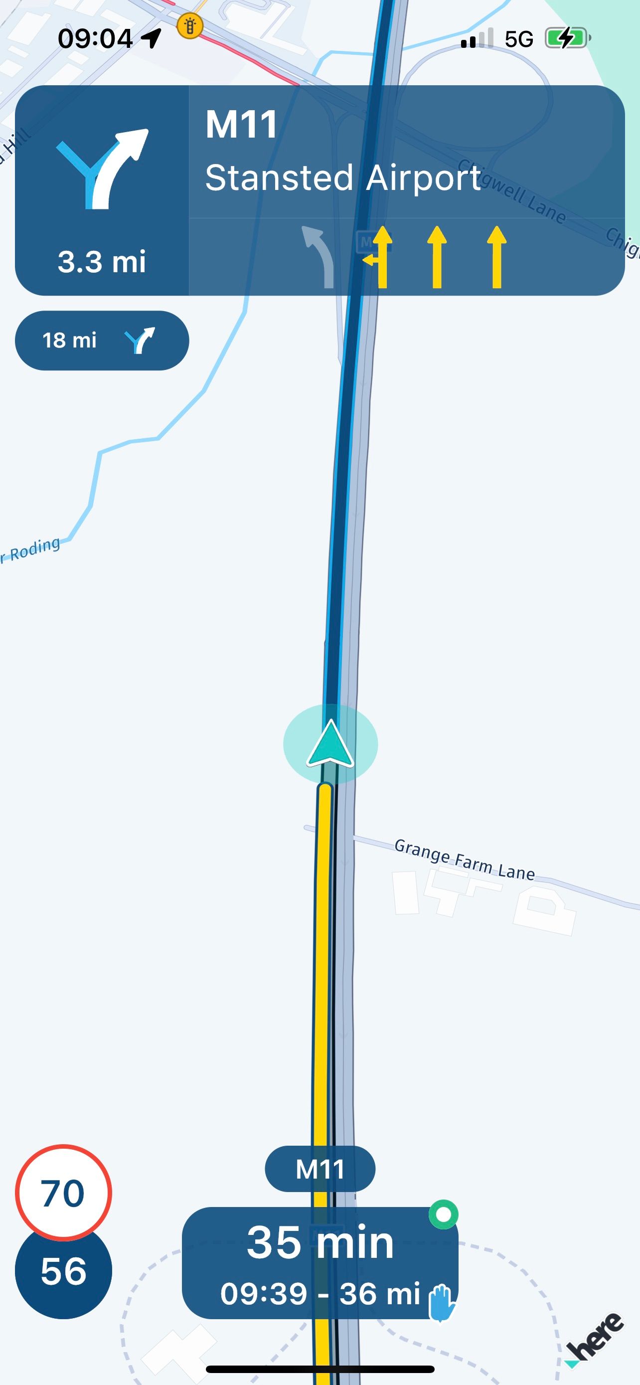
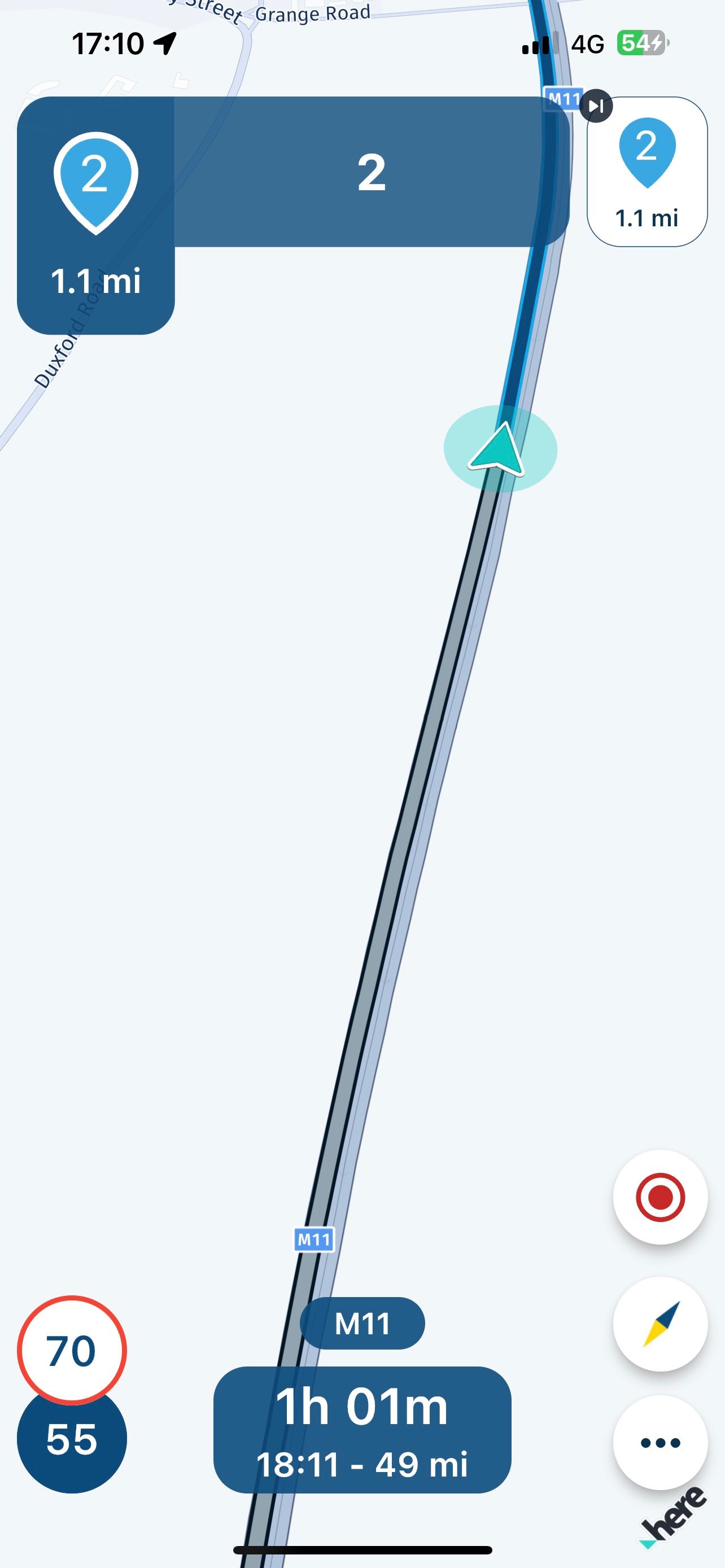
On the way up, the app showed the track I had driven as a bold yellow line. On the way back, it was a dull grey.
I have no idea why one is yellow and the other grey?
C. Buttons for filming and taking pictures
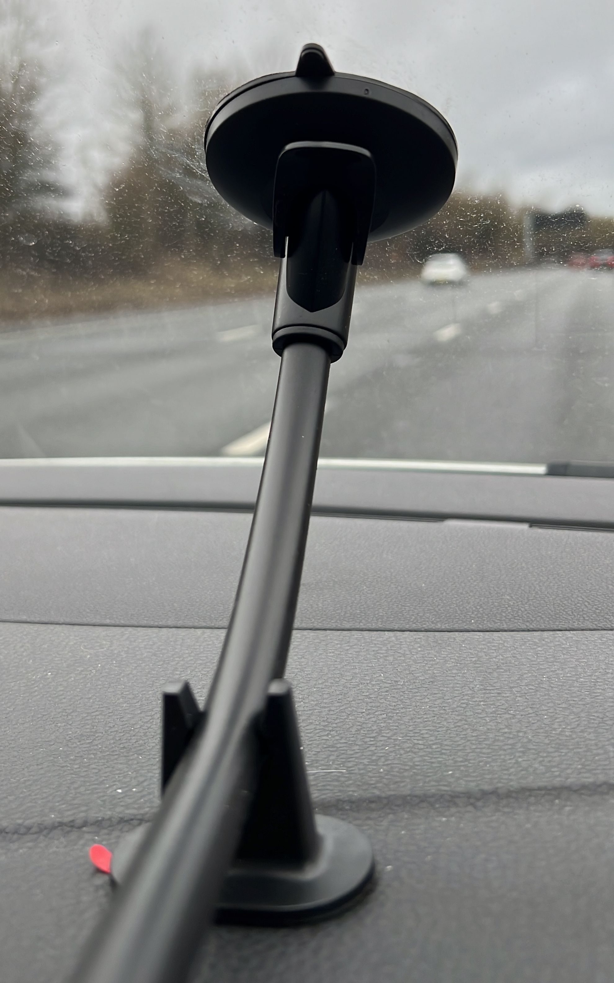
I can see no value in these at all. When the phone is mounted on a bike or in most cars, the pictures are less than stunning, particularly on a bike when the phone is typically mounted on the bars.
D. North up or route up
Out of preference, I like the route up. Can this made a default option, ie. the owner chooses which orientation they want and the app sticks to it.
I noticed that if I tapped on the map I could make the buttons for the filming / pictures vanish. Which is fine.
What I did though notice was that sometimes the map altered so that the cursor showing the vehicle’s position didn’t scroll and remain central on the display. Inevitably it eventually vanished off the screen. Why it did this sometimes and not always, I have no idea.
E. Green and orange dot
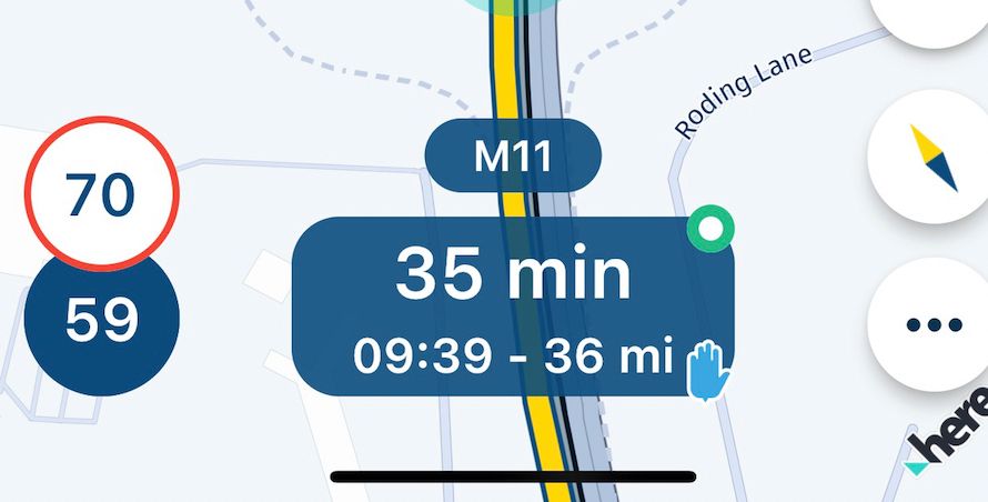
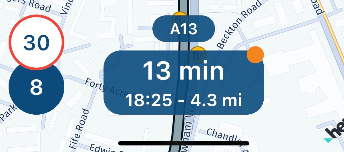
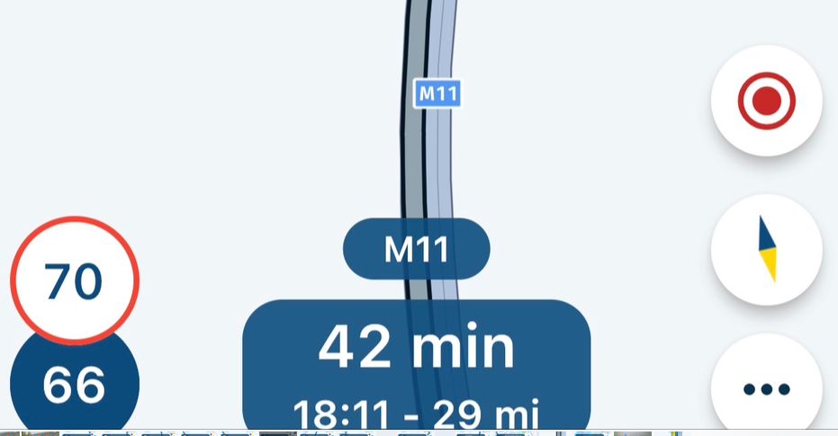
What is the significance of the green or orange dot in the top right hand corner box at the bottom?
Why does it change colour?
Why is there sometimes no dot at all?
F. Voice prompts
This may well just be an iPhone / VW thing, perhaps?
On the way up I had the car radio off. There were no voice prompts from the phone’s speaker.
On the way back, I had the car radio on and the voice prompts came through the car radio speakers, very clearly.
Do I always have to have the car radio on, to hear voice prompts from the app?
G. The colour of the route
I appreciate that My`Route’s ‘corporate colour’ is blue. Might it be possible for the user of the app to chose a different colour, other than dark blue, please.
Whilst the detail and clarity of the display is very good, I would prefer to make the route stand out more clearly, in a colour that was very different to the overall ‘blue’ theme. Garmin make this work really well with their magenta.
H. Zoom in and out buttons
Can we have these please, preferably instead of the camera buttons.
H. Good things include:
i. Great lane marking
ii. The exit / junction numbers now seem to be working
iii. I like the box at the bottom and how you can tap on it for different data.
If it could be set up to allow the owner to select what was the dominant piece of data of the three on display, the other two being reduced, it would be perfect.
iv. No app crashes
v. I don’t usually use speed warnings but I like the way it gives a little (2 miles an hour) leeway before it goes red. I similarly like the way the camera alert changes to red, depending on the vehicle’s speed.
v. The option to display (or not) the way and shaping points works really well
I. Not so good:
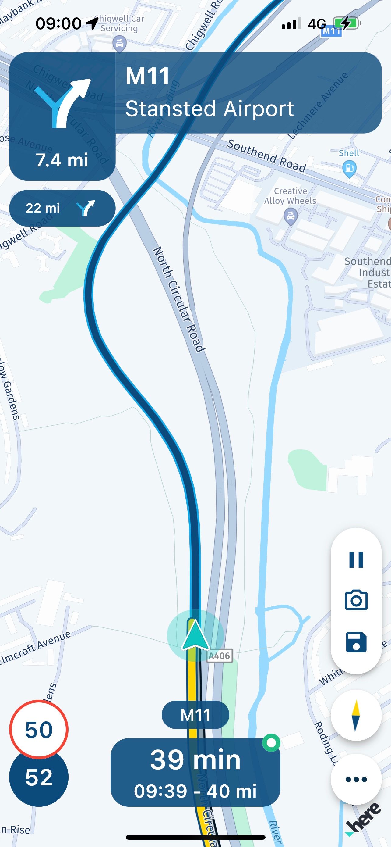
i. I still see no point in the second smaller direction change box. This can sometimes be miles away, as shown in this picture. The 7.4 mile indicator is fine and useful; the second (very small) 22 mile indicator is not useful at all.
ii. Nothing else
Overall, a really good experience. This is great as I, as a newcomer to MyRoute, am also learning as I go along. The app and the whole MyRoute app ‘thing’ is really good…… and that’s me as a long term Garmin fan saying it!
Richard
-
Comments / questions, all coming from today, running an iPhone 13 ProMax in a VW Polo, powered by a standard Apple lead from the cigarette lighter socket. I confess some of these might well be down to user error.
A. Power usage
I started the morning with a fully charged (100%) phone, receiving charge from the car. The journey was one hour (70 miles) on a straightforward A to B route. No other apps were actively running though of course a few might be running in the background.
After one hour, the battery was showing 89% or a loss of 11%.
By contrast, the return journey over the same route, which took one hour and twenty minutes (due to heavy traffic in east London on the A13) showed a starting power of 54% (I had used the phone a lot during the day) but power of 55% - ie. no loss at all - on arriving at home. That is what I think I would expect.
Very different figures. I can only guess that I was possibly recording the journey on the way up.
B. Track colour
On the way up, the app showed the track I had driven as a bold yellow line. On the way back, it was a dull grey.
I have no idea why one is yellow and the other grey?


C. Buttons for filming and taking pictures
I can see no value in these at all. When the phone is mounted on a bike or in most cars, the pictures are less than stunning, particularly on a bike when the phone is typically mounted on the bars.

D. North up or route up
Out of preference, I like the route up. Can this made a default option, ie. the owner chooses which orientation they want and the app sticks to it.
I noticed that if I tapped on the map I could make the buttons for the filming / pictures vanish. Which is fine.
What I did though notice was that sometimes the map altered so that the cursor showing the vehicle’s position didn’t scroll and remain central on the display. Inevitably it eventually vanished off the screen. Why it did this sometimes and not always, I have no idea.
E. Green and orange dot
What is the significance of the green or orange dot in the top right hand corner box at the bottom?
Why does it change colour?
Why is there sometimes no dot at all?


F. Voice prompts
This may well just be an iPhone / VW thing, perhaps?
On the way up I had the car radio off. There were no voice prompts from the phone’s speaker.
On the way back, I had the car radio on and the voice prompts came through the car radio speakers, very clearly.
Do I always have to have the car radio on, to hear voice prompts from the app?
G. The colour of the route
I appreciate that My`Route’s ‘corporate colour’ is blue. Might it be possible for the user of the app to chose a different colour, other than dark blue, please.
Whilst the detail and clarity of the display is very good, I would prefer to make the route stand out more clearly, in a colour that was very different to the overall ‘blue’ theme. Garmin make this work really well with their magenta.
H. Zoom in and out buttons
Can we have these please, preferably instead of the camera buttons.
H. Good things include:
i. Great lane marking
ii. The exit / junction numbers now seem to be working
iii. I like the box at the bottom and how you can tap on it for different data.
If it could be set up to allow the owner to select what was the dominant piece of data of the three on display, the other two being reduced, it would be perfect.
iv. No app crashes
v. I don’t usually use speed warnings but I like the way it gives a little (2 miles an hour) leeway before it goes red. I similarly like the way the camera alert changes to red, depending on the vehicle’s speed.
v. The option to display (or not) the way and shaping points works really well
I. Not so good:
i. I still see no point in the second smaller direction change box. This can sometimes be miles away, as shown in this picture. The 7.4 mile indicator is fine and useful; the second (very small) 22 mile indicator is not useful at all.

ii. Nothing else
Overall, a really good experience. This is great as I, as a newcomer to MyRoute, am also learning as I go along. The app and the whole MyRoute app ‘thing’ is really good…… and that’s me as a long term Garmin fan saying it!
Richard
@Richard-18 said in I gave the new Beta app another go today.:
On the way up, the app showed the track I had driven as a bold yellow line. On the way back, it was a dull grey
blue route = route ahead
yellow = route track
grey = route doneGreetings
Ronni -
@Richard-18 said in I gave the new Beta app another go today.:
On the way up, the app showed the track I had driven as a bold yellow line. On the way back, it was a dull grey
blue route = route ahead
yellow = route track
grey = route doneGreetings
RonniSo the yellow track is only displayed when the route being driven is also being recorded?
Is that it?
I had guessed that was a possible reason.
-
Thinking about comment B in my post above.
I can see a huge value in having the dark blue route line fade away behind the driver, as they drive along the route. In other words the direction to drive in is always clearly shown.
I can also see advantage in displaying the route that has already been driven along as a faded version.
I can also sometimes see an advantage of displaying the roads that have been driven along more clearly, particularly if the driver / rider wants to backtrack then and there.
Garmin has a useful, owner set preference as to whether to show track lines or not. The device remembering the preference setting. Sometimes I chose to have it on, sometimes I chose to have it off.
Might it be possible to have this choice? Chose to have it on and the track line is displayed yellow. Chose to have it off and the track line fades to grey.
-
Comments / questions, all coming from today, running an iPhone 13 ProMax in a VW Polo, powered by a standard Apple lead from the cigarette lighter socket. I confess some of these might well be down to user error.
A. Power usage
I started the morning with a fully charged (100%) phone, receiving charge from the car. The journey was one hour (70 miles) on a straightforward A to B route. No other apps were actively running though of course a few might be running in the background.
After one hour, the battery was showing 89% or a loss of 11%.
By contrast, the return journey over the same route, which took one hour and twenty minutes (due to heavy traffic in east London on the A13) showed a starting power of 54% (I had used the phone a lot during the day) but power of 55% - ie. no loss at all - on arriving at home. That is what I think I would expect.
Very different figures. I can only guess that I was possibly recording the journey on the way up.
B. Track colour
On the way up, the app showed the track I had driven as a bold yellow line. On the way back, it was a dull grey.
I have no idea why one is yellow and the other grey?


C. Buttons for filming and taking pictures
I can see no value in these at all. When the phone is mounted on a bike or in most cars, the pictures are less than stunning, particularly on a bike when the phone is typically mounted on the bars.

D. North up or route up
Out of preference, I like the route up. Can this made a default option, ie. the owner chooses which orientation they want and the app sticks to it.
I noticed that if I tapped on the map I could make the buttons for the filming / pictures vanish. Which is fine.
What I did though notice was that sometimes the map altered so that the cursor showing the vehicle’s position didn’t scroll and remain central on the display. Inevitably it eventually vanished off the screen. Why it did this sometimes and not always, I have no idea.
E. Green and orange dot
What is the significance of the green or orange dot in the top right hand corner box at the bottom?
Why does it change colour?
Why is there sometimes no dot at all?


F. Voice prompts
This may well just be an iPhone / VW thing, perhaps?
On the way up I had the car radio off. There were no voice prompts from the phone’s speaker.
On the way back, I had the car radio on and the voice prompts came through the car radio speakers, very clearly.
Do I always have to have the car radio on, to hear voice prompts from the app?
G. The colour of the route
I appreciate that My`Route’s ‘corporate colour’ is blue. Might it be possible for the user of the app to chose a different colour, other than dark blue, please.
Whilst the detail and clarity of the display is very good, I would prefer to make the route stand out more clearly, in a colour that was very different to the overall ‘blue’ theme. Garmin make this work really well with their magenta.
H. Zoom in and out buttons
Can we have these please, preferably instead of the camera buttons.
H. Good things include:
i. Great lane marking
ii. The exit / junction numbers now seem to be working
iii. I like the box at the bottom and how you can tap on it for different data.
If it could be set up to allow the owner to select what was the dominant piece of data of the three on display, the other two being reduced, it would be perfect.
iv. No app crashes
v. I don’t usually use speed warnings but I like the way it gives a little (2 miles an hour) leeway before it goes red. I similarly like the way the camera alert changes to red, depending on the vehicle’s speed.
v. The option to display (or not) the way and shaping points works really well
I. Not so good:
i. I still see no point in the second smaller direction change box. This can sometimes be miles away, as shown in this picture. The 7.4 mile indicator is fine and useful; the second (very small) 22 mile indicator is not useful at all.

ii. Nothing else
Overall, a really good experience. This is great as I, as a newcomer to MyRoute, am also learning as I go along. The app and the whole MyRoute app ‘thing’ is really good…… and that’s me as a long term Garmin fan saying it!
Richard
@Richard-18 Thanks so much for the elaborate feedback! Happy to hear you had a nice drive using the Beta

A. Power usage
This is something we got quite some reports about and is something we will monitor and improve upon. I don't get consistent usage myself after some elaborate testing so we are not sure what is going on.Thanks for your reports on this matter!
B. Track colour
So indeed - as mentioned in a comment - blue is the route, grey is the route you have traversed and yellow is the track line. This last one is only shown when tracking is turned on and even then, you can turn off the visual display of the corresponding line from your Navigation preferences.@Richard-18 said in I gave the new Beta app another go today.:
Might it be possible to have this choice? Chose to have it on and the track line is displayed yellow. Chose to have it off and the track line fades to grey.
I think that also answers your question above, it's already possible

C. Buttons for filming and taking pictures
The idea really isn't to use it when it's mounted. It's a quick access button once you've got the phone in your hand and want to take a picture. I believe quite some people like this the way it is but obviously, if more people in the community think this can be improved, let us know!
D. North up or route up
This is something we already have on our list to improve! Right now automatic zooming & route up is the only option. As soon as you move / zoom the map, we stop following your location and you need to press the compass button again to regain focus. We want to allow multiple configurations.
E. Green and orange dot
It isn't shown when tracking is turned off. It's green when tracking is on. It's orange when tracking is paused.F. Voice prompts
Further configuration options and improvements are coming in a future update, before release!G. The colour of the route
We'll see Again, if more people like this, please let us know.
H. Zoom in and out buttons
We are currently checking how and where these buttons will be added as we had multiple requests about this.H. Not so good:
Happy to see this is a short list If you don't like that box, you can hide it from the Navigation preferences! It's the "Next instruction" switch.
Thanks for the elaborate feedback once again, very useful!

-
@Richard-18 Thanks so much for the elaborate feedback! Happy to hear you had a nice drive using the Beta

A. Power usage
This is something we got quite some reports about and is something we will monitor and improve upon. I don't get consistent usage myself after some elaborate testing so we are not sure what is going on.Thanks for your reports on this matter!
B. Track colour
So indeed - as mentioned in a comment - blue is the route, grey is the route you have traversed and yellow is the track line. This last one is only shown when tracking is turned on and even then, you can turn off the visual display of the corresponding line from your Navigation preferences.@Richard-18 said in I gave the new Beta app another go today.:
Might it be possible to have this choice? Chose to have it on and the track line is displayed yellow. Chose to have it off and the track line fades to grey.
I think that also answers your question above, it's already possible

C. Buttons for filming and taking pictures
The idea really isn't to use it when it's mounted. It's a quick access button once you've got the phone in your hand and want to take a picture. I believe quite some people like this the way it is but obviously, if more people in the community think this can be improved, let us know!
D. North up or route up
This is something we already have on our list to improve! Right now automatic zooming & route up is the only option. As soon as you move / zoom the map, we stop following your location and you need to press the compass button again to regain focus. We want to allow multiple configurations.
E. Green and orange dot
It isn't shown when tracking is turned off. It's green when tracking is on. It's orange when tracking is paused.F. Voice prompts
Further configuration options and improvements are coming in a future update, before release!G. The colour of the route
We'll see Again, if more people like this, please let us know.
H. Zoom in and out buttons
We are currently checking how and where these buttons will be added as we had multiple requests about this.H. Not so good:
Happy to see this is a short list If you don't like that box, you can hide it from the Navigation preferences! It's the "Next instruction" switch.
Thanks for the elaborate feedback once again, very useful!

-
@Corjan-Meijerink said in I gave the new Beta app another go today.:
G. The colour of the route
We'll see Again, if more people like this, please let us know.hi,
@Corjan-Meijerink said in I gave the new Beta app another go today.:
G. The colour of the route
We'll see Again, if more people like this, please let us know.I too would prefer the route line to be a more contrasting colour, as suggested, the Garmin magenta colour does stand out very well, and leads to no confusion of recognising the planned route.
@paul-69 like you, I would like to have a different route colour as an option. I know they are looking to have different map layers enabled as overlays (Nav calf will still use HERE as the base layer) but I will still want to be able to configure the colour of the route depending on the overlay and the conditions.
-
@Corjan-Meijerink said in I gave the new Beta app another go today.:
G. The colour of the route
I prefer a color that is not used on the map to prevent misunderstandings.

Her, any powerful color. -
@Corjan-Meijerink said in I gave the new Beta app another go today.:
G. The colour of the route
I prefer a color that is not used on the map to prevent misunderstandings.

Her, any powerful color.@Jörgen said in I gave the new Beta app another go today.:
I prefer a color that is not used on the map to prevent misunderstandings.

Her, any powerful color.Indeed so. That is why Garmin’s magenta colour shows up so well. It does not clash with any of the other colours on display.
You can see how well the yellow of the recorded track in MyRoute stands out against the blue, too. That though might clash against some roads (D roads in France for example) depending on the layer chosen to navigate over.
