Larger Font on Info Boxes

-
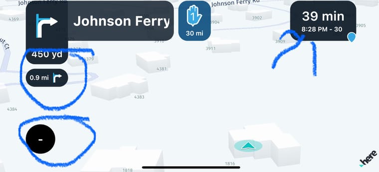
The font used for the secondary information in the info boxes needs to be larger. For example, the distance to the next turn needs to be larger. This is true for all the smaller text that is in the info boxes. They are hard to read quickly while you are moving down the road and requires more time looking down rather than watching where I am going!
-
The font used for the secondary information in the info boxes needs to be larger. For example, the distance to the next turn needs to be larger. This is true for all the smaller text that is in the info boxes. They are hard to read quickly while you are moving down the road and requires more time looking down rather than watching where I am going!
@Steve-Autera Thanks for sharing
")
-
@Steve-Autera Thanks for sharing
@Corjan-Meijerink Moet je dan al die dingen nog eens apart bekijken/programmeren voor Carplay?
-
@Corjan-Meijerink Moet je dan al die dingen nog eens apart bekijken/programmeren voor Carplay?
@MarcM CarPlay werkt volledig anders maar ja, daar zijn we alleen wel veel minder vrij in de vormgeving.
-
Whilst I understand not being able to see the smaller font as I have the same problem making them bigger will take up more screen and so less map visible. having these boxes as a pop up in a larger font would be a better choice.
Hello! It looks like you're interested in this conversation, but you don't have an account yet.
Getting fed up of having to scroll through the same posts each visit? When you register for an account, you'll always come back to exactly where you were before, and choose to be notified of new replies (either via email, or push notification). You'll also be able to save bookmarks and upvote posts to show your appreciation to other community members.
With your input, this post could be even better 💗
Register Login-
013172
-
2975
-
111241
-
0431.2k
-
0461
-
0363
-
018373
-
0263