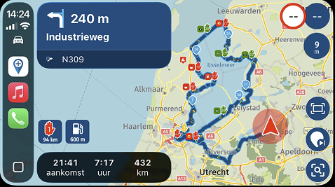
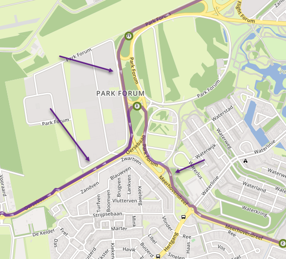
entering the route overview
-
Now the crashing problem is solved (thanks Corjan!) I can try to give some more input.
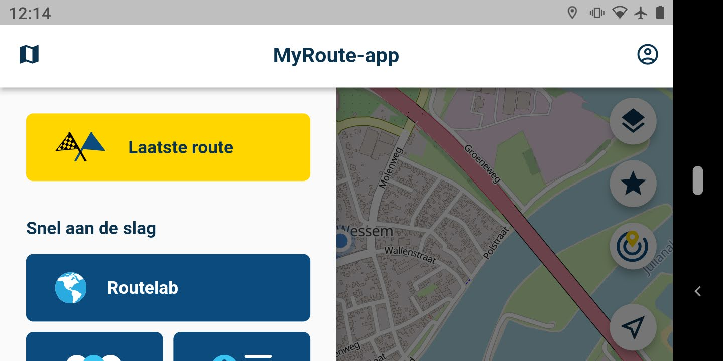
When loading a route in landscape mode you get this screen:

People using the Mobile app for navigating would rather not see the Routelab button prominently on top like it is now. In portrait mode the menu is shown across the whole screen. It would be great(er) if in landscapemode the Routes button is visible without swiping the menu. Whether by upping it to the top, or by using more real estate for the menu on screen. The map, at this point in the app, does not give very relevant info, so the menu could be made screenwide, like in portraitmode.
-
Happy to hear the crashes are fixed! I’ll pass the credits over to Joost

Thanks for the input regarding this sidebar in landscape mode. Will reconsider!
Hello! It looks like you're interested in this conversation, but you don't have an account yet.
Getting fed up of having to scroll through the same posts each visit? When you register for an account, you'll always come back to exactly where you were before, and choose to be notified of new replies (either via email, or push notification). You'll also be able to save bookmarks and upvote posts to show your appreciation to other community members.
With your input, this post could be even better 💗
Register Login

