2 little errors, some graphical proposals
-
Did a tour on Saturday, here are some insights.
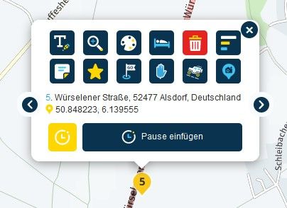
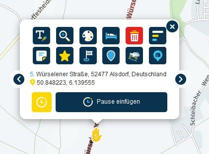
1.) While driving I tried all the color options for the waypoints. I noticed that the first color option with the white writing was not very easy to see. Black would be better. When testing now on the PC, I find that the writing is sometimes black sometimes white. Can you please change that, uniformly with black writing would be great.
2.) the three buttons at the bottom right, (compassneedle , settings..) don't stand out particularly well against the light color of the map. If you can make a dark ring, like the red one for speedlimit around these buttons, then these would also be easier to see.
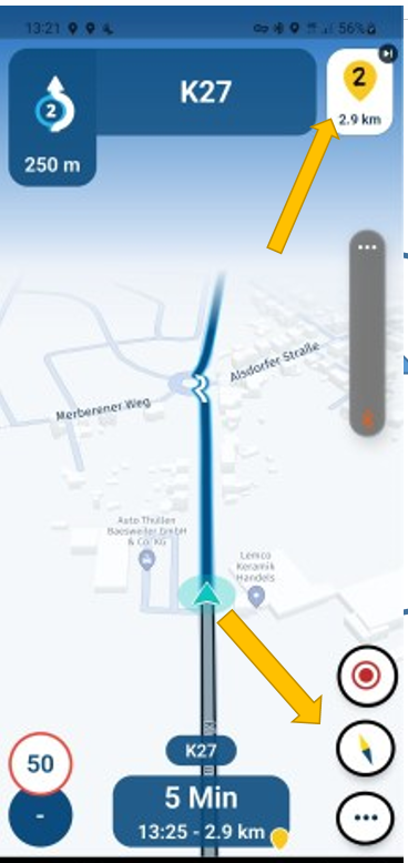
3.) we often had a discussion about displaying the way point at the top of the screen. And we have learned that you cannot deselect them via the settings, because information for other items will be lost. But couldn't you show/hide them by tapping on the screen, like with the compass needle etc.?
single tap: on/off compass etc.
double tap or long press: on/off waypoint / streetname / direction4.) I had a crash (screen freezes) after taking a picture of the screen. (while i was standing) I didn't notice until I was driving again, because the spoken instructions were completely correct, but the screen was frozen. Should only be a short note, was perhaps also a wrong operation by me with the gloves and the cold fingers. (when are the bar buttons coming?)
no direction sign!
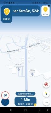
5.) I think we've had this error before, but I'm not sure and I couldn't find it with a quick search. if so, sorry and delete this comment.
The announcement was:
take the first exit at the roundabout,
the graphic was right at 90°,
although the first exit was straight ahead at 180°. that made me a bit confusingExcept for the two small errors, everything worked great.
Greetings
Ronni -
Did a tour on Saturday, here are some insights.
1.) While driving I tried all the color options for the waypoints. I noticed that the first color option with the white writing was not very easy to see. Black would be better. When testing now on the PC, I find that the writing is sometimes black sometimes white. Can you please change that, uniformly with black writing would be great.


2.) the three buttons at the bottom right, (compassneedle , settings..) don't stand out particularly well against the light color of the map. If you can make a dark ring, like the red one for speedlimit around these buttons, then these would also be easier to see.

3.) we often had a discussion about displaying the way point at the top of the screen. And we have learned that you cannot deselect them via the settings, because information for other items will be lost. But couldn't you show/hide them by tapping on the screen, like with the compass needle etc.?
single tap: on/off compass etc.
double tap or long press: on/off waypoint / streetname / direction4.) I had a crash (screen freezes) after taking a picture of the screen. (while i was standing) I didn't notice until I was driving again, because the spoken instructions were completely correct, but the screen was frozen. Should only be a short note, was perhaps also a wrong operation by me with the gloves and the cold fingers. (when are the bar buttons coming?)
no direction sign!

5.) I think we've had this error before, but I'm not sure and I couldn't find it with a quick search. if so, sorry and delete this comment.
The announcement was:
take the first exit at the roundabout,
the graphic was right at 90°,
although the first exit was straight ahead at 180°. that made me a bit confusingExcept for the two small errors, everything worked great.
Greetings
Ronni@Ronni In addition to the point 1; are you planning to add more colors to the waypoint selection? The tow "red" colors are very difficult to distinguish.
More icons for stopovers would help too. -
@Ronni In addition to the point 1; are you planning to add more colors to the waypoint selection? The tow "red" colors are very difficult to distinguish.
More icons for stopovers would help too.@UltraStar said in 2 little errors, some graphical proposals:
@Ronni In addition to the point 1; are you planning to add more colors to the waypoint selection? The tow "red" colors are very difficult to distinguish.
More icons for stopovers would help too.I personally don't need more colours, and yes, some more icons would help.
Greetings
Ronni -
Thanks again for the elaborate feedback!
We'll take all aspects into consideration (if we aren't doing so already)
Regarding the images used to display roundabout exits, these indeed need to be improved in a later stage. Currently we always assume symmetrical roundabouts but quite often they aren't

