The new menu, some ideas
-
@Corjan-Meijerink said in New Beta! (v3.2.9):
New menu
The previous menu wasn't in the style we liked so we made a new one. It's important that functionality hasn't been lost so please do provide feedback on this new layout!There are only some minor things:
According to the graphical representation, i would add some text
 Sprachansagen ON / OFF
 Audio Warnung ON / OFF
 Liste der Wegpunkte
During riding a Tour, i like to have a quick look at the complete route. So i need a quick acceess to the point "Route anzeigen". Actually, i have to therefore to scroll the menu list.
No misunderstandings, please. Standing on the side of the road and operating the smartphone is part of riding a tour for me,too. gloves are a hindrance and you don't always want to take them off and put them on. short distances / only a few clicks are very helpful.First idea:
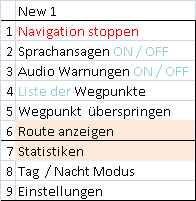
would swap "Statistics" with "Show route" so that you can directly choose and get the display of the complete route. You don't need the stats so urgently while driving, they can come a little later. (Scroll)
Better solution:
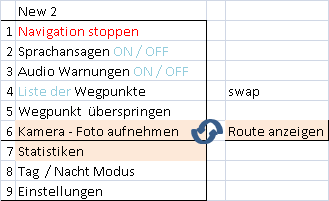
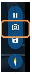
swap "show route" with the "camera symbol" (which is just a notice, i've read in a post) Again, i have quick access to "show Route".
3rd possility:
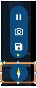
the complete route could also be displayed using the compass needle. (press 3 times). Then i have a quick access, too. This version like most.
Greetings
Ronni -
@Ronni I like your ideas about the menu. I also would like the compass to be displayed all the time. I would like to know which direction I am heading, especially when is dark or cloudy.
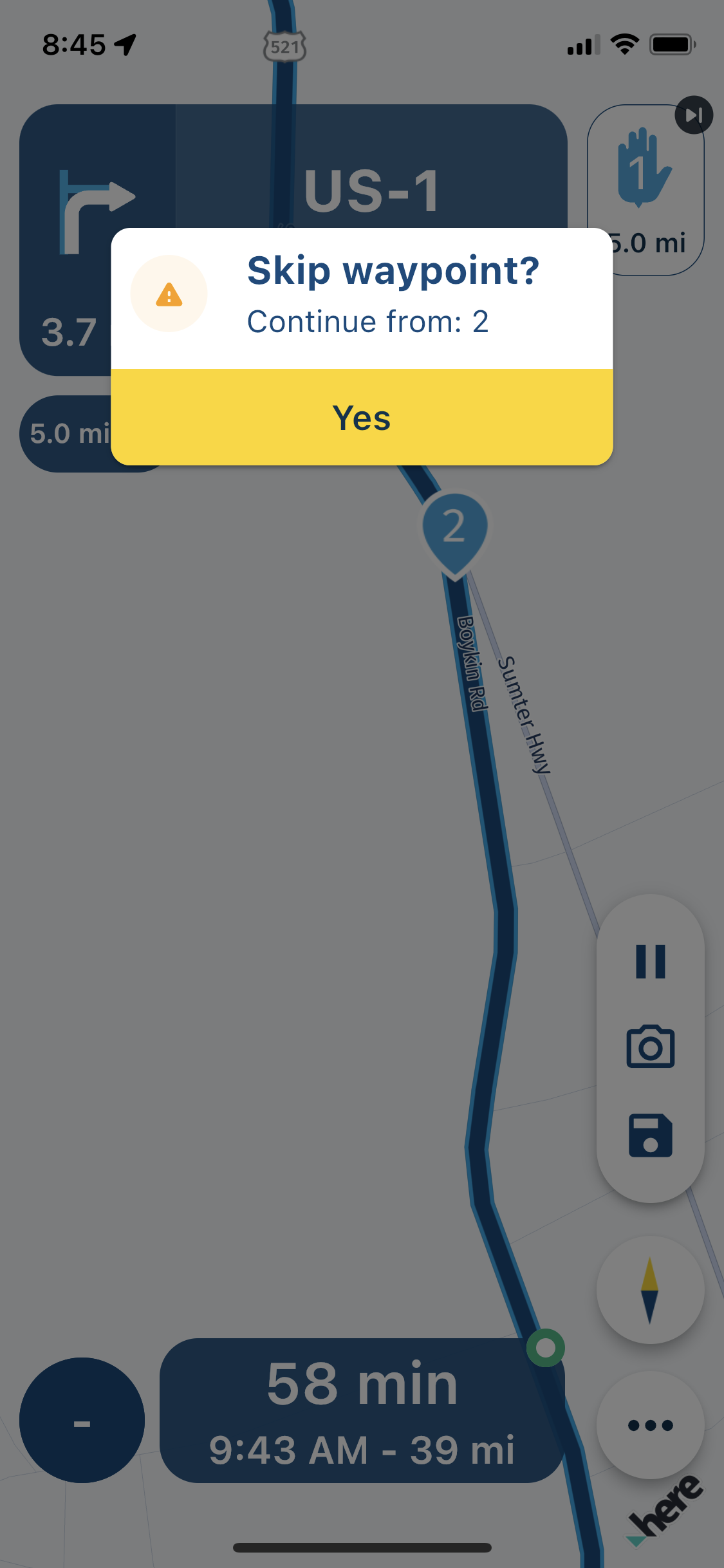
In addition, I would like to ask you for making the font larger in the skip waypoint message. When I am riding I cannot see these puny numbers on the phone.
-
@Ronni I like your ideas about the menu. I also would like the compass to be displayed all the time. I would like to know which direction I am heading, especially when is dark or cloudy.
In addition, I would like to ask you for making the font larger in the skip waypoint message. When I am riding I cannot see these puny numbers on the phone.

@UltraStar said in The new menu, some ideas:
When I am riding I cannot see these puny numbers on the phon
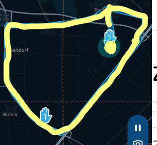
Yes, so do I. And in dark mode i prfer a bright color, something like this.
-
@UltraStar said in The new menu, some ideas:
When I am riding I cannot see these puny numbers on the phon
Yes, so do I. And in dark mode i prfer a bright color, something like this.

@Ronni Agreed, although yellow is used for tracking.

I know I am pushing really badly now. It would be nice to be able to select the color of the background of the maps. I have not used my Garmin in a while now (I use MRA exclusively!
 ) and I remember they have some interesting options. Maybe selecting of the route or track colors would be an option (@Corjan-Meijerink please don't kill me.)
 -
Thanks for all the feedback!

I’ll immediately change some based on the feedback and other aspects will be discussed.The record/pause, photo and save are are tracklog related actions. This won’t include a show route button.
I do like the idea of putting this action on the compass. Might be able to do so immediately on the double tap (or long press). Note a double tap is something else than tapping twice

@UltraStar I won’t kill you hahah. All user feedback is appreciated. This however is really something for the final development stage - hope you understand.
-
Thanks for all the feedback!

I’ll immediately change some based on the feedback and other aspects will be discussed.The record/pause, photo and save are are tracklog related actions. This won’t include a show route button.
I do like the idea of putting this action on the compass. Might be able to do so immediately on the double tap (or long press). Note a double tap is something else than tapping twice

@UltraStar I won’t kill you hahah. All user feedback is appreciated. This however is really something for the final development stage - hope you understand.
@Corjan-Meijerink
 I do. Thank you for everything you do.
I like the idea of the compass having additional action. Double top, I don't know; when you are riding on the rough road the double top might happen inadvertently. I like the long press more.
Are you saying that the compass might be displayed constantly?
-
@Corjan-Meijerink
 I do. Thank you for everything you do.
I like the idea of the compass having additional action. Double top, I don't know; when you are riding on the rough road the double top might happen inadvertently. I like the long press more.
Are you saying that the compass might be displayed constantly?
@UltraStar Thanks for the extra input

I don’t know that yet hahah -
This post is deleted!
-
Changes for the upcoming update have been made:
- Textual changes as suggested
- Sorted some menu items
- Long press on the compass now focusses the route
- On a single available action in the popup, clicking anywhere on the popup will execute the action
-
Changes for the upcoming update have been made:
- Textual changes as suggested
- Sorted some menu items
- Long press on the compass now focusses the route
- On a single available action in the popup, clicking anywhere on the popup will execute the action

