Some initial comments...
-
Kudos to the dev team. Impressed so far. I like the look and feel.
IIRC there was some complaint about redundant information being displayed. I think the example was similiar to this...
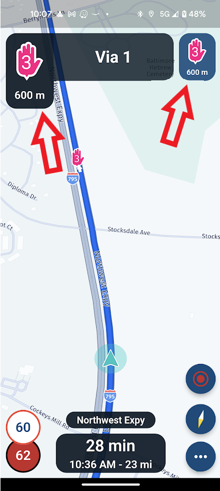
Personally... I don't agree. The fields in question serve different purposes. It's only when you have situations like the one displayed that the purposes converge. I think this is fine and makes sense. When the purposes don't converge, you get what one would expect...
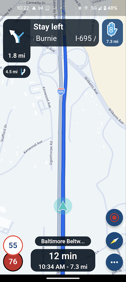
Lots of clear, concise information displayed at the top... Next turn/navigation point (stay left on I-695), subsequent turn info (exit in 4.5 mi), and next navigation point (this case a stop in 7.3 mi). Looking good.
This one puzzles me though...
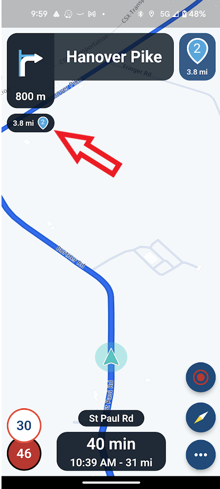
I would think that the field pointed to was to display subsequent turn information - and so far that's what I've been seeing. But in this case what is it telling me? Shapping point 2 isn't a subsequent turn so why is it displayed here? In this case it does seem a bit redundant. Am I missing something?
It's also great that the given stop/shaping point names are displayed. I also really appreciate how the time-to-go/arrival time is user configurable and selectable on the fly...
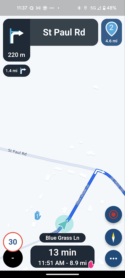
Nice touch with the icon at the bottom right of the field. Tells you at a glance what you are looking at.
With all these improvements... I shouldn't have issues in the future with planned stops (i.e. fuel stops) whizzing by unnoticed.
Here's another one that caused me to sratch my head...
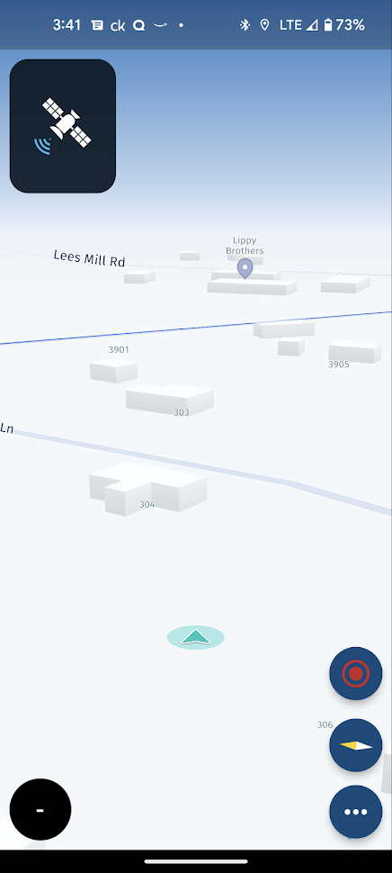
It appears that when you start navigation, it doesn't really start navigation until you actually get to a road. Once there it kicks in... although momentarily with a foresty icon that replaces the statellite icon in the upper left. What does that foresty image signify anyway? That I'm lost in the woods? Anyway... I guess my qualm with this is that it appears that you can't skip waypoints before starting out (or did I miss something?). You seem to have to first get to road and then deal with skipping waypoints (i.e long press a waypoint an tell it to start from there). Maybe it's just a matter of where things are at in the development cycle and things are yet to come.
Well... that's it for the moment. Looks like a lot of well thought out design choices. Not much I would question/change so far. Ought to be a great app when done.
-
Kudos to the dev team. Impressed so far. I like the look and feel.
IIRC there was some complaint about redundant information being displayed. I think the example was similiar to this...
Personally... I don't agree. The fields in question serve different purposes. It's only when you have situations like the one displayed that the purposes converge. I think this is fine and makes sense. When the purposes don't converge, you get what one would expect...
Lots of clear, concise information displayed at the top... Next turn/navigation point (stay left on I-695), subsequent turn info (exit in 4.5 mi), and next navigation point (this case a stop in 7.3 mi). Looking good.
This one puzzles me though...
I would think that the field pointed to was to display subsequent turn information - and so far that's what I've been seeing. But in this case what is it telling me? Shapping point 2 isn't a subsequent turn so why is it displayed here? In this case it does seem a bit redundant. Am I missing something?
It's also great that the given stop/shaping point names are displayed. I also really appreciate how the time-to-go/arrival time is user configurable and selectable on the fly...
Nice touch with the icon at the bottom right of the field. Tells you at a glance what you are looking at.
With all these improvements... I shouldn't have issues in the future with planned stops (i.e. fuel stops) whizzing by unnoticed.
Here's another one that caused me to sratch my head...
It appears that when you start navigation, it doesn't really start navigation until you actually get to a road. Once there it kicks in... although momentarily with a foresty icon that replaces the statellite icon in the upper left. What does that foresty image signify anyway? That I'm lost in the woods? Anyway... I guess my qualm with this is that it appears that you can't skip waypoints before starting out (or did I miss something?). You seem to have to first get to road and then deal with skipping waypoints (i.e long press a waypoint an tell it to start from there). Maybe it's just a matter of where things are at in the development cycle and things are yet to come.
Well... that's it for the moment. Looks like a lot of well thought out design choices. Not much I would question/change so far. Ought to be a great app when done.
@Tim-Thompson Thanks for your positive remarks! Happy to hear that you are enjoying the experience of this Beta.
First of all, I truly appreciate that you actually share another opinion!
") Once people start noting they would like to see stuff different, it is crucial that others indicate that they like it as is. I personally agree with you and also think that they serve very different purposes. Really happy to hear it is clear to you too
Once people start noting they would like to see stuff different, it is crucial that others indicate that they like it as is. I personally agree with you and also think that they serve very different purposes. Really happy to hear it is clear to you too 
Regarding your second statement, it would be "turn right" and then "after 3 miles you reach waypoint 2". So between the right turn and waypoint 2 there apparently are no relevant instructions at all. I guess this is just a long, straight road.
Glad you like the configurability of the ETA widget. We designed it exactly for the purpose you describe.
Concerning you last head scratch, this is currently indeed an "issue". The app only works once you are actually on the road!
This will be improved later.Appreciate all your comments! Cheers
-
Great comments from Tim Thompson, he’s helped me to understand a lot of what I’ve been seeing.
Hello! It looks like you're interested in this conversation, but you don't have an account yet.
Getting fed up of having to scroll through the same posts each visit? When you register for an account, you'll always come back to exactly where you were before, and choose to be notified of new replies (either via email, or push notification). You'll also be able to save bookmarks and upvote posts to show your appreciation to other community members.
With your input, this post could be even better 💗
Register Login-
212130
-
015222
-
111258
-
0431.2k
-
0588
-
0377
-
019446
-
0368