Selecting routes for navigation
-
Re: Suggestion: Mark routes for visibility in Navigation (Next)
Hello:This topic is related to the suggestion mentioned above.
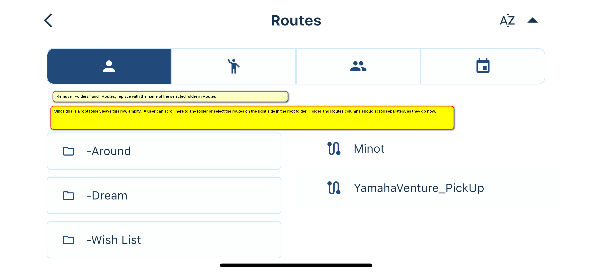
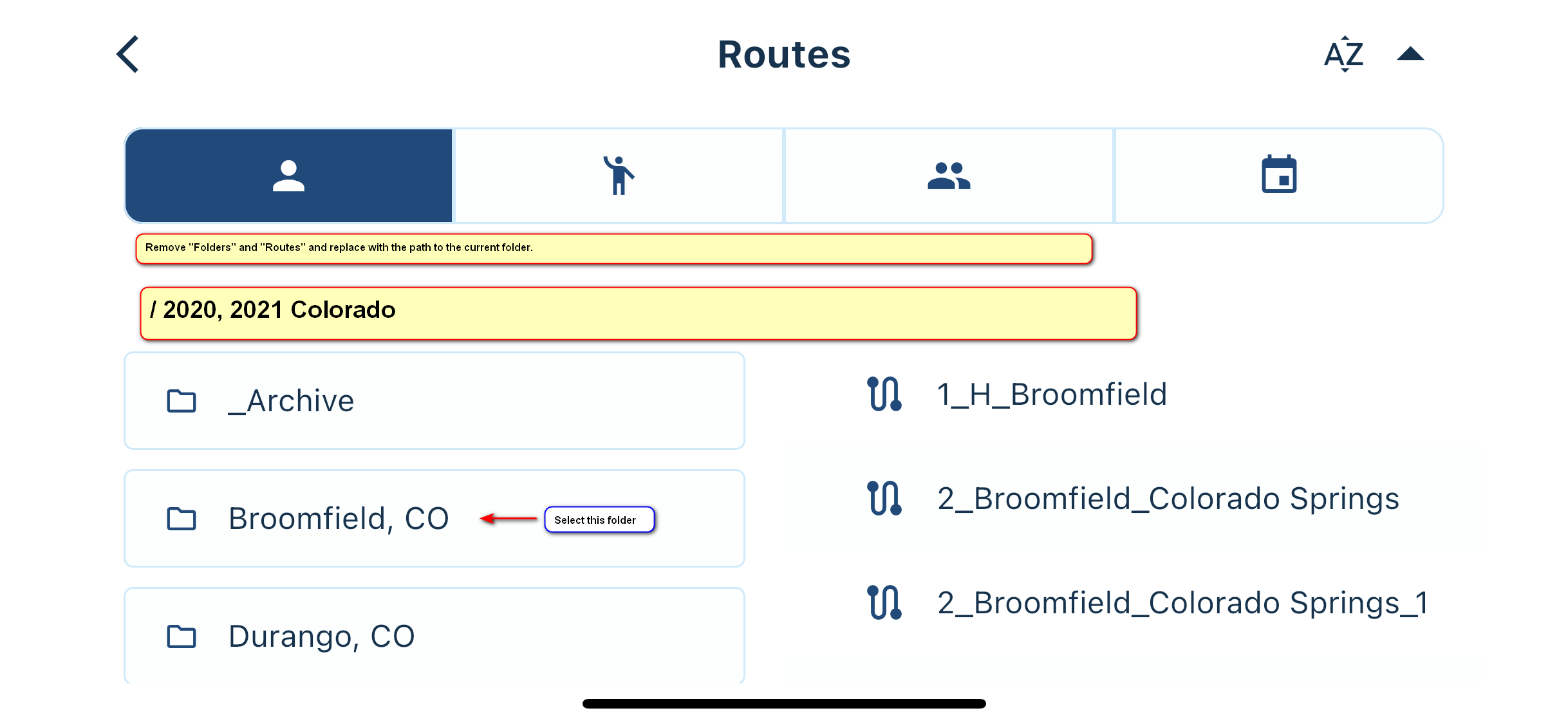
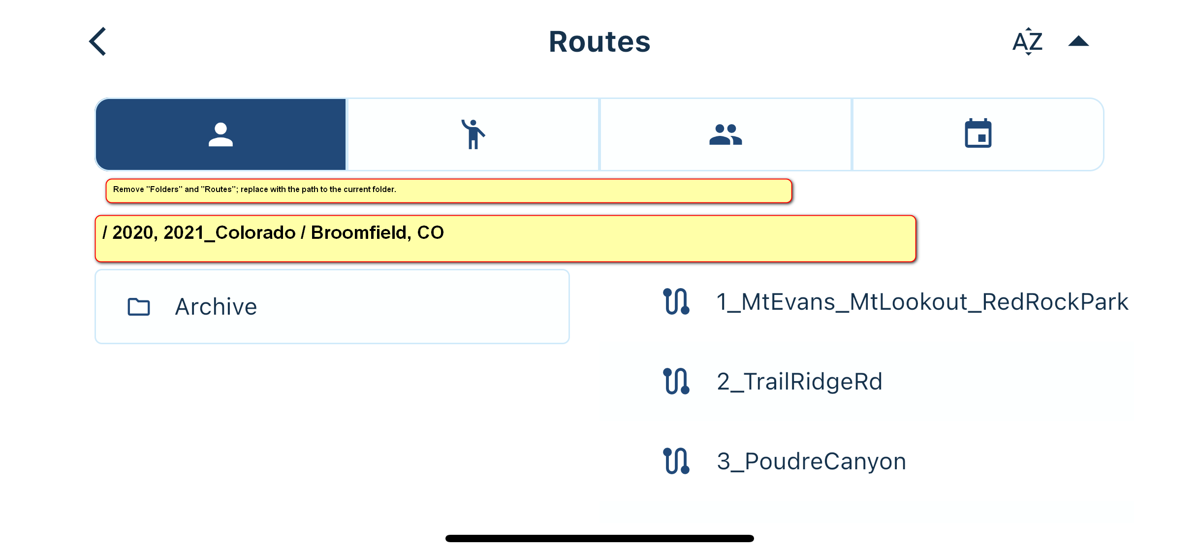
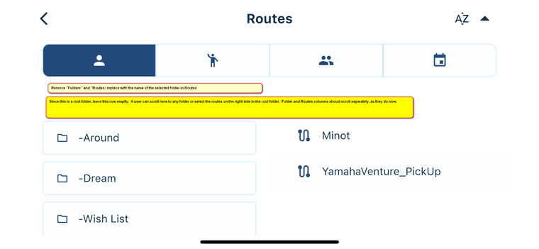
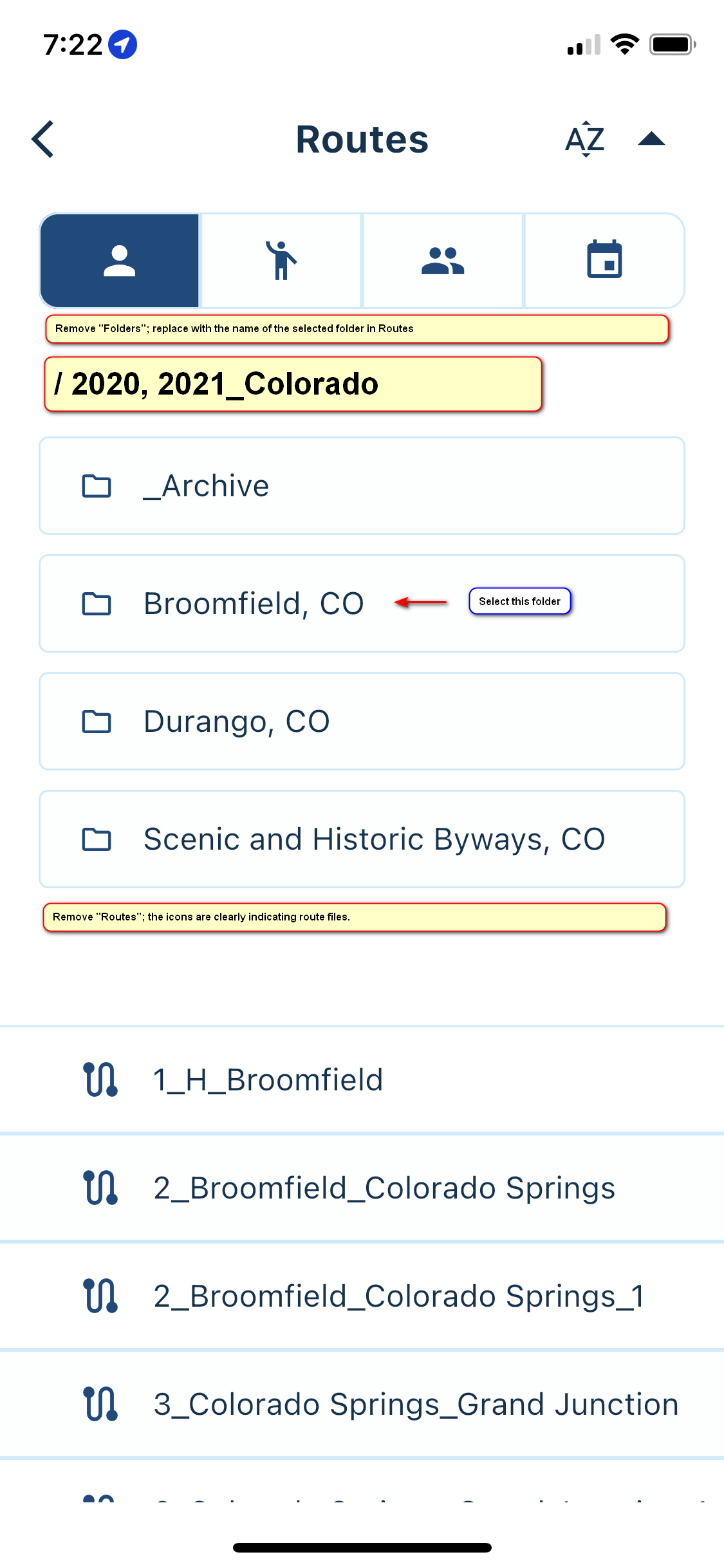
When we open Routes (or Tracklogs in that matter,) we are presented with a familiar folder/file (route) list as in the browser on the PC. The thing is, there is no indication where in the folders tree you are. Since the names of the routes might be short and abbreviated, at certain point of time we might get lost. What I would recommend is display the path to the current folder, as you do on the webpage in the browser:
Root folder for Routes
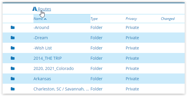
First level folder for Routes
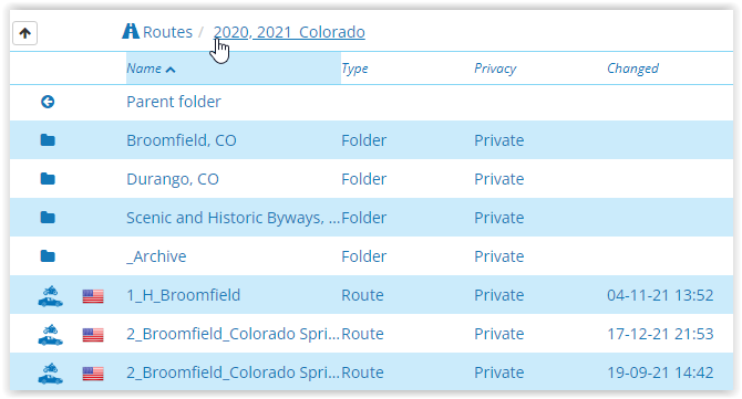
Second level folder for Routes
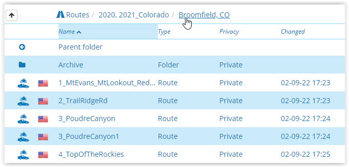
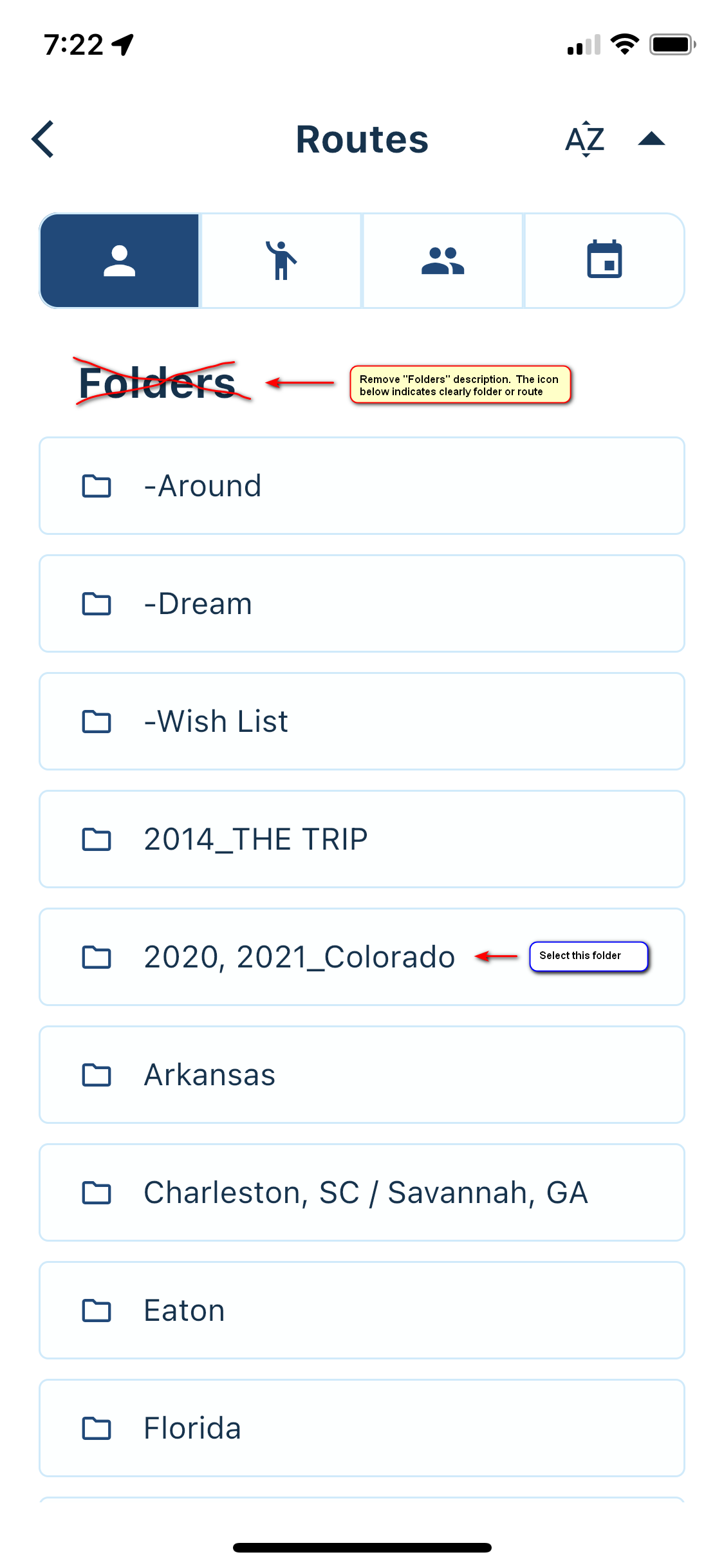
On the phone or tablet it could look like the examples below.
Root folder for Routes
First level folder for Routes
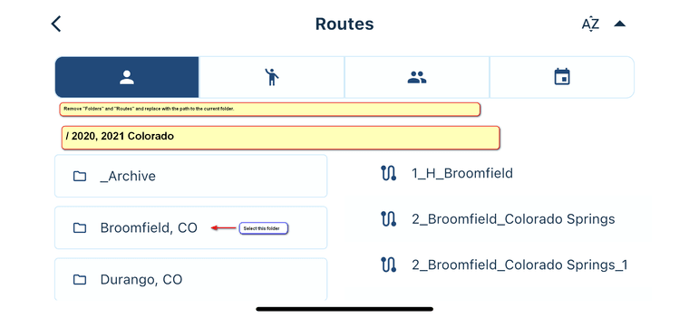
Second level folder for Routes
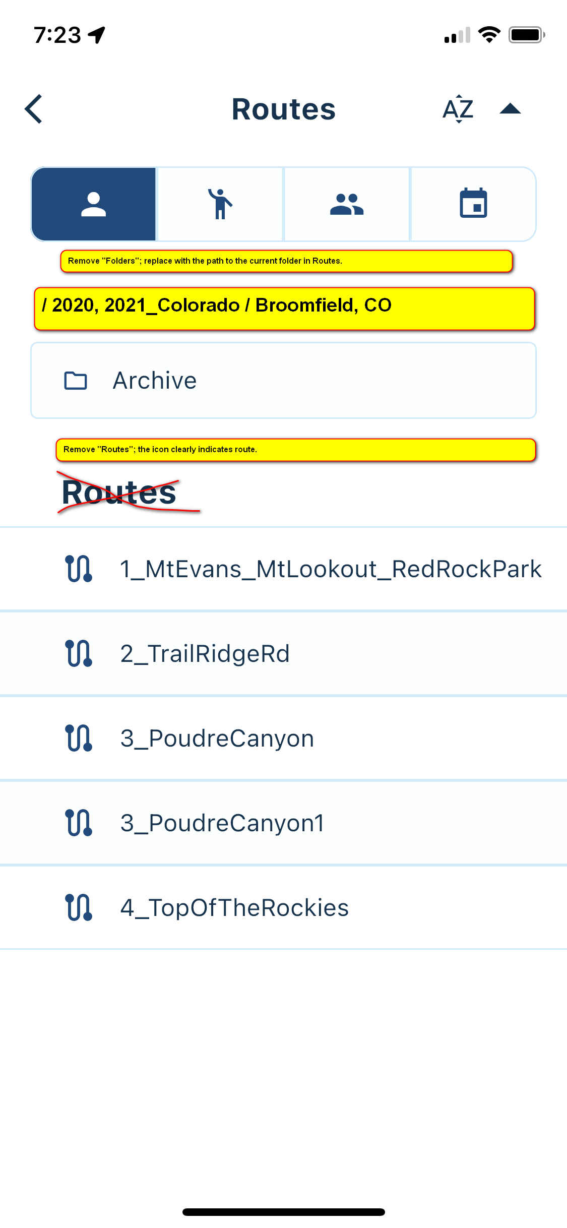

I would recommend freezing the path to the folder row (it does not have to have a large font size) and allow it to be displayed all the time when scrolling down through the folders and route files.
The same suggestions would apply to Tracklogs.Also, I would like to return to the suggestion by Con Hennekans above. When you have a lot of folders and route files, it might be cumbersome to find one that you are looking for quickly. Con recommended marking the routes for navigation and they displaying them clearly.
The folder / file display makes me very happy camper; I have been asking for it before on old navigation app. But Con's idea made me think about that again.
First, I have thought about the "_Navigation" folder that would be displayed at the top of the list in Routes. One could copy the immediate navigation files to this folder. I hate to make multiple copies of the files though; it can get out of hand really quickly.
What if we create "Navigation" folder at the top of the tree, just above routes. Then, find the way to mark the routes that you are focusing on (I do not have an idea how to mark them now; checkmark would be preferred so we could see in the list which files are marked,) and create a link to the Navigation folder. This way the file name would be displayed in the Navigation folder, and the file would still be in the original location. Something like that.Sorry for the long rumbling. Happy reading.

-
Re: Suggestion: Mark routes for visibility in Navigation (Next)
Hello:This topic is related to the suggestion mentioned above.
When we open Routes (or Tracklogs in that matter,) we are presented with a familiar folder/file (route) list as in the browser on the PC. The thing is, there is no indication where in the folders tree you are. Since the names of the routes might be short and abbreviated, at certain point of time we might get lost. What I would recommend is display the path to the current folder, as you do on the webpage in the browser:
Root folder for Routes

First level folder for Routes

Second level folder for Routes

On the phone or tablet it could look like the examples below.
Root folder for Routes


First level folder for Routes


Second level folder for Routes


I would recommend freezing the path to the folder row (it does not have to have a large font size) and allow it to be displayed all the time when scrolling down through the folders and route files.
The same suggestions would apply to Tracklogs.Also, I would like to return to the suggestion by Con Hennekans above. When you have a lot of folders and route files, it might be cumbersome to find one that you are looking for quickly. Con recommended marking the routes for navigation and they displaying them clearly.
The folder / file display makes me very happy camper; I have been asking for it before on old navigation app. But Con's idea made me think about that again.
First, I have thought about the "_Navigation" folder that would be displayed at the top of the list in Routes. One could copy the immediate navigation files to this folder. I hate to make multiple copies of the files though; it can get out of hand really quickly.
What if we create "Navigation" folder at the top of the tree, just above routes. Then, find the way to mark the routes that you are focusing on (I do not have an idea how to mark them now; checkmark would be preferred so we could see in the list which files are marked,) and create a link to the Navigation folder. This way the file name would be displayed in the Navigation folder, and the file would still be in the original location. Something like that.Sorry for the long rumbling. Happy reading.

@UltraStar Thanks for the great suggestion! The technical term for showing the path of folders is called "breadcrumbs". I think you understand where this comes from

Long story short: this has been on our list since the release of the Mobile app. Never really came to implementing it, I will move it up the list to see if we can get it done in an early update of the Beta!

Marking folders as favourite in a certain way, is a nice idea too! Added this.
-
@UltraStar Thanks for the great suggestion! The technical term for showing the path of folders is called "breadcrumbs". I think you understand where this comes from

Long story short: this has been on our list since the release of the Mobile app. Never really came to implementing it, I will move it up the list to see if we can get it done in an early update of the Beta!

Marking folders as favourite in a certain way, is a nice idea too! Added this.
@Corjan-Meijerink Thank you for the consideration and hard work.
-
For the nexts versions (offline navigation) : ad a button "download on the phone"
So that we choose which roads are synchronized between Myrouteapp and myroute nav -
For the nexts versions (offline navigation) : ad a button "download on the phone"
So that we choose which roads are synchronized between Myrouteapp and myroute nav@Joce-Doubs Yes, there will definitely be a way to manage this

-
 undefined Corjan Meijerink referenced this topic on
-
@UltraStar Thanks for the great suggestion! The technical term for showing the path of folders is called "breadcrumbs". I think you understand where this comes from

Long story short: this has been on our list since the release of the Mobile app. Never really came to implementing it, I will move it up the list to see if we can get it done in an early update of the Beta!

Marking folders as favourite in a certain way, is a nice idea too! Added this.
@Corjan-Meijerink Sorry to be a pest about that issue. I like already very much what you have done with the breadcrumbs in the new Beta 3.2.5. The navigation through the folders/routes is lot clearer.
What I would recommend is to remove the large font descriptions from the display: Files and Routes (also the Tracklogs.) The title at the top of the screen writes Routes, so we know exactly where we are. The icons clearly describe the type of the item: Folders or Routes.
This way we would have more room to see how deep we are in the folder tree, and save some room for more items on the screen as well. (Sorry, I did not have the Home icon handy; this is a very nice touch on your side!)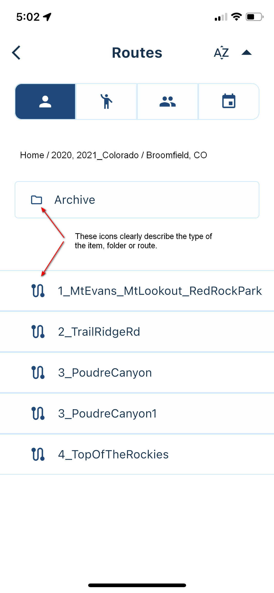
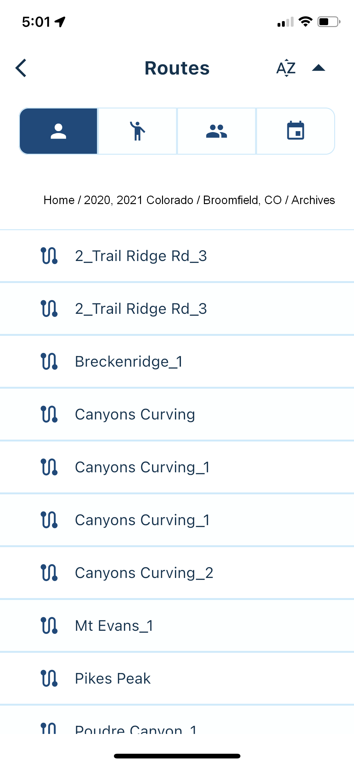
All of you guys, thank you for a great job and hard work, and have a Very Merry Christmas and a Happy New Year! From what you have done so far, I think it will be very exciting and adventurous (clear navigation will let us ride harder and further; it is important for all of us who does not want to dig for paper maps anymore!
 )
) -
@Corjan-Meijerink Sorry to be a pest about that issue. I like already very much what you have done with the breadcrumbs in the new Beta 3.2.5. The navigation through the folders/routes is lot clearer.
What I would recommend is to remove the large font descriptions from the display: Files and Routes (also the Tracklogs.) The title at the top of the screen writes Routes, so we know exactly where we are. The icons clearly describe the type of the item: Folders or Routes.
This way we would have more room to see how deep we are in the folder tree, and save some room for more items on the screen as well. (Sorry, I did not have the Home icon handy; this is a very nice touch on your side!)

All of you guys, thank you for a great job and hard work, and have a Very Merry Christmas and a Happy New Year! From what you have done so far, I think it will be very exciting and adventurous (clear navigation will let us ride harder and further; it is important for all of us who does not want to dig for paper maps anymore!
 )
)@UltraStar Thanks for your kind words! Glad you like this first implementation. We will definitely take your feedback into consideration again

Removing the big title, is very easy hahah
Hello! It looks like you're interested in this conversation, but you don't have an account yet.
Getting fed up of having to scroll through the same posts each visit? When you register for an account, you'll always come back to exactly where you were before, and choose to be notified of new replies (either via email, or push notification). You'll also be able to save bookmarks and upvote posts to show your appreciation to other community members.
With your input, this post could be even better 💗
Register Login
