Button Size and Landscape
-
@Corjan-Meijerink Well done on a great start with this beta app. Had a good ‘play’ with the app today but a couple of suggestions/requests that would be really helpful from my perspective:
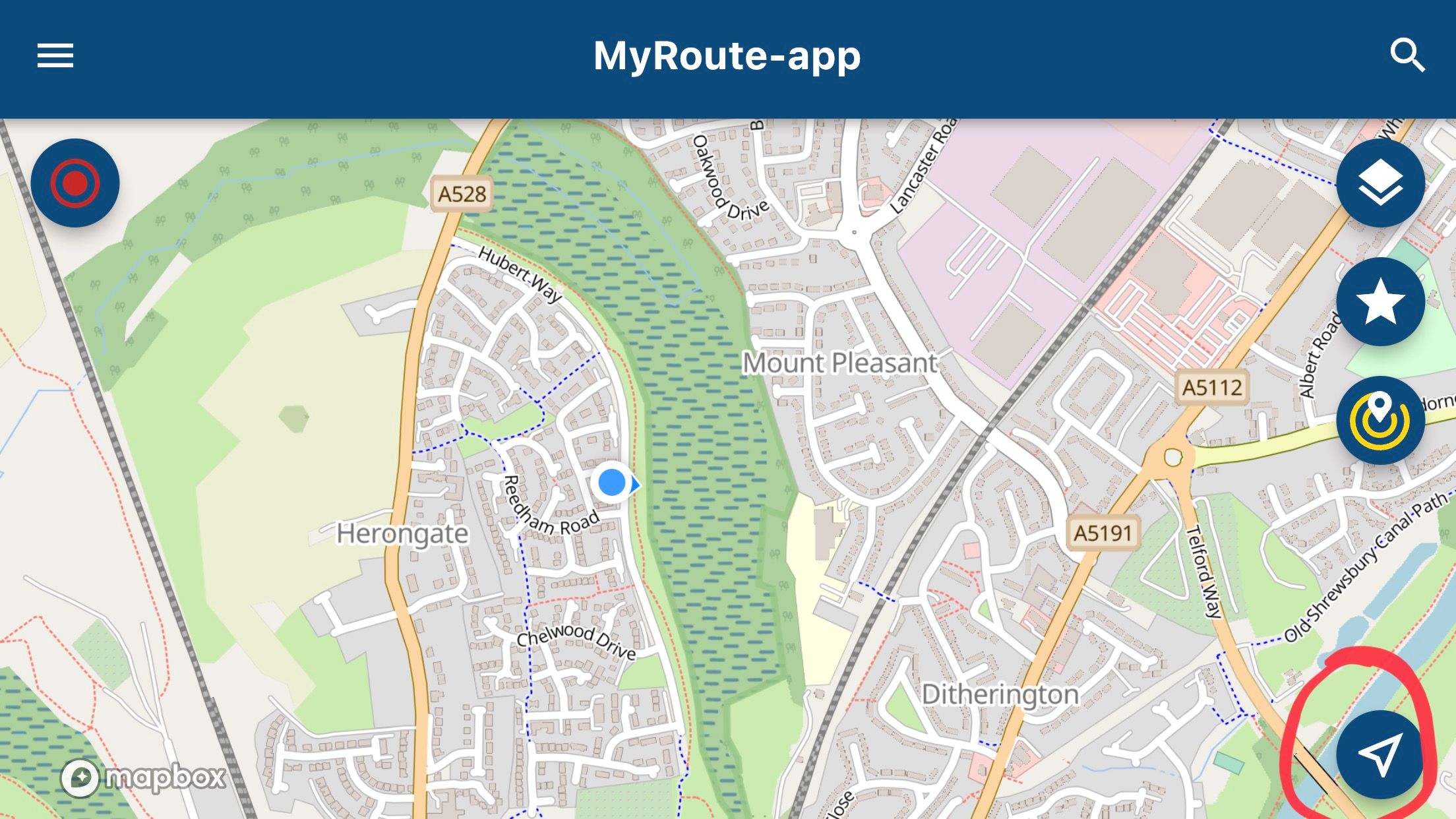
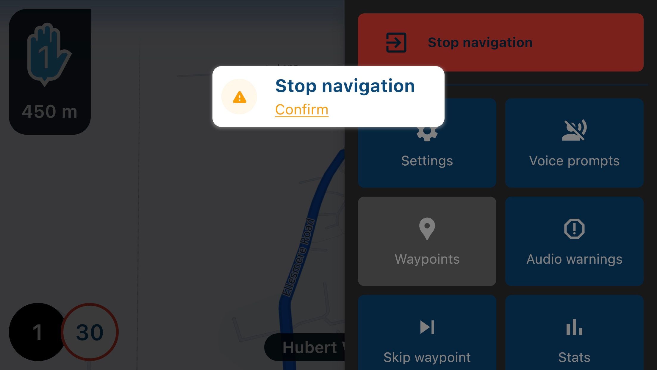
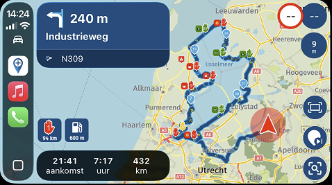
- Button Size. I found the ability to select the buttons (at their current size) with gloves a little fiddly. An option to have a larger size would be really helpful, particularly as these ‘buttons’ disappear from view. Same goes for the prompt/confirmation pop ups.

- Left and Right Orientation. Using the Beta on an iPhone 8 Plus on the bike, I would like the option to have the buttons to be orientated to left hand use and not the current more right hand centric, particularly the arrow selector.
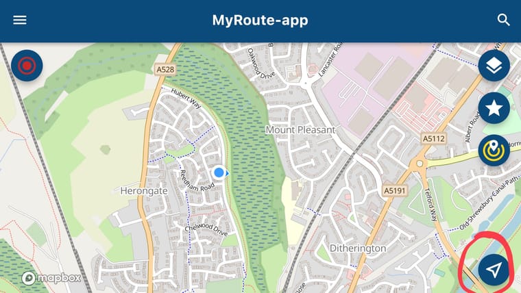
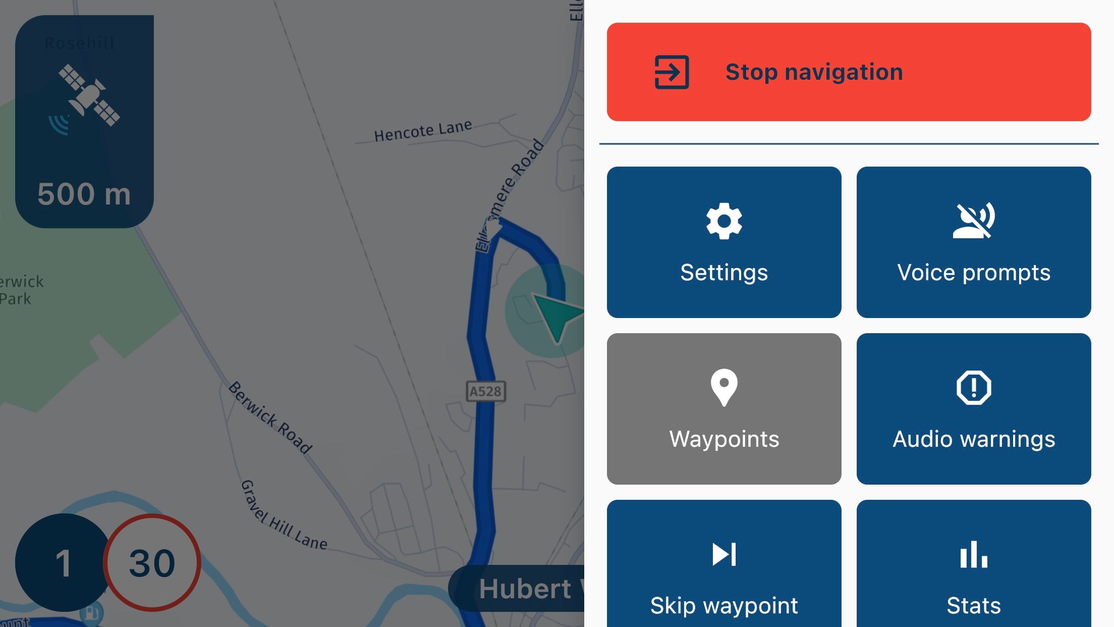
And the options button (3 dots):
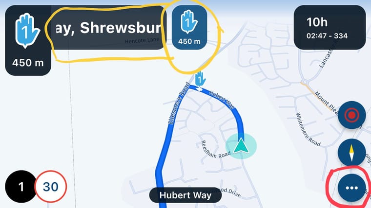
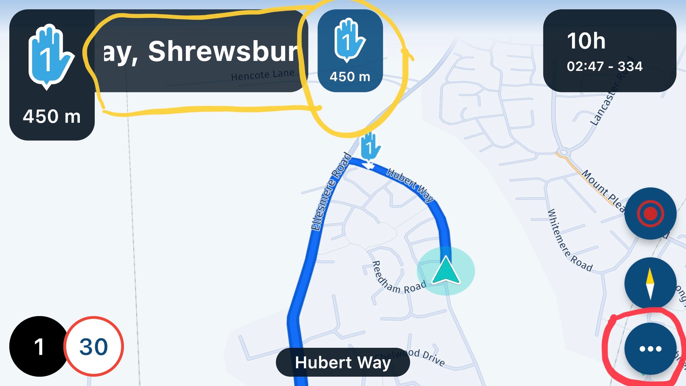
Not sure why there is ‘doubled’ information at the top either which restricts the scrolling text to a small area?
- Configurable Order for Options Menu (3 dits). In landscape, not all the menu is able to be shown. Would be great to be able to reorder these in a future version for those ‘options’ that I will use the most instead of having to swipe up. Again, a left hand orientation option would be really helpful.

Great work and I look forward to next versions. Huge leap forward compared to the current nav app. Well done.
-
@Corjan-Meijerink Well done on a great start with this beta app. Had a good ‘play’ with the app today but a couple of suggestions/requests that would be really helpful from my perspective:
- Button Size. I found the ability to select the buttons (at their current size) with gloves a little fiddly. An option to have a larger size would be really helpful, particularly as these ‘buttons’ disappear from view. Same goes for the prompt/confirmation pop ups.

- Left and Right Orientation. Using the Beta on an iPhone 8 Plus on the bike, I would like the option to have the buttons to be orientated to left hand use and not the current more right hand centric, particularly the arrow selector.

And the options button (3 dots):

Not sure why there is ‘doubled’ information at the top either which restricts the scrolling text to a small area?
- Configurable Order for Options Menu (3 dits). In landscape, not all the menu is able to be shown. Would be great to be able to reorder these in a future version for those ‘options’ that I will use the most instead of having to swipe up. Again, a left hand orientation option would be really helpful.

Great work and I look forward to next versions. Huge leap forward compared to the current nav app. Well done.
@Dave-J-0 Thanks for your kind words! We did put in a lot of effort.
- Button size: will take a further look. We really did try to make them big enough for functionality without making it ugly
 The popup is indeed still a bit smaller compared to the sidebar buttons. Please note: tapping anywhere on the white block is enough to comfirm.
 - Left hand orientation: will investigate, check if more people want this.
- The doubling is slightly more complicated to explain. Please allow me to elaborate this later on. In short: there is not significant instruction (such as: turn left) until the first waypoint, therefore we show the first waypoint. The waypoint within the white block van be hidden using the settings and is used to skip a waypoint (short or long press)
- Configurable sidebar: way more complex, like the suggestion but is something for the longer run.
Hope you are satisfied with my answers!
-
@Dave-J-0 Thanks for your kind words! We did put in a lot of effort.
- Button size: will take a further look. We really did try to make them big enough for functionality without making it ugly
 The popup is indeed still a bit smaller compared to the sidebar buttons. Please note: tapping anywhere on the white block is enough to comfirm.
 - Left hand orientation: will investigate, check if more people want this.
- The doubling is slightly more complicated to explain. Please allow me to elaborate this later on. In short: there is not significant instruction (such as: turn left) until the first waypoint, therefore we show the first waypoint. The waypoint within the white block van be hidden using the settings and is used to skip a waypoint (short or long press)
- Configurable sidebar: way more complex, like the suggestion but is something for the longer run.
Hope you are satisfied with my answers!
@Corjan-Meijerink thank you for the answers and the explanation. I did a bit more testing last night with the double info and I understand what you say. The waypoint (via) marker popping up in the centre top of the screen would (from my perspective) be useful on the left hand side as I noted that I can skip waypoint by selecting this pop up to then start a recalculation to next via. Once again great work.
- Button size: will take a further look. We really did try to make them big enough for functionality without making it ugly
-
@Corjan-Meijerink thank you for the answers and the explanation. I did a bit more testing last night with the double info and I understand what you say. The waypoint (via) marker popping up in the centre top of the screen would (from my perspective) be useful on the left hand side as I noted that I can skip waypoint by selecting this pop up to then start a recalculation to next via. Once again great work.
@Dave-J-0 Happy to hear that my explanation helped!
We will see if the "double" information can be improved to prevent confusion.
You're other feedback points have been added to our list of feature requests which is starting to grow nicely after all the positive feedback

-
 undefined MyRoute-app community moved this topic from [Beta] The MyRoute-app on
-
 undefined Corjan Meijerink referenced this topic on
-
 undefined Corjan Meijerink referenced this topic on
Hello! It looks like you're interested in this conversation, but you don't have an account yet.
Getting fed up of having to scroll through the same posts each visit? When you register for an account, you'll always come back to exactly where you were before, and choose to be notified of new replies (either via email, or push notification). You'll also be able to save bookmarks and upvote posts to show your appreciation to other community members.
With your input, this post could be even better 💗
Register Login
