Suggestions - Skip Waypoints, Waypoint display/announcement, Layout
-
I have been using MyRoute-app Mobile since the release of version 3.2.7 a few days ago and I have a few initial observations.
On the positive side, I do like the map used for the display and the layout at the base of the screen (speed, current road, time/distance to finish etc) is nice. Also the automatic skipping of missed waypoints is quick and accurate, much better than Navigation.
There are however areas where this release is less successful,
- Skip Waypoints
In this version, unlike previous versions, the ‘Skip Waypoint’ button on the main screen has been removed. I am not sure why this is as I regard this as an essential feature. I realise that waypoints can be deleted by pressing on them in the display, but this is really not practical on the move, and you really need a LARGE STATIC BUTTON to make this at all possible. Also of course most of the waypoints are not visible.
If I went off route when using the old Navigation app, I would keep deleting waypoints until the blue line went in the direction I wanted to travel. This was difficult to do as the ‘Skip Waypoint’ function was in a submenu, but was very easy to do in MyRoute-app Mobile (previous versions). Please reassure me that this feature will be reinstated to the main screen before general release!
- Waypoint display/announcement
I do not see the point of showing distance to waypoints in the display. In fact this information now masks the much more important information about directions at the next junction, roundabout etc. See my attached photo showing no notification of the ‘turn right’ direction until very close to the junction.
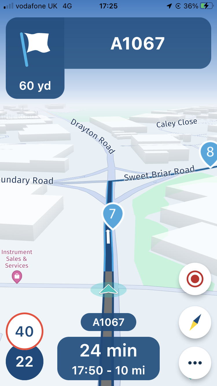
Certainly there is no need to announce ‘Shaping’ points. I use lots of waypoints at junctions etc to ensure I stay on route, and constant announcements of these is annoying and quite distracting.
Possibly displaying and announcing ‘Via’ points could be a useful option, in which case information contained in the description or notes e.g. ‘Silver Ball Cafe’ could be displayed and/or announced.
- Layout
I think the layout at the top of the screen is confusing. Can I suggest looking at the Sygic layout (photo) as a good example of how to display the essential information.
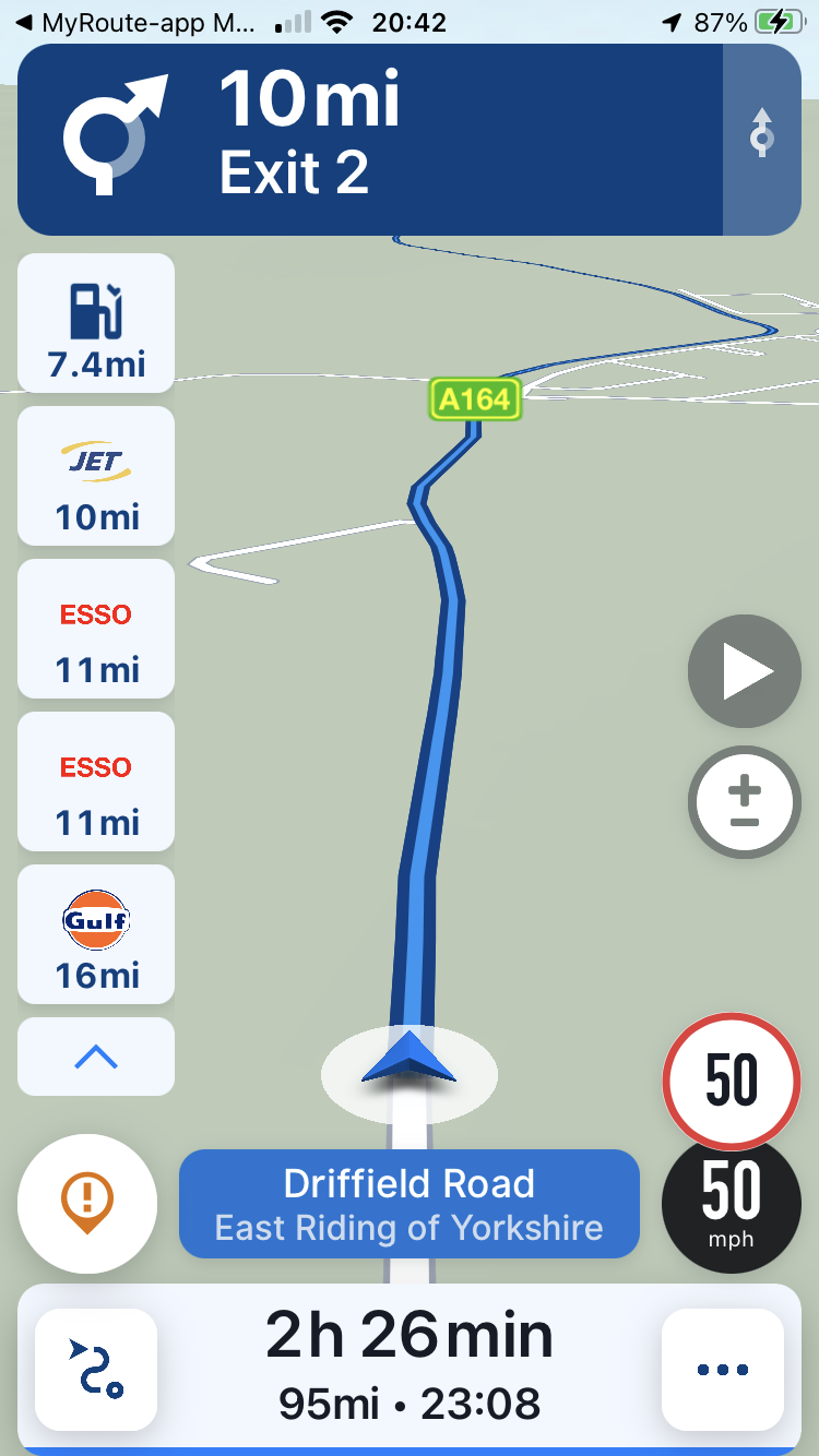
The most important information is how far it is to the next ‘turn off’ and in which direction to turn - even if that is 10 miles away as shown on the photo. Otherwise you simply follow the road you are on!
As an aside, I also like how Sygic display petrol stations information and a button to show route overview (automatic return to route guidance after a short time)
I hope these comments are helpful and are not meant to be negative - generally I think the new app is a big improvement. Keep up the good work!
-
I have been using MyRoute-app Mobile since the release of version 3.2.7 a few days ago and I have a few initial observations.
On the positive side, I do like the map used for the display and the layout at the base of the screen (speed, current road, time/distance to finish etc) is nice. Also the automatic skipping of missed waypoints is quick and accurate, much better than Navigation.
There are however areas where this release is less successful,
- Skip Waypoints
In this version, unlike previous versions, the ‘Skip Waypoint’ button on the main screen has been removed. I am not sure why this is as I regard this as an essential feature. I realise that waypoints can be deleted by pressing on them in the display, but this is really not practical on the move, and you really need a LARGE STATIC BUTTON to make this at all possible. Also of course most of the waypoints are not visible.
If I went off route when using the old Navigation app, I would keep deleting waypoints until the blue line went in the direction I wanted to travel. This was difficult to do as the ‘Skip Waypoint’ function was in a submenu, but was very easy to do in MyRoute-app Mobile (previous versions). Please reassure me that this feature will be reinstated to the main screen before general release!
- Waypoint display/announcement
I do not see the point of showing distance to waypoints in the display. In fact this information now masks the much more important information about directions at the next junction, roundabout etc. See my attached photo showing no notification of the ‘turn right’ direction until very close to the junction.

Certainly there is no need to announce ‘Shaping’ points. I use lots of waypoints at junctions etc to ensure I stay on route, and constant announcements of these is annoying and quite distracting.
Possibly displaying and announcing ‘Via’ points could be a useful option, in which case information contained in the description or notes e.g. ‘Silver Ball Cafe’ could be displayed and/or announced.
- Layout
I think the layout at the top of the screen is confusing. Can I suggest looking at the Sygic layout (photo) as a good example of how to display the essential information.

The most important information is how far it is to the next ‘turn off’ and in which direction to turn - even if that is 10 miles away as shown on the photo. Otherwise you simply follow the road you are on!
As an aside, I also like how Sygic display petrol stations information and a button to show route overview (automatic return to route guidance after a short time)
I hope these comments are helpful and are not meant to be negative - generally I think the new app is a big improvement. Keep up the good work!
@David-Bonner said in Suggestions - Skip Waypoints, Waypoint display/announcement, Layout:
I do not see the point of showing distance to waypoints in the display.
hi, in my view, this would depend on how one uses the distance to next waypoint.
At present I have it displayed on my XT, for when my pillion asks, "how long until the next scheduled rest stop"
but this is only for waypoints and not shaping/via points.
I like your lower screen shot, I believe that is helpful to have that view, the XT does it this by default, perhaps next can morph a mixture of sygic and XT, or other satnavs, or perhaps have a menu where the user can choose which icons and info to show on screen.
some prefer no clutter at all, others like to have as much info as possible -
I have been using MyRoute-app Mobile since the release of version 3.2.7 a few days ago and I have a few initial observations.
On the positive side, I do like the map used for the display and the layout at the base of the screen (speed, current road, time/distance to finish etc) is nice. Also the automatic skipping of missed waypoints is quick and accurate, much better than Navigation.
There are however areas where this release is less successful,
- Skip Waypoints
In this version, unlike previous versions, the ‘Skip Waypoint’ button on the main screen has been removed. I am not sure why this is as I regard this as an essential feature. I realise that waypoints can be deleted by pressing on them in the display, but this is really not practical on the move, and you really need a LARGE STATIC BUTTON to make this at all possible. Also of course most of the waypoints are not visible.
If I went off route when using the old Navigation app, I would keep deleting waypoints until the blue line went in the direction I wanted to travel. This was difficult to do as the ‘Skip Waypoint’ function was in a submenu, but was very easy to do in MyRoute-app Mobile (previous versions). Please reassure me that this feature will be reinstated to the main screen before general release!
- Waypoint display/announcement
I do not see the point of showing distance to waypoints in the display. In fact this information now masks the much more important information about directions at the next junction, roundabout etc. See my attached photo showing no notification of the ‘turn right’ direction until very close to the junction.

Certainly there is no need to announce ‘Shaping’ points. I use lots of waypoints at junctions etc to ensure I stay on route, and constant announcements of these is annoying and quite distracting.
Possibly displaying and announcing ‘Via’ points could be a useful option, in which case information contained in the description or notes e.g. ‘Silver Ball Cafe’ could be displayed and/or announced.
- Layout
I think the layout at the top of the screen is confusing. Can I suggest looking at the Sygic layout (photo) as a good example of how to display the essential information.

The most important information is how far it is to the next ‘turn off’ and in which direction to turn - even if that is 10 miles away as shown on the photo. Otherwise you simply follow the road you are on!
As an aside, I also like how Sygic display petrol stations information and a button to show route overview (automatic return to route guidance after a short time)
I hope these comments are helpful and are not meant to be negative - generally I think the new app is a big improvement. Keep up the good work!
@David-Bonner Thanks for sharing your feedback!
This version introduced track navigation and indeed some aspects of route navigation where (unexpectedly) affected. This resulted in the issues you also mentioned. This week we will release another update fixing these issues!

-
@David-Bonner said in Suggestions - Skip Waypoints, Waypoint display/announcement, Layout:
I do not see the point of showing distance to waypoints in the display.
hi, in my view, this would depend on how one uses the distance to next waypoint.
At present I have it displayed on my XT, for when my pillion asks, "how long until the next scheduled rest stop"
but this is only for waypoints and not shaping/via points.
I like your lower screen shot, I believe that is helpful to have that view, the XT does it this by default, perhaps next can morph a mixture of sygic and XT, or other satnavs, or perhaps have a menu where the user can choose which icons and info to show on screen.
some prefer no clutter at all, others like to have as much info as possible@paul-69 Yes, I can see that it could be a useful option to display and announce Via points, such as for a planned rest stop, especially if the Title or Notes could be displayed.
But I really can't see the point of displaying and/or announcing shaping points, even as an optional setting.
I think it is planned to display (& announce?) POI's, which maybe a better option for planned stops.
-
@David-Bonner Thanks for sharing your feedback!
This version introduced track navigation and indeed some aspects of route navigation where (unexpectedly) affected. This resulted in the issues you also mentioned. This week we will release another update fixing these issues!

@Corjan-Meijerink Thanks, I look forward to the next release.
-
@paul-69 Yes, I can see that it could be a useful option to display and announce Via points, such as for a planned rest stop, especially if the Title or Notes could be displayed.
But I really can't see the point of displaying and/or announcing shaping points, even as an optional setting.
I think it is planned to display (& announce?) POI's, which maybe a better option for planned stops.
@David-Bonner said in Suggestions - Skip Waypoints, Waypoint display/announcement, Layout:
But I really can't see the point of displaying and/or announcing shaping points, even as an optional setting.
yes I agree
-
@David-Bonner said in Suggestions - Skip Waypoints, Waypoint display/announcement, Layout:
But I really can't see the point of displaying and/or announcing shaping points, even as an optional setting.
yes I agree
@paul-69 @David-Bonner You will understand the usage in another update!

Using the routeplanner you can add notes to waypoint, those notes can then be announced! So imagine you driving past a cliff and you know a nice spot to to take a picture. The app can then announce your note: “Stop for a picture on the left”. -
@paul-69 Yes, I can see that it could be a useful option to display and announce Via points, such as for a planned rest stop, especially if the Title or Notes could be displayed.
But I really can't see the point of displaying and/or announcing shaping points, even as an optional setting.
I think it is planned to display (& announce?) POI's, which maybe a better option for planned stops.
@David-Bonner I agree with David's suggestion the distance and time displayed to a Via point - rest stop and then final destination. no need to announce each shaping point.
Suggestion: I would like to see the font for the posted mileage be a little bit bigger and make the time of arrival display a little smaller..
